#book design
Books read in March 2022
BUSTER UNDERCOVER by Caleb Zane Huett
TIGER VS. NIGHTMARE by Emily Tetri
THE MUSHROOM AT THE END OF THE WORLD by Anna Lowenhaupt Tsing
FOUR THOUSAND WEEKS by Oliver Burkeman
CAMP by Kayla Miller
FIBBED by Elizabeth Agyemang
SLIP by Marika McCoola and Aatmaja Pandya
WHEN I GROW UP I WANT TO BE A LIST OF FURTHER POSSIBILITIES by Chen Chen
THE LESBIANA’S GUIDE TO CATHOLIC SCHOOL by Sonora Reyes
Post link
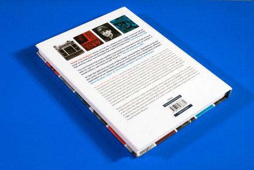
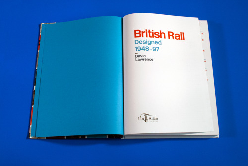
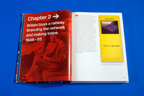
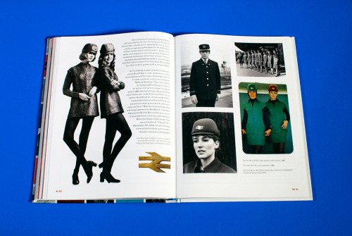
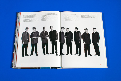
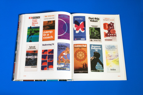
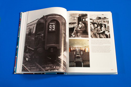
British Rail Designed 1948-1997 by David Lawrence, published by Ian Allan Books. Designed by me: http://www.theoinglis.co.uk/
Featured on It’s Nice That, I wrote a bit about the design process there:
http://www.itsnicethat.com/articles/british-rail-designed-theo-inglis-david-lawrence-181116
Post link
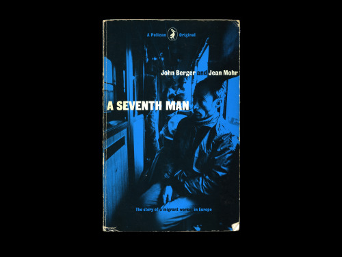
New article for Grafik about John Berger and book design:
https://www.grafik.net/category/feature/berger-s-books
Post link
I have designed an entire book, it is a hardback with 272 pages. It will be released on the 10th November by Ian Allan books.
Basically a dream project to work on the definitive book about such an iconic aspect of British design history. But also a slightly daunting one, as it is a brand so revered by my fellow graphic designers. Hopefully they like it…
I also have a new website: http://www.theoinglis.co.uk/
Post link
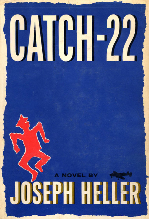
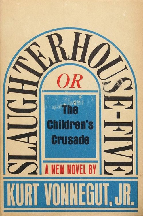
“Paul Bacon, 91, Whose Book Jackets Drew Readers and Admirers, Is Dead”
He is widely credited with pioneering what is known in the industry as the “Big Book Look” — typically a bold, minimalist design featuring prominent lettering and a small conceptual image. He did all of his designs, including the lettering, by hand.
Post link
This really was interesting to see and the layout is so good.
Decorative Paper Sunday
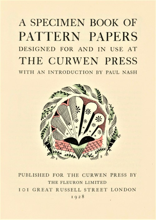
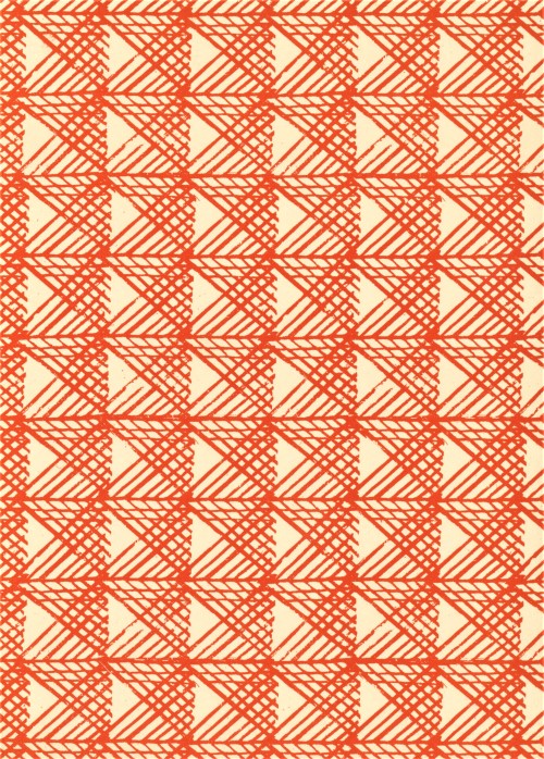
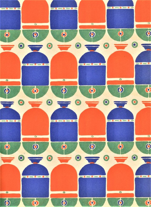
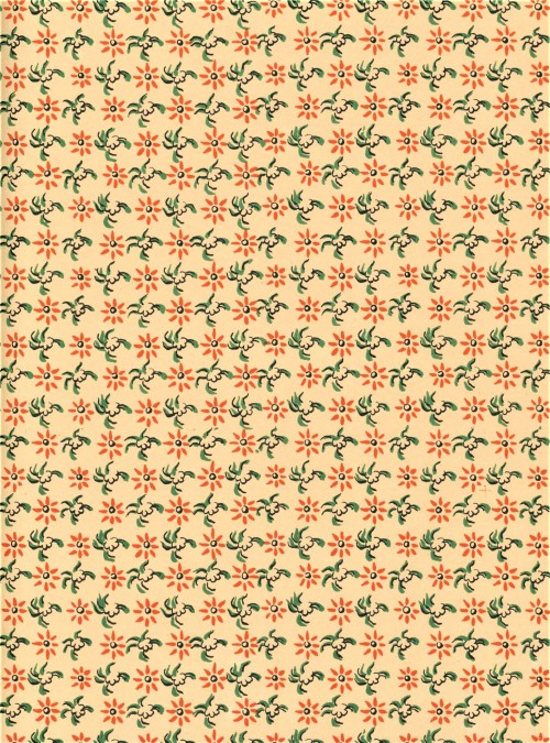
I’ve been excitedly waiting for this specimen book to make its way through processing and into our catalog so I can share these gorgeous decorative papers with you all. I hope some design nerds out there will share my enthusiasm. The book isA Specimen Book of Pattern Papers Designed For and in Use at the Curwen Press,published in London for the Curwen Press byThe Fleuron Ltd. in 1928 in a limited edition of 220, containing 31 samples of pattern paper, with an introductory essay by artist and Curwen collaborator Paul Nash.
From Nash’s introduction:
The papers in the following Collection are from designs reproduced by offset printing, the original key pattern being a line block from a drawing, or wood engraving … The latest designs are mostly from blocks engraved upon wood, sometimes with another colour applied either flat or grained. This notable output by an English printer is another sign of the steadily growing conviction that distinction of design is not only aesthetically, but commercially important. Every article, from the Shopman’s showcard to a motor-car, must have economy and beauty of form. It is a lesson we are learning very late, but if we can learn it intelligently, and not like parrots, we may yet recapture what has been so long lost with us, a pride in style.
The Reverend John Curwen established the Curwen Press in 1863 in order to produce hymn sheets for his congregation, where he was responsible for popularizing the tonic sol-fa method of sight singing. John’s grandson Harold Curwentook over management of the press in 1914. Inspired by William Morris and the Arts and Crafts movement and invigorated by fresh design ideas after a sojourn in Leipzig, Harold led the firm in a new direction, focusing on typography, design, and collaboration with artists in print projects. The Curwen Press, together with its associates in the Design and Industries Association,were highly influential in 21st century printing and publishing in the West.
The Curwen Press closed in 1984, but the Curwen name lives on in the Curwen Studio. The studio was established in 1958 and managed by esteemed printmaker Stanley Jones and specializes in fine art lithographic printing.
See image captions for design attributions. This book was acquired with support from the John S. Best Fund.
You can find moreDecorative Sunday posts here.
Moreposts about the Curwen Press can be found here.
-Olivia, Special Collections Graduate Intern
Post link
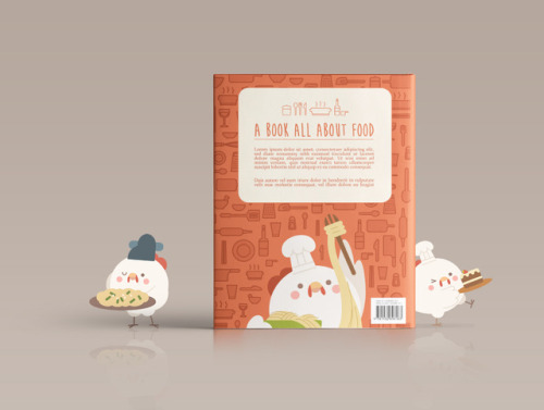
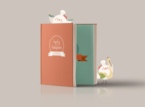
What if Tasty Teaspoon was a book? Here’s what it might look like!
(Just for fun! ;) )
I did a book design mockup for Tasty Teaspoon for practice!
Post link
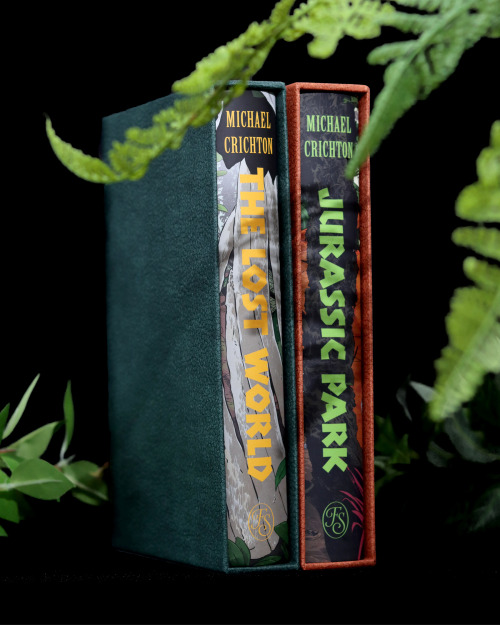
I’m delighted with how they look together.
Jurassic Park and The Lost World, written by Michael Crichton.
Published by Folio Society, with binding / endpapers / title page / internal illustrations by me. Both are out now only on foliosociety.com!
More images on Instagram: instagram.com/vectorthatfox
Post link
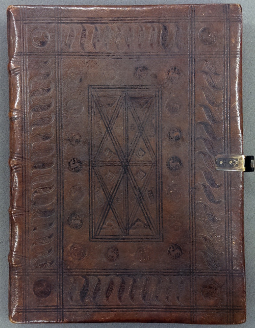
If you’re in the habit of reading descriptions of old books—and why wouldn’t you be?—you’ve likely come across something described as bound in period style or in a sympathetic binding. This typically means the book was rebound relatively recently, but rebound in a style consistent with the time period of the book’s original publication.
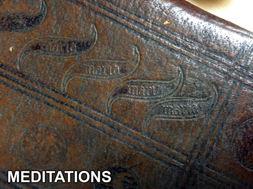
For example, our first edition of the Meditationes Vitae Christi (Meditations on the Life of Christ) was rebound in such a way. You can read more about this work—a recent acquistion—here.
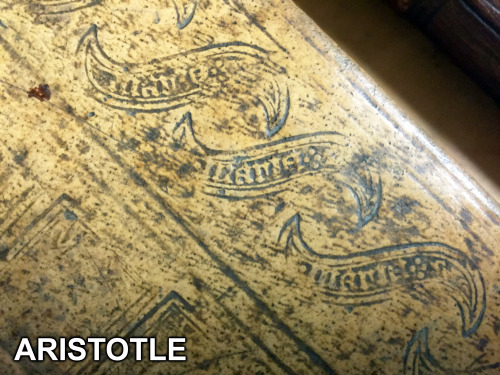
And shortly after the Meditations arrived, we received the first printed Greek edition of Aristotle (it was a very good summer), which underscored just how well done this period-style binding was. Although the books were likely bound about 400 years apart—the Aristotle around 1500 and the Meditations around 1900—the styles are strikingly similar. The combination of borders built up from different tools, surrounding a central diaper pattern, was a familiar style when both were published. The Aristotle binding is almost certainly German, so it’s no surprise that the binding of the Meditations, which was printed in Augsburg in 1468, emulates a 15th-century German style.
Of all the similarities, what most caught our eyes was a particular tool used to decorate the boards. While obviously similar, small differences distinguish them. The Aristotle version, for example, has four tiny dots following Maria, while the Meditations version has no dots; a double border surrounds the Aristotle tool—thick on the outside, thin on the inside—while the Meditations tool has a single border; the Aristotle tool measures over 3 cm from end to end, while the Meditations tool measures just under 3 cm. The sheer volume of such tiny differences among tools is staggering. The Einbanddatenbank, a database of 15th- and 16th-century finishing tools used on German bindings, records more than 600 versions of the Mariatool.
How do we know the Meditations binding isn’t original? There are a number of clues, the general as-new appearance being a big one, but subtler evidence is there. The spine edges of wooden boards were commonly beveled in the late 15th century, but they aren’t here. Spines were seldom decorated at this time, yet the binder of the Meditations couldn’t help but to add some restrained decoration. Could these features be found on bindings from the late 15th century? Sure. But the accumulated weight of the evidence favors something done later in period style.
Make no mistake, the Meditations binder was good. Even the endpapers are period-appropriate leaves removed from an old book. This binding was absolutely the product of a skilled craftsperson with a thorough understanding of period styles—and perhaps the product of a binder with the skill and patience to make their own finishing tools.
~Pat
Post link
The Doors of Perception, Aldous Huxley
Play It As It Lays, Joan Didion
The Three Stigmata of Palmer Eldritch, Philip K. Dick
The Silver Locusts, Ray Bradbury
Post link
“I will do my thing.”
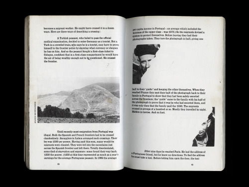
Irma Boom - Graphic designer who specialises in bookmaking, she has been described as the Queen of Books.
An Art Lovers’ Guide: Amsterdam
Post link
more on my art books instagram page
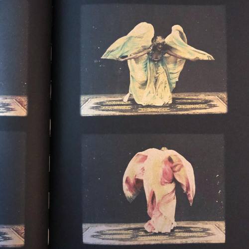
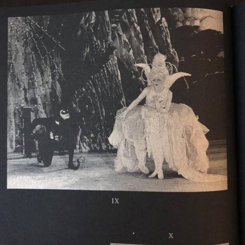
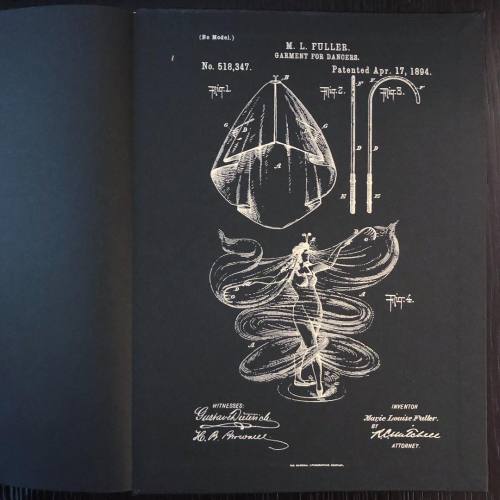
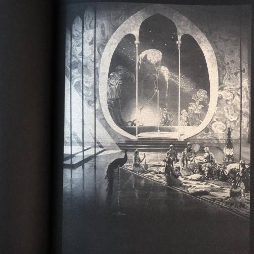
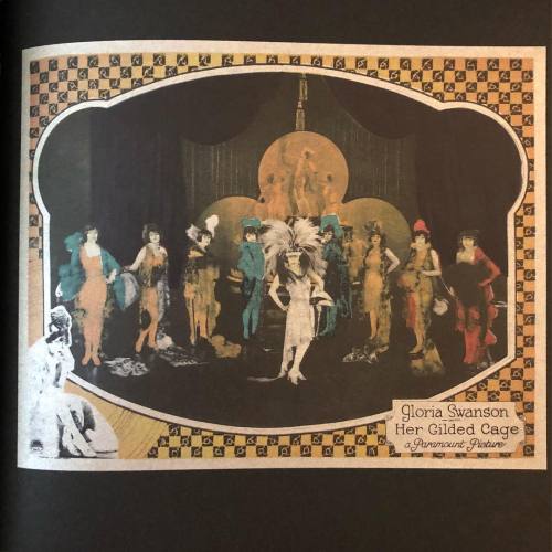
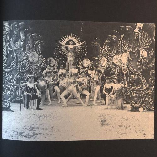
BIRDS OF PARADISE: COSTUME AS CINEMATIC SPECTACLE
(One of the most wonderful books I’ve ever seen)
Post link
more on my art books instagram page
BIRDS OF PARADISE: COSTUME AS CINEMATIC SPECTACLE
(One of the most wonderful books I’ve ever seen)
Post link


