#cover design


Cover Unveiled For The 10th Anniversary Edition of ‘Looking For Alaska’
So how long before John Green is straight up forced to become a chalk drawing with FAULT IN OUR STARS tattooed on his forehead by a cabal of power-mad brand managers
Post link

TIME: …
Me:
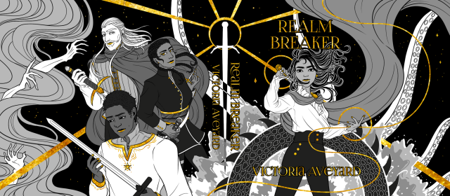
Hello hello it’s the Realm Breaker by @vaveyard dust jacket I designed for The Bookish Box!


The Arcana
once past these doors, it is every soul for themselves,
let out to run, hide and fight,
make it until dawn
and survive the game of madness
she looked up into the dark sky,
the Arcana above them all
two triangles in a diamond representing
mountains in front of the setting sun
the dusty smell of the wildflowers was surrounding her,
the desert stretching wide.
they were not alone in this game.
people of the sands.
it was their territory.
when a hand covered her mouth,
she didn’t bother to scream,
no-one was out here to hear her anyway.
she was in the hands of the enemy now.
she wouldn’t make it until the setting moon at dawn
Post link


Concept:
The first three book covers I redesigned for the Harry Potter series. Story-time: ever since I was a wee baby child, the Harry Potter series has always been a big part of my life. As cliche as it sounds, it’s what got me into reading when I was growing up and my interest in the books hasn’t diminished since. As a long time fan, I’ve been around the block a time or two and seen my fair share of variant book covers from different artists and countries. My concept was that I wanted to stray away from having any illustrations of the main trio and focus on specific elements/ objects that were important to each book without spoiling anything for new time fans while also incorporating Easter eggs for longtime fans such as myself.
Front and Back Covers: 1 of 2
1. The Sorcerers Stone: This was probably the hardest concept to design.I went with a silhouette of the Hogwarts Express in the foreground, behind that a silhouette of Hogwarts in the background and the forbidden forest on the sides. Then everything is placed inside of the Sorcerer’s/ Philosopher’s Stone to show that the Hogwarts will never vanish and will always live on. In front of everything else there are a couple Hogwarts letters falling like how Harry receives his letters in the books. The letter idea is further illustrated on the back cover (left) with the owl dropping dozens of letters around the text.
2. The Chamber of Secrets: This was the simplest design to create. The front cover is the door to the Chamber of Secrets while the back cover shows Dumbordore’s Phoenix:Fawkes fighting the Basilisk.
3. The Prisoner of Azkaban: My favorite book of the entire series and thus the cover I am most excited with the outcome. At first I struggled with ideas because the first thing I thought of was the wanted poster for Sirius Black since he plays a HUGE role in the book. But that idea seemed too obvious and overdone in my mind. So instead I went with the teacup that Harry receives in divination class with the prediction of the Grimm. In this metaphorical sense, the Grimm represents Sirius Black in his animagus form which is placed inside of Hogwarts castle because Sirius snuck into the castle while he was a dog. Both the design of the castle and the footsteps are reminiscent of pieces found on the Marauder’s map which Sirius and Remus both contributed in making. The footsteps also tie into Peter Pettigrew who was discovered to be alive by his footsteps on the Marauder’s map. Finally the circle that the illustration is in represents the full moon and Remus’s transformation into a werewolf each month.
Spines:
1. Sorcerer’s stone: Harry’s glasses with the iconic lightning bolt
2. Chamber of Secrets: Tom Riddle’s diary- aside from being an element of how Harry gets into the Chamber, it’s also a horcrux.
3. Prisoner of Azkaban: The Time Turner- Its how Harry and Hermione are able to go back in time to rescue Sirius and Buckbeak from death.

A cover design for the fictionalized-from-life novel My Father’s Ghost is Climbing in the Rain by Patricio Pron. A reflection on depression, obsession, and ultimately, the past of our parents that needs to be remembered. I enjoyed this read, as I do most Latin American authors who I pick up at the library, though the design stumped me until it came upon me to combine two of my ideas.
Post link

A painful and unsettling poetry cycle, The Beauty of the Husband by Anne Carson, was the next book cover I designed. Although my first idea for this cover struck me as more intriguing and obtuse than this one, I have not yet found the best way to iterate that idea. This approach conveys much of the emotional ambiguity of Carson’s narrative.
I’ll be posting more cover designs over the next few weeks on this blog, but you can check them out on my website, too.
Post link

I read The Rings of Saturn after finishing Station Eleven.
Unlike the author of that book, Sebald does not use visual images to embed his narrative with symbolic meaning and in that sense coming to a design idea felt much murkier than the previous cover I tackled. Nevertheless I’m very satisfied with the results, and definitely think this refresh has more contemporary appeal than the old New Directions cover designs.
I’ll be posting more cover designs over the next few weeks on this blog, but you can check them out on my website, too.
Post link

Next in the book cover series–here is my design for Station Eleven, by Emily St, John Mandel. Though I wasn’t enamoured with the writing, I appreciated that taking on this design project lead me to abstract the subject matter. The text was so replete with visual images that I wanted to get away with a more expected direction.
I’ll be posting more cover designs over the next few weeks on this blog, but you can check them out on my website, too.
Post link

I’ve started making cover designs for the books that I’ve been reading. Here’s my design for Play It As It Lays, by Joan Didion.
I read the book in one sitting, it’s so powerful and devastating.
Post link


Cover illustration design for a scientific journal in development, the protective umbrella of human body – T lymphocyte cell in personification, dresses like the martial actor of Chinese opera, wearing a T cell-like cap, he uses his fiery keen eyes to distinguish the four variants of the Corona virus: Alpha, Beta, Gamma and Delta. The viruses are all depicted as wind and fire wheels from Chinese martial arts, hinting at their extremely fast escape speed.
Post link

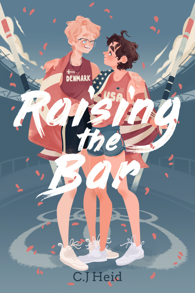
Raising the bar - C.J Heid
, presented new album Once, play on Apple Music")
The Pictures, rock band from Yekaterinburg (Russia), presented new album Once, play on Apple Music .
Design by FXSD/Photo
Post link


)")


Another book cover for another novel I’m writing
__
For anyone interested in more than just the art, here’s the synopsis and link to where you can read it:
Juniper Savine has three goals: first, to clear her father’s name. Second, to win the competition to become the king’s head chef. Third, to get revenge. As a sensari of Taste, Jun’s got magical cooking on her side–and that’s about it. If she fails, she faces sacrifice to a wrathful god…but that’s the least of her worries. Dark secrets and the people entangled in them hound her every step. The cherry on top? She’s pretty sure she’s falling for one of her most bitter enemies…the daughter of the man she intends to kill.
Oh, and her burly guard, too.
~A polyamorous tale of love, revenge, and magical food wars set in a world with a magic system based around the five senses~
Available on Wattpad, Royal Road and Scribblehub
Post link


. 2016.-Sho")
Japanese Publication- Monthly Cosmopolitan. Aoyama Nozomi and Wakida Asuka (Cosmopolitan). 2016.
-
Shop | Goods Collection | Twitter | Instagram | Pinterest | Facebook | Y I S . u b e c o | OGG Instagram
Post link

Philippe Halsman’s Jump Book.
-
Shop | Goods Collection | Twitter | Instagram | Pinterest | Facebook | Y I S . u b e c o | OGG Instagram
Post link

The book “Mayakovsky for the voice”. 1923.
-
Shop | Goods Collection | Twitter | Instagram | Pinterest | Facebook | Y I S . u b e c o
Post link
 13冊 / 恩地孝四郎編.-Shop | Goods Collection | Twitter | Instagram | Pinterest | Fa")
書窓(アオイ書房) 13冊 / 恩地孝四郎編.
-
Shop | Goods Collection | Twitter | Instagram | Pinterest | Facebook | Y I S . u b e c o
Post link
 yet to write: a compi")
 yet to write: a compi")
 yet to write: a compi")
 yet to write: a compi")
 yet to write: a compi")
 yet to write: a compi")
 yet to write: a compi")
 yet to write: a compi")
 yet to write: a compi")
 yet to write: a compi")
Duology and series covers I’ve designed for stories I have (for the most part) yet to write: a compilation post.
Post link
![cover design [3/?]: book covers with sad/distressed women (with obscured faces)read about this cover](https://64.media.tumblr.com/83118dfb1505255054be76fe860042bb/964733d049511d36-7a/s1280x1920/03cc87cacf2f795f3be1bc21bd579a34b093f467.png "cover design [3/?]: book covers with sad/distressed women (with obscured faces)read about this cover")
![cover design [3/?]: book covers with sad/distressed women (with obscured faces)read about this cover](https://64.media.tumblr.com/0715951ac60bf03baf6781d06a41f32a/964733d049511d36-0c/s1280x1920/70a247c3ccba6afd142e7f73b19886d8e8442706.png "cover design [3/?]: book covers with sad/distressed women (with obscured faces)read about this cover")
![cover design [3/?]: book covers with sad/distressed women (with obscured faces)read about this cover](https://64.media.tumblr.com/2ac896a494bed4a59acc8d4c758adba9/964733d049511d36-01/s1280x1920/23f042735faa44287b26062c7029e6b1e5747a65.png "cover design [3/?]: book covers with sad/distressed women (with obscured faces)read about this cover")
![cover design [3/?]: book covers with sad/distressed women (with obscured faces)read about this cover](https://64.media.tumblr.com/590af71ae7502e2b0043caa87b56544f/964733d049511d36-8b/s1280x1920/0ef05a49567b3bcd09379310ff7ad218bbc8d5c3.png "cover design [3/?]: book covers with sad/distressed women (with obscured faces)read about this cover")

Very excited to announce that the trailer for my Domestikacourse — GRAPHIC DESIGN FOR FICTION — is now LIVE! Check it out & discover the full course (yes, I’ll be discussing X-Men).
If design, branding and storytelling are your thing; and you want to learn how to create compelling identities that help tell a story this is the course for you. PRE-ORDER now at the #domestika link below and get 50% DISCOUNT; with the course lessons and assets unlocking next week!
https://www.domestika.org/en/courses/3281-graphic-design-for-fiction-visual-identities-with-stories/hellomuller
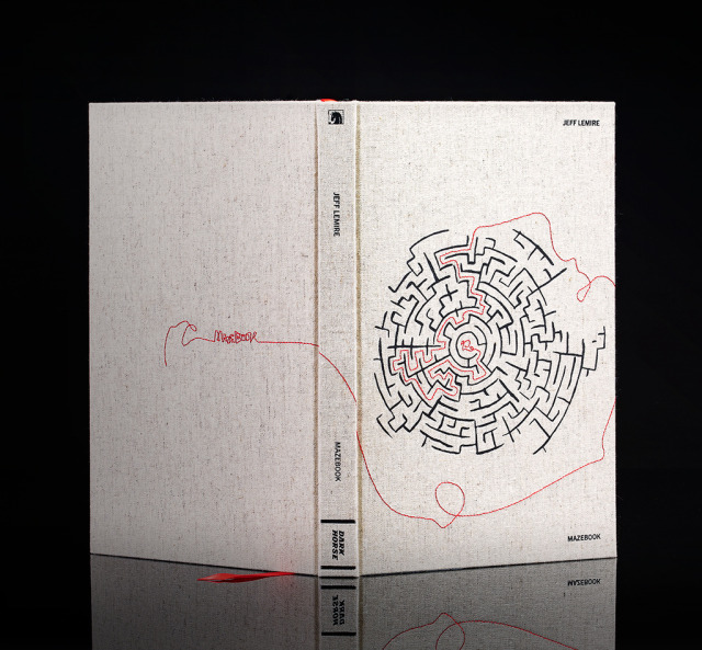

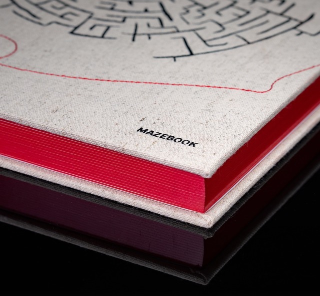

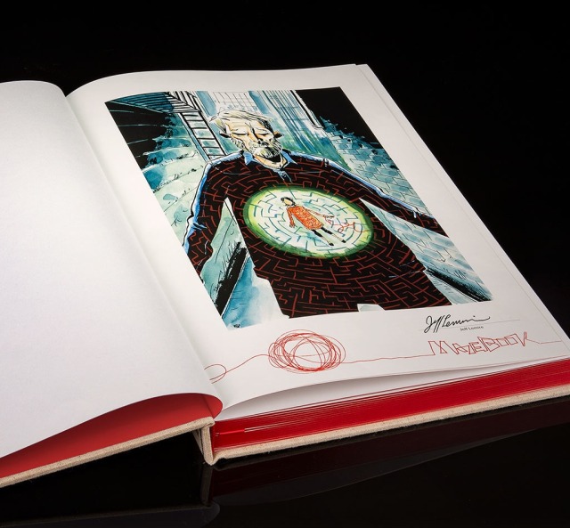

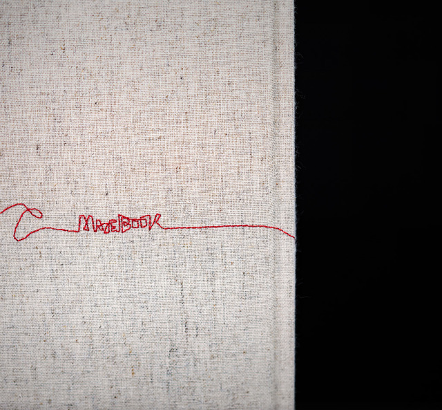


Excited to share new work for New York Times bestselling and Eisner award-winning creator Jeff Lemire (Netflix’s Sweet Tooth, Black Hammer, Gideon Falls) — the publication design of a limited, and oversized hardcover edition collecting the bestselling MAZEBOOK series (published by Dark Horse Comics). Bringing the Mazebook to life through design, the publication features a cloth cover with embroidery, foil stamping, a color ribbon and gilding, signed tip-in plate and a rich backmatter section featuring illustrations by guest artists and Jeff’s notes on the creation of Mazebook.
This caps the creative journey we embarked on when I joined Jeff and Dark Horse Editor Daniel Chabon to develop the publication design and visual identity for the landmark, best-selling series.
(Photography by Dark Horse Comics)