#packaging


Mr. Porter asked me to illustrate outfits for different careers or professions as toy box outfits, referencing the old Action Man outfit sets from the 60′s and 70′s. Basically a dream job for me. Action figures, fashion, retro imagery, andall of that in monochromatic colour schemes? Yes. Count me in.
Post link


Video: Is Plastic Sustainable? - By The British Plastics Federation
By Shardell Joseph
The British Plastics Federation (BPF) has released two videos to to help tackle some of the public misunderstandings around plastic, addressing its role in society and the best ways to prevent plastic waste.
The video’s were released after an international debate on plastic waste at the World Economic Forum last week, in support of the BPF’s recent document Understanding the Debate about Plastic, which outlines why plastic is important for modern life and the evidence on effective ways to reduce waste.
Video: Improving Plastic Recycling in the UK - By The British Plastics Federation
YouGov findings recently revealed over two-thirds of the public believe that plastic packaging is the most damaging material for producing carbon emissions during its lifecycle. Research into the environmental impact of plastic, however, disproved this, and indicated that that replacing plastic with other materials is not necessarily better for the environment. Academics have also cautioned against swapping plastic for other materials due to the unforeseen negative consequences it may have for the planet.
‘We hope that through widely sharing content such as these videos, we can help clear up public misunderstanding about plastic,’ said British Plastics Federation Director General, Philip Law. ‘The recent YouGov poll results show the issue clearly - most do not appreciate plastic’s role in helping us reduce greenhouse gas emissions.
‘Policymakers and the media need to take note. By turning away from plastics we may do a lot more harm to our environment than good. We must ensure we work together to make the best choices for our planet, and plastic has an important role to play in fighting climate change.’

19-4052 Classic Blue – The Pantone Colour of the Year 2020. Image credit: Pantone.
By Anthony Caggiano
“We are living in a time that requires trust and faith.”
Pantone Colour Institute Executive Director, Leatrice Eiseman, used the line to help frame the direction as to why 19-4052 Classic Blue was chosen as the Pantone Colour of the Year 2020.
Eiseman said this particular colour is a solid and dependable hue that expresses constancy and confidence.
‘A boundless blue evocative of the vast and infinite evening sky, Classic Blue encourages us to look beyond the obvious to expand out thinking – challenging us to think more deeply, increase our perspective and open the flow of communication.’
Since 1999, the Pantone Colour of the Year has helped shape product development and buying in areas including fashion, home furnishing, industrial design and packaging.
It is chosen by the Pantone Color Institute, the business unit within the company.
So what are some of the areas that we might be able to expect to see the colour popping up? We take a look at some areas where we’ve seen things.
Fashion
Designer Demna Gvasalia used the hue in his Balenciaga Spring collection, which was displayed at Paris Fashion Week. While the shapes looked at uniforms and had very square structured shoulders, the colour appeared in the stage and a number of items in the collection.
Product Design
A number of the Red Dot Design 2019 winners had blue hues to them.
The CHARGEit powerbank, made by SACKit ApS, Denmark, wirelessly charges smartphones, loudspeakers and other mobile devices placed on the “X”. Its design includes a rounded aluminium frame surrounding and woollen upholstery fabric, of which the on-trend colour is in the palette.
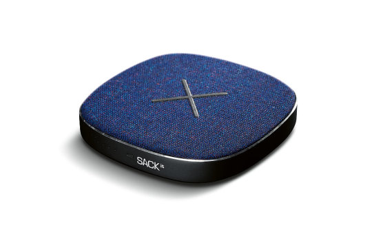
Image credit: Red Dot/Sackit
The Pocket Sky by Active Wearables GmbH, Austria, is worn like a pair of glasses. According to Red Dot, the wearable produces a soft blue light which, similar to daylight, reduces the production of melatonin for the user.
‘The sleep-wake rhythm, wakefulness and general well-being are improved. Pairs of magnets, plated with gold, help the arc to fold and glide into its dock,’ they said. The jury said with the use of blue light, ‘the wearable device increases the well-being of users in situations of stress affecting the biorhythm.’
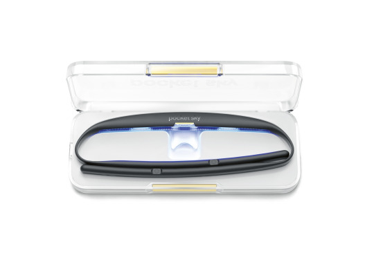
Image credit: Red Dot/Active Wearables
Packaging
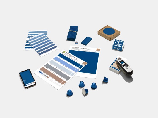
Classic Blue colour swatches and packaging products. Image credit: Pantone
Pantone said because of the colour’s relation to the sky at dusk, something we see every day, it maintains a perception of dependability and constancy.
“Classic Blue is an ideal shade for many applications in graphic design. This is especially true for packaging, where PANTONE 19-4052 Classic Blue conveys the message of credibility and reliability that today’s consumers are connecting to,’ the company said.
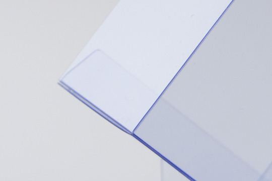
PET Blue Ocean Image credit: Seufert Transparente Verpackungen
At Packaging Innovations 2019, London, UK, Seufert, Germany, was awarded ‘Most Innovative Pack’ for its PET Blue Ocean Material, which has a blue hue and has up to 100% recycled content in the central layer of the polyester.
The manufacturer credited the material’s bluish tint to it conveying ‘freshness and purity to the consumer, setting products in an attractive light at the point of sale.’ The material can also be recycled as a mono film.
Q. What have you seen that is blue this year? Tell us in the comments box below.


☕️ Donde hay té, hay esperanza | @jorgeluis_campozano y @fierasestudio
.
.
.
.
.
#branding #packaging #graphicdesign #ecuador #tea #inca #handmade #illustration #logo #otrasdemencias
https://www.instagram.com/p/Bv0_nZYhLvV/?utm_source=ig_tumblr_share&igshid=1s8sm5jo9jyxu
Post link

")
Ok ok ok I’ve seriously have just #died & #wokeup in #luxury #packaging #heaven like serious!! Yeah, Ima need you to go ahead an #pressplay see for yourself… I’ll wait- What you see is there are #gerardcosmetics #starpowder in #lucy on right & #brigitte on left, the #lipsticks are #underground & #maitai.. #LA #kissablelips #tryme #vibrant #video

Our new packaging has arrived! Say hello to our gold foil on matte gold stickers and sustainable custom tissue paper bearing our brand new pattern for 2019, “Palme before the Storm” - Palme being the French word for Paisley (from which the design is inspired) and the storm part refers to the wind and wave patterns that form the abstracted Paisley pattern - you might even be able to see the lighthouses and windmills that we incorporated into the design to reinforce the idea!
Post link
