#behind the scenes
The Making of Photoplay Titles
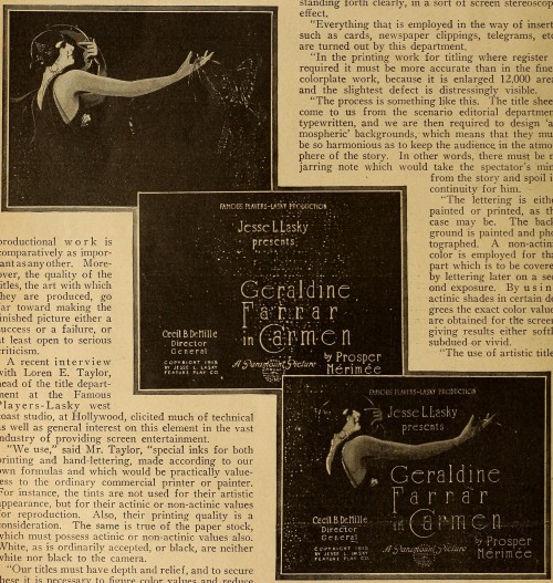
The importance of the titles and subtitles in motion pictures, while scarcely realized by the layman, is recognized by those in the profession, but probably many of the latter fail to realize that a third of the actual picture is comprised of the words thrown upon the screen and that this phase of the productional work is comparatively as important as any other. Moreover, the quality of the titles, the art with which they are produced, go far toward making the finished picture either a success or a failure, or at least open to serious criticism.
A recent interview with Loren E. Taylor, head of the title department at the Famous Players-Lasky west coast studio, at Hollywood, elicited much of technical as well as general interest on this element in the vast industry of providing screen entertainment.
“We use,” said Mr. Taylor, “special inks for both printing and hand-lettering, made according to our own formulas and which would be practically valueless to the ordinary commercial printer or painter. For instance, the tints are not used for their artistic appearance, but for their actinic or non-actinic values for reproduction. Also, their printing quality is a consideration. The same is true of the paper stock, which must possess actinic or non-actinic values also. White, as is ordinarily accepted, or black, are neither white nor black to the camera.
“Our titles must have depth and relief, and to secure these it is necessary to figure color values and reduce them to monochrome, giving the same values that would be gained by the eye in viewing the printed or painted title before it was reproduced for the screen. We use lights with no red rays in them, and the red pigments are an important quality in the paper and inks used.
“The art department has to be alive to the necessity of clever designs and new ideas, which shall combine the art of designing and printing with engraving, photography and the various so-called trick methods which have been applied to the camera, such as double exposure, dissolves, composites, etc. The most artistic titles are those which have a soft and impressionistic background of decorative design, appropriate to the subject, with the lettering standing forth clearly, in a sort of screen stereoscopic effect.
“Everything that is employed in the way of inserts, such as cards, newspaper clippings, telegrams, etc., are turned out by this department.
“In the printing work for titling where register is required it must be more accurate than in the finest colorplate work, because it is enlarged 12,000 areas and the slightest defect is distressingly visible.
“The process is something like this. The title sheets come to us from the scenario editorial department, typewritten, and we are then required to design ‘atmospheric’ backgrounds, which means that they must be so harmonious as to keep the audience in the atmosphere of the story. In other words, there must be no jarring note which would take the spectator’s mind from the story and spoil its continuity for him.
“The letting is either painted or printed, as the case may be. The background is painted and photographed. A non-actinic color is employed for that part which is to be covered by lettering later on a second exposure. By using actinic shades in certain degrees the exact color values are obtained for the screen, giving results either softly subdued or vivid.
The use of artistic titles has a great effect upon the spectator. It is a matter of psychology, and the best picture may be marred by imperfectly made titles, or those which are out of harmony. Yet the art of the screen subtitle is really in its developing stage.”
Motion Picture Magazine, March 1919. Internet Archive.
Post link
Vogue.com gives Karlie Kloss a GoPro for a behind the scenes look at a her day during New York Fashion Week
Purple hair, don’t care. Backstage at Jeremy Scott Spring/Summer 2020.
Photo: Rachel Scroggins/The Greyest Ghost
Post link


