#catwalk


Paris Fashion Week Couture - Spring 2015
I finished watching and reviewing the couture collections earlier than I expected - I feel like Superman now! - and so I’m pretty ready to fill you in with all my comments. In general I was pleased with what I saw, even if it seems more and more obvious in my opinion that Couture is becoming more and more similar to prêt-à-porter: everything becomes simpler, everything becomes more wearable.
Day 1
As usual Versace opens the couture runways in Paris, and this time I really hoped some of the subtlety Donatella put in both mens and womenswear collections was infused in this collection as well - what’s better than a subtle elegant couture gown? At the beginning I really thought this was the case - beautiful the total white or total black looks, even trousers on the runway, with sinuous cuts showing that much of skin just to be considered sexy without being vulgar. When the first electric blue piece went out I thought ‘ok, that is nice’. But then it started going worse and w(h)orse: giant oversize belts, more and more skin showing, and more and more predictable gowns. Missed opportunity.
Day 2
Schiaparelli opened the day with the collection designed by the in-house team after the departure of Marco Zanini. I want to spend some words on this line even if I didn’t quite like it, because I’m really worried for the future of this just-reborn brand. I don’t see where it’s going, and unless the next creative director really pushes the boundaries, this one is going to be the proof that sometimes is better to leave the maison dormant than to restore it. This collection was nice, but Schiaparelli can’t be nice. It has to be SHOCKING. And overall, it lacked cohesion.
Thank god Rad Hourani (photo 1) saved me. Even if it was a very short collection, more a presentation than a runway show actually, it was great in every sense, from putting menswear in a couture show to the clothes in themselves, merging the polished quality of kimono clothing to details from male suits, like the lapels. Everything is extremely futuristic - just look at the materials. And the very bright pop of colour wasn’t missing either.
Colour which was present in Dior(photo 2) as well. It’s amazing to see how Raf Simons can go from an inspiration to a radically different one in the space of a season: how could the 'period’ gowns we saw last season come from the same maison as this colourful contemporary extravaganza? There were some unusual shots for Dior: varnish thigh-length boots, transparent plastic coats, Picasso-like prints. Still, there was Dior at its full: ballerina dresses, strapless gowns with full skirts, luxurious materials, some bling which never risks of being over the top. It was a feast for the eye and for the soul, as well as for the mass of Dior addicts dreaming after seeing such an amazing show.
I was disappointed by Giambattista Valli (photo 3) as he’s one of the designers I like the most. But this time there was nothing original about his collection. Don’t get me wrong: I really think this looks were beautiful, but I saw this collection more as a tribute than as an original work. It’s Chanel, maybe even Dior - but very little Giambattista Valli.
Day 3
It was smart of Kaiser Karl to open Chanelcouture show (photo 4) with an explosion of solid colours; and it was as smart as this to pair these colours with simple straight-lined silhouettes. Of course there were the cream and powder tones dear to the maison, but everything seemed more precise and detailed, brighter in some way; even the total black looks had strong, bold lines; the flowers in the last looks - except being too heavy in some instances - looked like glowing of a new light. New things came from little details: like the exaggerated shoulders or the slightly more feminine edgy atmosphere of the whole show.
Julien Fournié chose feminine elongated silhouettes. His clothes went from the simplest to the extreme of decoration, with coral-like necklaces and accessories and multicoloured prints.
There was Russia in Ulyana Sergeenko’s collection (photo 5) as usual. It was very visible in her looks, as usual. Heavier in some of them, subtler in others. Still, what I really liked from her this time was the caricatural quality of her work: everything was exaggerated until it became ironic. The prints were extremely graphic and bold, the model was forced in rigid postures by the dresses, the very high waist of many looks made the model’s legs look extremely long - maybe too long. But after all, it was obvious that was the goal. Haute couture that can’t take itself too seriously anymore. Ulyana is growing up.
The bamboo forest on Armani Privé catwalk (photo 6) was enough to understand we were in Asia for this collection. But then, the oriental inspiration came very strongly from the clothes themselves: there was chiffon, glossy silk, some bamboo printed ethereal fabric, kimono belts, and an essentiality of cut which one can only find in Japanese tradition. The colours were lighted of a very toned down glow and the bling was to the minimum, extremely chic.
Day 4
A 'Lady Gagaish’ extravaganza with Frank Sorbier opened the fourth day, with encrusted lace, voluminous gowns made of what looks like chiffon foulards and sculptural outfits. More relaxed was the atmosphere with Elie Saab (photo 7). Every season I say 'next one I WON’T put his looks in my post’, because you know, it’s true, he always does the same things. Yet, you can’t help looking at his gowns with open mouth and a sparkle in your eyes. They are really beautiful gowns, no other word can be used to describe it appropriately. And I must admit, there was something different this year: no strapless draped glamorous gowns, but more traditional silhouettes and shapes, like princesses from a not-so-far-away past sliding down the catwalk. The glamour was there but it was in some way less glam and more sophisticated.
Jean Paul Gaultier presented his first collection after the closing of the prêt-à-porter line. I was disappointed. It felt like watching a Moschino show from the 80s. Viktor & Rolf (photo 8) never disappoint instead. They go very wearable and understated when they do ready-to-wear, but with couture they choose art all the way. Yet, it’s not art for art’s sake; it’s art AND fashion, because apart from all the irony they put in their clothes, the exaggeration, the fantasy in their looks, there are always those outfits that stay on the verge between couture and ready-to-wear. This collection was fantastic in taking a fairy-tale little gown - I can clearly see Snow White wearing every single piee - with puffy skirts and flowery maxi-prints, and making it sort of resort, paired with flip-flops and essential straw hats.
If you want a perfect end of the day, just ask Valentino (photo 9). I was skeptical about this collection at the beginning: it looked like something already seen, it looked like D&G, bla bla bla. After the fifth or sixth look I was in love - again - with what Valentino designers had to offer. It was all about love: as simple as that. There were lines from literary works stitched to the skirts of the more opulent gowns, but love was especially visible in the romantic aura surrounding every piece of the collection. Russia gave the inspiration for the decorations and with the prints, colourful and traditionally decadent at the same time. Nothing was too much, everything was flawless.
Day 5
It’s good to see there’s someone apart from the big brands doing very good couture fashion. This was the case with Serkan Cura (photo 10). It was definitely over the top. Yet, every piece started from one simple piece: the bustier. And so, here they went with countless versions of it, with fur, chiffon, lace. There was even a male model wearing one of the pieces. And it was sexy.
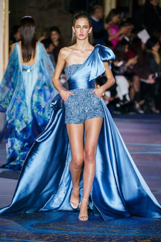
I finish my review by mentioning Ralph & Russo which presented a very pleasant collection even if it lacked cohesion overall: it looked like there were two parallel collections going on. Nevertheless, there were some happy results, like the layered skirts - kinda reminded me of Capucci’s 'Nine skirt gown’ -, the algid floor-length capes and the total chiffon looks.
xxx
Post link


Paris Fashion Week - Menswear
I’m completely exhausted after having covered all the three major menswear fashion weeks and if I think Couture Fashion Week has just started and will be over in just some days - this means I’m going to cover it very soon - I think I’m going to die - and we haven’t got to RTW Fashion Weeks yet! But after all, I love fashion, and that’s why this is sweet labour for me - since I started studying fashion for my MA my life is completely soaked in it, today I was at a conference with three of the most important Italian fashion historians - I love my life!
But apart from my personal life, here we go with the best runways from Paris, day by day!
Day 1
Yes, it was a very exciting fashion week after all, and I was surprised by a city which I thought was fashion only for the marvelous past it had in the business. 22/4_Hommes (photo 1) was a great shot to start with. I enjoyed this collection the more I went ahead with the looks. Still could do without the fur, but in general it was classy in a new way, even if giving a sort of reference to the past. Loved the elongated silhouettes and the edgy cut of jackets and coats.
Lemaire then delivered a collection for hipsters growing up, while Walter van Beirendonck was brave for opening a collection in Paris after the recent happenings at Charlie Hebdo with a top on which the sentence ‘Stop terrorising our world’ was written. It was a strong message, if not for the content in itself - it’s a pretty simplistic and obvious statement - at least it reminded everyone fashion can be used as a very big means of communication. Apart from that, I saw a lot of reference to art in this very eccentric collection, especially Picasso and Braque: colourful pullovers with faces, a lot of patchwork, even three-dimensional. And there was eroticism also: 'Explicit’ was written on some of the looks, and explicit enough was the mini sex toy hanging from the chain of the accessory decorating some of the pieces.
It would be a lie if I said I didn’t like Valentino collection. Yet, it was nothing like the last collections, and this time Maria Grazia Chiuri and Pierpaolo Piccioli went for something very very understated that, after all, really risked of being not interesting enough. The only very positive thing I can point is the fact they finally chose to use some more popping colours than usual - even if, again, everything was really subtle. But this is Valentino, of course.
We’ve understood reminiscence is going to be a big inspiration among designers for the next few seasons. Raf Simons (photo 2) took the theme and made it his own in a shocking way. The coats were covered in drawings and writing tags, from the most infant-like to the ones more appealing to adolescence and the rebelliousness that comes with it. The clothes talked about time: raw hems, floor-length proportions mimicking something like 'too big for your age’, and the last, fantastic looks, 'ruined’ by holes but at the same time getting their charm exactly from those flaws, because they talk about time, and time and memories are some of the most precious goods we have in life.
Balenciaga (photo 3), under the direction of Alexander Wang, instead, had no flaw which could be apparently found in its looks. Not even a seaming could be seen. It’s such perfection that you can’t even imagine it can exist. But it can, and after all Balenciaga has always been about this: construction and structure before anything else. Nothing more, nothing less. Just the piece of clothing and the person wearing it.
Day 2
3.1 Philipp Lim put together formalwear with dynamic materials, shapes and details, while when I saw Kolor collection I thought, at the beginning, 'Ooops, there’s someone here copying Missoni’; but then I rethought my judgement and kinda enjoyed the overall collection, with its subtle playfulness. Loved the trouser details, like pockets and closures, applied to coats.
You can’t help talking about a collection everyone talked about just because models were actually walking down the runway with their 'little friends’ hanging freely in front of the audience. Yes, I’m talking about Rick Owens. Apart from this little detail, been overlooked by the designer who defined it as 'juvenile transgression’, I really think there was something wrong in this collection. Believe me, I’m all for research on new ways to do fashion, but apart from very few looks, it was just formless rags hardly covering the body. And the dicks bouncing freely down the runway just distracted you from the most important thing: clothes.
At least there was Louis Vuitton (photo 4) to comfort us all. Angels were singing in my head as soon as I saw the first look and immediately fell in love with this collection. It was great in its simplicity. The clothes in themselves were just plain, ordinary clothes, but everything was superbly toned up with the quality of material, the perfect cut - have you ever seen such perfection in cut, shape and proportion? GOD, I’m crazy about it! - and the print, which was sublime, being figurative as well as optical, looking like a giant tattoo sometimes, and a maxi decoration in some other instances. Classic monogram bags were the right complement for such an amazing view.
Dries Van Noten offered a great variety of clothes of which I particularly liked the quilted trousers. Alexander Wang (photo 5) hit the jackpot with his own collection again after Balenciaga. It’s now obvious, he elevated activewear to its first and foremost inspiration and style and we’re always happy to see what such a motive can bring to fashion. This time it looked more summery than anything you can possibly wear for winter, and the Hawaiian-like prints make this impression stronger. Loved it anyway. It’s like waiting for the summer to come ASAP.
Viktor & Rolf presented a collection which was less conceptual than usual, still loved the digitised print and the colour palette for the slick skinny-fit suits.
Day 3
Maison Margiela went very 70s with a wearability we don’t expect from the maison - is it a sign of the changes happening with John Galliano’s return? Ann Demeulemeester instead confused me a little bit with the huge amount of pieces they sent down the runway, but overall there were some very interesting details, like the rows of dozens of buttons going over tops, trousers and coats, as well as the heavy layering of some pieces.
Juun.J chose XL proportions with military vibe and formalwear as the ingredients of this new collection. Kris Van Assche instead manipulated camouflage and made it urban and appealing.
Comme des Garçons (photo 6) is always one of those collections you expect with excitement because you know it’s going to explosive. This time it seemed like the main focus of the designer was the research on male suit. There were reinvented proportions, buttons moved from one place to another, oversize shorts instead of trousers, a real revolution of the most conservative piece in the male wardrobe. The dreamy part - never missing in CDG collection- ? Total tattoo look.
Givenchy (photo 7) was another one you would probably like to see. Despite the usual references to gender crossing in fashion these days, there was something very masculine about this collection, and something very erotic too. I don’t know it it was for the colout combination - guess black and these tones of red and orange together turn me on. I absolutely adored the print looking like a Persian rug.
J. W. Anderson knows what he’s doing and he does it in such an amazing way that you start wondering if Loewe (photo 8) has ever been so amazingly fascinating. This time it seemed every garment was infused with a retro 60s atmosphere which really made it look like an authentic vintage piece of clothing. Yet, it has the brightness - in colour, in cut, in material - of today.
Day 4
If it wasn’t obvious, the 'UFO’ written on some of Kenzo pieces (photo 9) swept away all the doubts you could have about the inspiration of this collection. Yet, the biggest achievement for the designers of the maison was to talk about something so otherworldly as aliens in such a down-to-earth way. Irony in the presumably 'alien’ symbols - but there were actually human symbols mixed with them as well - covering total looks or combined to form messages added that smile which sealed the entire collection. Genius and futuristic the leather bundles as bags. Études Studio (photo 10) was not one of the most innovative collections, but it was eye-catching for sure, and I loved the reference to architecture visible in the geometry of the patterns and in the structure of many of the looks.
Dior Homme went for businessmen with a touch of colour this time, Wooyoungmin chose soft comfy silhouettes and, to close the day, Miharayasuhiro displayed decadence in an opulent way, with denim torn apart and enriched by brocade-like prints.
Day 5
InUndercover’s collection(photo 11) everything was thought to the last detail: the velvet of the coat was perfect to accentuate the beautiful bright shade of blue; many pieces had a back as important as the front in terms of decoration; some outerwear even had a pocket for iPhone6. It was young, fresh and perfect for the metropolitan boy of today.
No Editions delivered a collection of basic classic silhouettes with soft cozy fur - I only hope that was faux fur. Paul Smith was somewhat more polished than usual, it seems he wants to focus on the suit and on geometrical patterns. From Umit Benan I appreciated the inspiration coming from sea - fishermen were everywhere. Still wished he went a little bit further with this inspiration, making it more modern - some looks really looked like they were actual fishermen’s clothes. Loved the warm knit in multicoloured patterns.
Thom Browne (photo 12) was the perfect ending to Paris Fashion Week - even if he wasn’t the very last designer to show. It was subtler than usual, but after all, it was total black. And it’s so genius to present a total black collection, even more if the obvious theme of it all is mourning - and if this mourning comes at the end of Paris Fashion Week. Amazing quality of the cut, there is every ingredient that makes Thom Browne recognisable, included the jacket + shorts suit. Feminine-inspired pieces for men were alternated to more manly silhouettes. The thing I liked the most was, paradoxically, the life exuding from every garment, like in the aztec print beautifully camouflaged in a ton-sur-ton black: there is life after death, and Thom Browne wants to be designer in it as well.
The honour of actually closing in Paris was given, of course, to Hedi Slimane for Saint Laurent. I understand Slimane’s style is 70s, edgy, rock, but there should be something changing, because in this way I’m just getting the same thing every season. And then there were too many too similar looks. Apart from very few strong pieces, in general it was something extremely predictable.
xxx
Post link


Project Runway All Stars Season 4 - Episode 10: Versatile Tops and Bottoms
Ok, apart from the embarrassing homosexually referenced title of the episode - did they do it on purpose? - this was an interesting challenge, at least because the designers were pretty much free to design whatever they wanted, and it’s good to let them be for once. The contestants had to design two looks: one had to be separates that could possibly be manufactured and sold by QVC, while the second one had to be a fashion forward complement for the separate look.
Give me neoprene and bright colours and I’ll be yours, and thanks Dmitry for this two absolutely FAN TAS TIC looks! I’m more and more convinced he’s going to get to the finale. I loved the idea of mixing neoprene and lace, and I liked the fact he chose two very different colours for the two looks, because making two outfits in the same colour would be the easiest way to make them cohesive. In this case the cohesion was in the cut and in the materials. The lace he chose was so elegant and very modern in its graphic quality, the jacket was absolutely outstanding and new and the contrast between the black lace and the bright yellow of the fashion-forward look was just breathtaking. It’s true that the first look was more fashion-forward than the dress, and it wasn’t something many people would wear; yet, you just can’t help loving it.
I have many reasons for completely hating Helen’s look and being very surprised at the judges loving it. First of all, the separate look: while the top is acceptable, that skirt is absolutely HIDEOUS. It reads really cheap, it looks like something you can buy at Kmart, there’s nothing new in it, the two pieces together have awful proportions and I just thought that was enough to stay in the bottom. The ‘fashion-forward’ look, despite being cute, it’s not 'forward’ at all: she made the EXACT SAME THING on her season. It’s also true that Dmitry used a technique he used in his season finale for the coat from last challenge, but in fact, it was only a technique, not the exact same dress. And anyway, Helen’s black dress was matronly in many ways: the length was odd, the fabric - looked like wool jersey??? - reads old and the hem of the skirt seems uneven.
Jay didn’t do much better, but at least I liked his first look - differently from the judges, I thought those trousers worked really well and the overall style looked pretty urban and contemporary - and the second look was not a masterpiece, but it had something interesting going on. Anyway I was right when I wrote he was the next one to go home. Now it’s Helen’s turn.
I appreciate Michelle’s work, but I’ve never been able to stand her behaviour when she picks something very very strange and she’s convinced that everyone loves it, that it’s impossible not to love it, that everyone would kill to have it. It happened with that awful fabric. There were times when I looked at it and thought 'I think I like it’, but after a second, third and fourth look, I understood I just hate it. And yet, she kept saying how amazing that fabric was for a whole episode. At least Fabio knows that there could be someone not liking his work when he does something strange; Michelle seems completely unaware of this.
And talking about Fabio, I was really disappointed by the judges’ critique this time again and especially by the fact he was between the bottom two again. His looks had to be in the top 3 in my opinion, or if not, at least as third bottom, but for sure not risking to go home. At the beginning I was even really confused about his fabric, as I thought it looked like it was dirty more than dyed, instead that little dress was amazingly nice, fresh, simple and especially fashion forward, just like his first look.
Sonjia was my second favourite without any doubts, I was shocked at her just cutting the roll of fabric and getting a dress - a beautiful dress - out of it. And I love her understanding of colour and texture, I think this is really her biggest strength.
We’re just some episodes away from the finale, who do you think will make it to the end?
xxx
Post link


Milan Fashion Week - Menswear Fall 2015
While Paris is currently kicking off its collections, I’m reviewing this last collections shown in Milan from January 16th to 20th. I admit I’m not quite impressed with the overall style I’ve seen down the catwalks, but as usual there are some highs - very interesting highs. Let’s see together the best looks, day by day.
Day 1
Well I don’t actually know if Day 1 can be counted as first day of the fashion week, as the grand opening was exclusively given by DSquared2. You basically cannot help talking about it, as they were the only ones showing on January 16th, but in general I didn’t like the whole collection, celebrating the anniversary of the brand; it was obvious, predictable, boring.
Day 2
With day 2 the game was already at its full. Corneliani presented a collection with lovely furry coats and jackets with jersey lapels, while Ermenegildo Zegna (photo 1) left its usual classic style for something more innovative, at least in materials: from the waterproof wet-looking fabrics chosen for coats, windbreakers and even jackets and formal blazers, to the velvet going total look in some cases, everything had a glowing aura which made clothes look richer. The last part lost some of its charm, but overall it was a great great collection.
Edmund Ooi (photo 2) excited me with a collection I can just call avant-garde. Origami treatment to fabrics, gender crossing to its extremes - I would personally do without the little dresses for men, but they were anyway doing their job without appearing too strange -, optical prints, activewear style with formal suits: there was everything and yet nothing looked too much. Andrea Pompilio (photo 3) is one of those designers that I’m discovering more and more every new collection. This time the line gave me a feeling of sport in the 60s - which was, at least in clothes, much more elegant than activewear nowadays. I loved the colours - peach and sky blue above all - which were a sort of borderline pastel/neon - I know it sounds like a contradiction, but look at them! - going very bright in some instances - the red flashing down the runway in suits and jackets or the lemon yellow of the fluffy pullover at the end (now I know I need a fluffy pullover).
As usual with Jil Sander, the brand offered a collection for the minimal dandy of today, with basic coats, pullovers, and parkas, baggy trousers, everything brought to another level by the exquisite details. Les Hommes went for geometry with optical patterns on jerseys, shirts and even quilted on coats.
After womenswear collections in September, I was again blown away by how Versace (photo 4) is changing. Or better than changing, it’s still exactly the same, but in a new way: exaggeration, a key feature of the brand, is more subtle, more centered on proportions and quality of materials than in bling and ‘flamboyantness’. Loved the special closures for the jackets, replacing the classic buttons and I found very interesting the contrast in shape between oversize trousers and leggings.
Day 3
Calvin Klein Collection (photo 5) must have called this collection 'An Ode to Grey’: the most basic colour for one of the most basic brands, that’s it. I didn’t quite like the first part, but I really appreciated the second half with the plasticky loose trousers, high-waist military bomber - I think they were one of those pieces which you don’t really like at the beginning but they grow on you the more you look at them - and the maxi raincoats.
When I was looking for a suit for my graduation in February last year, I knew I wanted something classy but still with an edge, maybe in pattern, and I couldn’t really find it, so I had to buy the fabric and have it made to measure (but this is another story really). Anyway, now I know Vivienne Westwood (photo 6) understands me - not that I’ve ever had any doubts about that. It’s incredible how easy mixing patterns looks in these outfits - what about stripes and checks together? It goes from the very eccentric explosion of prints to the reassuring softness of the maxi pullovers. What I also liked was the range she showed: different types of crotch for the trousers, different length, different proportions.
I think my head is convinced of the fact Miuccia can do no wrong, but I know that even if the collection Prada showed in Milan these days could border boring for some people, I enjoyed it a great deal. I absolutely loved the fact she went for something we don’t usually expect by her ever-genius mind with its twists and coups de théâtre: the colour palette reduced to only black, different shades of grey, very dark navy blue, a little beige - and only one print, a tartan womenswear coat. Then I saw the shine in the black fabric of the first looks, and understood that all the twists and shocking details were more subtle this time. I saw the perfectly cut coats, and the girly shapes of the womenswear looks with a manly twist - are those bows in front of the dresses mimicking bow ties? Marvelous Miuccia.
To finish with the third day, it would be impossible not to talk about Moncler Gamme Bleu collection, designed by Thom Browne, who always manages to give the audience a great show. It was amusing and still a simple idea if you just think about it: coordinating the suits with the bomber they came out with. Genius.
Day 4
I’m not one of those who worship Giorgio Armani - or any other designer, with the exception of Thom Browne, maybe - for everything he does. But this Emporio Armani (photo 7) collection blew me away with its details. First of all, the delicate 'brushes of dirt’ giving light to some of the looks, from coats, to blazers and trousers; secondly, the fact that it was all about soft comfy knitwear - how comfortable must a pair of knitted trousers be?; last but not least, the maxi zippers designing diagonal lines on pullovers and trousers.
What Gucci (photo 8) showed on Monday was truly incredible. Just appointed creative director Alessandro Michele made me forget about Frida - still, I love her <3 - with a real miracle. I cannot help but thinking about the most obvious and stupid word for this collection: FANTASTIC. The biggest achievement of the line was, in my opinion, the whole rethinking of the now-so-cool concept of gender crossing, which in Michele’s hands became gender switching: menswear really looked like womenswear and viceversa. Men were wearing chiffon shirts with bows, lace tops, long bright coloured coats, while women went for suits for the most part. In Italy we say 'Il buongiorno si vede dal mattino’ (that literally means 'you can tell it’s a good day from the morning’, if something starts well, it’s going to continue well). I really hope that’s true, because this was an amazing morning.
Canali is the last brand of this day I want to talk about, relaxing my eyes with a smart, wearable collection of horizontal stripes in cream-coloured tones or black-and-grey, but most of all I was obsessed by the perfectly squared bags with zippers. I want one.
Day 5
Not much to say about this last day, even if some big names showed their collections, no one really caught my attention. It was instead Stella Jean (photo 9) who achieved something the others didn’t manage to do. I must admit I was excited to see this collection, and I wasn’t wrong. I loved the fact her style is recognisable even in the male wardrobe but in a toned-down way, more manly indeed. This time she travelled to India to find her inspiration for this amazing collection, where the simplicity of cut of the Asian country traditional clothes was perfectly mixed with the flamboyant prints we’re used to seeing in her work - which, after all, really suits India with its bright popping colours. It was a fascinating trip, and at the end I promised myself I will save some money to have one piece from her collection before next year. This girl is gonna be big.
xxx
Post link


Project Runway All Stars Season 4 - Episode 9: Sketching with Sharks
Never an episode name was so literal: the designers sketched with sharks for real. Well, actually it was just one designer. But let’s start from the very beginning.
Contestants were brought to Long Island Aquarium to find inspiration for their next challenge: AVANT-GARDE, BITCH! :D They were also given the chance to nearly double their budget to spend at Mood if one of them accepted to dive into the shark tank and design UNDERWATER. Helen immediately accepted - I wouldn’t be afraid of sharks either with those nails - and I didn’t realise she was really going to design underwater until I saw her with a sort of pen and a whiteboard - but was she designing for real? While sketching I was looking at the board but couldn’t see any sign whatsoever.
At the end of the episode the judges congratulated all the designers for the good job they did, but I was actually not impressed, I expected much more from a group of people who started the season very well and are now doing just ordinary things.
However, I agreed with the judges on Dmitry’s win (finally!). It’s true that his dress was not very avant-garde, and it’s also true we’ve already seen this technique from him (even if not this season, but on the runway finale of the season he won) but after all, who cares! It was just BEAUTIFUL, all the pieces went together like a puzzle, I loved the black sheer panel on the waist adding a little sexiness, I absolutely loved the colour (white was perfect for this coat) and I was crazy - at least as crazy as Isaac - about the length. I quote him for saying a very true thing “This length is something that is not happening in fashion right now, AND I WANT IT TO HAPPEN!”.
Jay, Jay, Jay. I was happy to hear the judges didn’t like his design either - I was pretty sure they would have loved the black and white, the movement of the dress and bla bla bla. It was boring. The dress was just a normal - uglyish - dress in front, and behind it was an art and craft project with all those bits and pieces and stripes. I didn’t mind the jacket, it was probably the most interesting piece of the whole look.
It was just because I found Jay’s look extremely boring that I didn’t choose Justin’s as the loser. His look was a sort of Lady Gaga meets Gwen Stefani during the What you waiting for? era. Which is not a bad thing, but in general there were too many ideas going on, and the fabrics he chose were hideous - this is the proof he’s unable to choose fabric. Yes, it was his time to go home.
I wouldn’t have put Fabio in the bottom two - Alyssa also said he was really close to going home - and I was really shocked the judges did, because I was pretty sure they would have - they should have - appreciated at least the concept. Fabio really had the best concept of all the designers, doing a ‘reverse’ suit. The execution was poor, this is true, and the fabric he chose was really bad, I would have probably put him as third bottom, but he didn’t deserve so many negative comments.
I loved Helen’s look because it looked like a little simple dress gone avant-garde with all the ruffles. For all the others, it was just a nice job, nothing more.
There are only six designers left. Next designer to leave? I think it’s Jay.
xxx
Post link


Maison Margiela S/S Couture 2015
And here he is. Galliano is among us. Again.
Apart from the great event that this return represented for the world of fashion, before taking a look at the collection i was wondering why everyone was saying that this collection was more Galliano than Margiela. I mean, since I knew Galliano was going to become the new creative director of the maison it was obvious for me that this was a match made in heaven: Mr Galliano’s eccentric style is basically perfect for the distort fairytale world of Margiela. But now that I saw the whole collection, I understand what people were saying.
No, it was not all about finding the little flaw just to criticise someone’s work - especially because basically everyone was waiting with excitement for Galliano’s return. This collection didn’t have the usual abstract quality that characterises Margiela’s work - oh, btw, it changed name to Maison Margiela only, thanks Vanessa Friedman for making me notice with your article - and everything, from inspiration to shapes to drama was a little bit toned down. Yes, I would say it was more Galliano, in the sense that it was more feminine and couture-like than a usual Maison Martin Margiela collection. Yet, it doesn’t mean what Galliano did has to be criticised.
Every brand has to face the arrival of new designers, and it’s impossible for the new arrived creative director not to put a little bit of himself in the creative process of the brand he takes over. So, how could you possibly expect such a strong and loud personality as Galliano totally conforming to someone else’s aesthetic? Instead, not only is it inevitable for a designer to transfer his own aesthetic to the brand he’s designing for, but it’s also an enriching moment for the brand in itself. Brands are like human beings, they evolve and change. It would be a pity if it wasn’t this way.
And talking about change, Galliano’s personality, as seen from his new creations, has transformed into something still recognisable but definitely different from what we were used to see. Sure, it’s partly because he’s not designing for his own line, but must, in some way, absorb some of the brand’s creative view; but after all, if you know Mr Galliano’s past work, you can see there’s a new softness to his work, a new subtler elegance, far from the revolutionary inspiration of his graduate collection at Central Saint Martin’s in the 80s, which made him so famous. And yet, even if understated, his looks were unbelievably strong.
Regal lace on black velvet gowns with plastic see-through pockets, A-line dresses and coats where fabric and leather applications design Picasso-like faces - is that an Arcimboldo composition that I’m seeing on the blood red trench-coat? - black glossy shells decorating a gothic bustier, a little black ribbon around a model’s neck, and then perfectly polished, strapless, straight black dresses, and long-sleeved plainly blood orange - it’s fucking red! - buttonless coats, and velvet, and leather. It seemed to be in front of the whole evolution happening in Galliano’s mind during these years away from the world of fashion. And the grand finale, the red avant-garde dress decorated by an explosion of EVERYTHING being part of Galliano’s history as well as Margiela’s: fake jewels, little mirrors, faux flowers, even a little face of something that looks like a Barbie. But doesn’t it look like, after all, as an explosion of those useless little things, feelings, emotions that we all have in our lives and that we store in what we call memory? Yes. Margiela’s artisanal collection this time was about memories. And it was about a designer, like Galliano, that no one talking about fashion can ever forget.
And he won’t be forgotten. He’s back and he’s ready to take over wearing a little strange crown with a pearl smile on his face, while looking forward to the future that is unfolding in front of him.
xxx
Post link


London Collections: MEN
As we’re approaching to the womenswear collections fashion weeks, Men are showing throughout Europe, and the male parade started in the city where, more than anywhere else, menswear was born: London. London Collections is becoming more and more important in the fashion business for its ability to reunite promising designers with innovative ideas in a sector of the business which has always been seen as conservative. I don’t think the mens market has reached its full potential, but I agree on the fact we’ve seen many good ideas during this first menswear fashion week, coming from both established names and newbies. In general, black was (of course) the key colour - always present in every man’s wardrobe - and the inspirations came from different areas: of course 70s, which we so much saw during the womenswear Spring collections in September/October - so much that I’m going to throw up if I see another pair of bell-bottoms or hippy inspired looks - but thank god it was much softer and defused for man; the military inspiration, often the starting point for new ideas in mens fashion; gender crossing.
Day 1
Topman Design had the pleasure - or is it bad luck? - to show as the very first brand at London Collections, but it was a good opening in perfect Topshop style: great variety, not vey far from what the market offers - it’s a high-end brand anyway after all - going 70s swiftly transitioning from ethnic to urban style. I personally loved the return of the three-button jacket, disappeared from the catwalks - except for some scattered references - for years.
London was also the place where the finale of the International Woolmark Prize took place; Public School took the award for its innovative use of wool and originality in design - basically this is always the reason given for the awards by the juries.
Coach delivered a collection for a very cold winter, where coats and windbreakers were the centerpieces. Leather and sheepskin as king materials also for trousers and shoes. Different kinds of leather were also mixed with printed textiles in leopard or with extremely soft-looking jersey. Alex Mullins brought to the table another interesting collection for its androgynous atmosphere, with trousers which I would define as EXTRA LARGE - and I’m not talking about the size -, A-line silhouettes - for men, yes! - translated into bell-bottoms taken to their extreme, and shapes extremely developed in length. Velvet gave every look an old-fashioned vibe which was fascinating and made the collection look like coming from another era.
For the event MAN, in collab with Topman and Fashion East, three designers showed their collections this season, and I was particularly happy with Nicomede Talavera’s work (photo 1). The looks were made of layers of different outfits, representing a perfect armour for the urban boy of today, and every piece had an Oriental quality to their cut which was interestingly melted with a vague reference to hip-hop street style.
Christopher Shannon (photo 2) had an attention-grabbing collection as well, which I would definitely compare, in art, to Malevic’s suprematism, with the insertion of colourful geometrical shapes showing a great deal of research on the subject to reach, just like the Russian artist, purity of form. The fabrics were borrowed from activewear, with hi-tech materials and the overall impression was that of a strong reference to recycling - what about the plastic bags onto the models’ heads?
Todd Lynn developed the idea of eliminating the distinction between male and female wardrobe - as you can see if you look at the whole line, there was basically no difference between the two, and even the models as of styling, face, hair etc. looked exactly the same. The colour palette was essential, made of black, grey, white and some sparkle of mustard yellow - which I greatly appreciated - and there was in every look an essentiality which brings you back to the 60s, with that touch of optical effect characterising that decade.
Day 2
Lee Roach (photo 3) presented the kimono in a new light which I hadn’t considered before: that of tender manliness. Yes, it can sound like an oxymoron - that is actually - but this is the reason why it’s all so fascinating, and it perfectly suited the essential minimalism of pieces like the top made of one single patch of fabric in raw cut.
Patchwork was a very big team this season - as we’re going to see in a few lines as well - and Maharishi chose to collage different types of quilted fabric to create its windbreakers in the green tones of the camouflage. Astrid Andersen (photo 4) was possibly one of the most interesting collections shown in London, because the designer managed in an extremely difficult task: make hip-hop culture look polished. The palette was basic, with black being the focus, the materials were hi-tech and had a shine which made them look rich, but there was also suede, which brought you a step higher than the usual blingy style of street fashion.
Shaun Samson reminded me of firemen uniforms - well, after all, most of the models were basically half naked wearing bermudas and Timberland-like boots. I appreciated the interesting take on the checked flannel woodman shirt - it seems he took inspiration from every sexual cliché about men at work - which was delivered in different new versions, even as chemisier - for man.
Fashion East was again held during London Collections, and this time I absolutely loved loved loved the mini collection delivered by Grace Wales Bonner if not for the clothes in itself - which were interesting and new in their ‘oldness’ - at least for the inspiration, which seemed to me coming from a melting pot of elements I’ve never seen well-represented in fashion, at least not all together: 70s - black - homosexual. Loved the high waist trousers and the African contamination - fringes which made me think of Morocco - in a urban version.
Agi & Sam seemed to merge art history all in one single collection: there was a little bit of Picasso, a little bit of Kandinskij, even a little bit of Mondrian, and yet, even if the colours were so beautiful and made me think of contemporary art in such a strong way, still I thought their brightness distracted from the overall look - that’s why my favourite part was the total black outfits.
Hardy Amies (photo 6) proved there’s always market for classic-looking but young and fresh looks. Everything was magical in its perfection and the prints, the cool palette of yellows (lemon) and blues (electric) made everything lighter and youth-appealing.
If there was a collection I’ve heard about during this menswear fashion week, it was Sibling’s. After pink has been introduced and accepted, as a colour, in the male wardrobe - for several years - now, after Jeremy Scott for Moschino brought Barbie to the catwalk for S/S 2015, Sibling’s designers decided it was time to put her male counterpart - Ken - under the limelight. Everything was shocking pink in the most 'Schiaparelli’ sense of the term, and the male models were even accompanied by stuffed animals and teddy bears during their walk. The collection in general sort of made me smile more than everything else. I didn’t like the faux fur pieces, while the strongest ones were, in my opinion, the knitted outfits.
Day 3
J. W. Anderson (photo 7) is an ever-rising star of fashion heaven, and even if it brought to the runway the usual, so-often-seen-that-I’m-going-to-throw-up 70s style, he did it in such an interesting way that you can’t but love it. There was a curious mix between menswear and womenswear, using the same shapes, the same fabrics (cowhide, leather), same giant buttons - made of what looks like mother of pearl - but also bustier shapes in men’s pullovers and other jerseys, bicoloured, inspired by cowboy shirts.
Margaret Howell really made me think of Armani - or better, a sort of English twin of Mr Armani - for her polished quality and the classic evergreen look of the outfits. Joseph (photo 8) proposed oversize proportions, knitwear basically everywhere - have you seen the total knit look in the photo? - and ethnic patchwork.
James Long decided to take over a challenge long faced by the fashion world: making jeans couture. He tried with insertion of lace but also by tearing the fabric apart, which instead of reading cheap and predictable, gave the looks an air of rich decadence.
And then, there it was: Moschino. It’s like that very moment I wait for during fashion weeks - especially after Jeremy Scott took the helm of the creative process. Yet, apart from the snowy mountain setting, which immediately conveyed the idea Scott wanted to communicate - yes, winter, cold, fur, warm clothes, bla bla bla - the patchwork pieces - I told you collage was big this season - and tartan prints - the most successful part of the collection IMHO - I wasn’t exactly mesmerised by the overall collection. Guess I’ll have to wait until womenswear fashion week in Milan to be shocked again by the mythological figures brought to life by Mr Scott.
In fashion weeks, there are always those brands, know by very few people, who deliver very little collections which are usually noticed by basically nobody, and Kilgour was one of them, but thank god, I noticed. There were something like eight, even less, looks, but the detailing was so precise and interesting, which I couldn’t help deciding to talk about it in my blog. The same innovative, new lines were repeated in the cut of jackets, shirts and coats, showing that you don’t need to change very big things in order to convey fresh ideas.
Alexander McQueen’s Sarah Burton (photo 9) was very smart in taking inspiration from a very actual topic, making the red poppy a constant decorative motive in this collection after the Tower of London was covered in poppies to remember the 100th anniversary of World War I. Apart from the blood red of the flowers, the outfits were total black, with some hint of military green. And military was also the inspiration - it linked to WWI after all - behind the coats - I absolutely loved the bright blue trenchcoat.
To finish the day, KTZ’s inspiration was not an easy one to digest, but it was definitely strong: violence, Clockwork Orange, dystopian views of the world were the elements of their collection, which even if efficiently delivered, were not cohesive enough.
Day 4
Paul Smith was possibly the smartest designer of them all, showing that even after many years in the fashion industry you can still come up with amazing ideas. It was not a collection: he just presented one single simple classic suit. A black suit. The stroke of genius was another, summed up by the name of the 'event’: A suit to travel in. In a performance between theatre and circus, some models all dressed with the same classic suit showed how you could basically do anything - from walking to dancing acrobatic rock - and still have a perfectly polished and not wrinkled classic black suit. Craig Green (photo 10) is one of the new names in fashion which are going to have a fantastic career, and you could see it immediately after just few collections. Yes, the colour palette was one of the most classic (black, white, red) but the outfits were an explosion of creativity: some of them look like being inspired by parachutes - ever thought parachutes could be cool? - as well as bulletproof vests in unexpected cuts. Liked the long-sleeved t-shirts with pulled strings in front.
Katie Eary was all about three-dimensional prints and knitwear in awesome colours - I particularly loved the detail of the strings in the trousers croach - while Burberry Prorsum went for 70s coming up with a nice wearable collection - and yes, this time wearable goes very close to meaning 'boring’.
Among the talents from Asia, this time my attention was caught by Xander Zhou, of whom I loved the manipulation of the denim as well as the optical effects given by the fur applied over the coats looking like cowhide and the geometrical patterns of the leather decorating the last looks.
Stay tuned now for John Galliano’s return with Maison Margiela and the rest of menswear fashion weeks: Pitti Uomo, Milan, Paris.
xxx
Post link


Project Runway All Stars Season 4 - Episode 8: Making a Splash
I want to start my review by saying that I’m really enjoying all the challenges the designers have to face during this season of All Stars, because it seems to me the producers want them to really explore every single aspect and style in fashion. For episode 8 the contestants had a sort of double challenge: design a resort look paired with - of course - a swimsuit. It’s been ages since the last time I saw Project Runway designers making swimwear.
Sonjia was again my favourite. It’s not the first time she uses lace (is it her favourite fabric or what?) but I’m always amazed at how interesting and new the fabrics she chooses are. This time she picked an electric blue lace with maxi flowers (very resort) and paired it with a shiny blue jeans. Of course I was crazy about the juxtaposition of different materials but I also loved loved loved the silhouette, very simple and yet strong, with a sort of kimono-like jacket with a maxi zipper and a pair of perfectly fitted trousers. She also thought about the whole concept as she used a fabric which allows you to see underneath it and kinda reveals the hip swimsuit she paired with the outfit. I thought the fact the model didn’t have any boobs at all made the swimsuit lose some of its appeal, but overall it was young, very graphic and different from the usual bikini. Extremely good job.
Yes, it was time for Samantha to go home. I liked her jumpsuit (guess I would have made a jumpsuit as well if someone asked me to design a resortwear look) and I liked the colour of the fabric she chose, even if I would have preferred something brighter or something more towards a pink or orange palette. The swimsuit paired with it was DISASTROUS. I recognise the fact she wanted to make something of a 90s style, which is really cool at the moment - and I can clearly see it as totally Samantha style - but it wasn’t well-executed. It looked really cheap and the proportions were odd. Samantha was a sort of disappointment, I have to say, because I expected a lot from her as I thought her elimination during her season as being unfair and wanted to see more from her, but her overall performance during All Star was really mediocre.
I liked Justin’s winning looks, although flowy gowns are, in my opinion, too predictable for a resortwear look. I also liked Helen’s (guess lace was right for this challenge then) and Dmitry nailed it AGAIN - and again, he didn’t win.
I didn’t like Fabio’s though, the problem wasn’t that it was too simple but that it was a little bit old and made me think of a cheap Primark look; he’s going like a roller-coaster, one day he’s on top and one day he’s among the worst designers, but I guess that’s what you call ‘taking risks’. Michelle’s dress was HORRIBLE but she made the most beautiful swimsuit among all, I loved the colour, the optical quality she added by using the elastic band, I loved the cut, the deep cleavage, the strap aroung the neck. It was really perfect.
For now, I’ve made up my mind about who’s going to the finale, and I’m pretty sure that the three names will be Dmitry, Sonjia and Fabio, but let’s keep an eye on Justin because judges love him (I just think his looks are boring most of the times) and Michelle, who always manages to save herself by doing something very right at the very right moment.
For now, let’s just wait for the next episode - avant-garde challenge! - and let’s keep in mind that in Project Runway EVERYTHING CAN HAPPEN :D
xxx
P.S: Hope to be as busy as I would like to be with the blog these days, as menswear collections for Fall 2015 started - and finished yesterday - in London some days ago, Milan and Paris menswear fashion weeks are coming, as well as Pitti Uomo and - how could I forget! - there’s the Golden Globe Red Carpet from January 11th to comment! Just stay tuned!
Post link


Project Runway All Stars Season 4 - Episode 7: Mix and Match.com
Yes, I’m relaxing during the holidays and that’s why I disappeared for some - a lot of - days but now that I’ve lounged about for weeks I’m ready to take over my life as a fashion blogger again. And we still have to catch up on the last episode of Project Runway All Stars.
This time the producers of the show started a collaboration with the meeting website Match.com to spice up our life a little bit. It seems love is a big part of this season as the designers already had to get inspired by their past relationships for one of the other challenges. Anyway, this time designers were grouped into couples - but they didn’t really have to work together - to design…for couples! Well, it would be better to say for prospective couples, as their clients, apart from being normal people and not models, were Match.com users going on their first date - aaaaw, how lovely! This also meant some of them were MEN. Michelle freaked out, I thought she was going to pass out as she decided with Samantha - her partner for this challenge - that she was going to design for man - well, it seemed to me it was actually Samantha who decided for both of them. Thank god she did good, but let’s now talk about the BEST and the WORST of the challenge.
Fabio was my favourite - and he won indeed. He was designing together with Jay for a gay couple - and both of the guys were hot in my opinion :D - and the two designers had a great idea, the best in my opinion: when talking with their clients to know what they like and what they would want to wear, they decided to dress each one of them according to the other person’s taste. No one else did it, and it was a really smart thinking as they were not dressing people just to go to a cocktail party, but they were dressing people to go ON A DATE. Another thing I loved about Fabio’s look was that he went for not very bright colours, which is usually the common thing to do for menswear, but at the same time there was a sort of cheerfulness to the shades he chose; it was not dull and boring. I was absolutely crazy for the fact he turned a shirt into a kind of short-sleeved jacket, it was very well-done and the idea of a designer actually inventing new clothes during the show is the best thing that can happen. Those trousers, then, were perfect. And the guy was really sexy.
I don’t know if Justin is too lucky or the judges are too biased by the fact - I’m sorry to write such a thing - he’s deaf. He definitely deserved to go. What he made was basically NOTHING, just like the week before, when he had silk and gallery opening from the fashion gamble and he designed a basic dress. The only thing was right about his Match.com look was that both the shirt and the trousers were really well-done, but the show is not called PROJECT SEAMSTRESS. You have to design. And this was nothing. Not even the details were interesting, it was just a shirt - moreover, in grey - with a pair of trousers.
I was really mad at the judges choosing not to send anyone home, because it was clear there was more than one person deserving to go home during this challenge. Helen wasn’t better than Justin, she sent her client down the runway wearing those really short shorts, making her look like a slut, but a Victorian slut, as the top had a kind of old-fashioned feeling with all those ruffles. And the fabric she chose for the shirt was amazingly awful, all shiny and wrinkly, it really looked cheap. I still think Justin was worse as he didn’t do anything though. And Samantha was definitely joining them in the worst look parade, but at least she had something interesting going on which could be better with a little bit of effort.
They started well, but they are now becoming boring, and this episode was the chance for the judges to cut off on the number of designers, but they decided to save them. Justin and Helen are really, really lucky: Justin had Tim Gunn’s save during his season and Helen was saved by the judges in her season when she made an awful-fitting evening gown during the second or third challenge and she cried for the entire episode; I guess they saved her for pity.
Next episode will air on January 8th, so we’re going to have plenty of time to enjoy the rest of the holidays and welcoming the new year in a very fashionable way :)
xxx
Post link


Project Runway All Stars Season 4 - Episode 6: Luck Be a Lady
Just in time before the new episode airs - phewww - I can post my review about the last one. I finally took the exam which was driving me crazy so now I have much more time for you guys while I prepare my Fashion History exam :D
The concept of the last episode was probably the most hilarious I’ve seen in a long time: Fashion Gamble! The designers had to roll the dice which were going to decide what fabric and for what occasion each designer had to work. The matchings were as follows:
- Dmitry: Velvet and Gallery Opening —> Velvet is basically always a bad choice
- Fabio: Denim and Masquerade Ball —> the first thing I thought about was Justin Timberlake and Britney Spears at 2001 AMAs
- Gunnar: Brocade and Masquerade Ball —> I thought a masquerade ball could be the only thing which could save Gunnar from doing really really badly. I was wrong.
- Helen: Brocade and Awards Ceremony —> good combo after all
- Jay: Denim and Sunday Brunch —> Boring.
- Justin: Silk and Gallery Opening —> The best matching of all, he completely missed this opportunity. I was already imagining a beautiful flowy powdery pink shirt, I got an ugly and common little dress.
- Michelle: Lace and Gallery Opening —> not bad
- Samantha: Brocade and Awards Ceremony —> same as Helen
- Sonjia: Brocade and Bachelorette Party —> maybe brocade was not the best choice for a party, but it could work out
You’re probably going to get shocked at this, but my favourite was Fabio, who was instead between the bottom two for the judges. I would like to start by saying that I wasn’t impressed by anyone this time, and it was a pity as I thought they were doing pretty well during the whole season. This time I was bored by more than one of them. There are different reasons why I chose Fabio as my favourite this week: first of all, apart from colour and material, I thought the dress was really nice, elegant and simple but at the same time very powerful and head-turning. I like the way it was constructed and draped in the front. Then, despite what the judges said - which was pretty predictable - I thought the colour was fine for the challenge. Let’s not forget he was designing for a MASQUERADE BALL, I don’t know, do you think someone would wear a grey cocktail dress to a fancy dress ball? I thought the colour really gave that extra feel to a dress which would just be a very nice dress in another colour; shocking pink made it a fancy dress - and anyway I hate the fact the judges always have such prejudices against bright colours, boring people. What’s more, the dress didn’t look costumy at all to my eyes, despite the heavy styling, which I liked as well - I thought the idea to use the necklace as a headpiece was really a stroke of genius. It’s true that he chose the least denim fabric he could find, but at the same time I cannot help thinking it was a smart choice: as I wrote above, a denim which looked like a denim would have immediately conveyed Britney and Justin in 2001. And we don’t want to see that anymore.
Jay was the worst instead, and I don’t understand how the judges could just save him. First of all, Helen was totally right when she told him it looked more like something a girl - a hooker, I would say - would wear to go to a club - even if I agree with Jay when he says that she’d better mind her own business. I HATE the shiny denim he chose - how could you on earth think that a SHINY fabric is suitable for a BRUNCH? - and the overall impression is that of a girl who is more interested to find her one night stand more than attending a brunch. Moreover, the dress - or is it separates? - is something that I’ve already seen, nothing new, nothing fresh.
Sonjia’s dress, the winning look, was a nice dress, but nothing more than something you can usually find in H&M. I praise her for making an entire dress out of golden fabric without making her model look like a whore though, it was sexy but not vulgar. What I was shocked about was imagining Alyssa Milano’s fat thighs coming out of that tiny tiny tiny dress. Let’s not find excuses saying that she’s pregnant, so it’s normal she’s fatter and bla bla bla. No. No way those thighs are going to get to an acceptable shape. Thank god there’s photoshop.
Gunnar was eliminated, so I was right the last time when I said he was the next one. It was definitely the worst after Jay’s, messy and schizophrenic, as the top didn’t really connect to the bottom. Once again I had the impression Gunnar doesn’t have any clue about what he’s doing.
I liked Helen’s dress, it was simple and traditional but fresh at the same time, and I didn’t mind the very deep slit, but it seems she can only do good when she creates something in red. I ADORED Michelle’s look, it was a pity for the shape of the skirt, which was not very flattering in my opinion; if it wasn’t for that, she would have been my favourite absolutely. I was stunned by how she manipulated the fabric and the colour choice was divine. Very chic.
Next episode airs tonight, and I hope to be able to post my review immediately while I’m preparing to go back to my lovely homeland Sardinia to spend Christmas holidays with my lovely friends and family :D
xxx
Post link


Project Runway All Stars Season 4 - Episode 5: Designing for the Duchess
I’m again late for my review - thank you for not having sent me any threatening message to have me write the post - but I’m basically doing nothing but studying for my philosophy exam - it’s a nightmare.
Anyway I’m here and I’m now ready to fill you in with all my opinions and thoughts about last episode of our favourite show.
The Duchess of the title is - of course - Sarah Ferguson, I guess the most famous member of the royal family after, of course, the MAIN royal family (and after Princess Beatrice and Princess Eugenie, sadly remembered for their awful outfits at the Royal Wedding some years ago). Project Runway producers finally decided to ask designers to create my favourite piece of clothing: A COAT. I was really excited because I truly adore coats and they never had any challenge in which they were specifically asked to design one. Of course the winner’s design was going to be worn by the Duchess in person, so this was another great opportunity for all the contestants.
Sonjia hit the mark again in my opinion. It’s true, the Duchess is not a young girl anymore, so her look was maybe a little bit too girly for her, but hey, basically everyone went very young with their designs. First of all, I loved the fact she used neoprene (yes ok, I’m aware I have a problem with it) in grey, I loved the length of the coat and the fact it was asymmetric with the slit behind. It was elegant and sporty at the same time, and this is a very great achievement. I didn’t particularly like the print she used for the sleeves (I hadn’t noticed it until now) but I’m obsessed by the maxi-zipper she put in front, it’s just A M A Z I N G.
Benjamin’s outfit was not good at all, but Gunnar’s was definitely worse, and I don’t understand why he wasn’t even among the bottom 3. It’s a sort of Frankenstein coat made by using different style which can even work on their own, but that together make an awful match. The tweed print could make a nice trench-coat, but then it would have been too classic and predictable; at the same time, trying to insert an extremely different style in the sleeve part really wasn’t a good idea. As soon as I saw the two silver bands on the model’s elbows I understood it was the worst of the bunch. I say it again: Gunnar is the next one to deserve to go home. Please, kick him out.
I’ve already said Benjamin’s coat was really bad as well, and the judges already expressed everything I think about, which can be summed up in two points: it was too junior and the pockets were something as awful as can’t be described. For someone who started the episode saying coat is his creative field that’s not a very successful result.
I definitely LOVED Dmitry’s coat, it was minimal without being too simplistic, everything about it was unique. I really appreciate how Dmitry can always turn things in his favour even when he’s in a bad situation, that’s an extremely important quality for a designer. I’m remembering why he used to be my favourite during his season <3
Fabio was the winner, I recognise his coat was extremely detailed and had a very good mixture of styles, but the overall impression didn’t really win me over. Jay, instead, could have edited a little bit, but I thought his creation was a good idea and I loved the fact he was one of the few to play with colours - I wouldn’t have put him among the bottom 3. Samantha was good as well, I like her style, I think it’s really cool taking inspiration from the past as she does and making something which can be really sellable without being boring. And I love oversize, so you can understand why I really liked her look for this last episode; it wasn’t maybe perfectly constructed, but the idea was extremely fresh.
Seeing the sneak peek for next episode I expect it to be HILARIOUS: fashion gambling this time. When I start thinking the producers have run out of ideas, they surprise me with something new and crazy. I love this show.
xxx
Post link


Ralph & Russo creating magic

There are no words.. Ralph and Russo.

Ralph & Russo
Zuhair Murad Couture Spring 2019 collection

Fav piece from the Zuhair Murad Couture Spring 2019 collection
Zuhair Murad Couture Spring 2019

Zuhair Murad Couture Spring 2019
