TiL (click to go to the thread, which probably has more interesting tidbits I missed).
Bonus:
These are my people.
Betting I’ve reblogged this before. Betting I’ll reblog it when it turns up again.
In addition to the print terminology stuff: the visual shorthand icons and ad graphics for something about writingare still often pen-nibs, fountain pens and typewriters…
…while graphics of a monitor, keyboard and mouse remain visual shorthand for computing…
…even though most writers now use monitor / keyboard / mouse or even laptop / touchpad.
In addition, headers for “this blog / website is about writing” are often in one of the many imitation typewriter fonts complete with smudges, or just Courier.
The start and end call icons on most / all smartphones is still the handset of a classic desk telephone, and sometimes the open-app icon is a complete phone.
The term “hang up” for “end the call” refers to something even older - one of these…
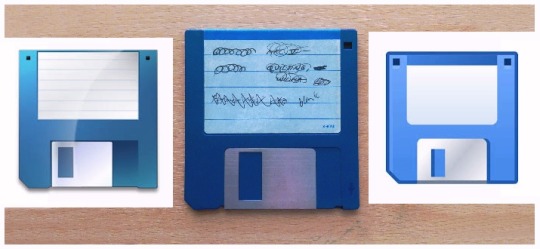
And of course the Save icon is indeed a 3½ inch floppy disc.
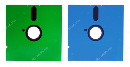
Why it wasn’t a 5¼ floppy is a mystery. The icon version is just as distinctive.
Also, why various OP updates never changed “Save” to the graphic of a CD / DVD or flash drive is another mystery, and nowadays a Save icon should probably be a cartoon cloud.
Graphics and terminology are funny things.
reblogging this again for EVEN MORE information.
I’m mostly entertained by the guy who thinks you need to know that “case” means “box” in French as though that’s not what it means in English.
Outdated icons come up in client work every now and then, so I have RESEARCH about why it’s still used and why it still works. According to Nielsen Norman Group, there are three broad categories of icons used in UI design:
Resemblance icons - “depict a physical object which the icon is intended to represent.” For example, using an envelope icon for an email.
Reference icons - “Depicting some object which by reference or analogy might represent the concept the icon is intended to represent. For example, using a picture of a clamp to represent a file-compression utility (because it squeezes) would be a reference icon.”
Arbitrary icons - “only have meaning by convention. Traffic signs are often arbitrary icons and may form a good source of computer icons because of their fairly standardized international use. For example, a warning triangle might be used as the icon for a warning message.”
So in regards to the floppy disc save icon specifically:
Originally, this was a resemblance icon: users actually saved their files on floppies, so as long as the icon looked reasonably like a floppy disk, it was likely to be recognized and understood.
Later, people got hard drives and the “Save” icon became a reference icon. A floppy disk is a form of storage device and thus can be used to represent the generalized function of storing the document onto any kind of storage device, even one that looks very different. Indeed, most users have never seen a hard drive, so it was probably better to continue using the floppy-disk icon at the time when the switchover from floppies to hard drives happened.
Today, many younger users have never seen a floppy disk, and the icon has become an arbitrary icon for these users. Why should a small square represent saving? Well, it just does.