#justice leauge


80 year celebration
“We Can’t Help What We Are, Only What Life We Choose To Make For Ourselves.”

Post link


“Hey. Amnesia, remember? Completely forgot how truly annoying you are.”
Athenas Watchlist 2020 : Young Justice
Artemis (Artemis Crock)
Post link
Who is The Silhouette? co-editor Tom, here. I just wanted to take a moment and talk about the process that I went through in developing the cover for Who is The Silhouette?
I started with a bunch of thumbnails. Tiny, rough ideas of what I was thinking. This let me get down some ideas that I had been thinking of as well as force me to push myself farther and have better ideas.
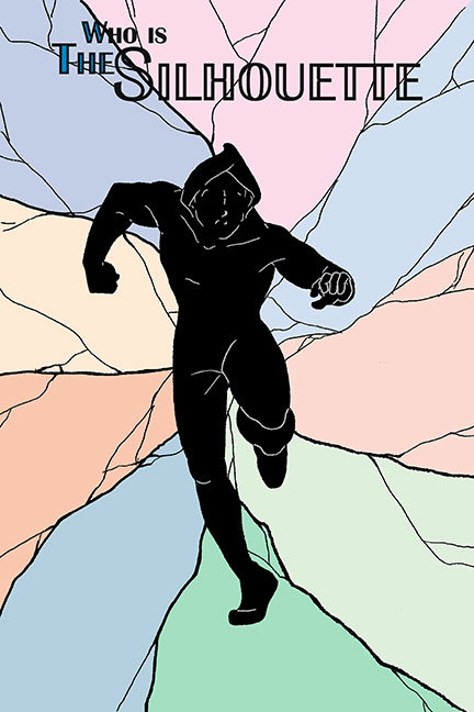
I had an idea from the get goof a shadowy figure in the foreground with shattered glass behind and a different main character in each of the major shards. It was the first thumbnail that I did and was super excited to run with it. I spent some time working on a more detailed version, working out kinks and ideas, but the more I played with it, the less I liked it. It would be a good cover if The Silhouette was able to be anything more than just that, a silhouette. Having the main focus of your cover be a detail-less black shape doesn’t make for good design, no matter how cool the idea is.
So I started going back to my thumbnails. A lot of them didn’t end up working very well, but what that did show me was that the direction that I was headed (at the time) was towards a feel of a classic superhero comics cover. There was an image in my head from many years ago of dozens of versions of Superman stacked shoulder to shoulder, versions of himself throughout the multiverse. I drew from that for my next concept.
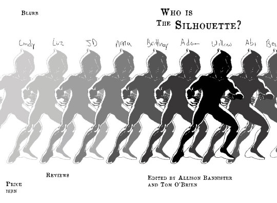
This idea had potential but wasn’t working for me. It lacked color or a dynamic feeling, and although it was only an early concept, the fact that I had copy/pasted the same drawing just for the mock-up made it feel bland to me, so it was tossed.
Still wanting the feel of a classic comic, I turned to team books. I looked at X-men, Avengers and Justice League. A lot of the covers showed a group fighting a specific villain, which I couldn’t do, or were just a general class photo, which sounded right up my alley.
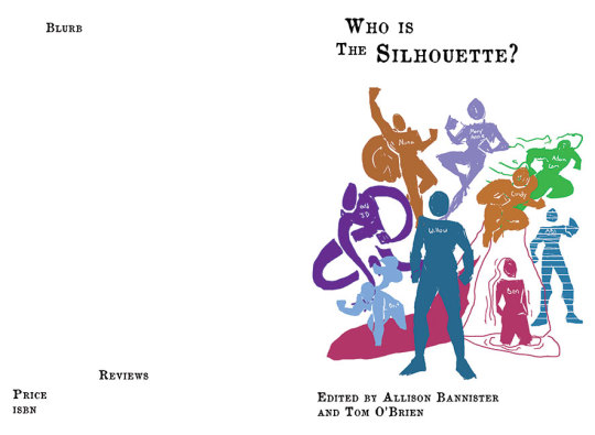
This had a few issues. Problem 1 was that some of the stories in Who is The Silhouette? are primarily character studies. We don’t see powers being used or fights being fought, so distilling the characters into an action pose was difficult, and ultimately, the feel wasn’t quite right. Problem 2 was that the cover might lead people to think that all of these characters co-existed together, not that they were different possibilities of the same hero. So, back to the drawing board.
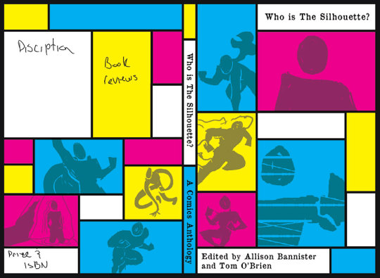
At the same time, I spent a lot of time looking at the cover of Michael Chabon’s The Amazing Adventures of Kavalier & Clay. One version of the cover screams 1940′s superhero (which was clearly intentional), and especially Batman (who was one of the inspirations, in a way, for this anthology), but the other cover is much more design-oriented, high contrast and graphic. This got me thinking, and I developed an almost Mondrian inspired cover, but it ended up being too much, probably in part because of the CMYK color pallet.
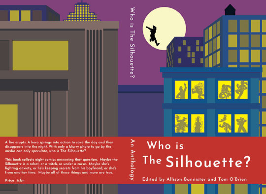
I had decided at that point that although I didn’t want this cover, I did want it to be striking and graphic. Allison suggested a cityscape to mimic our banner for the Kickstarter, which was inspired originally by the opening credits of Batman: The Animated Series.
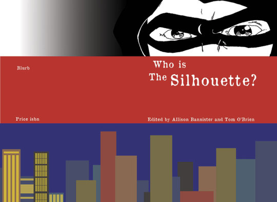
We liked the city but not the face at the top. We also wanted to pull more directly from the work of our contributors.
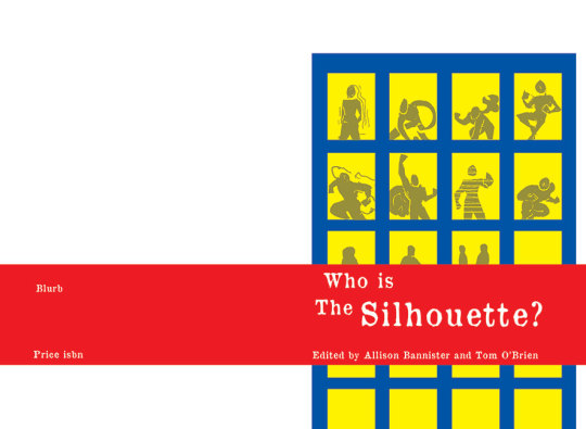
This was a rough concept. It was okay, but abandoned early for being too bland.
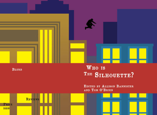
We both liked this one, but felt that it needed work. The text needed to be tweaked, the pose of the silhouette was awkward and there was no hint that this was a collaborative project. Before moving on we tried 6 different fonts, each with a few variations in size and layout, before deciding on one.
I sat down at my computer and started from scratch with this concept as a roadmap. I pulled open Photoshop, grabbed the shape tool and got to work. Then Photoshop crashed, and I lost everything because I hadn’t saved. Let that be a lesson, kids. Save early, save often.
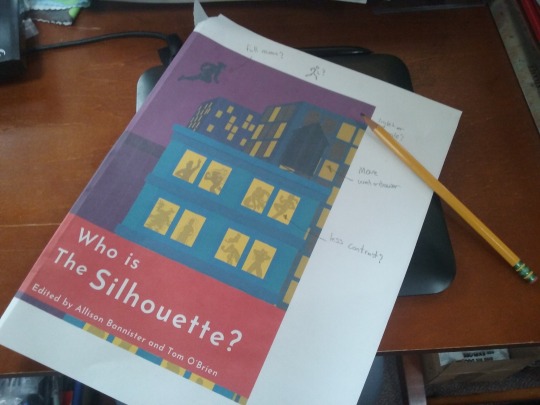
So I started in again, building buildings with more detail and depth, paying better attention to where the text would land and how the spine would look. Then, when I was happy with how it looked, I printed out a test copy and we wrote on it. Things we liked, things we didn’t like, things to shift, etc.
I then made those few changes. This is where the cover stands at this point in time. There will probably be a few more tweaks and changes in the days to come. Tell us what you think! And if you haven’t checked out the Kickstarter, there are a few days left to do so.