#koriyuetxt

FELLAS i was being a menace and jokingly calling my friend a dumbo idiot dumbo dummy dumb (affectionate). he turned around and kinda leaned over me and said, “wanna say that again?” and i. i shut up so fast
pov you watch me speed run the chasm for spare primos with tears in my eyes b/c mistsplitter leaves in a week
BABE WAKE UP CINEMA RELEASED ON PROJECT SEKAI!!!!
am i allowed to…. post some cute kazuha scenarios i wrote… based on my experience at the tulip festival…..?
i already miss the irodori festival :<

DOING CARTWHEELS RN


hiya!!! i’m back from vacation!! :DD got kinda burnt by the sun and have blisters on both my feet :,) will be back to making content () soon! <3
(some pics under the cut hehe :>)

i think heizou is very qyoot !!!!
i’m so weak i saw this picture of kazuha and burst into tears

THERE’S A SPIDER IN MY ROOM HELP?&?
aaAAA i saw the cutest xiangling cosplayer today !! i really wanted to say hi but i was in the car and they were crossing the street,,,, :<
@ the xiangling cosplayer please be my friend you looked so cool,
????? IN SHOCK my parents spontaneously planned a weekend trip and i have t-6 hours to pack everything i am. COMBUSTING
diluc birthday 2022 gfx (process work)

since i had so much fun making my diluc birthday 2022 edit (and jumped through numerous hoops to finalize the design,,,) i wanted to share the process!
this is not a tutorial! i will not be going over how i made every graphic. instead, this post shows all of my jumbled thoughts and decisions when putting everything together!
details under the cut! (initial thoughts / rough brainstorming + inspiration / final layout / colours / motifs / concluding thoughts)
cw: tons of rambling! i attached a couple of images too! no moving images or flashing.
i. initial thoughts
let’s be honest every thought i had going into this was about diluc and how FINE he looked in his birthday art,,
a majority of my edits are 800 x 1000, and this one was originally going to be 800 x 1000 too. but! i have a bad habit of overfilling smaller documents and not using negative space properly. so, i tried to use an 800 x 800 document for this edit instead!
choosing to work with a square base instead of a rectangular base meant i had to use the smaller space more effectively.
ii. rough brainstorming + inspiration
initially, i was aiming to do an editorial style of graphic where diluc was meant to be presented as a model in vogue (or any high-fashion magazine). some of the inspiration i had:

i was going to focus mainly on typography and experiment with different editorial layouts!

i knew i wanted a combination of text and images in this post (which is why i played around with two boards at once). i really wanted to keep this monochrome and use one red (sampled from diluc’s hair) as an emphasis colour.
but then i thought… wait.. diluc looks SO GOOD in his art.. why would i relegate him to the background????? and make it black and white?? fool behaviour,, so! i scratched everything and started from the very beginning! but now i wanted to focus on diluc’s figure and his character instead!
so… now what? i was so ready to give up— i had spent the first two hours going back and forth between different layouts and different monochrome colourings and to lose all the progress was just. defeating, really. :<
iii. final layout
after mourning the loss of my model!diluc dreams, i wanted to create an edit in a style that i was more comfortable with. usually i create vectors or lineart in my edits, but this time, i wanted to go back to my roots and experiment with textures! before being on tumblr, i made numerous edits that looked like this:
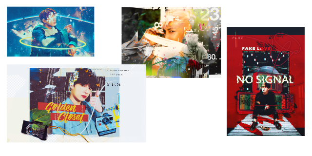
(i was still, and continue to be a bts fan haha)
i really, really enjoy this style of editing and i really missed it when i started creating for genshin! but it’s hard to mix real-life elements with 2D characters, which is why i tried to stray from it… but i always had so much fun making these that i was like,,, hey,,, why not???
so! using my past self as inspiration, i began gathering images and making elements to create a diluc-piece that focused on layering textures + manipulating them!
iv. colours
okay. preface: i really fricking love using colours. i don’t know what i was thinking when i tried to make this entire thing black and white, but i was wrong!
i sampled a bunch of colours from diluc’s birthday art and came up with something like this:

buuut it looks a little bit… flat? so i took the green from the background and added that to the palette too! this really helped the red pop, since they’re complimentary colours. after i finished making the edit, i went back and altered some of the colours to make them pop out!

v. motifs
my favourite,favourite part that i can talk about for ages!!!!! here’s where i obsessively read up on diluc and brainstormed the things i wanted to symbolize in my edit! some stuff i included / took into consideration:

- grapes + vines. hints at his status as a wine tycoon. also symbolizes fertility, wealth, inner transformation. similar to the process of fruit becoming wine, diluc has grown to become a respected man.
- the king of hearts. i emphasized diluc’s title as the uncrowned king of monstadt by directly referencing him as a king. the king of hearts symbolizes honesty and is often regarded as a kind-hearted man. so… diluc.
- splatters. it’s not blood! diluc is alive and well!!! the red is supposed to mimic spilled wine (a play on the saying “no use crying over spilled milk) but… legal.

- a crown. another reference to the uncrowned king title. diluc deserves a crown and i will personally place it on his head.

- the sun. references his title the dark side of dawn. bright, scorching, unrelenting—a very diluc symbol.
- the golden halo. symbolizes royalty and glory. can i highlight his status anymore in this edit?
- black feathers. a reference to his title the darknight hero. black feathers also symbolize protection and are considered good omens. it’s kinda like a silent thank you to diluc for always protecting monstadt!
- golden wine. shh, it’s apple juice! but also.. diluc as king midas who has the power to turn anything into gold. references his wealth and his adeptness as a businessman. i think there’s also a beer called liquid gold… funny!
some stuff i didn’t end up using:
- burnt paper. i was going to make it look like one of the pictures were burnt. for the obvious: diluc’s a pyro character, duh. but (on a sadder note) the burning of bridges and the past as nothing but a pile of ashes. bonus points: i was going to burn a picture of diluc and kaeya haha. in the end, i didn’t do it b/c it looked out of place.
- an owl. references his constellation. okay it’s supposed to be a "night bird” but. owl. whoo! i made it and tried my best to fit it somewhere, but it made everything too crowded… so it had to be scrapped from the final design.

vi. concluding thoughts.
honestly, i really do love this edit. it came out a lot better than what i had in mind initially… haha… i’m proud of how it looks, and it was really fun to make! i haven’t had this much fun making something since my long kazuha & tomo edit… rip.
i think i’ll continue sprinkling in this style of editing more often since i really enjoy doing it! it really reminds me of myself from the past it’s kinda.. bittersweet, i guess? to still prefer my old editing style after everything that i’ve created? shrugs.
anyway! if you read through this entire thing, thank you for reading! i really enjoyed laying out all of my ideas and showing my (messy) thought process throughout the whole thing. i would love to make more of these in the future and babble on and on about editing,,, sighs dreamily,,