#pastel kimono
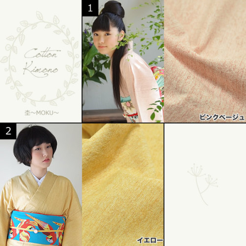
A gentle creamy-pink acrylic kimono from Kisste Kimono, which shows how you can add a great degree of interest to a kimono just by pushing up the contrast with the obi. There isn’t even an obijime or obiage on this coordination, but it still looks very proper and crisp!
Post link
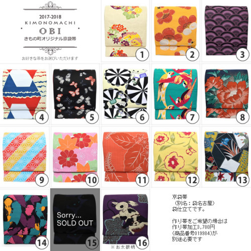
Kimonomachi has this amazing collection of hyper-contemporary obi which you can mix & match with a pale cotton kimono of various colors for a set price of 19,800 yen.
Kimonomachi has long been a favorite of this blog because they are simply unafraid of color and pattern– this is a powerful way to make a statement, especially when wearing kimono for daily fashion instead of at a traditional function like tea ceremony. Which one would you pick? :3
Post link
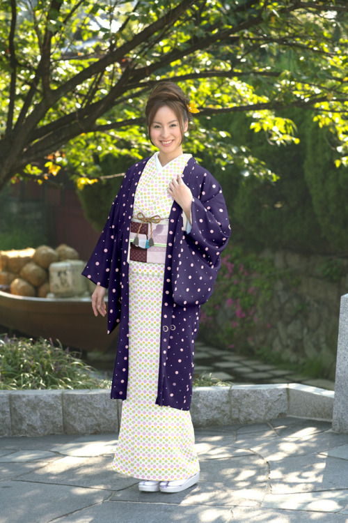
I’m blown away by this tricky coordination from Kimono Yamato!
Why do I say “tricky”? Well at first glance, or in the thumbnail, this coordination looks like it’s made of desaturated, perhaps even brownish or cream pieces, a dull violet haori with white or cream spots, and a brown obi. But the longer you look at it, the more you see bright colors hiding in the coordination.
The kimono that blurs into a golden brown is actually made of green, yellow and pink flowers of similar value, so they mix in your eye to make a visual gold. The purple is not dull at all, but deep and saturated, just looking dark against the sunny background. And half of the spots on it are pink, not white!
The obi is made of raspberry and pink, but it’s less saturated than the kimono, so that block of dark raspberry just echoes the value of the haori. And the whole thing is so intensely contrasted that the model looks slightly washed-out against the background, even though she is evenly lit. The entire coordination is a real journey into color and the way you can manipulate it by just placing it against other colors!
Post link


