#process log

process for my illustration for my zine collab with Leporidae
started knowing I’ll just be doing spot illus so i wasn’t too concerned about the complexity. focused on composition here. initially i liked how flowy it was, but fumbled with the form.. i think the cabinet structure kind of lessened the strength of the shape. probably should have made it smaller/tighter with a rounder general shape/impression so the overall image looks more compact. i also wanted to add more details/things on the shelves but the item size needed to be bigger bc the shelf proportion was drawn kind of big.. maybe i should have put more items in rows/repeating.

referenced the color scheme from this official work. i wanted something bright but not too dark or saturated. overall i liked how the colors turned out and the hue jitter brush settings on procreate made color picking easier.
changing the lineart color was a bit of a hassle because I accidentally started the it on the wrong layer so i had to use a different layer setting to change it. that made it darker than i preferred and i wasnt sure how to toggle it lighter. just more post processing but i think overall the colors came out nice. I’d like to do more pieces with this kind of bright color scheme in the future.
anyway, go read the cute fic if you haven’t already
process for my @chinenmiyazinepiece
this took way longer than i initially planned. the moral is, when in doubt/stuck/whatever go back to references and fundamentals. the first draft was fine, but it looked boring even just from the sketch. pretty sure it would have been tedious to render fully.
went back to my poser app and laid out the general idea i wanted to pull off. pushed the perspective and drew over the general layout. kept the file with the grid in to help with the background later on. after the layout was finalized, it was all just a matter of lineart + coloring. arguably the sweets were fun but tough to draw. i think some of the perspective might still be off but they do look mostly good. procreate’s hue jitter brush setting really helps me a lot when i color, especially when i paint. i think i prefer single layer painting more on procreate with this setting on because any brush i use gets that painterly feel when the setting is turned on.
overall this was fun to color, pretty happy with how it turned out but if i could, i’d still tweak a few things here and there.
(i also lightly based this off an actual cafe in okinawa. they’re @caracalla.okinawa on instagram. their pastries are colorful cute and their location has that refreshing by the beach look i wanted to capture.)
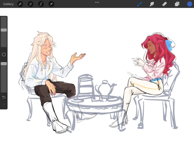


another process dump. this is taking a while to finish. i tried the head-on perspective from the first one. fiddled with my poser to try to get a funky perspective but it didn’t work. scrapped and tried again.
i don’t know the lore back and forth yet but i imagine raspberry and madeleine are sort of friends because they were forced to be nice to each other as kids of noble families. never grew out of it. they’re not besties but they’re not not-close.
i’ll finish this one day. i worked too hard on the composition to scrap it again.
(guess why there is a misplaced (is it though) mirror behind her)
second time attempting this art style (first was avocado cookie). looking back i should have done a different kind of warm up for this, even with just these characters.
their shapes are fun to draw though. it was hard trying not to make everything too detailed. needed to have the shapes be clear and smooth because there’s not a lot of room to render. should also work on making them more… flat? they are cookies.
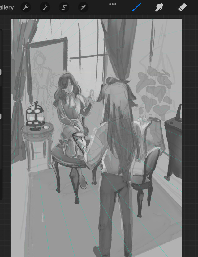
Rewatching and editing this footage made me realize how messy my process still is, especially for bigger pieces. I would tend to pick up and render certain parts before laying down all the other elements which makes for a messy workflow. Although I do think that somehow gives me room to change it still early on, but overall in the moment it just feels incredibly cluttered and picks at my focus.
This piece was done over the span of a few months, so some days when working on it I felt very stiff. I think I worked on the bulk of this in one go after getting stuck for so long in the early stages (in the footage it’s where I kept rendering and rerendering her face). In the end I think I could have worked much faster on this. I nitpicked a lot on small details and the composition was also a bit hard to finalize because I had to consider the spine and print layouts. But I’m not unhappy with the piece. It makes me want to work more on making complex but dynamic compositions, as well as more conceptual work. Something I need to practice and research more in the future.