today in ‘i wasn’t actually expecting this, but i really should have expected this’: i do a lot of visa application invites for people for work, and the passport first page for just about every country i’ve seen has clear, black text printed on light/white background with maybe some simple pastel-coloured designs. and for the first almost-three-decades of my life, i was happy in the naive belief that all passports around the world were similar; that one day all countries of the world gathered in Geneva or wherever and formed a Passport Design Committee where they all agreed on the general aesthetics for passports worldwide.
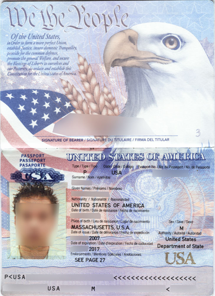
then, about two weeks back, i saw an american passport for the first time, and it straight up has a giant-ass flag, an eagle, a fucking ear of corn, and the first line of the constitution on it, the text is on glaring multicoloured backdrop, and while i was caught off-guard by it, it is also completely in line with its country of origin, and also i feel like this tells me everything i need to know about america as a nation.
-the most typical reaction for non-Americans when seeing an American passport for the first time is to google for credibility, because someone is clearly taking the piss.
-IT’S WHEAT!!!!!! NOT CORN!!!!!!!!!!!! and Americans are really particular about what you call their Freedom Grain (for the record: in US English, corn refers particularly to one specific grain, i.e. maize, whereas in other Englishes it can mean “any type of grain”. I use one of the many other Englishes on the planet)
-many americans were to not ready to learn that other countries’ passports are actually, like legible, so for comparison here’s a bunch of random examples that i found via google. these are all example/invalid passports
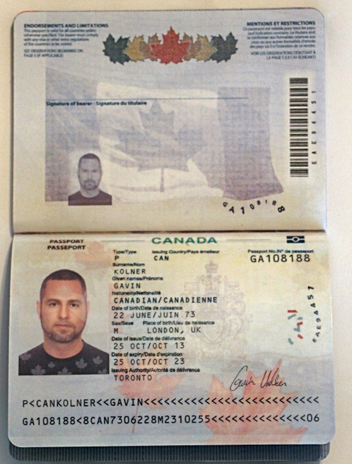
just top of the border, the canadian one:
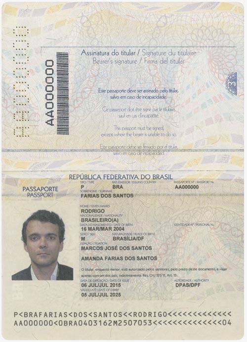
the brazilian one:
the chinese one, and I’m pretty sure that blurb has copied the American one, sorry ‘bout that:
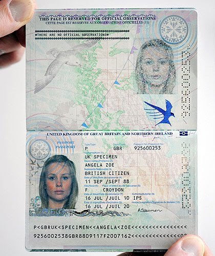
the british one, in which the bottom left corner kind of has that mid-00′s bedroom wall decal aesthetic going on:
so there you all are.
The front page of passports around the world are generally designed for easy identification and legibility instead of PATRIOTISM - thus, pale, pastel designs on light background. That doesn’t mean that a passport’s design can’t be fun - both the CanadianandNorwegian ones are having a party under blacklight, the Finnish one has an animated moose, and those are just the ones i know of.
It’s just that the American passport is really uniquely Like That.
It also didn’t always look like that. I remember when we had to get ours updated to that new style and we were very much caught between delight at how hilariously awful our passports were and outrage that we now had to show them to people.
I mean the swedish passports got drawings of swedish towns on every page, so more countries Do Things Like That
I like our passports art style better though
Literal cottage with a swedish flag on last page.
And the city of gävles page. With 1 gigantic gävlebock.
A different flavour of countries representing themselves via passport art than usa one, i admit