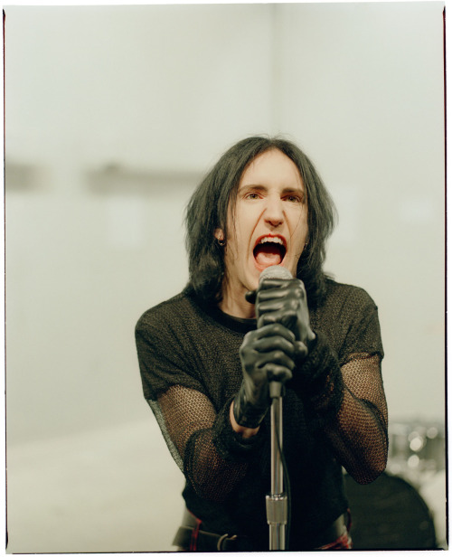
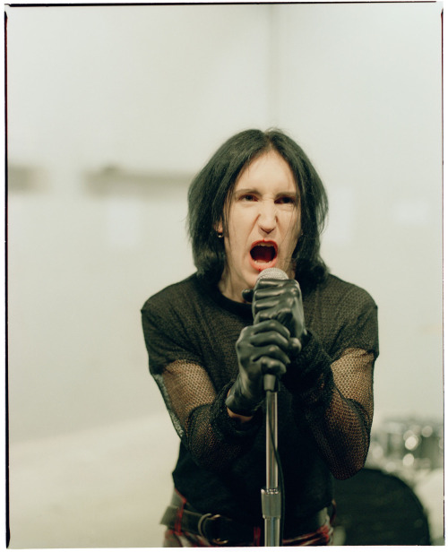
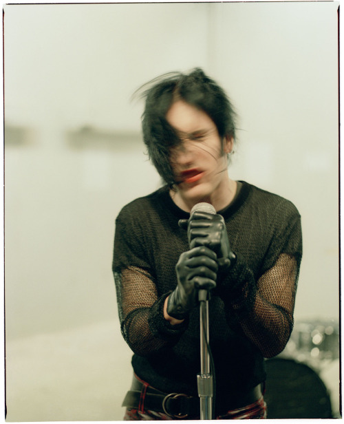
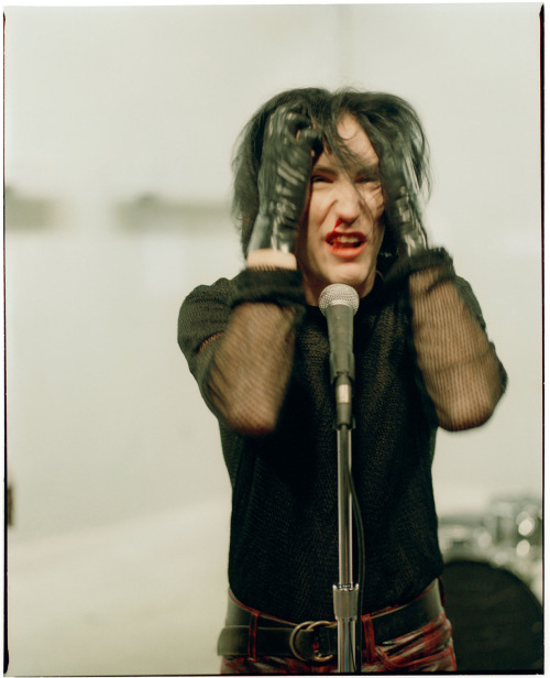
#the downward spiral
Nine Inch Nails performing “March of the Pigs” live in Melbourne on March 14th, 2014. Filmed on stage by robsheridan with a Blackmagic Production Camera 4K. Viewable in full 4K resolution.
NIN is on tour this year in Europe, UK, and North America. Tour dates and tickets at http://tour.nin.com
NINE INCH NAILS - THE DOWNWARD SPIRAL
GRAPHIC DESIGN - SINGLE COVER ART
TRACK 12: REPTILE
I like the way all of these translated into single covers, but I’m definitely drawn to the one up top with the slug following the worm. It feels like there is a narrative being played out, as if the slug drawn to the worm after being put under some sort of spell. The fact that only the tail end of the worm is exposed after I cropped the image, curling upwards as if it is luring the slug down a dark path is very apt for the song ‘Reptile’
The protagonist returns to his old ways indulging in the worst parts of himself but the only thing he knows to be true. What’s tragic is he will realise that seeking escape in these destructive patterns has made him weary and aware of just how alone he is. The woman to which he has turned is cold and compassionless. She cares as little for him as she did the one before him or will for the one after him.
Devils speak of the way in which she’ll manifest
Angels bleed from the tainted touch of my caress
Need to contaminate to alleviate this loneliness
I now know the depths I reach are limitless
Oh my beautiful liar
Oh my precious whore
My disease my infection
I am so impure oh
Post link
NINE INCH NAILS - THE DOWNWARD SPIRAL
GRAPHIC DESIGN - IDEAS DEVELOPMENT
TRACK 12: REPTILE
EDIT: I’m after being informed by Andrea (https://k00234566.tumblr.com/) that the worm I found is actually a New Zealand Flatworm, a particularly invasive species not common to our part of the world that should be reported when found. Thanks Andrea! I knew it was up to no good…)
As our protagonist’s plea for someone to end his suffering go unanswered, he naively attempts to salvage some shred of his former self, or perhaps even find a way out of what he already knows deep down is inevitable, his destruction.
We can assume from the opening lines that the woman this man encounters is not the same as was hinted in ‘Piggy’ or ‘Closer’, but more than likely a prostitute:
“she spreads herself wide open to let the insects in
she leaves a trail of honey to show me where she’s been
she has the blood of reptile just underneath her skin
seeds from a thousand others drip down from within…
oh my precious whore”
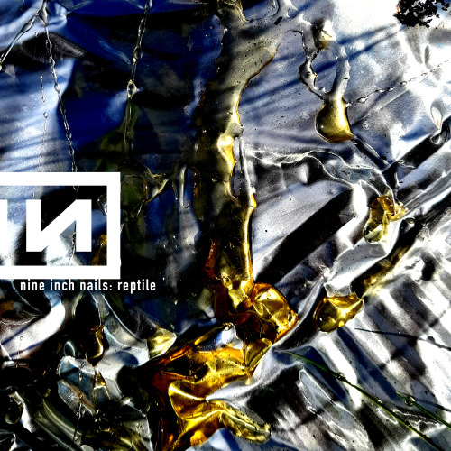
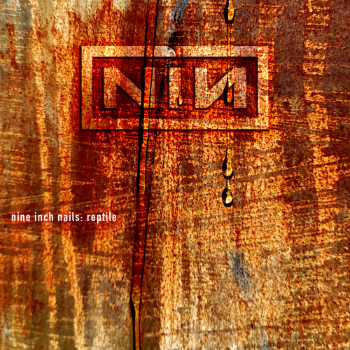
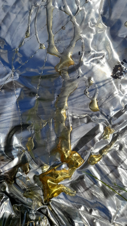
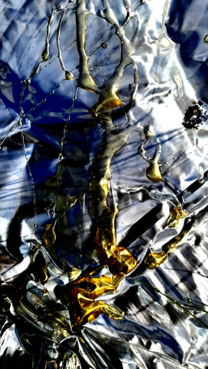
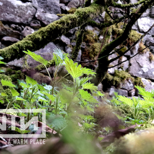
The images of ‘honey’ and ‘insects’ always stood out to me in this song. I decided to get a little on the nose with it and take a jar of honey out to the field across from my home. I dripped the honey on to different surfaces to see what kind of effects I can get. I was happy with the way the colours and textures of the rusted gate and aluminium pan complimented the honey, but I wanted to get some insects involved if I could.
I turned over as many rocks and pieces of garbage as I could, and succeeded in finding many different ant colonies around the place. However the pictures of them I took on my phone were underwhelming as they were too small to make any sort of impact with the camera i was working with.
Then I lifted a rock and found one of the weirdest things I have seen in recent memory. What appeared to be some sort of worm that looked like an eel started slithering out from under the rock. Perhaps I just don’t get out enough but I have never seen a worm that shape and with the strange off-white border around it.
I decided to take some pictures and while the worm made it’s way, a nearby slug suddenly shared my curiosity and started following the worm. I caught a few pictures of their encounter and then let them on their way.
I adjusted the contrast on the photos and found it difficult to decide which one to use for a cover. I looked forward to bringing them into photoshop to add the NIN logo and get a better sense of which one was most appropriate.
Post link
NINE INCH NAILS - THE DOWNWARD SPIRAL
GRAPHIC DESIGN - SINGLE ARTWORK
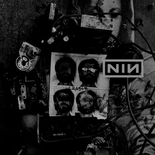
TRACK 11: ERASER
I had played around with a few ideas for logo and title placement after selecting the image I was happiest with, and I settled on the one up top.
I like the placement of the logo and how there is a thick wire underneath it that looks as if it is holding it up. I also like how the ‘Eraser’ title is subtly in the centre of the image, and looks as if it is hand written on the photoset.
I did indeed hand write the title for this one, as I thought it was appropriate given the title of the song. I flirted with the idea of doing an actual erased version, however when I used a graphite pencil to fill in a page and erase letters and words into it, the lines just weren’t thin enough and it looked sloppy.
The compensate, instead of ‘erasing’ the word eraser, I simply drew a line through it making it look as if it had been crossed out.
I’m happy with the way this cover turned out, I think it suits the song and is rich with meaning.
Post link
NINE INCH NAILS - THE DOWNWARD SPIRAL
GRAPHIC DESIGN - IDEAS DEVELOPMENT
TRACK 11: ERASER
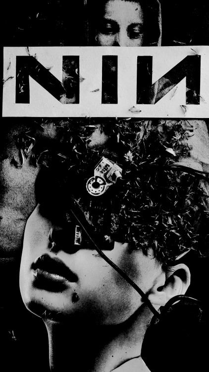
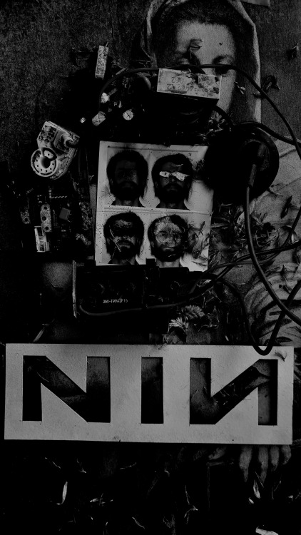
Here are a few of the different options I have settled on for the ‘Eraser’ single artwork. I loved the way each arrangement looked and felt in black and white with the contrast turned up high and the exposure turned down. They have a real industrial feel and brought to mind the visuals used on the Nine Inch Nails tour promoting ‘The Downward Spiral’, particularly the video that I have attached below.
Post link
NINE INCH NAILS - THE DOWNWARD SPIRAL
GRAPHIC DESIGN - IDEAS DEVELOPMENT
TRACK 11: ERASER
Following the lucid interval of ‘A Warm Place’, our protagonist returns to a desperate fit of violent rage, however this time it is directed towards himself.
Upon the realisation that he has become the very thing he set out to destroy, he knows that he too must now be destroyed. However, he is not yet ready or able to do it himself. He pleads for another to end his torment.
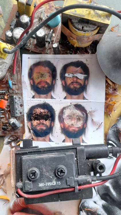
In developing ideas for ‘Eraser’, I wanted to use a set of passport photos I had taken a few years back and had lying around. I ended up getting these photo’s retaken as, admittedly, I thought I looked very ‘suspect’ in them for a passport. The beard and long hair just screamed “terrorist” to me, more so in a Ted Kaczynski way than anything else. It was probably a ridiculously paranoid train of thought, but as an American citizen living abroad, I just didn’t want the potential hassle going through customs for the next 10 years, so I went home and shaved to have them retaken.
I wanted to do a different “erased” version of each image, one where my eyes were burnt out, one where they were scratched out, one where they were covered in ink and then one where I used bleach.
Once I achieved this literal erased effect, I wanted to tie in some deeper symbolism. I thought of how the protagonist was desperate to attain some sort of meaning in the absence of God in his life, but had failed in this regard and now wished to sacrifice himself for a greater good.
Going back to the “terrorist” connotation I had attached to the passport photos, I dwelled on the idea of a “terrorist” and how that label is often given to someone by those of opposing ideologies. From the IRA to ISIS, one person’s terrorist is often another’s freedom fighter, thus making an objective definition of a terrorist very difficult to pinpoint.
I took some religious imagery into the frame using a print of the Virgin Mary and baby Jesus. I believe it is a work by Leonardo Da Vinci. I then took some random electronic pieces I had found around the same time as the computer screen I had used for ‘The Becoming’ and positioned them as a frame around my passport images. I wanted to get an effect that was somewhere between a home-made bomb and a memorial shrine to a deceased person. The flowers were added for texture, but also to reinforce the memorial element as well as contrast with the electronic imagery.
I was happy with the way it was looking, but wanted to bring the images into Photoshop and see what could be done with them.
Post link
‘THE DOWNWARD SPIRAL’ - NINE INCH NAILS
SINGLE ARTWORK : FINAL DRAFT
TRACK 10: A WARM PLACE
These are my final drafts for ‘A Warm Place’ by Nine Inch Nails.
I decided to also do an Irish version, as a tribute to the Joyce Family and those that were wrongfully accused of their deaths.
I am also going to include the song ‘A Warm Place’, which you can listen to below. I didn’t bother doing so with any of the other tracks because ‘The Downward Spiral’ is a pretty noisey, abrasive record and this is a project for school after all.
However this is probably one of the most beautiful, peaceful songs I’ve ever heard. I would recommend it to anyone.
I also recently only realised for the first time that it borrows quite a bit from the David Bowie deep cut called “Crystal Japan” which Bowie had originally written for a gin commercial for a Japanese company.
Reznor had written ‘A Warm Place’ himself without realising where the melody came from, but having a feeling it was not actually his. It’s a funny story you can read about here.
Post link
‘THE DOWNWARD SPIRAL’ - NINE INCH NAILS
RESEARCH: 10500 CIELO DRIVE: THE TATE MURDERS
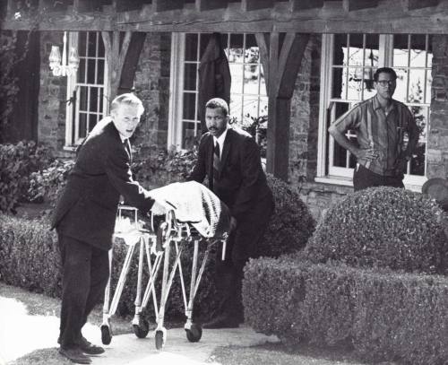
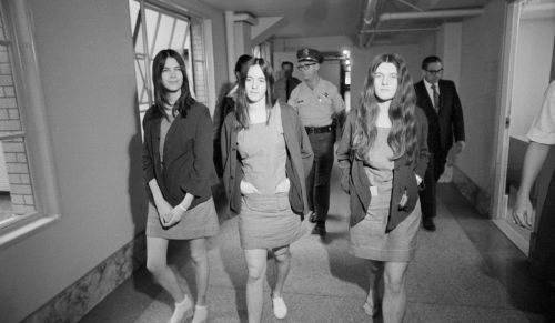
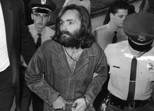
On the night of August 9th 1969, Tex Watson, Susan Atkins, Patricia Krenwinkel, and Linda Kasabian, forced their way into the home of Sharon Tate and Roman Polanski on the orders of Charles Manson, who instructed them to “totally destroy” everyone in it, and to do it “as gruesome as you can”.
Manson’s motivation was revenge against famous record producer Terry Melcher, with whom Manson had a previous relationship with before being snubbed concerning the possibility of recording his music together. Melcher was the previous resident of the house before Tate and Polanski, and had invited Manson over as a guest on a couple of occasions.
At the time, Polanski was away in Europe working on a film project, and Tate was entertaining guests, among them Abigail Folger (heiress to the Folgers Coffee fortune) her boyfriend, aspiring screen-writer Wojciech Frykowski, and Jay Sebring, Tate’s friend and former lover.
Steven Parent, a friend of the caretaker who lived in the guest house in the back, was the first of the Manson Family’s victims that night, as he was stabbed and shot leaving the residence. Among those invited that night but did not attend were record producer Quincy Jones, and actor Steve McQueen.
After an evening of socialising, Tate and her guests had fallen asleep, only to be awoken by Manson’s followers and brutally murdered in the ensuing struggle. Included in the list of victims was Tates unborn child, Paul Richard Polanski. Tate was 8 ½ months pregnant.
Manson had told his followers to “leave a sign—something witchy” before they left the scene. Susan Atkins took Sharon Tates blood and wrote the word “PIG” on the front door.
Post link
‘THE DOWNWARD SPIRAL’ - NINE INCH NAILS
SINGLE COVER: DRAFTS
TRACK 9: BIG MAN WITH A GUN
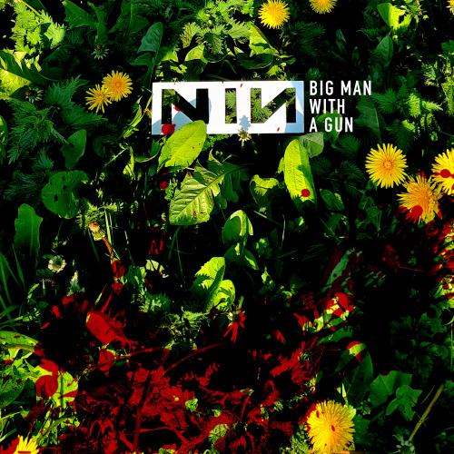
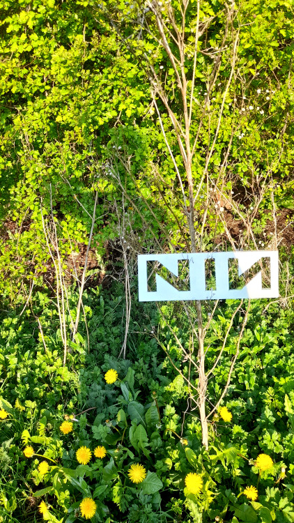
I brought the ‘big man’ image into photoshop when I decided which one I would use. After slightly adjusting the contrast, I felt something was missing, so similar to what I did with the “explicit” version of my ‘The Becoming’ artwork, I added a splash of blood to the bottom of the image. I like the idea of mystery behind who’s blood it might be, the shooter or a victim.
I also love the contrast between the very grim subject matter and the beautiful, sunny day. the dandelions are a nice touch as well. I remember always thinking of them as beautiful flowers when I was a kid, until I was corrected and told that they are in fact weeds. But who is to say really?
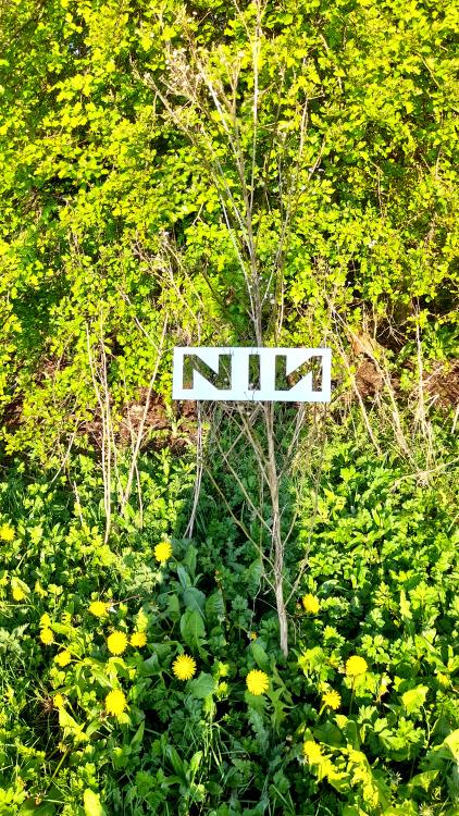
It was nice as well to not have to digitally impose the ‘NIN’ logo. The fact that it is so symmetrically perfect really makes it easy to do something like this, as at the very most it might need a slight adjustment in regrgards to perspective in photoshop. The fact that it is bright white also makes it pop when the contrast is adjusted, making it look as though it may have been digitally added or enhanced.
Overall I’m very happy with the way this turned out, and it probably needed the least editing of any of the other covers I have come up with so far.
Post link
‘THE DOWNWARD SPIRAL’ - NINE INCH NAILS
PARK: IDEAS DEVELOPMENT
TRACK 9: BIG MAN WITH A GUN
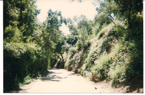
After all the doom and gloom of ‘The Downward Spiral’ it was nice to get out of my room and good for a walk in the lovely weather.
While I wanted a break from the project, I couldn’t help myself and brought with me the logo stencil, in case any opportunities presented themselves.
I was glad I did in the end because I captured some great shots, but among my favourite was the one at the top, where the ‘golden hour’ had stretched my shadow across the ground.
I decided to play with the idea of “a big man with a gone” and so I pointed my hand to my head as if I was holding a gun to it.
I got some strange looks in the park, hopefully nobody thought I actually had a gun. Had I been back home in the states, it could have been a scene. People in Ireland though are pretty good at minding their own business, for the most part.
Post link
‘THE DOWNWARD SPIRAL’ - NINE INCH NAILS
COLLAGE: FINAL DRAFT
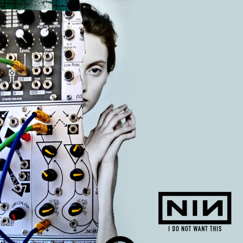
TRACK 8: I DO NOT WANT THIS
I decided to stick with the logo obscured to the right, as it didn’t interfere with the image but also gave it an interesting dynamic.
I’m happy with this image as I feel like it accurately depicts what is being expressed in the song, and not a million miles away from something Nine Inch Nails might use as a graphic today. However it plays into my own sensibilities and feels like something I would have produced myself, maybe more so than any of the previous songs I created work for on this album.
Post link
‘THE DOWNWARD SPIRAL’ - NINE INCH NAILS
COLLAGE: IDEAS DEVELOPMENT
TRACK 8: I DO NOT WANT THIS
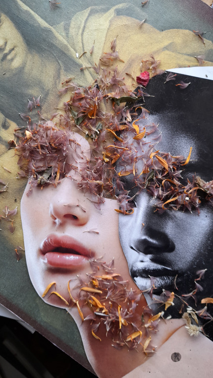
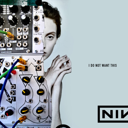
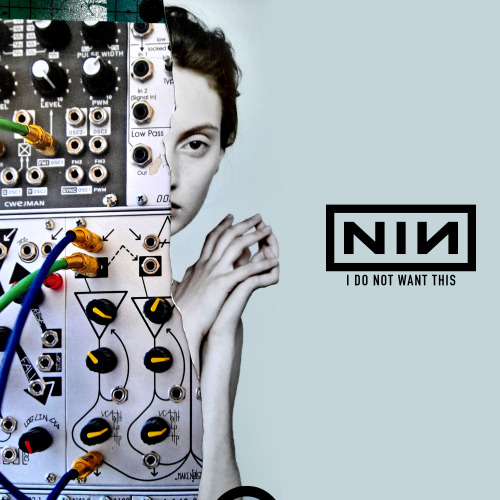
I had settled on this image as I felt like it accurately depicted a split between the mechanical and human sides, expressing a sense of conflict.
I was having trouble deciding where the logo and title should be placed, so these are the options I left myself to choose from. I feel drawn to the options with the logo placed centre, however the option with the logo obscured on the very right-hand centre of the page was very appealing as well.
Post link
GRAPHIC DESIGN: TYPOGRAPHY
‘THE DOWNWARD SPIRAL’ - NINE INCH NAILS
TRACK 5: CLOSER
‘Closer’ is Nine Inch Nails most famous song, made popular by its accompanying visionary music video (directed by Mark Romanek) and the unforgettable line, “I wanna f*ck you like an animal.”
I wanted to experiment with typography for potential single artwork for this song, using a font that suits the themes of this record.
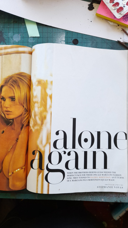
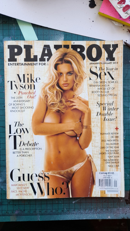
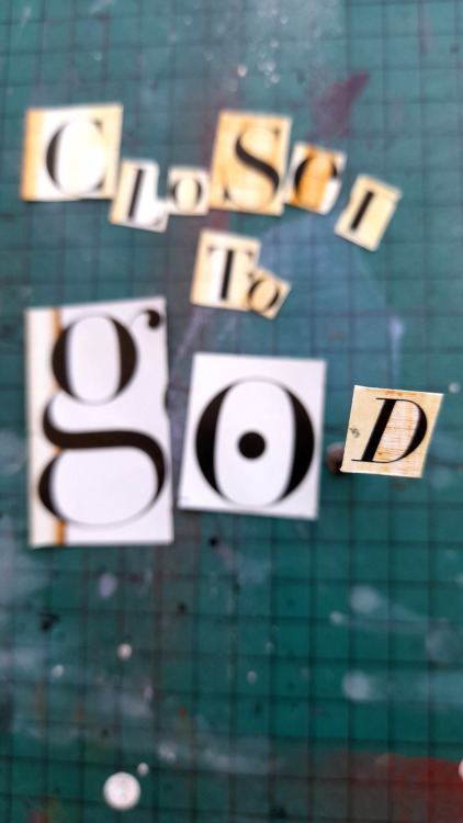
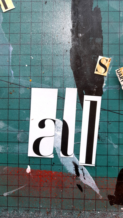
I found an old issue of Playboy in a stack of magazines I have set aside for collage (honestly, that’s all they are for!) and went about seeing if I could potentially extract the words “closer to god”.
While I came quite close, I needed to manipulate the ‘G’ to look like a ‘C’ for the word “closer.”
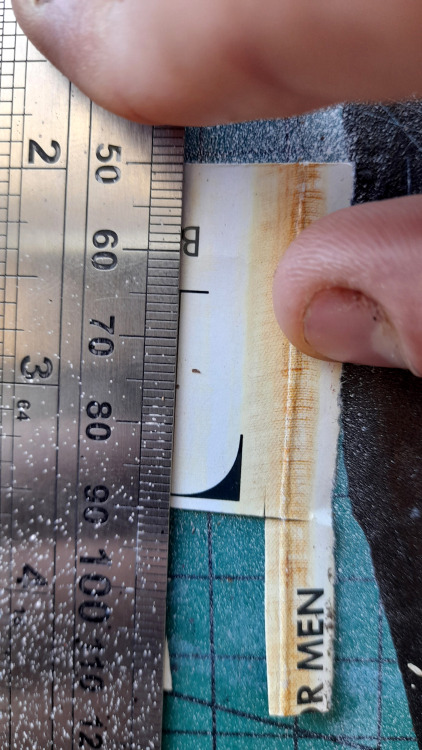
As it was a serif font, I was able to cut the lower edge off of the letter ‘L’ and attach it to the ‘G’ to make a convincing ‘C’.
The only issue now was that the ‘D’ in god was too small for my liking, so I therefor tried to position it closer to the camera’s lens by sticking it to the end of a nail with blu-tack. Unfortunately the camera was able to pick up on the difference in depth, so I resided to making my own lower case ‘D’ using half of a lower-case ‘A’ and attaching it to a lower-case ‘L’.
It took a bit of fooling around but I got there eventually.
Post link

One of the greatest gifts of Nine Inch Nails as art has been the ability for fans to make their own interpretations/connections to Trent’s introspection, concepts, and production. Oddly though, there’s been some talk on echoing the sound as of late that the career spanning references in artwork, NTAE, the re-issues, and Deviations 1 are all part of a new Year Zero ARG. There are people involved with ADD VIOLENCE that were part of the previous ARG, but beyond that, we just have some exceptional art, installation, and music. I truly believe the EP’s are an exploration of past eras, themes, and moods of NIN to create a story about finding ones place in this world, but as anything, I could be wrong. With that said, I do think it is audacious to assume that since 1989 Trent has been planning one giant ARG, and that intensely personal projects such as Broken, TDS, The Fragile, Ghosts I-IV, and Hesitation Marks were all just faked to be part of an ARG. With that said, ADD VIOLENCE is astounding_
What are your thoughts?
























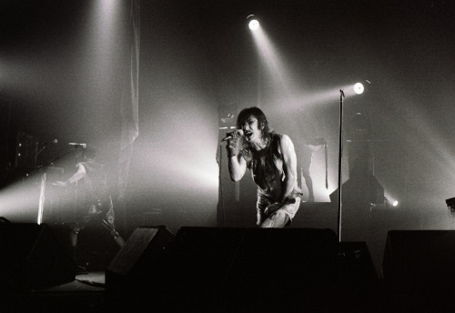
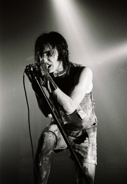
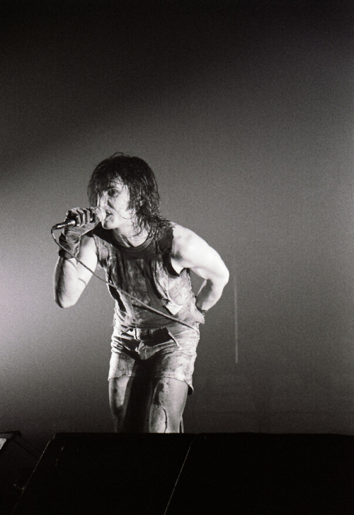
![[WOODSTOCK_1994] [WOODSTOCK_1994]](https://64.media.tumblr.com/f38716d2f4769af33795036ee4430ed3/tumblr_ou2wvxkr181rw4w9fo1_500.jpg)
![[WOODSTOCK_1994] [WOODSTOCK_1994]](https://64.media.tumblr.com/5a829bc39b7cd7f3e749b9fbeef4cbb9/tumblr_ou2wvxkr181rw4w9fo2_500.jpg)
![[WOODSTOCK_1994] [WOODSTOCK_1994]](https://64.media.tumblr.com/7505f83ec50eeaef8af75575f66d6c5a/tumblr_ou2wvxkr181rw4w9fo3_500.jpg)
![[WOODSTOCK_1994] [WOODSTOCK_1994]](https://64.media.tumblr.com/08ee127abeae55bf7f76f562f2a1a863/tumblr_ou2wvxkr181rw4w9fo5_500.jpg)
![[WOODSTOCK_1994] [WOODSTOCK_1994]](https://64.media.tumblr.com/014634036e871f2c311edd5e06fe7b7a/tumblr_ou2wvxkr181rw4w9fo4_500.jpg)
![[nine_inch_nails_live_1994_2017_] [nine_inch_nails_live_1994_2017_]](https://64.media.tumblr.com/96f76c2ce96f1a70c7c88d1afe99d862/tumblr_otpuqmrw8N1rw4w9fo2_500.jpg)
![[nine_inch_nails_live_1994_2017_] [nine_inch_nails_live_1994_2017_]](https://64.media.tumblr.com/8085230d404fa135e52575d9a08cf714/tumblr_otpuqmrw8N1rw4w9fo1_500.jpg)
![[nine_inch_nails_live_1994_2017_] [nine_inch_nails_live_1994_2017_]](https://64.media.tumblr.com/92203b367d126f26b138b73c68fbe817/tumblr_otpuqmrw8N1rw4w9fo3_500.jpg)
![nine_inch_nails_[1994]_[2014]_ nine_inch_nails_[1994]_[2014]_](https://64.media.tumblr.com/8d83efc458f172188481e8ea69b47a03/tumblr_ot96s2TZiU1rw4w9fo1_500.jpg)
![nine_inch_nails_[1994]_[2014]_ nine_inch_nails_[1994]_[2014]_](https://64.media.tumblr.com/dd3393388b5c1d0f3591a8f55eb046c8/tumblr_ot96s2TZiU1rw4w9fo2_500.jpg)
