#abracadabra


A magic word that means “I create as I speak”
See this design on many products in our Redbubble shop—> ValAndVanya


girls be watching dreamcatcher’s abracadabra video and gay panicking through the whole thing
I’m girls

Gustavo García Villa
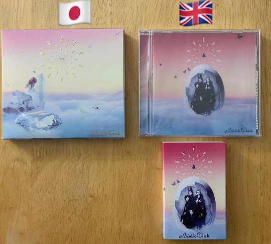
It’s been almost 1 year since Buck-Tick released Abracadabra and roughly 6 months since the international edition was released through the UK’s JPU Records. That marks 6 months of me being too lazy to publish this! When I received my copy, I wanted to make some minor notes on the differences and I shared them online. Since the production was delayed, fans grew more curious than usual on what the tangible item will be like and how it differs from the original release, besides the extra tracks and lyrics translation. Here’s a visual comparison.
Japanese CD vs. UK CD and UK cassette
I didn’t bother to buy the Japanese cassette but once the international cassette was announced, I decided to get it sort of as a novelty and sort of as a completist. The Japanese CD is the limited edition which has different packaging than the regular edition (slipcase). The international edition has different cover art for the CD but my understanding is that the cassette is the same artwork. The bonus tracks for the international edition were all taken from Japanese singles so if you’re a song completist who already owned the singles, the only reason to buy the international edition would be if you’re also an edition completist.
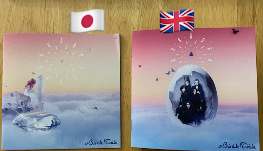
Now a comparison of the back of the CDs.

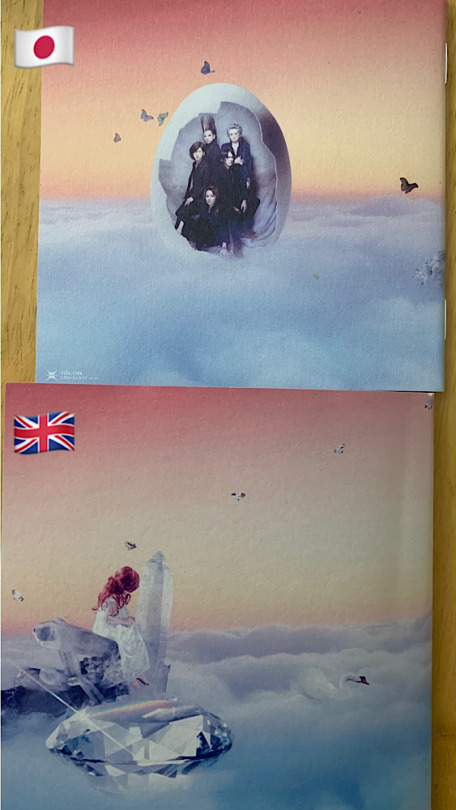
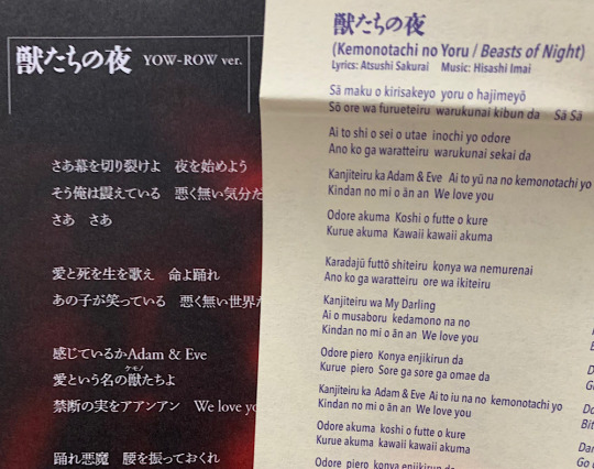
Next comparison are the lyric booklets. Here is perhaps where the saturation and paper difference is the most notable. The Japanese edition is slightly sharper in focus overall but if I didn’t have the two to compare side by side, I might not have noticed.
Below is a comparison of the back of the booklets. As you can see, the artwork for front and back was essentially reversed.
Then there is the discs themselves. Since these were released on different record labels, the label logo is first thing one would notice. Again, slightly sharper printing for the Japanese edition. Here is where the international edition’s print may feel a little too thick. Just look at the word “Abracadabra” next to the UK record label logo. The lines are a little fatter, kind of like the ink spreading in tattooed skin.

Below is the cassette label. Back in the day, the Victor cassette tapes were also white but the labels were yellow and they looked that way for all the bands. I think it was always the same color and font. To be honest, it was boring. This label has a little pizzaz, incorporating the color, font, and design of the album. Too bad I don’t have the Japanese cassette to compare it to.

A peek inside the lyric book. Overall it’s almost the same. This is the biggest difference.
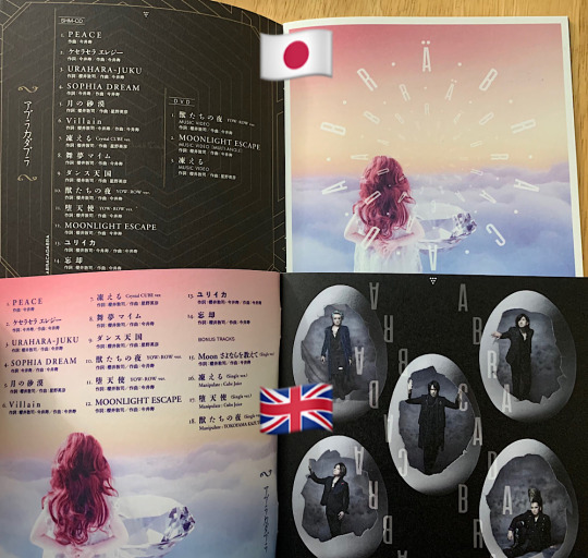
Below is a glimpse into the lyric sheet and translation. I was mostly curious as to if the lyric translation would be printed into the booklet, thus forcing the booklet to be thicker, with more pages, and more artwork choices to be made by JPU. However, instead there is a separate lyric translation sheet which had the lyrics in romaji and the translation next to it. This is very similar to how music is released in Japan. For foreign artists (non-Japanese), there will be a separate insert with the lyrics translated into Japanese. Schwein was foreign enough for it to include a lyric translation sheet. I’m not showing the entire thing because you should support the band and the record label and purchase it! Encourage Buck-Tick to continue working with international distributors and for international distributors to work with Buck-Tick.
If you can’t afford the physical copies due to all the shipping costs and taxes, then please purchase digital downloads from your local iTunes store. Mine has several albums, singles, and even music videos (some live).

Steve Miller Band
Abracadabra
1982 Capitol
—————————————————
Tracks:
01. Keeps Me Wondering Why
02.Abracadabra
03. Something Special
04.Give It Up
05.Never Say No
06. Things I Told You
07. Young Girl’s Heart
08. Goodbye Love
09. Cool Magic
10. While I’m Waiting
—————————————————
- Byron Alfred
- Norton Buffalo
- Gerald Johnson
- Kenny Lee Lewis
- Gary Mallaber
- John Massaro
- Steve Miller
Post link