#benjamin fox
clarendon
the original «clarendon» was registered by the firm thorowgood & co. of london, in 1845, while under the direction of robert besley; & was cut by besley’s partner benjamin fox at their fann street foundry*. «The type was an Egyptian with bracketed serifs and fulfilled a demand for a bold face suitable for dictionary work. It was so successful that the word Clarendon for a heavy type has become part of the common language. There had been types of similar design before Besley’s, which went under the name of Ionic.» [talbot baines reed (a.f. johnson, ed.), A History of the Old English Letter Foundries, faber & faber, london, 1952, p296].
of clarendon theodore low de vinne tells us: «Clarendon, a popular variety of condensed antique, was first made for the Clarendon Press of Oxford, to serve as a display letter in a mass of text-type, and for side headings in dictionaries and books of reference.» [Plain Printing Types, the century co., nyc, 1902, p331.] de vinne gives a taxonomy of «antique» faces: «Antique differs from roman [he means old-face roman] in the boldness of its lines: stem, serif, and so-called hair-line are always of greater thickness. … The intent of the designer was to produce, for purpose of display, a bolder style that should be as distinct and easily read as that of the old lapidary characters. For this reason it was called antique by some founders and egyptian by others.» (cp. ‹antique | egyptian›) according to de vinne square serif is a characteristic of a strict antique, but ionic antique has bracketed serifs & «has large face, open counters»; & a further square serif variant, the doric antique, «has features of roman» [ibid., p323-5]—added confusion as doric was «the Caslon name for Sans Serif» [reed, op.cit., p251], & i can discover no doric antiques in the bruce’s new-york type-foundry (de vinne’s main supplier) specimen book of 1869.
nicolette gray considers clarendon & ionic to denote the same type style: «Besley’s letter, in its slightly compressed form became the normal, but it was certainly not the first Ionic letter. The Ionic is an Egyptian with the slab serif bracketed and a definite differentiation between the thick and thin strokes. … In 1842 Caslon have an upper and in 1843 a lower case with the characteristics fully developed, but of normal width, and retaining the Egyptian E and F, without serifs to the middle arm.» [XIXth Century Ornamented Types and Title Pages, faber & faber, london, 1937, p51].
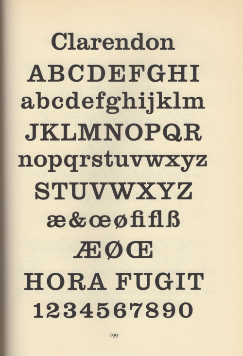
jan tschichold concurs with gray (some details muddled): «The fully developed ‘Clarendon’ dates from the year 1843 [ionic dates from 1843, clarendon was 1845]. The first form of this type, called ‘Ionic’ — quite similar to the Clarendon by the Haas Type Foundry depicted here — was cast by Henry Caslon, Type Foundry [sic], London.» [Treasury of Alphabets and Lettering, Rheinhold, New York, 1966, p233]. the hass’sche schriftgiesserei [münchenstein, switzerland] clarendon was drawn by hermann eidenbenz in 1951. the illustration above is tschicholds [ibid., p199]. for another clarendon revival vide‹volta›.
* the foundry founded by robert thorne in 1808, & acquired by william thorowgood at auction in 1820. robert besley became a partner in the firmc. 1838 at which time the foundry became styled thorowgood & co. upon thorowgood’s retirement the firm continued as robert besley & co, besley’s partner being his punch-cutter benjamin fox. in 1861 charles reed joined the firm, & the firm continued as reed & fox. after the death of fox in 1877 the firm continued as sir charles reed & sons, with talbots baines reed as sole proprietor until his death in 1893. operating until 1905 as a limited company, the material was finally acquired by stephenson, blake & co. [op. cit., pp 194 & 296-7.]
Post link

