#theodore low de vinne
b&r no.1
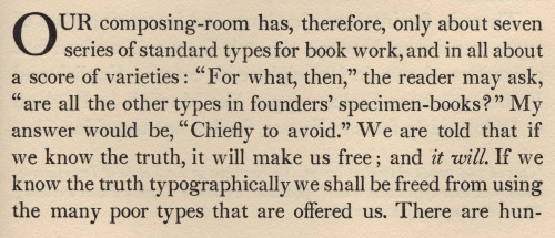
d.b. updike’s advice on acquisition of material for a printing office: «A third type (which originated with Binny & Ronaldson of Philadelphia over a hundred years ago) is in design transitional between old style and modern face. For books where the old-fashioned air of Caslon would be to obtrusive, and yet which call for a letter more interesting in design than the somewhat bald Scotch face, there is nothing better. I should not advise the purchase of this transitional series at the expense of the first two types chosen, but it will frequently do the work of either. … It is called ‘Oxford’ by the American Type Founders Company, from whom it may be had. I have used it for this book [first illustration]. It seems to me a type of real distinction.» [Printing Types, 2nd ed., vol ii, oup, 1937, p231].
a.f. johnson confirms: «The roman which Updike used for the text of his Printing Types, called ‘Oxford’ and originally cut by Binny and Ronaldson of Philadelphia, seems to have some affinity with Austin’s¹.» [Type Designs, grafton & co., london, 1959, p74].
in the same year as the 1892 merger that constituted the american type founders company [atf], joseph warren phinney, atf vice-president & former partner in one of atf’s original constituents, the dickinson foundry of boston, advocated revival of the b&r no.1: repaired & augmented with additional sorts, b&r no.1 was reissued as atf «oxford» (but what has this face to do with oxford—presumably the university? ² ). «oxford» is not shown in atf specimen books of 1897 or 1923 (nor do i find b&r no.1 material in the huge mackellar, smiths & jordan book of 1892 ³), but was available for special order into the 1960s. the atf oxford matrices (what of binny’s punches?) now repose in the smithsonian institution.
in 1946, in order to provide historically allusive faces for planned publication of The Papers of Thomas Jefferson [princeton unversity press, 1950], p.j. conkwright, then art director of the princeton university press, advocated adaptation of atf oxford for the linotype; c.h. griffith, then a vp at mergenthaler linotype, designed a b&r no.1 revival: linotype monticello, named in reference to the publication of its first showing. in 2003 linotype issued a digital version of monticello, based not upon the earlier linotype revival but on matthew carter’s redrawing, afresh from the atf oxford material [cf. ‹Monticello Typeface›]. for an allusive composition set in monticello vide‹perdita›.
1st illustration: excerpted from Printing Types [updike, op. cit., p241]; oxford types.
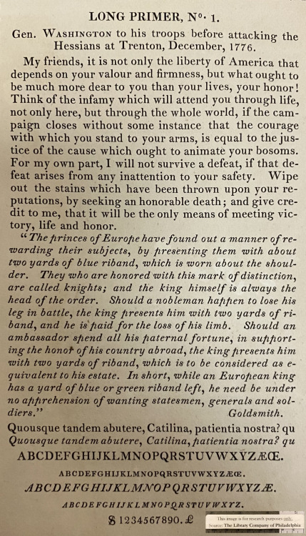
2nd illustration [iphone photo]: showing of long primer no.1 roman & italic [Specimen of Printing Type, from the Letter Foundry of James Ronaldson, successor to Binny & Ronaldson. | Cedar, between Ninth and Tenth streets, | Philadelphia. | 1822. [Am 1822 Ron 17455.O.1]. for the largest size of no.1, long primer, binny cut a variant, more cursive, italic p; & note the dollar sign—binny was the first to engrave this famous symbol.
with thanks to the library company of philadelphia for permitting my examination of their extremely rare binny & ronaldson material.
⎯⎯⎯⎯⎯⎯
¹ johnson refers to the types cut by richard austin of london for london publishing pioneer john bell—vide‹the letters of john bell›. the roman also shares affinity with baskerville’s—e.g. unclosed loop or bowl of g. updike affirms bell’s type but has no knowledge of bell: «The two upper sections in our plate (fig. 367) are set in a transitional font, which is, both in roman and italic, a fine and workable letter.» [updike, op. cit., p.243].
² latterly i discovered, harry carter posed the same question in his review of The Specimen Books of Binny and Ronaldson, 1809-1812, in facsimile [introduction c. c. rollins, the columbiad club, connecticut, 1936] in The Library [volume s4-xviii, issue 1, june 1937, p118].
³ original no.1 material still appeared in the 1853 specimen book of l. johnson & co., successor of richard ronaldson: the title-page, however, presents an anomaly—‘on the base of Sower’s Foundry of 1737’. apparently incorrect for christopher sower 1st had only imported his foundry from germany in 1772. i cannot find anywhere that sower material descended to binny & ronaldson [✓]; in particular, the foundry of christopher 2nd was worked by a german, justus fox, who fortuitously came into possession after the revolution due to disenfranchisement of christopher 2nd in consequence of previous affinities, & fox later purchased outright; de vinne reports «In 1806 Fox’s son [emanuel] sold the foundry to Samual Sower, son of Christopher Sauer 2nd [his 8th child], who had previously tried to establish a type-foundry at Baltimore, which attempt was renewed by him in 1815.» [de vinne, op. cit., p100]. thus sower family material reunited in the foundry that eventually evolved into The Baltimore Type Foundry, & which descended to be a constituent of the 1892 atf merger.
Post link
binny & ronaldson
reports of early type-founding in the usa tend to be anecdotal, but one fact is certain: in 1796 two scots émigrés entered into partnership (as to the details of their meeting reports are conflicting) & established the first full-time, professional type-foundry¹ in the usa, in philadelphia. skilled punch-cutter archibald binny, & businessman james ronaldson issued their first specimen book of ornamental material in 1809; indeed, the first such specimen book issued in the nascent usa, showing the firm’s ready repertoire of newly engraved ornamental material, as well as four sizes of type, the punches & or matrices for which binny presumably carried from edinburgh [p.j. conkwright, «Binny & Ronaldson’s First Type», PAGA, vol.1, 1953, p27]. their second specimen of 1812 shows new faces, replacing those of 1809, in prevailing fashion—no.2, a modern; & of the previous, transitional, fashion— vide‹b& r no.1›.
theodore low de vinne gives concise descendency of binny & ronaldson material: «The first founder in the United States of marked ability was Archibald Binny of Scotland, who had made types in a small way at Edinburgh. In 1796, in connection with James Ronaldson, he established a type-foundry in Philadelphia, which soon took the lead of the other foundries in that city. … He retired in 1819. James Ronaldson & Richard Ronaldson [jame’s brother] continued the business. ¶In 1820 Lawrence Johnson, a printer and native of England, established a stereotype foundry in Philadelphia. In 1833 he formed a partnership with George F. Smith for the purpose of buying the type-foundry of Richard Ronaldson. Under the new management the operations of the foundry were largely extended. In 1843 George F. Smith withdrew. In 1845 Johnson admitted to partnership Thomas MacKellar, John F. Smith, and Richard Smith, who had been trusted employees of this house. Peter A. Jordan was added afterword. Before his death in 1860 Johnson sold the foundry to his junior partners, who continued the business under the name MacKellar, Smiths & Jordan, and afterword of MacKellar, Smiths & Jordan Company, but the house has not lost its old name of the Johnson Foundry [presumably the premises]. In 1892 the Mackellar, Smiths & Jordan Company became the Philadelphia branch of the American Type Founders Company.» [Plain Printing Types, the century co., nyc, 1902, p102]. and thus descended the binny & ronaldson material to atf—vide‹b&r no.1›.
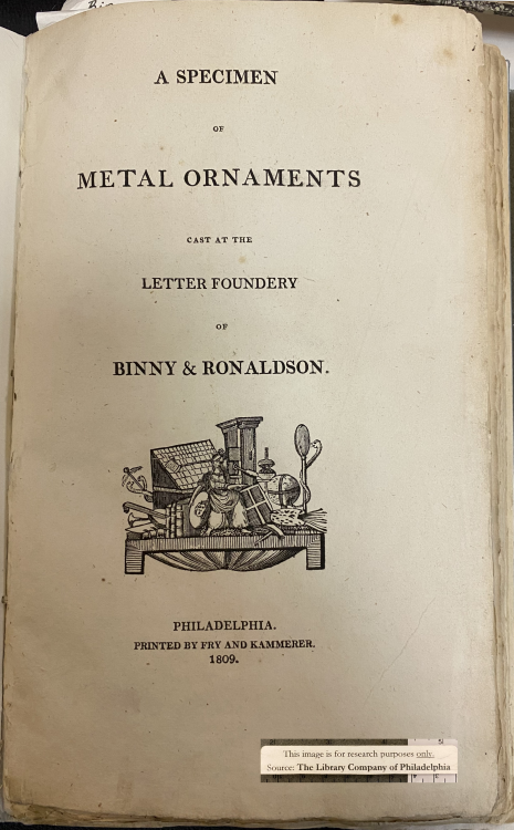
illustration:A Specimen of Metal Ornaments Cast at the Letter Foundery of Binny & Ronaldson. | Philadelphia. | Printed by Fry and Kammerer. | 1809. [Am 1809 Bin 13347.O .4]. with thanks to the library company of philadelphia for permitting my examination of this extremely rare specimen book.
⎯⎯⎯⎯⎯⎯
¹ others had attempted type-founding in english america before 1796, but most were unsuccessful, others succeeding only in a small way: isaiah thomas enumerates seven [isaiah thomas, The History of Printing in America, 3rd edition (original 1810), imprint society, barre, mass., 1970, pp28-32].
Post link
jenson’s rotunda
first illustrated is a setting of alfred forbes johnson’s statement regarding nicolas jenson’s rotundas, from his Type Designs [3rd ed., andre deutsch, london, 166, p17]. johnson capitalised Rotunda but not roman: for systematic capitalisation & to improve setting color i have set both lower-case. set in bruce roger’s centaur, roger’s neo-venetian homage to jenson. for more on centaur vide‹livius andronicus›. line finisher is digital reissue of monotype’s recutting of «Granjon’s flower on Bourgeois» (1558) [cf. hendrik d. l. vervliet, Granjon’s flowers, oak knoll press, new castle (del), 2016, p61].
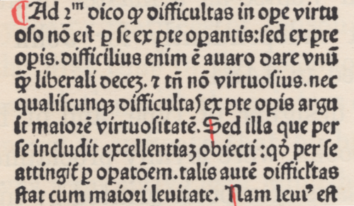
second illustration is facsimile of the final page from the Super Tertio Sententiarum of john duns scouts [johannis de colonia & nicolai iençon, venice, 1481]; plate 17 in theodore low de vinne’s Notable Printers of Italy during the Fifteenth Century [the grolier club, new york, 1910, p77]. the page is set in one of jenson’s small rotundas & concludes with colophon¹ & jenson’s device. «The type of the text is a Black-letter on 10 point body that may be accepted as a design approved by Jenson even if all punches were not cut by his own hand.» [ibid., p76]. the third illustration shows enlarged section of composition. i am amazed that there has been no digital revival of a jenson rotunda!
¹ translation given by de vinne: «Printed at Venice by the order and at the expense of John of Cologne, Nicolas Jenson & Company. In the year of our Lord fourteen hundred and eighty one. To God the praise.» [A Treatise on Title-pages, the century co., new york, 1902, p24].
Post link
fat face
apt german phrase, which permeates german literature. translation i like to give: gather together to form a composite. set in ultra bodoni [lanston monotype 675]; w/ tailpiece of ornamental border [lanston monotype 153-4].
letterpress on rives heavy weight, buff.
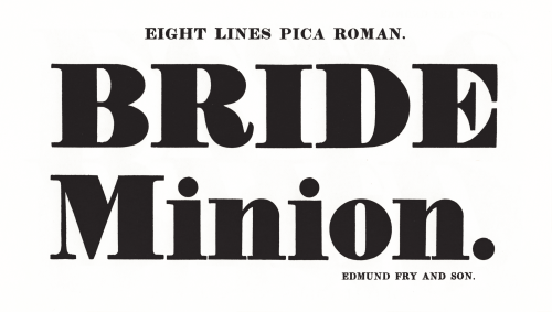
bodoni never cut anything so black as «ultra bodoni»! nicolette gray tells us that the process of fattening the modern cut for display purposes began with william cottrell in 1766, reaching a norm w/ edmund fry (2nd illustration) in 1816 [XIXth Century Ornamented Types and Title Pages, faber & faber, london, 1937, pp 22‒3]. but, she concludes: «The inventor of the fat face is generally considered to have been Robert Thorne. … It was he who was asked by the Imprimerie Royale in 1819 to cut a fat face for them.» [ibid., p25.]
theodore low de vinne gives an interesting account of the evolution of thorne’s face: «But great changes had been going on in public taste. Light faces were disapproved; bold and black faces were demanded. To meet the demand, Thorne showed in 1803 a full series of ‘improved types’ of the bold face which so seriously vulgarized the book printing of the first half of the century [19th]. Subsequent specimens from his foundry showed still blacker and more unsightly faces of large romans, but they were much admired and freely bought by printers in quest of novelty.» [Plain Printing Types, the century co., nyc, 1902, p100].
2nd illustration from facsimile: Specimen of Modern Printing Types by Edmund Fry 1828, printing historical society, london, 1986.
Post link
pointed runic
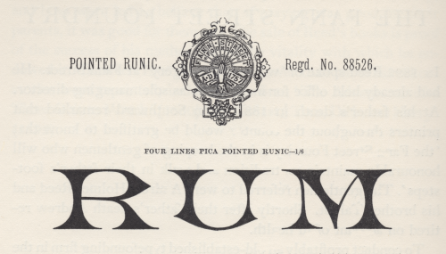
generally, i take the term runic to denote a fount of sorts requisite for setting the inscriptions of pagan, northern-germanic tribes in the letters they called runes [cf. isaac taylor, The Aphabet, vol.2, kegan paul, trench, & co., london, 1883, p210]. but in Plain Printing Types theodore low de vinne gives a taxonomy of types he assigns to the category «antique», & one is called runic: «Runic is the name given to another style of antique of light face, of condensed form, with pointed serifs, and often without lower case characters.» [the century co., nyc, 1902, p326]. perhaps here we get closer to the face illustrated, but not quite, i think.
stanley morison in his slim biography of Talbot Baines Reed [privately printed at the university press, cambridge, 1960] gives account of reed’s proprietorship of the type foundry he took over at his father’s death in 1881, the fann street foundry (vide footnote to ‹clarendon›); & morison shows several specimens from a fann street foundry catalogue [Specimens of Printing Types, Ornaments, &c, sir charles reed and sons, london, 1887], of which the illustration is one [op cit., p38]—morison must have found it striking. if runic is a species of antique, i do not see it in this face; or perhaps it was felt to resemble the ancient runes: there must be some logic in the name [✓].
Post link
clarendon
the original «clarendon» was registered by the firm thorowgood & co. of london, in 1845, while under the direction of robert besley; & was cut by besley’s partner benjamin fox at their fann street foundry*. «The type was an Egyptian with bracketed serifs and fulfilled a demand for a bold face suitable for dictionary work. It was so successful that the word Clarendon for a heavy type has become part of the common language. There had been types of similar design before Besley’s, which went under the name of Ionic.» [talbot baines reed (a.f. johnson, ed.), A History of the Old English Letter Foundries, faber & faber, london, 1952, p296].
of clarendon theodore low de vinne tells us: «Clarendon, a popular variety of condensed antique, was first made for the Clarendon Press of Oxford, to serve as a display letter in a mass of text-type, and for side headings in dictionaries and books of reference.» [Plain Printing Types, the century co., nyc, 1902, p331.] de vinne gives a taxonomy of «antique» faces: «Antique differs from roman [he means old-face roman] in the boldness of its lines: stem, serif, and so-called hair-line are always of greater thickness. … The intent of the designer was to produce, for purpose of display, a bolder style that should be as distinct and easily read as that of the old lapidary characters. For this reason it was called antique by some founders and egyptian by others.» (cp. ‹antique | egyptian›) according to de vinne square serif is a characteristic of a strict antique, but ionic antique has bracketed serifs & «has large face, open counters»; & a further square serif variant, the doric antique, «has features of roman» [ibid., p323-5]—added confusion as doric was «the Caslon name for Sans Serif» [reed, op.cit., p251], & i can discover no doric antiques in the bruce’s new-york type-foundry (de vinne’s main supplier) specimen book of 1869.
nicolette gray considers clarendon & ionic to denote the same type style: «Besley’s letter, in its slightly compressed form became the normal, but it was certainly not the first Ionic letter. The Ionic is an Egyptian with the slab serif bracketed and a definite differentiation between the thick and thin strokes. … In 1842 Caslon have an upper and in 1843 a lower case with the characteristics fully developed, but of normal width, and retaining the Egyptian E and F, without serifs to the middle arm.» [XIXth Century Ornamented Types and Title Pages, faber & faber, london, 1937, p51].
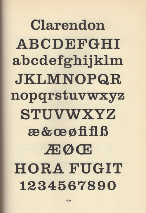
jan tschichold concurs with gray (some details muddled): «The fully developed ‘Clarendon’ dates from the year 1843 [ionic dates from 1843, clarendon was 1845]. The first form of this type, called ‘Ionic’ — quite similar to the Clarendon by the Haas Type Foundry depicted here — was cast by Henry Caslon, Type Foundry [sic], London.» [Treasury of Alphabets and Lettering, Rheinhold, New York, 1966, p233]. the hass’sche schriftgiesserei [münchenstein, switzerland] clarendon was drawn by hermann eidenbenz in 1951. the illustration above is tschicholds [ibid., p199]. for another clarendon revival vide‹volta›.
* the foundry founded by robert thorne in 1808, & acquired by william thorowgood at auction in 1820. robert besley became a partner in the firmc. 1838 at which time the foundry became styled thorowgood & co. upon thorowgood’s retirement the firm continued as robert besley & co, besley’s partner being his punch-cutter benjamin fox. in 1861 charles reed joined the firm, & the firm continued as reed & fox. after the death of fox in 1877 the firm continued as sir charles reed & sons, with talbots baines reed as sole proprietor until his death in 1893. operating until 1905 as a limited company, the material was finally acquired by stephenson, blake & co. [op. cit., pp 194 & 296-7.]
Post link

