#colour gamut

…in Photoshop.
I do all my Photoshop painting in RGB mode, then flatten those files and convert them to CMYK when it’s time to send them to my publisher to go to the printing press. Here’s why.
Let’s look at an image in which I’ve used a layer (handily named ”Screen”) with its blend mode set to “Screen” in order to simulate the light bloom from a big ol’ bonfire. This is the same document with the same layers, only the “Screen” layer ON and OFF. I painted it in RGB mode. It’s in RGB mode right now.

Let’s take this same layered file, and just change it into CMYK mode.
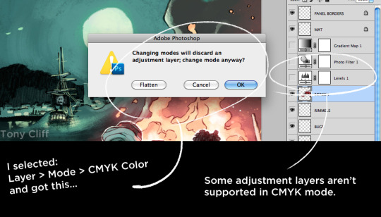
(First this happens: Photoshop doesn’t support my “Levels” adjustment layer in CMYK mode, so it’s going to throw it out during the conversion process.)
After the conversion, we get this:
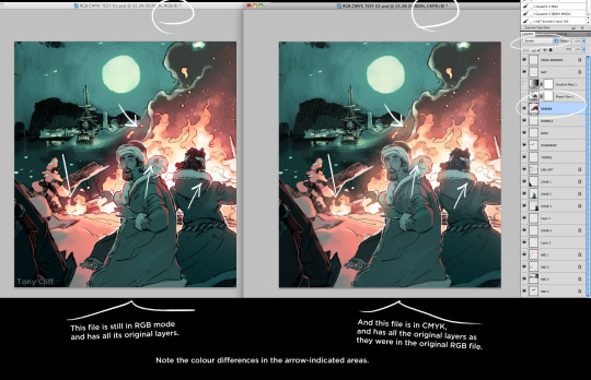
… now we have the original layered document in CMYK mode. Note the differences between the ways Photoshop accomplishes the Blend Mode rendering in each colour mode.

I’ve added some junk to help clarify. Again, notice how Photoshop handles that “Screen” blend mode in the RGB document versus the CMYK document.
If we take away all the other layers…

… you can see the “More Screen” layer is essentially identical, even though PS renders the Blend Mode effect differently.
Photo Filter adjustment layers operate differently, too…

Compare left and right. RGB on the left, CMYK on the right.
To send our painting to the printer AND preserve the original look of our Blend Mode and Adjustment Layer effects, just flatten the image before you convert the colour mode…
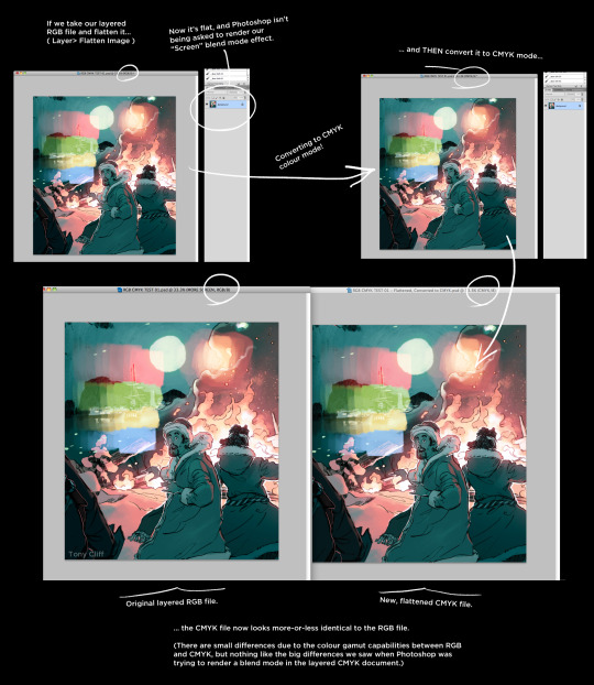
Photoshop “bakes” all our layer effects into one layer of definitive pixels, which can then be safely converted to CMYK without losing all the sweet juiciness of our original effects.
Now, CMYK can’t do everything, because the four-colour ink process (Cyan, Magenta, Yellow, blacK) just can not replicate the complete range of colours that the RGB (Red, Green, Blue) colour mode can produce. Welcome to “Colour Gamuts.”
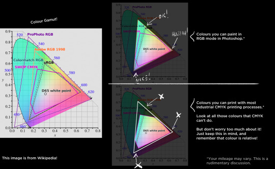
All you can do is keep this information in your mind. Remember that those hot pinks, rich teals, and deep purples will not survive the conversion to CMYK. But that’s okay – colour is relative,* so working within the CMYK colour gamut is no great pain.
[ * This is a topic of discussion for another day. Or, you know, look into it on your own. ]
Here’s an example of an image I painted that didn’t play well with CMYK:
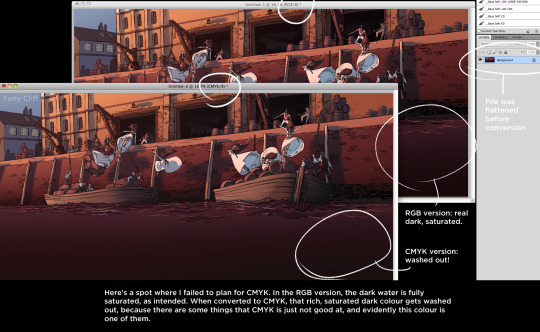
It may be hard to see, but the deep colours of the water turned bland and desaturated after being converted to CMYK. Oh well, you make adjustments and move on with your life.
Happy painting!
TL;DR:
- Blend modes look better in RGB
- Adjustment layers look better in RGB
- Bonus! RGB file sizes are smaller