#design theory
This time round we’re looking at the “bar”, the part of letters such as “A”, “H” and “e” where a horizontal stoke connects at both ends to other parts of a letter. Check out Danger Horse on Behance for more on typography.
Post link
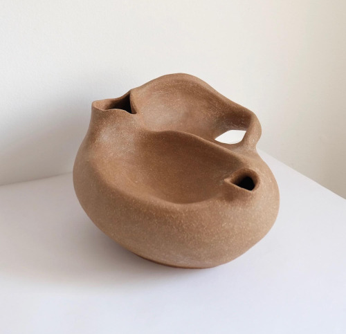
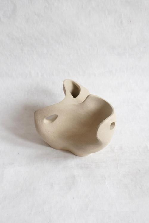
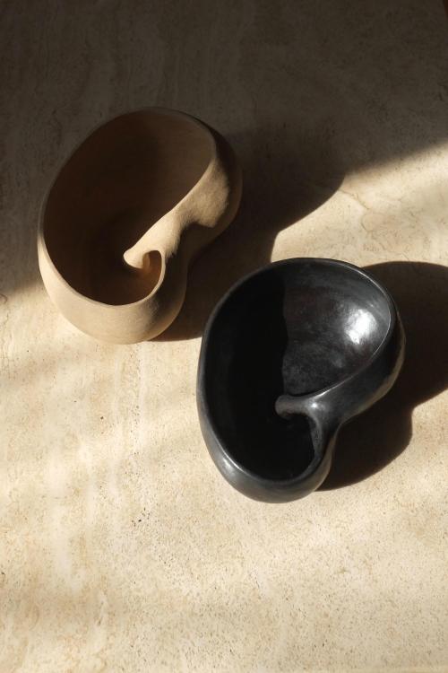
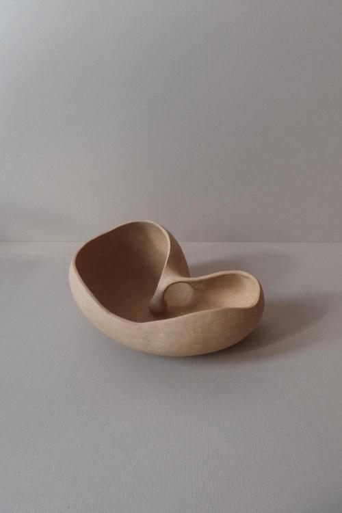
These vessels by Charlyn Reyes of somewhat aortic reference are really refreshing on the eyes. The bends and folds of the material, at moments, seem to be melting or caving inwards and in other moments, bulbous and strong like a beating heart. These pieces are a great example of how material and shape in tandem can create visceral responses on the human eye from familiarity and personal emotion. When I observe these as a person vs. observing them as an artist, I can admire that even though they seem to serve more as artful objects of display than functional ones, their form and humility still render them functional anyway. I find this to be true with various furniture/industrial designs, your artful eye may not want to use it but just admire it, shelf it, display it, yet, it begs to be used. I would say form over function is not always the intended consequence or result of well intentioned design.
Post link


