#economics
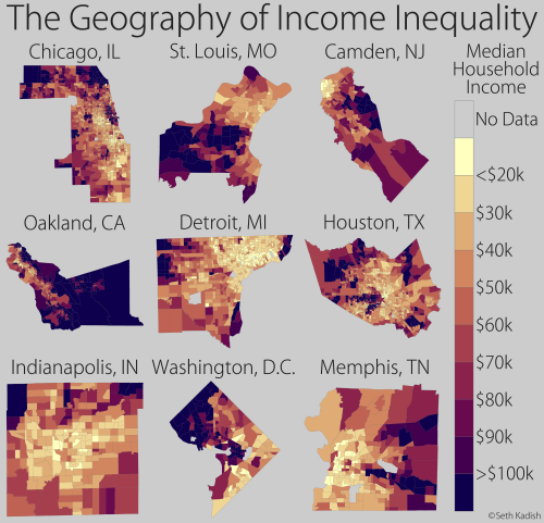
It’s no secret that the disparity in wealth is growing. This inequality manifests itself geographically; in most cities, the rich tend to cluster in opulent neighborhoods while poorer families live in more affordable areas. Here, I’ve mapped the median household income by census tract for nine counties (labeled by the largest city in the county). I selected cities that highlight the remarkable degree of economic segregation that can occur.
Data source: http://factfinder.census.gov/faces/nav/jsf/pages/index.xhtml (ACS 2013, 5-yr, B19013)
Post link
Many people believe that they can beat the stock market. Chancesare, they’re wrong. Fortunately, in the long run, the Dow trends upward, so if you have a diversified portfolio, your equity will generally grow. The approach of a day trader is far more complex because price fluctuations over the course of a day are highly unpredictable. They are not, however, random. With this in mind, I figured it would be interesting to identify which dates are more likely to see gains, and which are more prone to losses.
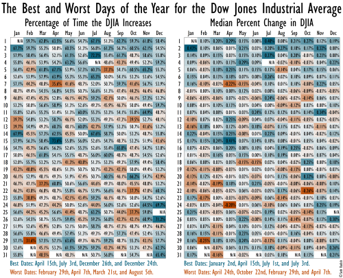
Using approximately 100 years of data (July 30th, 1914 – January 26th, 2015), I calculated the percentage change in closing price for the Dow Jones Industrial Average (DJIA) from day to day. I then ran summary statistics binning by day of the year, and selected two metrics to plot as heat maps.
For both maps, I’ve used a diverging color scheme centered on a neutral market (light gray). Blue cells signify market gains, while orange cells correspond to losses. White boxes with “N/A” are either dates that don’t exist, or fixed-date holidays when the market is closed (i.e., New Year’s Day, Independence Day, and Christmas).
The left map shows the percentage of time a given day sees an increase in the DJIA. For example, out of the 72 instances that the market was open on April 15th (Tax Day!), the Dow increased 53 of them, so it improved 53/72=73.6% of the time. One of the worst days occurs just over a week earlier, on April 7th; out of the 73 days it was open, the DJIA rose only 26, or 35.6% of the time.
The right map reveals the median percent change in the DJIA for each date. (Because the market can change significantly on a given day, the average and sum were both strongly influenced by outliers.) This generally shows the same pattern as the left map, but with different relative magnitudes. For example, while April 15th is the day that has most frequently seen gains, the median gain is not as large as that of January 2nd, when the median change in the DJIA is +0.43%.
The four best and worst days are listed under each map. April 15th is among the top four on each, and April 7th is in the bottom four on each.
Finally, note that this graph is intended for entertainment only – it should not be used for investment strategy!
Data source: http://measuringworth.com/DJA/
Post link


