#home owners loan corporation
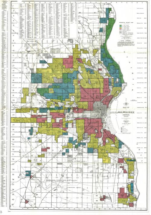
This map is probably our most popular one. Students, researchers, and media outlets alike ask to see this map every semester. It is a 1938 Milwaukee County residential security map prepared by Division of Research and Statistics with the co-operation of the Appraisal Department of the Home Owners’ Loan Corporation. It corresponds with a binder filled with notes and information about each section listed. The scale consists of four colors: blue, green, yellow, and red. According to this company, blue and green represented good areas to give loans, and red and yellow represented bad areas to give loans.
Residential security maps are most often called redlining maps, and these maps from 80 years ago show how modern cities are affected by the past. What better example of systemic racism is there than to see mainly non-white communities labeled red on this map?
As one of the most segregated cities (if not the most segregated city) in America, this map shows roots of this problem. When I-43 was built, it was constructed in predominantly black communities. Not only was the interstate built where black people lived but in places where black businesses were successful. All of this I’ve learned from students and researchers who have come into the AGSL to tell this map’s story and its effect on our city today.
Call number: 893-c .M54 E-1938 2015
[Image description: A map of Milwaukee County, Wisconsin, showing different sections of the county in four colors: blue, green, yellow, and red.]
Post link

