Hi everyone! Today, I have a bit of a smaller post seeing as yesterday I showcased a drawing I’m quite proud of with a particularly lengthy design process to go with it, though what I have for thispost is something I’ve been wanting to show off for a short while now!
A few days back, when looking at Mega Man Ultimate’s stage select (The most recent version from 2020, in particular), I decided that it was high time that certain aspects of it got a revision— most specifically, the bulky stage select icon borders.
While the portraits of the eight robot masters have been constantly reworked and improved upon since each one’s conception, the stage select icon borders have remained untouched since I first started making Mega Man Ultimate content back in 2018. Given I’ve had four whole years of sprite practice under my belt since then, it was time for a redraw!
When drawing a new stage select icon border, I took inspiration from the ones used in Mega Man 2 andMega Man 4, the former of which being my main reference. The initial 2018 borders have always felt a bit clunky to me, and there’s a lot going on on all sides of it (Figuratively and literally).
Upon setting out to make a slimmer, more compact redesign, I wanted the border itself to be a lot more simplistic than the version from four years ago. Really, all I needed were some cool blue gradients and the classic blinking corner lights, and it didn’t actually take me that long to whip something up with those design choices in check!
And that’s not all— if you look really closely between both portraits of Amazon Man, you may be able to make out a few small changes so that his portrait looks the best it can be! I redrew the leftmost side of his helmet and eyes a slight bit, fixed the shading on his head so that it looks a bit more vibrant, and extended his right pupil up a pixel. While small, these changes make his portrait look leaguesbetter than before!
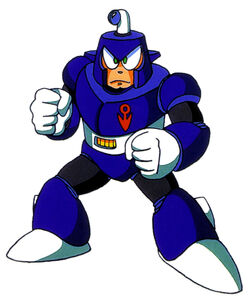
While we’re on the topic of SLN-004, it was when I had been making these changes that I wanted to try something in pertains to Amazon Man’s design that I had not once ever considered before… what would he look like withouthis usual mouthpiece?
The answer is a little something like this! While not a permanent change to his design, the minute ‘mouthpiece-less Amazon Man’ crossed my mind, I just hadto attempt spriting out what he would look like without it!
I’ve always envisioned Amazon Man to have a slightly darker, more tan skin tone than the usual lighter tone that most humanoid robot masters tend to have, similar to Blast Man. In addition, I felt that it would be appropriate to continue to stray from the norm by giving him a broader chin, which hasn’t been seen in a robot master since Dive Man.
The full, reworked version of Mega Man Ultimate’s stage select should be up very soon— since all that’s left for me to do is figure out one last portrait— but for the time being, enjoy this sneak preview of what to expect for it!


