Hi everyone! Today, I have a bit of a smaller post seeing as yesterday I showcased a drawing I’m quite proud of with a particularly lengthy design process to go with it, though what I have for thispost is something I’ve been wanting to show off for a short while now!
A few days back, when looking at Mega Man Ultimate’s stage select (The most recent version from 2020, in particular), I decided that it was high time that certain aspects of it got a revision— most specifically, the bulky stage select icon borders.
While the portraits of the eight robot masters have been constantly reworked and improved upon since each one’s conception, the stage select icon borders have remained untouched since I first started making Mega Man Ultimate content back in 2018. Given I’ve had four whole years of sprite practice under my belt since then, it was time for a redraw!
When drawing a new stage select icon border, I took inspiration from the ones used in Mega Man 2 andMega Man 4, the former of which being my main reference. The initial 2018 borders have always felt a bit clunky to me, and there’s a lot going on on all sides of it (Figuratively and literally).
Upon setting out to make a slimmer, more compact redesign, I wanted the border itself to be a lot more simplistic than the version from four years ago. Really, all I needed were some cool blue gradients and the classic blinking corner lights, and it didn’t actually take me that long to whip something up with those design choices in check!
And that’s not all— if you look really closely between both portraits of Amazon Man, you may be able to make out a few small changes so that his portrait looks the best it can be! I redrew the leftmost side of his helmet and eyes a slight bit, fixed the shading on his head so that it looks a bit more vibrant, and extended his right pupil up a pixel. While small, these changes make his portrait look leaguesbetter than before!
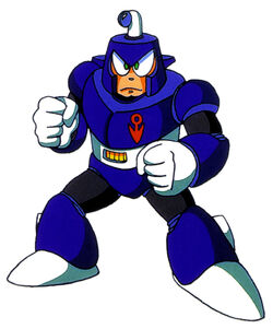
While we’re on the topic of SLN-004, it was when I had been making these changes that I wanted to try something in pertains to Amazon Man’s design that I had not once ever considered before… what would he look like withouthis usual mouthpiece?
The answer is a little something like this! While not a permanent change to his design, the minute ‘mouthpiece-less Amazon Man’ crossed my mind, I just hadto attempt spriting out what he would look like without it!
I’ve always envisioned Amazon Man to have a slightly darker, more tan skin tone than the usual lighter tone that most humanoid robot masters tend to have, similar to Blast Man. In addition, I felt that it would be appropriate to continue to stray from the norm by giving him a broader chin, which hasn’t been seen in a robot master since Dive Man.
The full, reworked version of Mega Man Ultimate’s stage select should be up very soon— since all that’s left for me to do is figure out one last portrait— but for the time being, enjoy this sneak preview of what to expect for it!
Longtime followers of mine may have seen my faux Mega Man Ultimate screenshots, which range from exemplary stage designstofull-on boss battles! However, it’s been a little while since I’ve made another sprite piece of what certain in-game moments of Mega Man Ultimate would look like, and for my next screenshot, I knew just what I wanted to sprite!
My last faux screenshot detailed the electrifying battle against SLN-001, Zap Man, and seeing how easy it was to sprite full screens with the magic of tilesetting, I aimed to make a mockup of a battle against another one of the Synth Legion Numbers, Satellite Woman! And unlike Zap Man’s simpler NES-esque boss arena…
… the boss arena of SLN-003 has a lot more going on!
Who doesn’t love space? When it came time for me to decide which of the eight Synth Legion numbers to devote my next boss battle mockup to, Satellite Woman was my first choice, because that meant I got to sprite an out of this world background for her by way of tilesetting!
And there was a lot I could do with it, too. While I initially didn’t have a whole lot of ideas as to what Satellite Woman’s boss arena could look like, I did eventually come up with two goals: for it to have a Mega Man V feel to it as well as referencing her bio, which mentions her base of operations being exactly one hundred parsecs away from Earth.
This is what I came up with! One of the earliest design decisions I made was that I wanted to have Mega Man fall into the boss arena rather than walk into it— we haven’t had a lot of robot master boss arenas of a vertical caliber since the original Mega Man! Fortress bosses have entrances of this type, so why can’t more robot masters?
Secondly, the arena lacks walls, because I find that the quarters in which you do battle with Satellite Woman feel a lot more vast without them than they would with the usual boss-in-the-box formula. I first planned on having the satellite platform be shorter in width, where if you fell off, it’d be a one-hit KO, but I felt like that wouldn’t be too fair (Even if Cloud Man did it first).
Perhaps the most appealing part about the entire background are the drifting satellites and the gorgeous view of Earth— both of which took me quite some time to sprite! The Earth sprite in particular (Which I think was the asset that took me the longest to sprite) fits snugly into a 32x32 tile, whereas the satellites make up a 48x48 tile.
The last design choice I’d like to mention are the colors in this piece. For Satellite Woman’s boss arena, I wanted to stray away from the usual NES limitations and go for something a little more flashy— hence my decision to make the space background all kinds of blue hues instead of a solid black (Plus, if I went with the latter, you wouldn’t be able to make out Satellite’s complex sprites very well!).
I kept switching between purple and light green for the bottom platform, and when I couldn’t reach a consensus, I tried a turquoise color to see what that would look like, and it made for a stellar in-between! It was always a given for the space station up above to be colored after Satellite Woman, so I didn’t have a lot of trouble figuring out colors there.
And finally, as I’ve started to do for my art posts, this was the process I went about in designing the arena! Starting with a conceptual sketch of the room I drew in MS Paint, it follows up with a general layout made up of placeholder green and purple tiles, and from there you can see the final product start to form!
With design specifics out of the way, we can touch base on what it’s like to be pitted against the connoisseur of the cosmos, Satellite Woman! Her battle takes a lot of inspiration from Star Man’s battle from Mega Man 5, with the emphasis on the robot master constantly being shielded and zero-gravity jumping aplenty.
When she’s not putting her Reflect Satellite to good use, Mega Man may attempt to land a blow on her… if she doesn’t land a blow on him first! The only time you can do damage to Satellite Woman is when her shields are down or when she’s firing lasers from her Satellite Buster (Pictured above), so it’s very much easier said than done…
That is, of course, unless you arrive with her weakness weapon in tow!
Enter Glitch Strike, the weapon you acquire after defeating the bug-tastic Glitch Man! Glitch Strike allows Mega Man to speedily glitch a lengthy distance in any direction, passing through any projectiles without harm and— with precise aim— may ram into opponents. However, this ability comes with a hefty energy cost (Much like Tornado Blow in Mega Man 9), and you’ll only see four or five uses of it with a full meter. Better use them wisely!
Well, that’s about everything— this ended up being one of my biggest sprite pieces in a while, and it took a whole lot of thought and experimentation to look just right! I hope you’ve enjoyed reading through the design process, and more importantly the fruits of my labor!
One of the things that I love the most about the Classic Mega Man series is its artstyle. It’s very anime-esque with a slight twinge of toon, and there’s a surprising amount of detail that goes into each art piece drawn by Mega Man illustrator Keiji Inafune (Such as how robot masters and characters like Mega Man and Roll have different pupil types and the infamous ‘Capcom hand’).
Naturally, ever since 2015, I’ve been trying my hand in seeing how accurately I can replicate the Mega Man artstyle, and considering I mentioned planning to make a full Famicom styled box art piece for Mega Man Ultimate, I decided it was about time to dive back in to researching Mega Man’s artstyle to make said art piece as 1:1 to official artwork as I can!
And where better to start with the centerpiece, Mega Man himself? Back in December of 2020, I drew a Classic styled Mega Man in honor of his 33rd anniversary, and while it was decent enough in its own right given my skillset at the time, this time I wanted to go all out in drawing a full-body Mega Man while keeping a lot of Inafune’s art choices in check…
… which resulted in the best Mega Man I’ve ever drawn!
Looking at a character like Mega Man, you’d think he wouldn’t be too difficult to draw, and design wise, he’s not. The simplicity of his armor and few colors actually make him— in theory— pretty easy to draw.
But when you’re attempting to match the actiony grandeur that is the key artwork for more recent Mega Man games on top of keeping an eye on proportions, shading styles, and shaping everything just right… then it becomes a tad hard.
So, when I sat down to draw Mega Man, I made the decision to start with arguably the most important part… the head.
To me, if you’re going after a stylistically accurate Mega Man, his head is detrimental in getting just right. This is easier said than done, because his helmet isn’t just a circle; it’s more ovular and widens toward the top, leaving the base of the helmet to be a bit slimmer.
Above, you can see two preliminary sketches I whipped up in preparation for the digital outline phase. While they look fairly similar, each one has a focus: the leftmost sketch was primarily focused on getting the head to look nice (Which took about forty-five minutes by itself!), as well as drawing a good buster.
The righthand sketch was more focused on Mega Man’s pose, explaining the placeholder head and buster. I was originally going to jump right into taking the left sketch and digitalizing it, but when I felt like the hand and legs could be drawn better, I made an additional sketch to merge with the first.
Woah! Here’s something new: just like how I’ve begun showing the spriting process for some of my sprite works, here’s the process I went about when digitalizing my Mega Man sketch after I had finished reshaping everything in my drawing software: from outline to flat color to the end result!
Interestingly, when I first got done drawing Mega Man, I thought it looked great… but I wasn’t a fan of how he looked proportionally, as I thought his arms and legs looked a little short. When I had been searching for reference images to base my sketches on, I noticed that Mega Man’s legs especially are a bit lengthy, so I redrew 45% of my then-final result with these changes in mind, which resulted in the version shown in this post.
I’m really impressed with myself on how great I got this piece of Mega Man to look, since shading and posing aren’t my forte— it feels nice to have one of the tougher aspects of MMU’s eventual box art drawn, and I hope you’ve enjoyed both the art and reading the process behind it!
Those who follow my self-ship sideblog (And read the tags of my posts at that) may have caught wind that I’ve started to get back into the Mega Man series quite a bit as of late, and I’m really excited to get around to making more Mega Man content, whether that’s resprites of my favorite robot masters throughout the franchise or sprite pieces revolving around Mega Man Ultimate!
I did want to make this post to ask any of my followers who may have followed me specifically for my Mega Man related posts a question, however— is there a certain variety of post you’d like to see? Of course, there are the aforementioned resprites and MMU related posts, but I’ve also been thinking a bit about a few other things to devote posts to…
This year, I want to see if I can practice to really get a good grasp of the classic Mega Man artstyle, so that I may draw key art of the Mega Man Ultimate robot masters as well as making a Famicom box art styled piece for MMU. I was also considering on making deep dive posts for certain titles in the franchise that would double as insight on each game’s development or my favorite/not-so-favorite aspects of each title… maybe I’ll even post about my robot master OCs you haven’t seen yet
Regardless, expect to see more stuff pertaining to the blue bomber in due course!
Hi everyone! Today, I have a bit of a smaller post seeing as yesterday I showcased a drawing I’m quite proud of with a particularly lengthy design process to go with it, though what I have for thispost is something I’ve been wanting to show off for a short while now!
A few days back, when looking at Mega Man Ultimate’s stage select (The most recent version from 2020, in particular), I decided that it was high time that certain aspects of it got a revision— most specifically, the bulky stage select icon borders.
While the portraits of the eight robot masters have been constantly reworked and improved upon since each one’s conception, the stage select icon borders have remained untouched since I first started making Mega Man Ultimate content back in 2018. Given I’ve had four whole years of sprite practice under my belt since then, it was time for a redraw!
When drawing a new stage select icon border, I took inspiration from the ones used in Mega Man 2 andMega Man 4, the former of which being my main reference. The initial 2018 borders have always felt a bit clunky to me, and there’s a lot going on on all sides of it (Figuratively and literally).
Upon setting out to make a slimmer, more compact redesign, I wanted the border itself to be a lot more simplistic than the version from four years ago. Really, all I needed were some cool blue gradients and the classic blinking corner lights, and it didn’t actually take me that long to whip something up with those design choices in check!
And that’s not all— if you look really closely between both portraits of Amazon Man, you may be able to make out a few small changes so that his portrait looks the best it can be! I redrew the leftmost side of his helmet and eyes a slight bit, fixed the shading on his head so that it looks a bit more vibrant, and extended his right pupil up a pixel. While small, these changes make his portrait look leaguesbetter than before!
While we’re on the topic of SLN-004, it was when I had been making these changes that I wanted to try something in pertains to Amazon Man’s design that I had not once ever considered before… what would he look like withouthis usual mouthpiece?
The answer is a little something like this! While not a permanent change to his design, the minute ‘mouthpiece-less Amazon Man’ crossed my mind, I just hadto attempt spriting out what he would look like without it!
I’ve always envisioned Amazon Man to have a slightly darker, more tan skin tone than the usual lighter tone that most humanoid robot masters tend to have, similar to Blast Man. In addition, I felt that it would be appropriate to continue to stray from the norm by giving him a broader chin, which hasn’t been seen in a robot master since Dive Man.
The full, reworked version of Mega Man Ultimate’s stage select should be up very soon— since all that’s left for me to do is figure out one last portrait— but for the time being, enjoy this sneak preview of what to expect for it!
Longtime followers of mine may have seen my faux Mega Man Ultimate screenshots, which range from exemplary stage designstofull-on boss battles! However, it’s been a little while since I’ve made another sprite piece of what certain in-game moments of Mega Man Ultimate would look like, and for my next screenshot, I knew just what I wanted to sprite!
My last faux screenshot detailed the electrifying battle against SLN-001, Zap Man, and seeing how easy it was to sprite full screens with the magic of tilesetting, I aimed to make a mockup of a battle against another one of the Synth Legion Numbers, Satellite Woman! And unlike Zap Man’s simpler NES-esque boss arena…
… the boss arena of SLN-003 has a lot more going on!
One of the things that I love the most about the Classic Mega Man series is its artstyle. It’s very anime-esque with a slight twinge of toon, and there’s a surprising amount of detail that goes into each art piece drawn by Mega Man illustrator Keiji Inafune (Such as how robot masters and characters like Mega Man and Roll have different pupil types and the infamous ‘Capcom hand’).
Naturally, ever since 2015, I’ve been trying my hand in seeing how accurately I can replicate the Mega Man artstyle, and considering I mentioned planning to make a full Famicom styled box art piece for Mega Man Ultimate, I decided it was about time to dive back in to researching Mega Man’s artstyle to make said art piece as 1:1 to official artwork as I can!
And where better to start with the centerpiece, Mega Man himself? Back in December of 2020, I drew a Classic styled Mega Man in honor of his 33rd anniversary, and while it was decent enough in its own right given my skillset at the time, this time I wanted to go all out in drawing a full-body Mega Man while keeping a lot of Inafune’s art choices in check…
… which resulted in the best Mega Man I’ve ever drawn!


