#web typography
Ampersand Conference 2015 roundup | Londondesignz.com
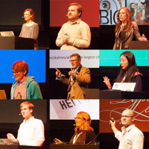
After a year’s hiatus, Clearleft’s Ampersand Conference returned to Brighton with another event focussed on web based typography, and a packed day of inspirational speakers. Despite the seemingly niche focus, I think it would appeal to a wide range of people interested in broader typography and lettering — I had a great time and learnt lots, so do keep an eye out for future events. Here’s a quick summary of the talks plus a few of my own favourite moments.
Down with web typography, Indra Kupferschmid
Indra provided some very in depth pointers for type on the web in different scenarios, looking at different kinds of content and what the typographic requirements and considerations were for each.
To hell for type, Marcin Wichary
Marcin designs for medium.com where his self instigated mission is to bring world-class typography to its readers, meaning a lot of inventive thinking to break out of the restrictions of the web and its underlying technology. This usually relies on a wild range of blatant hacks. To paraphrase Marcin, nothing good ever happens when you use ‘auto’ in typography!
Incidentally, I’ve just noticed that he’s posted a great article about one of the anecdotes he touched on during his talk — specifically about how an ancient Windows font predating the web came back to haunt medium.com. So taken with its reappearance, that he created a little easter egg — to turn it on, go to the Medium homepage or search page, search for C:\WINDOWS (all uppercase!), and press Enter.
Modern layouts: Getting out of our ruts, Jen Simmons
Some great thinking from Jen who is encouraging us as designers to break out of the confines of lazy web designs and standard page layouts by experimenting with tools that are available today.
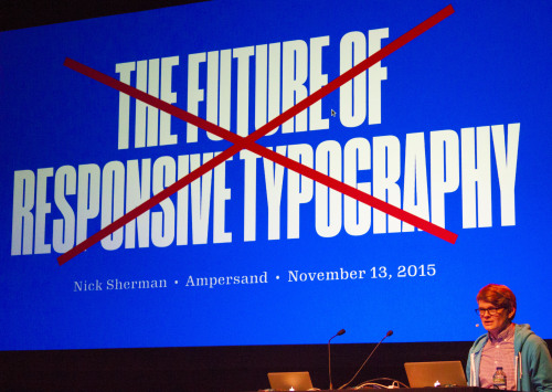
The future of responsive typography, Nick Sherman
Historically, type was made for specific reasons or particular applications, but in digital era typefaces could be used to do things they weren’t intended for. Nick discussed the issue and possible solutions around context specific typography and the technical roadblocks to doing it efficiently without resorting to loads of hacks.
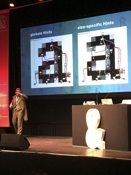
Designing typefaces for screens, Bruno Maag
Perhaps not surprisingly at an event like this, Font Hinting reared its head several times during the day (it always does at Ampersand). Swiss type designer Bruno Maag could write a thesis on the subject. He confesses that he likes pixels, black and white, even yes and no as it all makes things simpler, but the challenge of designing type for screen is the presence of anti-aliasing and RGB. With this in mind, he took us through designing for Kindle.
Chinese design for westerners, Lu Yu
Lu Yu provided a great overview of the challenges of designing for web in China. Areas touched upon included the differences between Western and Chinese culture, the variety of reading directions in Chinese languages and the vast range of characters in the Chinese character set.
Designing Pelican books, Matthew Young
Matthew designs Pelican books; both the physical paperbacks and their digital equivalents. He pointed out that each new reading format tended to copy aspects from older ones (I’m guessing to help readers of these new forms to feel a sense of familiarity in these unfamiliar environments). For example, early ebook designers mimicked physical books with pseudo page turns and similar items that might not be so appropriate for the newer medium with hindsight. While digital formats such as ebooks should avoid literal copying of printed books, designers still need to strive for consistency across platforms.
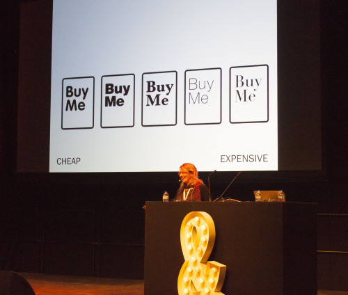
Think outside the font, Sarah Hyndman
Typetasting supremo Sarah Hyndman ran a great session peppered with games that backed up her on-going research into the psychology of type. She demonstrated how the shapes of fonts can change our perception of something for example actually making food seem to taste different.
The next steps for web typography, Marko Dugonjić
Marko closed the conference by showing how typographic design can be pushed beyond the constraints of the web. One of the unwritten themes of the day was about the limitations of the web dampening the designer’s creativity — Marko tackled this with a heads up on some CSS techniques we can use today to mix things up a bit, along with a few best practice pointers.
Post link
Ampersand Conference 2015 | Londondesignz.com
I’m at the Ampersand Conference in Brighton today. Time permitting I will try and blog as I go, but then again, there’s some great thinking coming from the speakers.
We’ve just seen Marcin Wichary from Medium.com who took us through some of the technical challenges of great typography across multiple platforms and before him was Indra Kupferschmid who had some very in depth pointers around type on the web for different situations.
More to follow…
Post link

