#alfred forbes johnson
blado’s aldine italic
a.f. johnson tells us of antonio blado’s aldine italic¹: «He printed some admirable volumes in an Aldine italic, in particular the first editions of various works of Macchiavelli [sic], 1531 and 1532. … No printer produced a better book in this style of type.» [Periods of Typography | The Italian Sixteenth Century, ernest benn, london, 1926, p11]. unfortunately, johnson did not provide a facsimile of this notable typeface; nor indicate who cut blado’s aldino² [✓]. casting around, i was delighted to discover copies of Il principe[The Prince]³ & Historie⁴, both 1532, held in the morgan library, nyc; & formed a plan to examine these at first opportunity.
with thanks to the morgan library for permitting my examination of these lovely & important books. unfortunately, departing the morgan’s reading room, my request to illustrate this post with my photos was declined by reading room staff: alas, illustration deferred until next visit to a more «humanistic», european library [✓].
¹ italic after the style of the first italic cut for aldus manutius in 1501 by francesco griffo.
² «The Italians called the character Aldino.» [d.b. updike, Printing Types, vol.1, oup, 1937, p129].
³PML 52863.
⁴PML 62958.
Post link
jenson’s rotunda
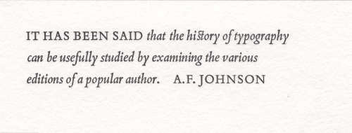
first illustrated is a setting of alfred forbes johnson’s statement regarding nicolas jenson’s rotundas, from his Type Designs [3rd ed., andre deutsch, london, 166, p17]. johnson capitalised Rotunda but not roman: for systematic capitalisation & to improve setting color i have set both lower-case. set in bruce roger’s centaur, roger’s neo-venetian homage to jenson. for more on centaur vide‹livius andronicus›. line finisher is digital reissue of monotype’s recutting of «Granjon’s flower on Bourgeois» (1558) [cf. hendrik d. l. vervliet, Granjon’s flowers, oak knoll press, new castle (del), 2016, p61].
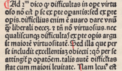
second illustration is facsimile of the final page from the Super Tertio Sententiarum of john duns scouts [johannis de colonia & nicolai iençon, venice, 1481]; plate 17 in theodore low de vinne’s Notable Printers of Italy during the Fifteenth Century [the grolier club, new york, 1910, p77]. the page is set in one of jenson’s small rotundas & concludes with colophon¹ & jenson’s device. «The type of the text is a Black-letter on 10 point body that may be accepted as a design approved by Jenson even if all punches were not cut by his own hand.» [ibid., p76]. the third illustration shows enlarged section of composition. i am amazed that there has been no digital revival of a jenson rotunda!
¹ translation given by de vinne: «Printed at Venice by the order and at the expense of John of Cologne, Nicolas Jenson & Company. In the year of our Lord fourteen hundred and eighty one. To God the praise.» [A Treatise on Title-pages, the century co., new york, 1902, p24].
Post link
we may wish to know who first said it, but apt dictum from alfred forbes johnson. his next line reads: «This may very well be done in the case of Petrarch in the sixteenth century, of whom there were scores of editions.» [Periods of Typography | The Italian Sixteenth Century, ernest benn, london, 1926, p7.]
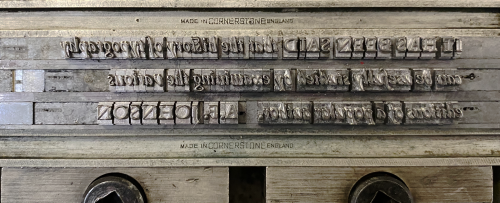
set in a custom fount of bembo italic—more fount info.
letterpress on johannot.
Post link


