#letterpress


分享一本便條本的製作過程,本本皆辛苦。
年初我幫Emerald Publishing設計了一款羽毛紅包袋,客戶很喜歡,便希望我用同款圖文設計一款便條本。
這款便條本封面用的色箔是雷射銀,在不同的角度下會展現七彩的顏色變化,而內頁我安排了十色不同的鋼筆用紙,這樣隨著四季的更迭使用不同顏色的內頁記事,讓紀錄行程多一份樂趣。
感謝晨欣凸版印刷社的師傅們幫忙,在檢查內頁的時候居然是「一張張」檢查,感受到職人們對於品質的龜毛堅持!
印刷:晨欣凸版印刷社
先前有朋友問到紅包上面的「金架派」字體是什麼,今天就帶大家來看它的設計過程,實際上其實很簡單,只是把筆畫畫出來,掃描進電腦拼成字就完成囉!
設計這款多用途的紅包盒,除了外表看起來像蘋果派盒獨樹一格以外,初衷是希望大家包完紅包之後,錢拿出來,紅包盒還可以留下來作為交換禮物的禮盒、筆盒使用,將長輩的祝福帶在身邊繼續用。
▼我的文具紙品快速一覽
▼虎記甜品紅包盒,單個NT.80
▼虎記小肉球春聯,兩張NT.50
▼月曆+紅包+春聯優惠套組
不用蝦皮的朋友,可以直接私訊晨欣凸版印刷社購買。
感謝發行印刷、技術指導:晨欣凸版印刷社
地址:台中市西區五權西六街115號
電話:(04)23730246


不解釋辦公桌明信片
和晨欣印刷合作推出的凸版印刷品《不解釋辦公桌明信片》
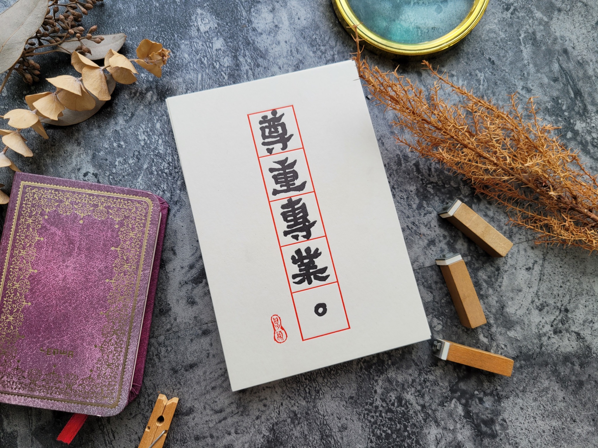
一開始是金哥嘴砲說他要在機台旁邊掛「尊重專業」,給那些不懂裝懂的客人看,然後大家就七嘴八舌許願各種辦公桌告示牌,然後字就寫了,還是用左手寫的,然後就印了,然後就放了三年。
啊印好了結果大家都小孬孬,沒勇氣把尊重專業掛出來~
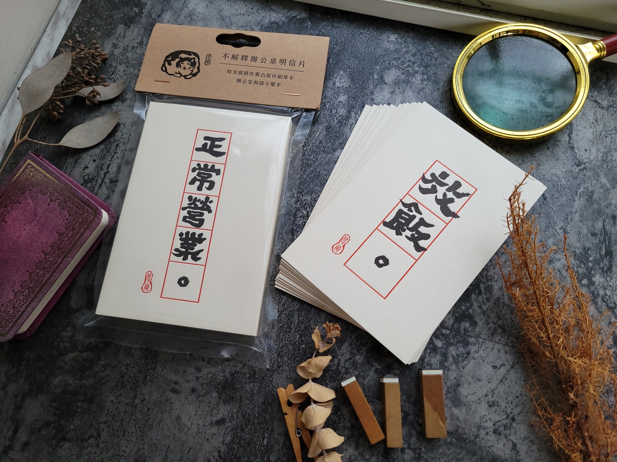
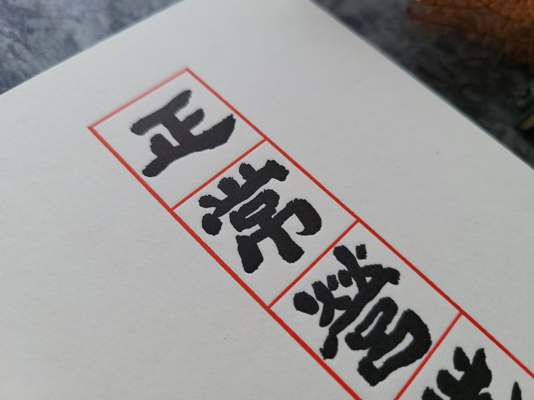
這套明信片是小小的告示牌,12種不同的辦公室標語,從最常用的「電話中」,到一根軟釘子「明日請早」,擺在桌上就是最委婉地提醒,用看的誰都不委屈,大家互相體諒。

明信片採凸版印刷,當時挑的是近一公釐的厚卡,但死白的卡紙總覺得少了點溫度,當時阿金表示這款紙張會隨著時間過去逐漸黃化,於是我們實驗性的試著把這套卡片封存近三年時間,一直到等到呈現質樸的米黃感才終於解封。
▼購買請直接私訊粉專
▼或至他們的蝦皮選購
https://shopee.tw/sunrise.letterpress
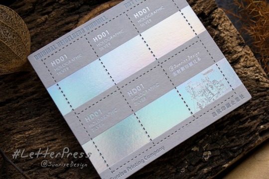
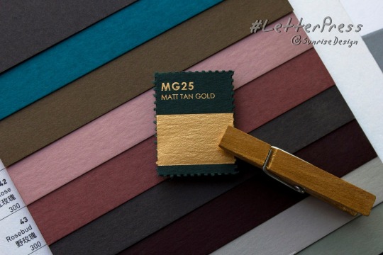
這是我和晨欣印刷合作推出的設計師工具:《可撕式燙金小色票》,為了解決和客戶溝通設計卡片時,最常碰到的問題:
- 手上沒有紙樣,客戶難以體會紙品的質感。
- 有些特殊的金箔難以用照片呈現,比如雷射透明箔、珍珠箔,只能靠螢幕憑空想像。
- 客戶不了解凸版燙金的限制,硬要印結果成品不如想像中的如意。
- 用太閃亮、太透明的色箔印名片,結果內文都看不清楚。
這款燙金小色票,是這樣用的:
- 15張常用的英國新百代卡紙+15種色箔,看色更準確。
- 可撕下來的小色票設計,方便開會or給客戶帶回家參考
- 可以撕下來附在設計稿上,方便印刷廠校對印刷色樣。
- 方便溝通,避開印刷風險。
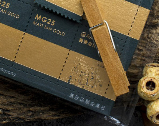
這款色票的重點在右下角那張小色票,我故意做了「錯誤示範」,請看下圖:
- 小不拉嘰的字+粗細相差太大的中文字體,容易燙糊。
- 在大色塊裡放了太細的線條,會使得金箔容易沾黏、燙糊。
所以碰上客戶堅持「字小、還要再小!」或是這種有口說不清的時候,直接給他看印刷後果更清楚。

那麼,萬一客戶堅持要字小小,但成品還是要很清楚怎麼辦呢?
請看色票右下角的「晨欣印刷企業社」七個小小字,是不是印得很清楚,但沒有糊?
這是因為那七個字不是燙金,而是油墨印銀,雖然閃亮度沒有金箔好,但是細節都能印得很清楚,建議客戶用油墨代替燙金,也是個好方法唷!
▼購買請直接私訊
▼或至他們的蝦皮選購

“Alphabet G” print by Luca Barcellona. White-on-white letterpress edition of 10.
Get yours at Luca’s shop
Post link


About these beauties:
-Hand-printed posters composed of wood type, manufactured by the Hamilton Manufacturing Co.;
-letterpress printed on a Vandercook printing press using foundry and wood type;
-created during the summer of 2014 for an exhibition at the Haley Gallery at the Country Music Hall of Fame in Nashville, TN.
Bee, Small Beetle and Snail are part of the Hamilton Wood Type & Printing Museum collection.
Title: Letterbugs
Artist: William Moran, 1962-
Newberry call number: Wing broadside ZPP 2083 .M675
Post link

Chicagoans, get your bicycling in before the heat wave!
Letterpress poster created by Bill Moran of Blinc Publishing, a print and design studio located in Saint Paul, Minnesota.
Collection:Blinc Publishing Ephemera Collection
Newberry call number: Case Wing oversize Z232.B65 B55 1997
Post link


A limited series of letterpressed prints by Jonny WanforPrint For Good.
I love me some letterpress.
Post link


slender mark
having need of marks for a folio facsimile volume, searched my paper trim looking for suitable scrap. but, so much better—print a decoration at the heads: fleuron composed of monotype corner unit [lanston 1201—vide‹lanston corners›] turned in to form a lozenge; finished with rule, & year set in ‹kennerley› small caps.
letterpress on somerset velvet, antique 250 gm.
Post link
![vistors’ card 2set in univers 45 [english monotype 685— univers light]; harmonises well with the ava](https://64.media.tumblr.com/ee11f432551ae5b27311c25c16d16584/d4779d4ace8483f5-b0/s1280x1920/3c0df1d8c0729d46af9bd59462461bb72902c5c0.png "vistors’ card 2set in univers 45 [english monotype 685— univers light]; harmonises well with the ava")
vistors’ card 2
set in univers 45 [english monotype 685— univers light]; harmonises well with the avatar [magnesium die, which, alas, engraving only so-so—does not hold fine detail ]. vide‹bombast 2›.
letterpress on fabriano tiziano adriatico.
the earlier version: ‹visitor’s card›.
Post link
 by Johan Noman, 1816. •Follow: Instagram | Pinterest")
 by Johan Noman, 1816. •Follow: Instagram | Pinterest")
 by Johan Noman, 1816. •Follow: Instagram | Pinterest")
 by Johan Noman, 1816. •Follow: Instagram | Pinterest")


 www.discoverattic.com")


September, October, November & December from my 2017 Slow Food Calendar. Letterpress printed by Bison Bookbinding & Letterpress, 2016. ©PhoebeWahl2016
Post link


May, June, July & August from my 2017 Slow Food Calendar. Letterpress printed by Bison Bookbinding & Letterpress, 2016. ©PhoebeWahl2016
Post link


January, February, March & April from my 2017 Slow Food Calendar. Letterpress printed by Bison Bookbinding & Letterpress, 2016. ©PhoebeWahl2016
Post link
")
")
")


#MiniatureMonday
A brief history of borders and type flowers / Robert Freese, Sr.
This one is for all of the type enthusiasts out there!
Freese walks us through a short history of the use of metal decorative borders that can be used with metal type, with many beautiful examples from different time periods!
“(Illustrations) consist of samples of type borders.
Cloth boards, printed paper label pasted on front cover; pink silk endpapers.” –Catalog
–Diane R., Special Collections Graduate Student
. | Londondesignz.comFollowing on from")
. | Londondesignz.comFollowing on from")
. | Londondesignz.comFollowing on from")
. | Londondesignz.comFollowing on from")
. | Londondesignz.comFollowing on from")
. | Londondesignz.comFollowing on from")
. | Londondesignz.comFollowing on from")
Pick Me Up 2016: Alan Kitching — A Life in Letterpress (pt2). | Londondesignz.com
Following on from my earlier post covering Alan’s work throughout the Nineties, this one samples some of his work from the turn of the Millennium.
One of the great aspects of this exhibition is that it shines a light on the working process used in select pieces. This can be seen in the artwork of 2003′s history of the Royal Albert Hall where we get to view the final product in tandem with a rough production layout.
You can find out more about the exhibition and its companion book over at thetypographyworkshop.com.
Post link
. | Londondesignz.comI recently droppe")
. | Londondesignz.comI recently droppe")
. | Londondesignz.comI recently droppe")
. | Londondesignz.comI recently droppe")
. | Londondesignz.comI recently droppe")
. | Londondesignz.comI recently droppe")
. | Londondesignz.comI recently droppe")
. | Londondesignz.comI recently droppe")
. | Londondesignz.comI recently droppe")
Pick Me Up 2016: Alan Kitching — A Life in Letterpress (pt1). | Londondesignz.com
I recently dropped into this year’s Pick Me Up festival at Somerset House and made a point of spending some significant time looking through Alan Kitching’s ‘A life in Letterpress’ exhibition.
There was loads to look through and wittling the number of pieces down to a small set to be featured here posed a challenge. Even then, I’m having to spread my picks over several blog posts.
This one focuses on Kitching’s work throughout the Nineties which from my perspective, was the period I found myself most drawn to in the show. While this era includes 1992’s legendary ‘Broadside 5: Clerkenwell Typographic Map’, I’m find myself more drawn to some of the other work here, possibly because the Clerkenwell map has been very present throughout my design career (great though it is). One such piece is the poster advertising a Gert Dunbar lecture and its reference to Dunbar’s Dutch background — it has great punch.
Watch this space. More of my choice picks to come from this exhibition…
Post link