#data visualization examples

I’m doing some research around how to display information that changes over time. Specifically I’m interested in looking at charts wherein at least 1 variable can be manipulated by the user – in other words, interactive charts.
Here are some data viz references and examples that I’ve found for inspiration:
Population in Germany | Link
The most straightforward time picker / scroll bar. Drag the picker to change the time variable.

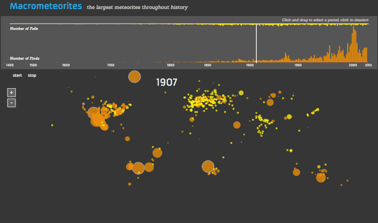
Macrometeorites | Link
An graph that changes over time. There doesn’t seem to be a way for the user to drag a picker on the horizontal timeline.
The Startup Universe | Link
Uses the typical horizontal scroll bar to allow the user to change the variable of time.

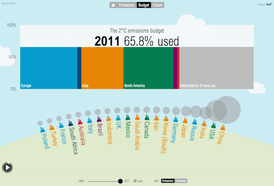
Carbon Emissions | Link
This one’s not very good (the picker is too small to allow for the user to precisely choose the year), but I’ll include it anyway…
Overall it seems like all the interactive data viz graphs that allow you to change the variable of time allow you to do so with a time picker / scroll bar.
The following interactive visualizations don’t necessarily incorporate the variable of time, but they were either interesting ways of organizing data, or they were representative of many similar kinds of data viz charts.
The Dawn Wall | Link
This one is by far the coolest visualization. It’s essentially like a Google Street View type of approach that takes you along the path of this rock climbing route. The 3D model of the rock and route itself is probably what’s most impressive.
[This GIF was too large to include in this post, so click here to view it.]
An Interactive Visualization of NYC Street Trees | Link
This one relies on a mouse hover interaction to display more information.

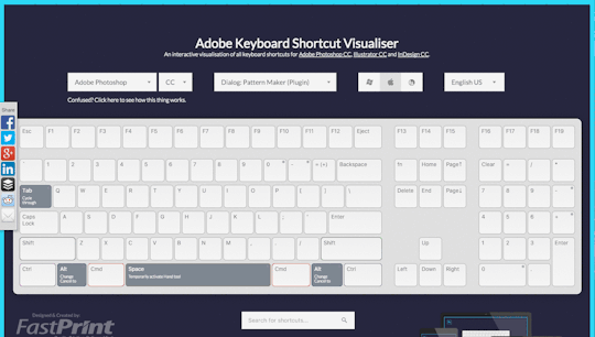
Adobe Keyboard Shortcut Visualizer | Link
This one is essentially just an interactive filter, i.e. the graphic changes when the user changes the filter.
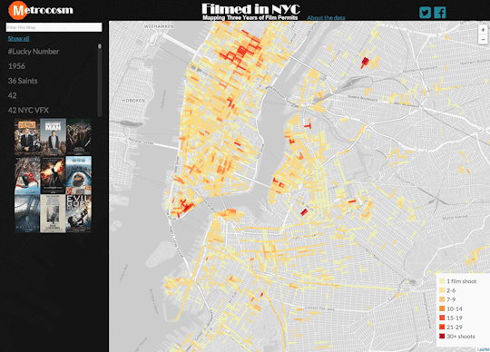
Mapping Three Years of Film Permits | Link
This one looks like CartoDB technology to me. Again, this is also basically just a filter that the user can change.
The Selfiexploratory | Link
This one is a little strange, but interesting. Essentially the filters themselves double as changing graphs of the trends. This makes it a slightly weird interface to use; definitely took me several minutes to figure it out.

And to conclude, I’ve noticed that some of the most popular data viz tools / platforms that keep coming up are:
- Visual.ly
- Tableau Public
- CartoDB (specific for maps)
Additionally, a popular data source is NYC Open Data.
Okay, that’s it for now. :)