#ux design

During my research for the subject of suburban planning and its social isolation I stumble upon a wonderful specimen of poor urban design in the state of Missouri, where the nefarious housing pods hosting cul de sac and twirly roads is the realm for car culture.

The whole looks like any other American suburban community with the freeway skimming residential areas, the collector defining the neighbors, and then smaller roads extending everywhere until they meet all houses.

I wanted to plot an hypothetical visit of one neighbor to the other and this is the result. It’s a three miles trip by car that will take at least 9 minutes because there are no opening in the shape of a road or pedestrian path to connect the two points.

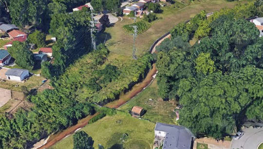
This is how it appears from top-down view with a series of semi-natural and artificial barriers that separates the cul de sac on the right with the curb on the right. Two worlds apart basically because of arcane and mysterious reasons that impelled urban designers to totally exclude any sort of travelling from one side of the neighbor to the other. Picture if the neighbor’s house is on fire and you want to help them escape death; you won’t probably because you either climb over the two fences and the trees, or you drive your car but that’ll take 9 minutes and who knows if people there are still alive by then.

Highlighted in red it’s the whole barrier of fence and trees that separate the neighbor in two distant sides, where socializing can be as difficult as Berlin in the 1950s between West and East.

To avoid your other neighbor doesn’t get the chance to invade you, the developers built an artificial canal (highlighted in blue) to furthermore make sure people don’t get together and come up with crazy ideas like socializing. In yellow the broken connection that might have been existed with a pedestrian path, but better not take any chance.

Here’s the site from another point of view and you can see how the whole portion doesn’t allow for people to walk or drive to the other side, splitting the pod into three areas.

I zoomed as much as I could and you can see it’s not just a road network issue anymore but a lack of safety feature that could help people stay away from danger. After all these are places where families with young kids live.

In yellow I highlighted the dangerous areas where the lack of fence around the power lines and the canal have allow for free access; anybody can go unrestricted near the pylons and the ditch. Unsupervised kids face the most peril especially when it’s right around their backyard. Coloured in magenta it’s what appears to be a narrow bridge but in fact is a floodgate connected by another fence to the little shack on the right.
Notice also the lack of sidewalks everywhere; this tells us a lot about the urban design of housing communities where the pedestrian was left out of the picture in the first place. People going for a walk have to be in the street increasing the risk of being struck by a vehicle, this shows us the very weak UX design home owners are affected, but also emergency vehicles who might get tangled driving streets which have been badly shaped.
What does this mean?- We live among cities that are the result of zoning laws which manufactured landscapes dictate by cars first and people second. In North America there’s nowhere a car couldn’t go from the driveway to the drive-through of your local burger joint; drive in movies for cars, parking lots eating away downtown portions of many cities, and many other issue which gets in the way of creating healthier places to live.
UX design is not only about websites and phone apps, it extend its dominion onto any other experience the user goes through that can be as simple as opening a pickle jar or driving to work. Both these elements engage people into specific and different behaviors which can result in the success of failure of products and services.

The presence of digital markets has changed the relationship between the user and companies; the engagement of behavior and values is today more sophisticated because of the introduction of variable in the UX. Too many companies still struggle understanding how to connect with their customers.
It’s important to makes sure companies understand their target audience quite well in order to assume the product/service meets the user expectation. Many startups fail in their early years because stakeholders do no focus on the user side. Creating a product comes with a complex structure of passages and too often companies loose sight of their target audience.
This happens when the business persists with conservative marketing strategies that belong to the analog era and don’t consent innovation to happen. Designers begun to break away from the traditional doctrine of the marketing department to seek new philosophies, simply because there’s much more than just using analytical data and projections to address the user’s identity.
The best vivid example of disrupting the traditional scheme of strategic thinking can be attributed when Apple introduced theiPhone. A company that had nothing to do with the telecom field managed to swipe clean a market, introducing something they never worked on before. Then we all know what happened to the conservative approach on UX design where the Blackberry almost disappeared from the market because the managing team couldn’t understand the new approach to touch screens.
This is what companies can learn from designers: move away from your comfort zone and embrace changes to stay competitive, even if crazy ideas are thrown on the table; they are worthy to be considered. Consumer behavior changes very fast through external factors that cannot be controlled by companies, so it’s essential stakeholders follow a progressive UX design that has the ability to truly connect with the user in order to cater to its needs. Without that companies are just building products and services just for themselves.
 called “How UX Design Can Uncover Usabil")
Last September I wrote a blog article (and illustrated it!) called “How UX Design Can Uncover Usability Holes in Your Products” for my company’s new blog, ‘Design Complex’.
It was also my first time using Procreate to draw something from start to finish!
Originally uploaded on September 16th, 2021
⋆etsy⋆instagram⋆twitch⋆twitter⋆deviantART⋆
Post link
“I went to school for game design! I am highly qualified to talk about any game out there!”
I bet you don’t even know how big an 8 year old’s hands are.
You cannot meaningfully understand a great deal of Nintendo’s game development decisions without understanding how a child holds and uses a modern game controller. People love to critique game companies like Nintendo, especially core gamers and educated developers, as if they are some authority on game design but in twenty years I have never seen this type of individual talk about how Nintendo’s game design is constrained by the size of a child’s hands.
So…how big are they?
Big enough to use a dpad on the playstation controller but not large enough to use the analog stick comfortably. The opposite is true on the xbox controller. The shape of the joycon is designed for easy access for small hands for both.
Still, the kid’s thumb will have difficulty reaching both so rapid switches are not possible. On the left hand of the switch the stick is above and the dpad below, and the opposite is true on the right. This is a direct consequence of how a kid might use the controller. In most games the left hand controls movement - meaning an analog stick - and the right hand controls discreet inputs - meaning the dpad/button diamond.
Children’s also struggle to reach shoulder buttons and have lower grip width, so the natural gamer grip in which two fingers are resting on the shoulder buttons does not work at all for children. They usually have to use all four fingers to hold up a heavy device. The shoulder buttons go from being the most easily accessed buttons on the controller to the most difficult.
A child’s grip strength is lower, and thus so is their ability to hold a heavy controller comfortably, especially one not designed for their hand size. A single joycon in sideways mode, often used in child’s party games on the switch, is a far better controller size for a child while it is uncomfortably cramped for an adult.
It is not a coincidence that the Switch, which is marketed as a family console, comes prepacked with the controllers that are kid friendly and adult friendly controllers are a secondary purchase.
There are more things you can point out, but in a practical sense you can see these design principles applied by comparing something like Kirby vs Metroid Dread.
Kirby is almost entirely controlled through the face buttons, with only the rarely used defense button mapped to the shoulder buttons, and you can really get by with never using it. The triggers are not used at all. You rarely have to combination press anything. If my memory is correct, the shoulder buttons are never used for any temporary transformation abilities. The difficulty of using new abilities should not be compounded by hard to reach buttons.
Dread on the other hand uses combination presses a lot and ties three critical abilities (free aim, missile use, and sliding) to the shoulder buttons. The omega cannon, a rarely used but critical and time sensitive ability, is tied to the shoulder buttons for the easiest and most intuitive possible use. The stress of defeating an emmi should not be compounded by fumbling with controls.
Smash Bros in particular is pretty cool in how its control scheme is set up. The most basic functions that a child might use are very simply mapped to the single stick and face buttons. As you learn to play better and try more advanced techniques (like an adult might) like timed grabs, dodging, and shield use you move away from the face buttons, incorporating more and more use of the shoulder buttons. It splits the difference for the best of both worlds. You can trace the principles of this design all the way back to the N64 and I would not be surprised to learn that the in game mechanics were built specifically to compliment this novice to expert transitional design, which is what makes smash bros so friendly to novice and expert gamers alike.
#i have smallish hands for an adult#and arthritis#so this is relevant to me too#something to consider
This is an excellent point as well, something I wasn’t going to get into but so much of game design just ignores accessibility issues like this all together. So many of the basic assumptions of game design from input device to button mapping to in game accessibility features are built around the assumption of fully abled adult between late teenager and middle age.


“紫薇命盘” website design.
-
Client: Tony Arms.
Date: 12.2016-1.2017
Art Direction : Jun-Yao Yu
Visual Design : Jun-Yao Yu
Illustration : Jun-Yao Yu
-
Twitter | Instagram | Facebook | Shop | Pinterest
Post link


elipsis App Icon set system design.
-
Client: Yasmine .
Date: 7. 2017.
Art Direction : Jun-Yao Yu
Visual Design : Jun-Yao Yu
Illustration : Jun-Yao Yu
-
Twitter | Instagram | Facebook | Shop | Pinterest
Post link


elipsis App design.
-
Client: Yasmine .
Date: 7. 2017.
Art Direction : Jun-Yao Yu
Visual Design : Jun-Yao Yu
Illustration : Jun-Yao Yu
-
Twitter | Instagram | Facebook | Shop | Pinterest
Post link


Brand farm website design.
-
Client: Heather Bothwell.
Date: 4. 2017.
Art Direction : Jun-Yao Yu
Visual Design : Jun-Yao Yu
-
Twitter | Instagram | Facebook | Shop | Pinterest
Post link


Holy shit, LOOK AT THIS:

WHAT MAGIC. SUCH SORCERY.
(Here’sa how to.)
Apparently this feature has been around since the launch of Safari 9 wayyy back in September, and I just never knew about it. Now this will be the only reason to put Safari back in my desktop dock.
(To be clear, Browserstack is still good for Android devices, but if I don’t have to use their slow ass interface, I won’t!)
I’m doing some research around how to display information that changes over time. Specifically I’m interested in looking at charts wherein at least 1 variable can be manipulated by the user – in other words, interactive charts.
Here are some data viz references and examples that I’ve found for inspiration:
Population in Germany | Link
The most straightforward time picker / scroll bar. Drag the picker to change the time variable.

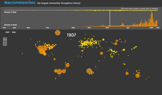
Macrometeorites | Link
An graph that changes over time. There doesn’t seem to be a way for the user to drag a picker on the horizontal timeline.
The Startup Universe | Link
Uses the typical horizontal scroll bar to allow the user to change the variable of time.

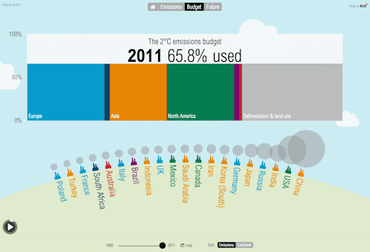
Carbon Emissions | Link
This one’s not very good (the picker is too small to allow for the user to precisely choose the year), but I’ll include it anyway…
Overall it seems like all the interactive data viz graphs that allow you to change the variable of time allow you to do so with a time picker / scroll bar.
The following interactive visualizations don’t necessarily incorporate the variable of time, but they were either interesting ways of organizing data, or they were representative of many similar kinds of data viz charts.
The Dawn Wall | Link
This one is by far the coolest visualization. It’s essentially like a Google Street View type of approach that takes you along the path of this rock climbing route. The 3D model of the rock and route itself is probably what’s most impressive.
[This GIF was too large to include in this post, so click here to view it.]
An Interactive Visualization of NYC Street Trees | Link
This one relies on a mouse hover interaction to display more information.

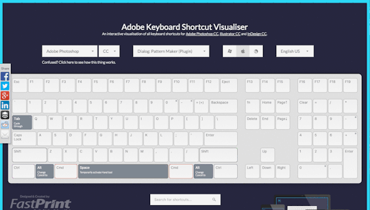
Adobe Keyboard Shortcut Visualizer | Link
This one is essentially just an interactive filter, i.e. the graphic changes when the user changes the filter.
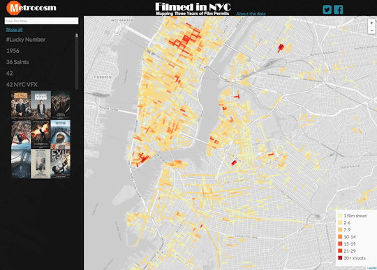
Mapping Three Years of Film Permits | Link
This one looks like CartoDB technology to me. Again, this is also basically just a filter that the user can change.
The Selfiexploratory | Link
This one is a little strange, but interesting. Essentially the filters themselves double as changing graphs of the trends. This makes it a slightly weird interface to use; definitely took me several minutes to figure it out.

And to conclude, I’ve noticed that some of the most popular data viz tools / platforms that keep coming up are:
- Visual.ly
- Tableau Public
- CartoDB (specific for maps)
Additionally, a popular data source is NYC Open Data.
Okay, that’s it for now. :)
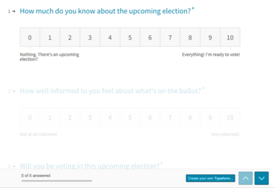
Finished the first round of prototyping of my ballot lookup tool. Here’s a summary of the design and user testing results.

Step 1: Collecting Information
So first, I started with a survey:
Almost all of my respondents were millennials, which was good because millennials are the least likely to vote.
Here are some of the results:
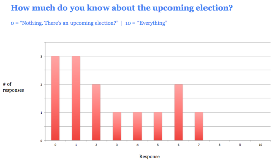

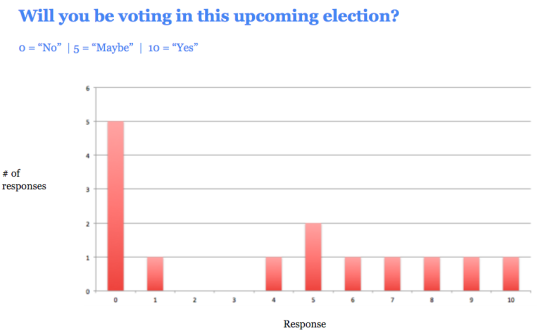

The majority of respondents said the problem was that they “lacked information.”
Step 2: Prototype #1 (Quick and Dirty)
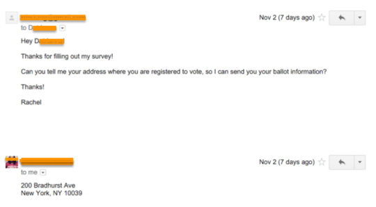
So, with my first prototype, I offered to send them information – and I did this just before the most recent general election on November 3, 2015.
This first prototype was pretty much just an email. I asked people for their registered voting addresses, and then emailed them back with their voting location, when they could vote, what positions and candidates were on the ballot, and links to read more about the candidates.
Here’s an example of an email I sent:

I then interviewed all the people that I sent ballot information to.
Result: Receiving ballot information was not enough to get people to vote.
People liked that ballot information was made so readily available. Some people said that it made the election feel “more tangible.” But people also said they wanted more information to help them decide who to vote for.
…But that they also didn’t want to read too much.
One user said:
First off, the fact that I even have names is helpful. It makes this election feel like something I should participate in. It’s like, with presidential elections, I always know the candidates by name, even if I don’t fully know their agendas.
I haven’t had a chance to read about all of the candidates, mainly because I’m too lazy to open all the links. At first glance having some key points in bullets would be helpful, just so I know if the person is worth learning about.
I definitely think I’d be more likely to vote if I had this info before upcoming elections.
Overall, this really made the election seem like some thing that was within my reach…as in, not too heavy of a lift. I already know where to go and who I could vote for, that’s like 70% of the battle.
Me: What is the other 30%?
It’d be me having background info about each candidate and feeling like I knew enough to pick one to vote for. Also, me taking the time to read through the stuff…time v. the payoff is always a big factor.
I want to say I’d open all the links you provided(which I’ve done, but haven’t read them yet) and read them, but I don’t want to be too idealistic. The thing about presidential elections is that the media covers them so much, that you don’t have to search hard for the info you want about particular issues. Plus, tons of people do think pieces on particular candidates or issues and so the info seems to come to me via Internet and tv, rather than me having to seek that out like in a local election.
Other questions that I heard from users were:
What do the positions mean? I don’t know enough about how our political system works to understand what this candidate would be doing in this position.
And…
In general this information is helpful… But I doubt I’ll go through and read all the links.
So at this point I knew that I needed to create an easy way for people to quickly understand what a particular position was even about, as well as whether or not they would vote for a candidate.
This is, obviously, no small task, since it’s hard to summarize many candidates up in just a few sentences. Still, it was helpful to know that this is what users wanted.
Step 3: Prototype #2 (Let’s Make an App!)
In my second round of prototyping, I was looking to hear from another group of users – except this time, instead of just a text-heavy email, I presented them with a minimal app.
The goal of this prototype was to gauge potential user interest in a mobile app. It had to be accessible via mobile because:
- Almost all millennials have a smartphone
- Mobile is the primary way that millennials get information
- It’s the easiest way to disseminate a large amount of information in a way that isn’t overwhelming. Neither emails nor text messages would allow for me to let users show/hide information as necessary, which I decided was a crucial element of the design.
My first prototype was a long email with a LOT of text. So with this second prototype I wanted to be able to give people access to all of that information, without presenting it in an overwhelming manner.
The other thing I needed my second prototype to do was to help people who weren’t sure about various things – such as their registered voting address, whether they were even registered at all, and what a political position meant.
So I added a few features to the second prototype:
- The ability to check if you are a registered voter
- The ability to verify your registered voting address
Additionally, I added a way for people to find out which candidates best matched their own personal beliefs. This was based on the design of www.isidewith.com/, which I think is a pretty brilliant site.
I wasn’t able to flesh out every single screen in this clickable prototype, but I included enough screens to allow me to get feedback about each of these features during my user testing.
Here’s a shot of the main screen:

You can click here to play with the clickable prototype.
This prototype got generally positive reviews.
Here’s some of the general feedback:
“I think it’s great that I can just tap on the question marks to find out more information.”
“I would definitely vote if it was this easy.”
Yes!! Exactly what I was hoping to hear. :)
And here’s what people expected to see when they tapped on a candidates name:
“I would want to see a voting history for each of the candidates.”
“I’m not sure what I would expect to see.. Maybe more information about their background?”
“I would want to see information specific to the position they are running for. For example, how would they act in this position?”
Here’s what people thought about the “My Stances” feature (which is the feature that allows you to enter your own political beliefs, so that the app can tell you how you match with candidates):
“I like that I can enter my political stances, and that the app will probably match me with candidates.”
“I don’t like that the app wants me to enter my political stances. Why would you ever enter personal beliefs online? Maybe this is a generational thing.”
Interestingly, out of 7 people that I tested this with, 6 of them liked the “My Stances” feature, and only 1 person did not.
Conclusion
I learned a lot through this process.
I learned that people (particularly millennials) want voting information to be as easy and clear as possible. Like with everything else that us millennials do on our phone (order food, chat with friends, check our emails, etc), voting information needs to be presented in a way that allows them/us to move through it quickly.
No one wants to read pages and pages of text, and they won’t, if that’s what they’re presented with.
The interesting conundrum that I am now faced with is: Is there even a simple and clear way to present candidate information to people? Is there a way to make this information scannable??
(For more information about scannability, see here.)
Furthermore, is there a way to make this information scannable, and yet still credible and trustworthy?
I think this is the crux of the issue I’m faced with. So, I’ll be working on this in the days/weeks to come. Stay tuned! :)
(P.S. You can view a Google Slides version of this presentation that I gave here.)
Version 7 of the design prototype is up!

You can view the Invision prototype live here.
Okay now on to user testing feedback! :)
Design Feedback / User Testing
Homepage CTA (Information input flow)
- “Why not just always have the user enter in their name, dob, and zip, if this will guarantee more accurate info? This information isn’t that personal.” (1/3 users)
- “Before I enter in my personal info, I want to know that you won’t share it with anyone else.. so maybe include a message about that, or a link to the privacy policy?” (1/3 users)
- “I’m not sure about my address.” should say “I’m not sure if or where I’m registered to vote.“
In response to the first question above… There are 2 things I considered for this information flow:
- I want to make it easy for power users (i.e. users who know for sure that they’re registered and where) to get straight to the info, without having to give me identifying information.
- Some people will balk at being asked up front for identifying info.
In general, it seems to be the case that there are 2 types of users:
- The Comfortable Voter: Slightly older — maybe mid-late 30s. Comfortable with voting. Generally knows if they’re registered or not, and where. More likely to be resistant to giving personal information. Reads more carefully.
- The New Voter: Slightly younger — early to late 20s. They generally feel like they don’t know much about voting or elections. Tends to skim more than reading every word. More likely to be unsure about where they’re registered to vote or if at all. Doesn’t mind being asked to give basic personal info such as name / dob / email, etc. They are used to this from the plethora of other apps that do this.
I’m currently trying to appeal to both types of users. Perhaps with a slightly stronger leaning towards the latter, while still trying to make sure that the former doesn’t feel alienated.
Homepage Navigation
“It looks like each section of the homepage almost fills the screen on mobile… Should the edges of each section snap to the screen edges to center content?”
“Consider indicator dots to let me know how much more info is on the homepage. I wouldn’t have made it past first CTA on the homepage if this wasn’t a user test, so I wouldn’t have seen that there are other upcoming elections.”
The “Send me reminders!” feature
- Text VS Email — It was pretty split. Younger voters tend to prefer text, because they actually read it. Older voters tend to prefer email, because it feels less intrusive.
- “How often will these be sent? I don’t want them if they’re going to be annoying, like in other apps.“
- For texts — Include “msg rates apply” text (1/3 users)
- “You’re all set!” —> Include a note to the user that they can expect a text/email confirmation shortly.
- “What are registration deadlines? Aren’t I already registered? I probably wouldn’t check this box.” (1/3 users)
“I want to see more information…”
- Voter registration — “What would an inactive voter status be…?” (1/3 users)
- Voter registration — “Is this actually what I would see on my official voter registration card?” (1/3 users)
- Ballot — “Why do I care who a delegate is pledged to?” (1/3 users) I HAVE THIS SAME QUESTION FSAJDOLSANLDSA. And I still haven’t figured out how to answer it… ;_;
- FAQ — Add something in about absentee ballots for people who won’t be in town on the day of an election (1/3 users)
Feature requests:
- Next Election — Include an “Add to calendar” feature (3/3 users) (this could be next to the date for this election… and/or it can also be part of the text/email reminders…)
- View Ballot — “Even if I’m registered with the Democratic party, I still kind of want to see the ballot for the other party..” (2/3 users)
Visual design
- “The header at the top doesn’t look like I can click on it.” (1/3 users)
- “I thought the arrow on the homepage was a link that would scroll me down to the next area.” (1/3 users)
- “The address input icon looks like an email icon. At first I thought you wanted my email address.. not my home address.” (1/3 users)
- “This seems like a pro-Bernie app, because Sanders delegates are at the top of the list.. How does the order of this list get determined?” (on the page where you view the ballot) (1/3 users)
- “I can’t vote in this app, right? Maybe make that more clear.” (1/3 users)
- “Candidates are far down the page where i can see my info… What if I ONLY wanted to see the ballot? Although I can see why it’s like that if you intentionally want the user to see all this other information first…” (1/3 users)
- “Why is the FAQ after the reminders CTA? Wouldn’t you want to answer these questions while the user is looking at their ballot?” (1/3 users)
Things I Need to Design
- The other election types
- When a user checks their voter registration, but they aren’t registered with that info (try a different address?)
Annnnd some positive feedback:
“Wow! The flow feels like it makes a lot more sense, and I love the language! I feel like you’re teaching people a lot about the process, without them even having to know what questions to ask, it feels really natural.” - Mat
:)
Polestar Head of Design Maximilian Missoni takes us on a walk through the design facility and speaks with some of the key players on his team. In this video, exterior designer Nahum Escobedo, interior designers Conny Ewe Blommé and Benjamin Pérot, UX designer Michael Gordh, and Color and Materials designers Maria Uggla and Komal Singh share some insight into the Swedish electric car brand’s design processes.
SUBSCRIBE ON YOUTUBE –http://bit.ly/2jBydam
BECOME A MEMBER –http://www.formtrends.com/subscribe
SUPPORT –http://www.patreon.com/formtrends
FOLLOW –
Facebook:https://www.facebook.com/formtrends
Instagram:https://www.instagram.com/formtrends
Pinterest:https://pinterest.com/formtrends
Twitter:https://twitter.com/formtrends
LinkedIn:https://www.linkedin.com/company/formtrends