#emphasis
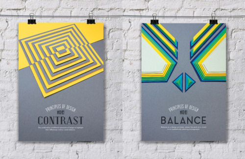
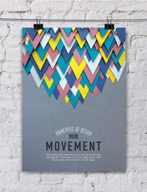
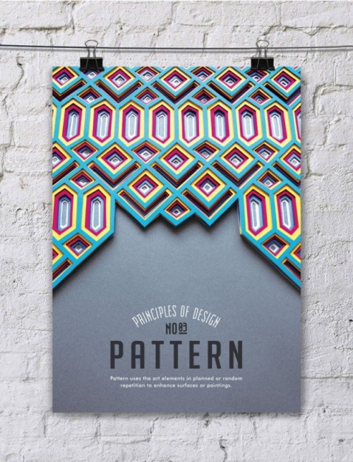
DESIGN - Principle of Design Poster Series.
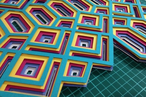
Efil Türk created a series of posters of incredible beauty to recall the 10 principles of design. Splendid creations “Principle of Design Poster Series” to illustrate the importance of balance in design, contrast, movement or rhythm. l Via FubizlArtist on Tumblr.
Post link
there was a moment today when I took stock of everything I was feeling - from my congestion to my stomach cramp to the uncertainty weighing down my mind, and I thought: wow, this is a new low. This was my body saying “enough” after months of running it to the ground. I’m waiting to hear from an interview, one that I really put my all into, and one for which I am preemptively mourning my rejection while I also recover from this nasty cold. This one has really knocked me out, and I’ve been in bed all day. I felt good enough to go for a walk at one point and this is when I had that initial thought of feeling so overwhelmingly at the bottom of things. After my walk, during which I sulked a little, let out some throaty groans (I highly recommend vocalizing), and moved my body some, I did feel more resolved.
I’m not sure what it is that shifted in how I feel about the process, because the feeling and the circumstance is the same: I put in my all. But when I started my walk, and for the last week or so, I felt a sort of injustice and even unrequited love toward the world, feeling like I put in my all only to not get anything back. How unfair all of it really is. F*ck meritocracy. Perhaps it was when I acknowledged fully how I was feeling, that I felt a shift. I let myself replay all of my efforts and preparations, I re-experienced some of the minor victories I felt after each stage of the process, and I feel incredibly proud. There is still great satisfaction that I tried my best and that is what matters most.
All this to say, it takes a lot of work to shift one’s perspective in order to take the same observation and circumstance and imbue it with new meaning. I don’t know if I have a new perspective or necessarily want one at the moment. However, placing emphasis on certain things in the observation or experience helps - especially the ones that valorize your effort and integrity. Even if what matters most is feeling proud of my efforts, there’s a little room still for the doubt and confusion and sense of loss. That part is not going away, and is integral to this experience. So if we let ourselves feel all the things, take stock of all the things, then we can assign those things their order of importance.
We have to go through and not around.
Emphasis in a Burger King Ad
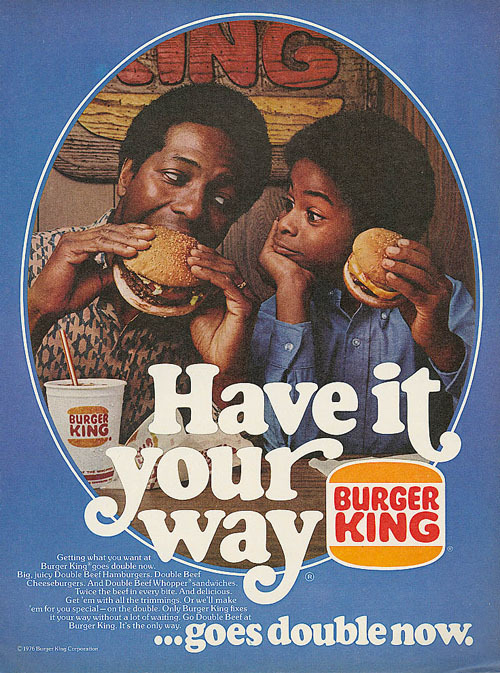
The main point of an advertisement is to sell a product to the consumer. The easiest way to do this is to create an advertisement that focuses on the product that you wish to sell. This 1976 Burger King ad has done just that.It subliminally makes the viewer focus on the food and logo.
The primary way of doing this was to create a frame to focus the viewer’s eyes on the image. a blue frame is put around the central image in order to contrast and amplify the central images main color scheme of a warmer orange. Next sight lines are established by the subjects eyes and hands that point directly to the food. Also apparent in the image are many smaller burger king logos. One above the subjects heads, one on the cub and two on the wrappers which are obscured by white text. Thus an entire image has been created that zeroes in on the burger and the expression of joy on the faces of the two subjects in an attempt to make the association that Burger King burgers taste good. Now the image continues through text to the second focal point, the logo.
The Burger King logo is also a focus point because of how it is presented in the lower half of the image. The logo is put half way through a sentence, interrupting it and causing the viewer to associate “Have it Your Way” with the logo. It also helps that the orange logo is contrasted on the blue back round.
Post link

