Just to let you know, I will be travelling over the weekend. However, once I’m in one place for a little while, I’m going to be working on the following fixes and features for Missing e:
Display tracked tags in the sidebar, in addition to the new tag search box
Fix for the tag reblogging when clicking the reblog button
Fix a problem with Quick Reblog not showing drop-down for secondary blogs on tag search results page
As we peel the last page off the 2013 calendar and take the 2014 version out of shrink wrap, we look back at some of our first few months of blogging.
Greg inaugurated our posting by asking if the world needs another online menswear store. Fortunately, the answer was yes. Not only that, it turned out the world needed another menswear blog as well. So we have spent the past few months posting about aspects of clothing and style that interest us most.
Buying nice clothes is useless if you don’t know how to spot the ones that fit you. So we want to make sure you know a shirt,a pair of shoes, or a jacket should fit,and how to think about the shapeandsilhouette of a suit jacket.
New Year’s Eve is the one night of the year when it’s OK to wear black tie, almost no matter where you’re going. Even if you’re the only person wearing a tuxedo, it’s understood to be part of an atmosphere of festivity, and no more ridiculous than the guy wearing the HAPPY NEW YEAR glittered plastic top hat.
Whereas in Britain the tuxedo began as a more informal way of dressing for dinner at home or at your club (hence the term “dinner suit,” used in England instead of “tuxedo”), in the United States the tuxedo has always been a celebratory garment. It’s a uniform for merry making.
But even if black tie is not bowling, it’s certainly not ‘Nam, so there are rules. The first is that you must wear a black bow tie. Do not try to “mix it up” with some cyan nonsense or “have some fun” with some paisley confection. And heaven help you if you wear a long tie.
The second rule is that you wear a white shirt.
Finally, you must wear black shoes.
This is the bare minimum, the sine qua non of black tie.
But every further detail that distinguishes your outfit from the look of a normal business suit is one that will bring out the tuxedo’s fun-loving character. For example, instead of your usual white shirt, wear a dress shirt that has either a bib or pleated front, and closes with studs instead of buttons. The studs help break up the expanse of white between your bow tie and your waist.
And that waist should be covered. It used to be that men would always cover their waist. Either they would wear a three-piece single-breasted suit or a double-breasted suit. While two-piece single-breasted business suits are now common, a waist covering remains standard for black tie. Either an evening waistcoat – cut low, to show the shirt studs – or a cummerbund will do.
Evening pumps are as elegant as men’s shoes get. But if you feel funny wearing shoes with bows, or if you don’t want to buy an expensive pair of shoes you’ll rarely wear, at least give your black oxfords an extra shine before putting them on with your tux.
If your shoes end up a little too shiny for the first few work days of 2014, they will reflect the final revels of 2013.
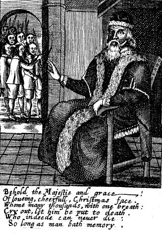
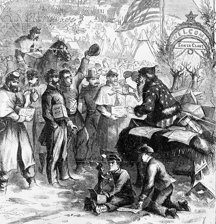
There has been some recent controversy over Santa’s ethnic background. But all modern-day Santas, be they white, black, or boozehound, wear the now iconic red suit with white trim.
Urban legend has it that Coca-Cola designed and popularized the Santa suit to match the company logo. In actuality Santa’s wardrobe was settled before Coke began their Santa advertising in the 1920s.
The Santa character is based on the gift-giving Saint Nicholas, in particular the Dutch personification of him, with influences from the jolly English Father Christmas. The rest of the Santa mythography – the sleigh, the reindeer, the chimney, etc. - comes from Washington Irving’s satire A History of New York, and “The Night Before Christmas,” an 1822 poem written by Clement Clarke Moore for the entertainment of his six children. It was published anonymously, but quickly went viral (yes, there were cultural viruses in the 19th century, too).
The poem’s only reference to Santa’s clothing is that “He was dressed in fur, from his head to his foot, And his clothes were all tarnished with ashes and soot.” Depictions of Santa Claus from this era show him in many colors, including red, but very often green.
He was even shown wearing the American flag in a 1863 illustration in Harper’s Magazine by Thomas Nast, the illustrator who also popularized the use of the elephant and the donkey as symbols of the two major American political parties. Nast became the most prolific illustrator of Santa Claus yet, which made him a sort of personal stylist for Santa.
By the late nineteenth century, Nast had converged to consistent use of red and white for the Santa outfit, with Santa himself having already become a slightly more ethnic looking version of the white-bearded, jolly, chimney-blocker we expect to find on our holiday Cokes today.
Nast’s version hadn’t quite vanquished all the other Santas by the end of Nast’s career in 1886 – note for instance this green-coated version on the cover of a popular children’s book in 1902 – but crimson tide had turned. By the time Norman Rockwell began painting Santa in the 1920s, he had no choice but to clothe his subject in the outfit his descendents have worn ever since: the Santa suit.
Many of my most prized possessions were gifts from others. My mother gave me a beautiful acoustic guitar for my high school graduation that has been with me ever since. A dozen years later when I finished graduate school, my godfather gave me a lovely piece of luggage which I am sure will age much more gracefully than I will.
Why is it that a well-chosen gift is worth more than its price? How can we choose the right gift?
The most common reason given by members of the panel is that a gift serves not only as a transfer of wealth from the giver to the receiver, but also a signal of how much the giver values their relationship with the receiver. Searching for a gift requires more effort and sacrifice, and knowing what to get shows a better understanding of the giftee and what makes them happy. I can’t think of a more important foundation for a relationship between two people.
Durable gifts can also be reminders of a shared bond. Cash isn’t a good substitute. To test the power of this theory, Chicago economist Austan Goolsbee suggests: “Instead of proposing to your wife with a diamond ring, offer a gift card of equal value. Efficient – if you don’t count your hospital bills.”
There are also gifts that people would enjoy but would never indulge in themselves. A wine or chocolate lover may not buy their most coveted delicacies for themselves, for fear of setting a precedent and succumbing to temptation too frequently. Receiving them as a gift allows enjoyment without the guilt of transgression.
A gift is also an opportunity to introduce someone to a new pleasure. It could be something totally new to them, perhaps a pocket handkerchief for someone who hasn’t worn one before, or a reintroduction to a familiar item on different terms – such as a finely crafted umbrella or luxurious socks, surprises that bring beauty to a place where only function was expected.
Reserve your cash gifts for tipping waiters. For your loved ones, give thoughtfully.
In the cold season of winter, many of us are breaking out our sweaters daily, and at some point will face the colder reality that, no matter how well-made, all wool sweaters pill. This is true whether you have one of those cheap merinos from a mass-market retailer or a hardier Scottish piece from a specialty boutique. With enough wear, all wool sweaters will pill over time. The question is just how much and how easily.
There are many techniques recommended online for how to take care of pilling, but beware: some of them will cause more harm than good. To understand why, you have to understand how pilling occurs in the first place.
Wool yarns are made from intertwining animal hair fibers that have been carded and then spun. The areas where each fiber connects to another is weak, at least compared to the rest of the yarn, and can break with enough stretching or friction. When it does, the tiny fibers tangle into each other and result in the fuzz balls we refer to as pilling.
Cheap yarns are made from shorter fibers, so they have more areas for potential breakage and thus pill easily. Nicer, more expensive yarns, on the other hand, are made from longer fibers, but this doesn’t mean they’ll never pill. They’ll just do so to a lesser extent and at a slower rate.
Once you have pills, you’ll want to get rid of them, but be careful of the technique you use. If you pull the little fuzz balls off with your fingers, your sweater will look nicer and tidier in the short term, but you can create new breakages as you pull and thus create more pilling in the future. “Sweater stones,” which are essentially like pumice stones for you knitwear, can do the same thing.
Instead of pulling the little fuzz balls off, try cutting. There are a number of sweater shavers on the market designed for this. Cheap ones on eBay typically don’t work that well, but for $15 or $20, you can get a perfectly serviceable machine at any major department store. These will achieve what you want: to remove pills without creating any new breakages.
Of course, the other approach is to just embrace the pilling. With enough of it, maybe you can say you have a Shaggy Dog.
‘Tis the season to be gaudy. It’s the time of year when every mall spins saccharine holiday music every shopping hour of the day, every annoyingly over-energetic neighbor covers their home in 37 pieces of holiday flair, and every child under the age of 13 becomes a walking wish list. But there is a bright side – office holiday parties. Your chance to get drunk and make small talk with people you already spend 2,000 hours a year with. Rejoice!
Though it would make for a good story, you probably should not go to your office party naked. So you’ll have to decide what to wear. If your party organizer has any sense, they will have stated clearly a dress code. This avoids the awkward situation that arises when the new guy wears his college sweatshirt and has to look like a jerk all night because everyone else knew to wear cocktail attire.
If there’s no announced dress code, ask the co-worker you think is least likely to play a practical joke on you. If they tell you the dress code is Power Ranger costumes, try a different coworker.
Since you will be with work people, but preferably not talking about work things, it’s good to eschew work clothes for something more festive. Some people show their Yuletide spirit by wearing hideous holiday-themed apparel. There is a better way. Here are some suggestions for each level of formality.
Casual
Casual means a tie is discouraged, and a jacket is not required. It doesn’t mean you have to look terrible. Your clothes should still be clean, well-fitting, and tasteful. Here’s an outfit with a sweater that captures the spirit of the season without skinning it and using its hide for a poncho. Scarf optional.
Smart Casual
Smart casual still means no tie, but a jacket is encouraged. This jacket is perfectly appropriate to wear to work as well, but the cotton and cashmere blended into the wool and the larger weave suggest a worker bee who might be on a honey break.
Cocktail Attire
If you’re lucky enough to be working at a place that’s willing to fund a nice party at a swanky spot, show your gratitude by dressing appropriately. Dark suit. White shirt. Evening tie.
Finally, always remember: what happens at the office party DOES NOT stay at the office party.
On a tip from the Instagram stories of my friend Paul Fournier, I picked up Nishiguchi Essentials 100, a bilingual compendium of the 100 articles of clothing and accessories that totemically compose the intrepid Shuhei Nishiguchi, the photogenic men’s fashion director of Japan’s directional department store, Beams. It is the sort of thing I love, a diverse collection of objects, each with their own particular stories and their own particular uniqueness. It reminded me of my old favorite Einstein’s Watch, which juxtaposed the most interesting items put up for sale in 2009 (from Einstein’s own Swiss watch to a Barbie version of the DC comics superhero Black Canary). It also put me in mind of Taryn Simon’s An American Index of the Hidden and Unfamiliar, out of whose catalog of hymen restoration clinics, corpse farms and Braille editions of Playboyrose a strange, yet familiarly offbeat, Americana.
Nishiguchi-san has been a stalwart of the hashtag-menswear scene for years, a fixture at the Pitti Uomo trade fairs (which he attends in a professional, rather than parasocial, capacity), and a popular enough phenomenon that menswear blogger Simon Crompton marketed a previous book of his, Nishiguchi’s Closet, which purported to show readers how to use just ten articles of clothing to create a hundred different outfits.
As its title suggests, Nishiguchi Essentials 100 features ten times the pieces of clothing as that earlier book, for a very different philosophy of dress. Why, at least three different raincoats are Essentials. Rather than pretend to any minimal rigor, or to the particular multifarious use of basics, the very number of these Essentials seems to beggar the meaning of the word. At last, a clothing book that does not lie about practicality, but instead exults in an overwhelming plenty of carefully sourced vintage trenchcoats, one-off briefcases specially created for him by a firm that specializes in gun cases, patinated prototype suede blazers, 1950s French army pants and… buffalo skin cowboy boots.
As the above list suggests, Nishiguchi is a polyvalent dresser not captive to any particular menswear style. His choices of Essentials is not just diverse, it is variegated like the motley plumage of an exotic bird. While his choice of vintage Brooks Brothers button-down-collar shirts would delight a Trad, his taste for vintage Ralph Lauren (a certain 1990s trenchcoat, baggy 1990s Polo trousers, and old American-made Polo oxford-cloth shirts) would put them off. The ‘Lo-Heads who might be impressed by those would be nonplussed by Nishiguchi’s 1980s Metallica T-shirts, French berets, or Hermès silver bangle hand-beaten by Touareg tribesmen like a Paul Bowles character. And each Essential has its own story: a tale of how each item had a connection to a person from his life, or how it is special in every detail, in ways the casual reader or consumer could not have imagined.
For every item in Nishiguchi Essentials 100 is special, and not just by its significance to its owner: even the Levi’s 501s Nishiguchi includes are specifically those from the 1950s to the 1990s, when Levi’s ceased making them in the United States. His Aquascutum trenchcoat was not one of its usual English production, but a version made in Canada for the North American market with natural shoulders. His handkerchieves are no ordinary bits of limp chambray, but by the infamous Simonnot-Godard, and came not only from Florence’s hallowed haberdashery Tie Your Tie, but from Tie Your Tie back before it changed ownership and, by implication, became just a bit more… well-known? Accessible? Viable? The implication is that experiences unavailable in the current day made many Essentials more precious, more covetable.
Even in purported catalogs like the other books I list above, a certain ghostly narrative detaches itself from the pretty (or unsettling) pictures and makes its presence felt. Nishiguchi is more explicit, writing even before his table of contents that he has “carefully selected” 100 items from his wardrobe that he cherishes and that are “indispensable” to his style and way of life… indissociable, it seems, from his sense of identity. Each item and its story seem like infinitesimally thin sample slices of self, specimens for us to pore over as if through a scanning microscope, and over a hundred of them to piece together a sense of Nishiguchi-san.
The recent pandemic, NIshiguchi-san writes, triggered a meditation that led to this book, In a way, it has catalyzed a sort of behavior of which Nishiguchi Essentials 100 is only the most brilliant version: the exhibition of self through visual and temporal fillets, consumerist fillets, pieces of self that each have their own narrative in our new world of social encounters, that of the distanced virtual interaction of Instagram and its ilk where so many of us have taken to including bits and pieces of what we wish to exhibit of our stuff… our latest kops, our latest drinks, talismans and fetish objects that have latterly become proxies, in our safety-minded physical stasis, for personality and identity.
How often have I thought, in recent months, of this exercise, this attempt to assert identity to faraway acquaintances (while we go bonkers with strain in our own real abodes), as a bit of body horror straight our of a Cronenberg film, our virtual attempts to maintain some sense of identity as we feel our real lives fall apart, like Brundle-Fly carefully, obscenely, gathering and storing the human pieces of him that fall off… What we store, what we catalog, what we display sometimes no longer aligns with who we actually are, and we have less control over the latter. What a fun exercise it would be, being able to show and write about the hundred or so things that we think compose us, or how we wish to be seen. But the Nishiguchi’s Essentials are actual talismans of his life, lifestyle and daily dress. This display is indeed inherent of him, for he actually is a fashion director for a famously eclectic luxury store, and a fashion icon, unlike most of the rest of us whose Instagram displays, whether self-conscious and ironical or not, are manifestations of aspiration, even if the act of display, the construction of images of our drinks, accessories, kops, and so on, can in effort feel like we are indeed parting with a piece of ourselves. As we are not Nishiguchi-san, let us pause to think about what remains, inside us, as well.
One fun thing to do is leer at the exorbitant prices ludicrously rich people pay for ugly or trivial things. This tradition goes at least as far back as George IV, whose clothes was sold at his death in 1830 for then-eye-popping amounts. It continues in this GQ article about Paul Manafort’s $1 million wardrobe full of exotic skins, and in friend-of-No-Man @dieworkwear’s tweets about $1,000 paranormal hoodies.
But I think I’ve found the best one yet: White cotton socks. Some fuchsia design flourishes on them, but nothing special aesthetically or technically. A brand you’ve probably never heard of. One size fits all, readymade. As of this writing, $86,450 a pair.
These socks aren’t sold in stores. And the price wasn’t set by the designer – they’re traded on a digital exchange, the Unisocks Exchange. The company has apparently made 315 pairs (only 13 are left unsold), and created tokens that can be bought and sold in any fraction.
Anyone who accumulates a whole token can trade it in for an actual physical pair of socks that look like they could be bought at Costco. So why doesn’t someone just produce a bunch of these socks, probably at a cost of pennies per pair, and sell them for tens of thousands? With each pair of socks delivered by the company comes a digital “nonfungible token” (NFT) – that is, a token that can’t be broken up into pieces and sold in shares. This NFT acts like a certificate of authenticity for the physical pair of socks. It’s the same technology that secures rights to digital artandNBA moments.
So the socks (and their accompanying NFT) act sort of like gold reserves for a currency that’s on a gold standard. This digital currency is on a socks standard. There are some differences: gold probably has more intrinsic value than a pair of socks. It’s rare in nature and can’t be produced by man. But for both the gold and the Unisocks, the main value comes from the social understanding of what they represent and what other people would pay for them. Just like fiat money! With the socks, the distinction between the commodity on reserve and the pieces of paper that have value only by virtue of what they represent becomes still more blurry.
If you wore gold jewelry during the gold standard era, you were very nearly wearing money. Maybe that was a thrill for some. I wonder if anyone has the fortitude to wear a pair of $85,000 socks. And if they did, would the socks lose value? Are they a collector’s item or a currency? A $100 bill doesn’t lose value when it wrinkles, but does an $85,000 sock lose value if it goes through the wash?
I would think so, but I’m not a player in this market. But these $85,000 socks do make me feel much better about socks that are 3 pairs for $85. They don’t come with an NFT. But they’re good socks.
Simon Crompton’s Bespoke Style is a shout from another period into the void that has been this past year. For the past decade, Crompton has been an infuriatingly disarming voice of intelligence and reason describing his various orders and experiences with makers of custom (and otherwise spousally unpardonably expensive) clothing and accessories. His latest book hit my quarantine bookshelf like a temporally retconned souvenir of Crisis on Infinite Earths, a link to a time that seems from a remote and recalibrated universe.
In that universe, Bespoke Style offered readers the chance to see Crompton make himself the pleasant, bearded and tattooed guinea pig for 25 of the best. Sadistic boarding school masters would be disappointed to learn that said best were not birch switches but some of the most prominent tailors in the world, whose styles, cuts, finishing, prices and proportions Crompton compares as closely as possible in the pages of Bespoke Style. And that’s it.
It’s a concept so simple it’s rather genius, as well as seemingly pointless: in each chapter the author poses in similar garments (generally a single-breasted two-piece suit or jacket and trousers) from each of the 25 houses, describes their styles and cuts and contrasts those with their neighbors’ or competitors’, and provides the same set of measurements for each tailor’s work so that the reader can get a sense of how each house differs from the others and what makes them stand out.
As the book was sponsored by cloth house Vitale Barberis Canonico, the Anderson & Sheppard haberdashery and shoemaker Edward Green, Crompton accessorizes each pose with A&S accessories and nice Green shoes. A particular splayed-leg shot modeling his Anderson & Sheppard clothes through a turned-around open-back chair is perhaps the book’s raciest. Cromton notes that almost all of the garments he wears were ordered in the house style, something clearly on display in his Huntsman jacket, a tweed whose huge check could even have deafened the jacket Roger Moore wears in The Man With The Golden Gun.
Simplicity presumes various absolute. :Here, such presumptions include that the tailors profiled are indeed the best, most prominent or most likely to be of interest to Crompton’s readers; that each house has a consistent style; and that each house will maintain its level of quality. The nature of a book like this, all about comparing details, invites quibbles attacking such presumptions. Out of the 25 tailors profiled, only two (Camps de Luca and Cifonelli) are French, while the book has two separate sections for Italian tailors. No Smalto or Florian Sirven at Berluti, for example. Some of the cutters (scrupulously listed in each chapter) who made the garments Crompton models have retired or move on, causing real changes to house styles or quality at certain prominent tailors who would prefer we continue presuming their perennity.
But this is a book that is the mirror image of quibbles: exhaustive details for the pulling apart, snapshots already fading of past moments. For this simple book captures a tension: it profiles famous tailors at a particular moment in order to memorialize their details and differences, even as many of those houses, and the custom tailoring tradition itself, are being undermined by skyrocketing rents and retail prices (prices are easily double, or more, the full prices I was paying at some of the same houses a decade or so ago), by the retirement or departure of knowledgeable and experienced staff, and all the pressures that mean that a skill that required years of patient, difficult practice and training is now exercised competently by, as well as only available to, a dwindling few who must still believe that what they are making or getting is more than just the Emperor’s New Clothes… even if more and more companies, even some of the most famous, sometimes try to get clients to accept less than what they ordered…
So whether or not the houses that Bespoke Style compares will remain, in some pocket universe, so even if it outlives its practical goal of providing aspirational punters a way of comparing and deciding on what tailors they would use… in their castles in the sky.. it is and will ever more become an interesting artifact, a time capsule like the books Alan Flusser used to write that told men where to find custom tailors (and British clothes) in cities all over the world. Our time-warped, isolated universe, each of us encased in our own Phantom Zone, can already find this book an interesting curiosity. Should time ever move linearly again, whether or not some Monitor realigns the various incarnations of the multiverse so that we actually travel and wear suits, this book will become a reference for sartorial archaeologists the way that old issues of Apparel Arts did, the closest thing to some sort of record of how names that were once meaningful supposedly looked, draped, fit… once upon another time.
We are testing out an optional setting to shorten long posts on the dashboard. We’re initially rolling this feature out to a smaller number of you on web and iOS starting today, March 28, with an Android release to follow soon. We realize this is a significant change to how you interact with your dash. So this will be an optional feature you can easily turn off anytime by visiting your dashboard settings and toggling “Shorten long posts” off.
What does this mean?
Long posts can crowd your dashboard. Some of you find them so annoying that you filter out the tag #long post. This means you could be missing out on posts you might love that also happen to be tagged as #long post. This setting shortens posts to offer a content preview instead—with the option to unfurl the full post by clicking “Expand” on web, or opening the post in a new screen by tapping “View Post” on iOS and Android. Here is a preview of how your dashboard will now appear on web before expanding the full post.
Why are we doing this?
Some of you have told us that long posts can feel like they take over your feed or make it harder to skip uninteresting posts. This feature will allow you to scroll through content more smoothly while also encouraging meaningful interactions—promoting the art, culture, and content you love, curate, and create.
Any questions? Then please drop us a line on@wiporSupport, and keep an eye out for more changes on the aptly-named @changes.
This optional feature is now rolling out on Android. It can be turned off anytime by visiting your dashboard settings and toggling “Shorten long posts” off.
Hello folks. Here’s another tipping update for you.
We are rolling out blog-level tipping for iOS and web today. This is a win-win—if you’re a fan of someone’s blog and forever loving their content and creations, well, you can tell them how much you like their style. If you’re a creator, you can receive monetary appreciation from your peers via tipping, well, just for being you.
What?
You can now enable tipping for your blog for web and iOS in your profile or blog view, following the launch of post-level on web and international tipping recently. This will be good news for creators, as it permits tipping at blog level without tying the tip to a specific post. This is especially important for those concerned about fan art, for example. You can find the option to gift your favorites a sweet little something directly in their blog view header, beneath their avatar. We are currently working on this feature for Android too, and it will launch soon.
How?
It’s simple—you can share your blog’s tipping URL at: /blog/view/Your-Blog’s-name/tip.
We are testing out an optional setting to shorten long posts on the dashboard. We’re initially rolling this feature out to a smaller number of you on web and iOS starting today, March 28, with an Android release to follow soon. We realize this is a significant change to how you interact with your dash. So this will be an optional feature you can easily turn off anytime by visiting your dashboard settings and toggling “Shorten long posts” off.
What does this mean?
Long posts can crowd your dashboard. Some of you find them so annoying that you filter out the tag #long post. This means you could be missing out on posts you might love that also happen to be tagged as #long post. This setting shortens posts to offer a content preview instead—with the option to unfurl the full post by clicking “Expand” on web, or opening the post in a new screen by tapping “View Post” on iOS and Android. Here is a preview of how your dashboard will now appear on web before expanding the full post.
Why are we doing this?
Some of you have told us that long posts can feel like they take over your feed or make it harder to skip uninteresting posts. This feature will allow you to scroll through content more smoothly while also encouraging meaningful interactions—promoting the art, culture, and content you love, curate, and create.
Any questions? Then please drop us a line on@wiporSupport, and keep an eye out for more changes on the aptly-named @changes.
We have increased the maximum queue size per blog from 300 posts to 1,000. This change will allow you weeks of queued content—don’t say we don’t spoil you.
Take note: your maximum daily posting limit will remain at 250, and the queue can still only publish a maximum of 50 posts per day at its fastest setting (hence the aforementioned weeks).
This will come as great news for many of you. Others might be unsure of what the queue is, and to those, we suggest taking a look at this Help Center article to learn more. As always, hit us up if you have any questions.
If you love ads, then this post is not for you. If you love Tumblr but hate ads and want the one to continue without having to endure the other, then this post is literally for you. Hello, you.
As of today, you can set up ad-free browsing on your personal desktop computer, from anywhere in the world, and then enjoy the same effervescent Tumblr you know and love (yes, including mobile) without the interruption of ads. Scroll away.
Some caveats:
It’s $4.99 for a month of pure, unadulterated nonsense.
If you like a discount, you can get 33% off (that’s four months for free) at $39.99 for a whole year. Imagine.
This is opt-in. You don’t have to do this. We won’t make you.
How do you opt in?
Easy! Just go to your Account Settings on desktop and hit “Go Ad-Free.” From there, you can choose to pay monthly or yearly:
And that’s it! You’ll be able to enjoy your favorite blogs and posts without any pesky ads getting in the way.
That’s all for now, Tumblr. Back to your blorbos.
You requested, we listened: You can now sign up for Ad-Free Browsing on Android and iOS. Remember that your dash will be ad-free across all platforms once you’ve signed up. That’s all platforms. That’s mobile and web. Ta-da!
If you love ads, then this post is not for you. If you love Tumblr but hate ads and want the one to continue without having to endure the other, then this post is literally for you. Hello, you.
As of today, you can set up ad-free browsing on your personal desktop computer, from anywhere in the world, and then enjoy the same effervescent Tumblr you know and love (yes, including mobile) without the interruption of ads. Scroll away.
Some caveats:
It’s $4.99 for a month of pure, unadulterated nonsense.
If you like a discount, you can get 33% off (that’s four months for free) at $39.99 for a whole year. Imagine.
This is opt-in. You don’t have to do this. We won’t make you.
How do you opt in?
Easy! Just go to your Account Settings on desktop and hit “Go Ad-Free.” From there, you can choose to pay monthly or yearly:
And that’s it! You’ll be able to enjoy your favorite blogs and posts without any pesky ads getting in the way.
We’ve got news. We’re introducing a new blog view experience for bluespace (dashboard, search, and explore) on web, and we’ll be rolling it out to you soon. You may have seen a sneak peek of it on @changes last week.
What’s changing, exactly?
Before, when you clicked on a blog in your dashboard, explore, or search, it opened up this drawer on the right-hand side of your screen. This didn’t work very well for smaller or wider screens, or indeed on mobile browsers:
With the new viewing experience, blogs will now unfurl in the center of your screen—giving you more space to scroll through their content (while still keeping your scroll position on the dashboard as before):
Why have we done this? What does this mean?
These changes address a common complaint: the current sidebar blog view doesn’t utilize the overall space very well. It’s 2022, after all; screens are bigger these days.
If you have asks open, the ask button (with its customized text, if you’ve customized it) will appear directly in your header, instead of hidden in a menu as it was before.
Extending the width of this blog view affords us the ability to add more stuff, like a sidebar—and maybe some more customizable elements!
What about your blog’s current customized appearance, you ask?
Don’t worry—we understand the time and love you invest in your blogs, and this change does not impact any custom blog themes. This change simply improves how your blog will appear when others view it from the dashboard, search, or explore.
Questions? Drop us a line on @wiporSupport, and keep an eye out for more changes on @changes.
The author starts posting about a topic they care about, the readers start contributing, and before you know it, the author has become a curator.
Tumblr has always been uniquely suited for this type of blog. In fact, 6 of them have gone from Tumblr blog to book deal in the last year.
So today we’re very excited to release Submissions, a feature to streamline community-driven blogs. You can enable it from your blog’s Customize screen to let your readers submit posts via web.