#graphic design educator
Design Conversation: Bonnie Siegler on Signs of Resistance
presented by the Museum of Design Atlanta (MODA) and Miami Ad School at Portfolio Center
@ the Woodruff Arts Center in Atlanta, Georgia
July 12, 2018 - 6pm to 7:30pm
Info & Tickets
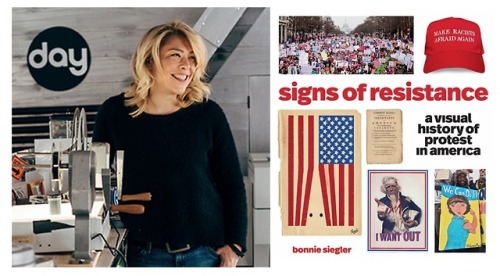
Bonnie Siegler, award-winning graphic designer and founder of the multidisciplinary studio 8 and a Half will discuss how powerful imagery has served as a method of resistance for outspoken citizens throughout social history. She will also share supporting research from Signs of Resistance: A Visual History of Protest in America, her newest book which examines two hundred and forty images—from British rule and women’s suffrage to the civil rights movement and the Vietnam War; from women’s equality and Black Lives Matter to the actions of our forty-fifth president and the Women’s March—in an inspiring, optimistic, and visually galvanizing history lesson about the power people have when they take to the streets and stand up for what’s right.
h/tMODA
Post link
Tricia Hennessey (Kalamazoo, Michigan)
Diverse Direction - Women Faculty Exhibition poster, 1990
h/t@garadinervi
Post link
Tereza Bettinardi (São Paulo, Brazil)
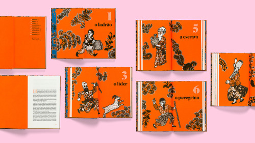
O Alforje (The Saddlebag) by Bahiyyih Nakhjavani, 2018
“The drawings were made in ink on paper by Adriano Rampazzo and then embroidered by fashion designer Izabela Starling. The novel describes events set in the Najd plateau along the pilgrim route between Mecca and Medina during one day in 1844–1845, when a mysterious saddlebag passes from hand to hand, and influences the lives of each person who comes across it. The main idea was to make reference to Persian carpets. The task to choose a typeface that could go along the richly detailed illustrations was not simple — I didn’t want to make any obvious reference to Arab lettering. The title of the book combines layers of Dala Floda and Dala Prisma, which is also used for chapters and drop caps (in Pantone 021) inside the book. The interior is set in Nyte by Portuguese type designer Dino dos Santos.” (source)
Post link


