#handset type

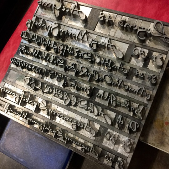

[image description: photos of proofs of handset type for letterpress printing, displaying all the letters in a given font, and the range of sizes available, and also photos of the formes set to print the proofs. Fonts displayed: Legend (a script) Libra (an uncial), Fortune Light, P. T. Barnum, Playbill, and Egyptian Bold (all slab serifs). End description.]
A bit of a weird mix at the back half of this cabinet but we do not have all that many slab serif cases and so they all live under the scripts together. Libra is also—I don’t know why the Libra is here. Last time I moved all the cabinets, I was very careful to keep things in logical groups unless that meant putting a heavy case very low to the ground. I like my spine the way it is.
Larger runs of book faces next—impramatur!! Caslon!! Garamooooond—which are mostly cleaner because they’re frequently used & checked. But still nobody’s just combed through the whole of them yet.


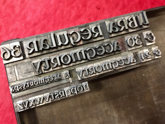
[image description: photos of proofs of handset type for letterpress printing, displaying all the letters in the font Civilite, and the range of sizes available. Also photos of two cases of the font, which are divided into compartments for each letter and figure. Civilite is a script font based on semi-formal French cursive of the 1500s, and has several alternate characters, especially lowercase letters with curling starts or extra long tails for beginning and ending words. In the cases, some compartments have extra cardboard dividers inside to separate variants on the same letter. End description.]
I should’ve jumped the Civilite cases up the cleaning queue a while ago. They weren’t very messy except for the part where they’d never been divided for alternate characters. I love setting with it, but it wasn’t very friendly to anybody else’s use.
All done now, and the extra 14 & 30 from a different casting checked for baselines & married in! perfectly usable cases. hmmmmm Legend next i think, but im pretty sure those ones are already basically good to go.
Post link
[video description: compilation of clips recording process for a letterpress printed broadside, printed from handset lead type and a relief plate of a wide and densely decorated border. steps include: setting the text of the broadside letter by letter; adjusting the spacing between letters in the forme of type with brass pieces 1 pt. wide; printing the border in a flatbed press, where the plate rests horizontally and the sheet is rolled over it, wrapped around a wide cylinder; locking up the forme of type for a clamshell-action press, where the type is wedged inside a frame, so it can be carried and held vertically in the press without any pieces falling out; pulling a print of the type, impressing inside the already-printed border as the clamshell press closes on a hinge; feeding the press for a green pass, where each time the hinge opens a printed sheet is removed and a new one is placed in register. end description.]
[video description: recording of printing a pattern of letterpress decorative materials in an irregular but specific shape. the repeating purple pattern of dotted arches and diamonds is set up to print a larger area, and then is printed through a hand-cut mylar frisket to protect the paper from impression and ink outside the boundaries of the desired shape. end description.]
purple pass for this piece


[image description: 4 photos of a combination letterpress-printed and hand-drawn illustration, and the handset formes of lead type used to print it. The illustration is of a person, wrapped in a blanket patterned in peach and pale purple, and listening to a podcast— “…and the knife was found in the back garden…” The podcast text and the color elements of the pattern on the blanket were printed from pieces of letterpress decorative material: randomized peach circles, and repeating lines of diamonds and dotted arches in purple. The relief pieces were set up to cover a larger area than the blanket, and then printed through a hand-cut mylar frisket, which protected the paper from being printed outside of the shape of the blanket. After the colors were printed, the black lineart of the illustration was drawn on top. end description.]
got to do this VERY sweet commission a couple of weeks ago, of the customer’s partner! requested elements included: their favorite peach color, a comfy blanket burrito, and listening to a true crime podcast.
I had to search a bit to find the right textures for the purple pass. The dotted arches were good, but it needed something else too and i sifted through the shop a bit before remembering the particular irregularity of Neuland—
(you might know Neuland even without knowing it by name; it’s a typeface used in a lot of promotional stuff for The Lion King musical—andwoahdo i hate what they did to those L&K caps??—or in the Inline version, or for Jurassic Park. anyway,)
i’m reasonably sure that what we have is og Neuland, that Rudolf Koch cut punches for himself, and there’s small variations between the same figure in different point sizes of the face. there’s a lot of hand in the shapes. so all the diamonds are Neuland periods and high dots, and they’re just a little bit softer than the perfect circles. that’s what was missing I think.
(podcast text is Gillies Gothic Light)
Post link
[video description: recording of handsetting lead type for letterpress printing. Each letter of a line of text is set one at a time, taken from a case of the font, divided into compartments for each letter and figure. End description.]
COOKED TUBE OF RIGATONI


[image description: Photos of the front and back side of a letterpress-printed business card, and the formes of handset type used to print it. The front side has the business name (“Ritual Birth”) and a logo consisting of four bold black circles, decreasing in size, set inside each other and all pushed to the bottom side of the circles. In the printing forme, the logo is built from four separate brass or copper rings. So that the forme can be picked up and held vertically in the bed of a clamshell-action press, the curved spaces in between circles are partially filled with many pieces of rectangular spacing material. When the forme is put under pressure from the sides, the forme can be carried unsupported despite the gaps. End description.]
Got to work from a sleek design from the customer on this one!
Univers & printing the feet of these circles, since all my small ones are double-lined on the face.


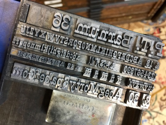
[image description: a photo of proofs of handset type for letterpress printing, displaying all the letters in a given font, and the range of sizes available, and also a photo of one of the formes set to print the proofs. Fonts displayed: Raleigh cursive (a calligraphic script) and Imprimatur (serif face, pretty upright but not sharp.) End description.]
MAN i love Imprimatur!! wedg-y flat terminations :))) short short descenders :))) ft ligature :)))))) Raleigh is also here.
no i don’t mean that Raleigh is also great but Imprimatur is an all time fav for me that’s all
Post link
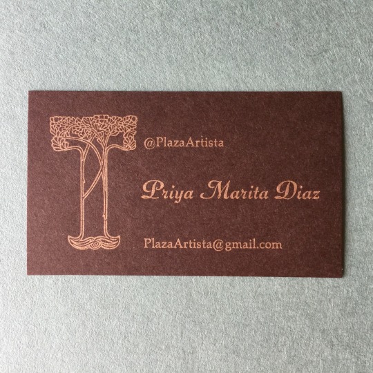
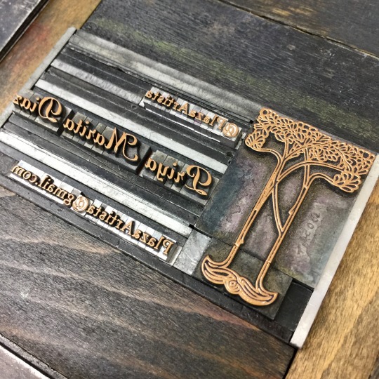
[image description: photos of a letterpress-printed business card and the forme of handset type used to print it. The card is for artist @plazaartista, printed in metallic copper-gold on dark brown paper, with an art nouveau tree decorating the left side. End description.]
Gosh I love these tree pieces!! I have a few more pieces that can extend its height but the minimum is the perfect size for a business card ✨✨✨
piranesi bold italic & palatino
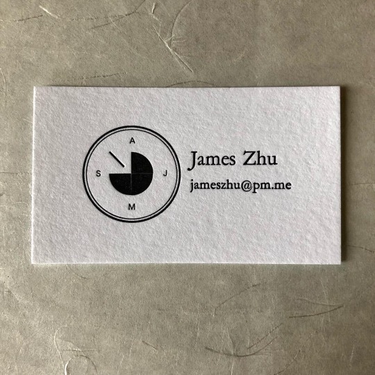

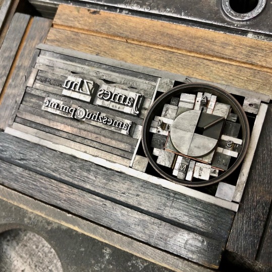
[image description: 3 photos of a business card letterpress-printed from handset type, and the forme of lead type used to print it. The contact info is set in Garamond; beside it is a simplified graphic of a piece of machinery for decryption. It’s circular, with the implication of all 26 letters spread around the outside circle by placing the A, J, M, and S at its cardinal points. Inside that ring is three-quarters of a circle, and a diagonal pointer from the center instead of the last quadrant. In the forme, each letter and space is an individual piece of lead, assembled into the custom shape. The circle is a single ring of brass, and all the rectangular pieces of type and spacing around it have to be assembled to accommodate the curves and touch its edges at several points, so that gentle pressure at the sides of the forme will hold all the pieces together and lift upright into the press bed, with nothing supporting its feet. End description.]
i had no idea what this little device was until yesterday, but it was VERY fun to build out of some simple colorets.
it’s one of the individual drums for a bombe, a cryptography device—whole banks of these things, crunching possibilities!! the backsides look like a whole rotating maw of shark teeth, but it’s all delicate wire brush contacts for input & output signals. and there it is, we’ve exhausted my understanding of both cryptography and early computing, that’s all I’ve got.
[video description: recording of lifting upright a chase of handset relief type for letterpress printing. The chase is a rectangular cast iron frame that holds any printing material for printing in a clamshell-action press. Formes of type or relief printing blocks lay inside it, and are held in position inside it by gentle pressure from quoins, metal wedge-devices that expand between the forme and the chase. Once under this pressure the chase can be lifted upright without any individual piece of type falling out, and carried to the press, held vertically in its bed, and pressed into the sheet in the clamshell-closing motion that brings type and paper together. End description.]
I probably would have to tighten up this forme a bit more to put it in the motorized C&P, doing speed & a thousand impressions, but for a hundred on the baby treadle I could trust it!


[image description: 3 photos of a letterpress-printed business card, and the forme of handset type used to print it. The job description is in Computational Imaging; beside it is a graphic which the customer explained to me and—I didn’t totally understand what it means, I’m sorry. A long-legged bird, stork or ibis type thing, stands at one point of a triangle. The other points are labeled P1 and P2. The lines from the bird are solid and the line between Ps is dotted. In the forme of type, the triangular shape has to be approximately filled with clusters of rectangular spacing material so that pressure can be applied evenly to its legs and keeps it standing stable in the upright bed of the press. End description.]
Apparently an armadillo, rabbit, or fish would’ve done also, but the bird won. For OBvious reasons I hope.
(Set in Invitation & Bodoni)

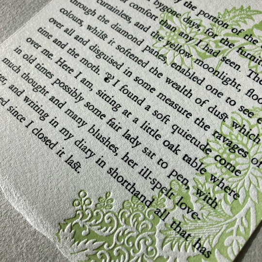
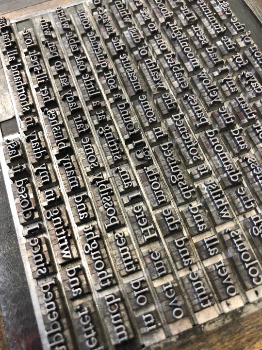
[image description: 3 photos of a small broadside of an excerpt from Dracula, letterpress printed from handset type, set in Garamond. full text under cut. Text in black, with a floral decoration on one side in pale green. The third photo is of the forme of lead type used to print the text, each letter and space an individual piece arranged by hand. end description.]
I have not read Dracula before and you know what. Adaptations have all lied to me, making Harker such a tasteless saltine cracker of a guy. He’s got some uuuh weird opinions of course but the text, and the way it’s being delivered in bits as letters to ME, and the big book club party happening here on the hellsite—it really brings me a whole lot of sympathy for him. This castle business has been wild but buddy, I get it, I too find great relief in the spaces worn down and the tasks done & re-done by the people before us. Reading this old book together with our contemporaries & otherwise.
also it’s been way too long since I got to set a little bit of TYPE-type, I missed it :) wanted to do a quick thing to shake some words out of my fingers.
“This was evidently the portion of the castle occupied by the ladies in bygone days, for the furniture had more air of comfort than any I had seen. The windows were curtainless, and the yellow moonlight, flooding in through the diamond panes, enabled one to see even colours, whilst it softened the wealth of dust which lay over all and disguised in some measure the ravages of time and the moth. … I found a soft quietude come over me. Here I am, sitting at a little oak table where in old times possibly some fair lady sat to pen, with much thought and many blushes, her ill-spelt love-letter, and writing in my diary in shorthand all that has happened since I closed it last.”
[video description: a compilation of recordings for a small letterpress-printed broadside, excerpt from Bram Stoker’s Dracula, with a pale green floral illustration. 1 - handsetting the text of the excerpt from lead type, by individual letter. 2 - mixing the pale green ink and hand-inking the magnesium floral illustration plate with a small brayer. 3 - locking up the forme of type for printing, where all the individual pieces of type are wedged inside a cast iron frame (chase), so it can be carried and held vertically in the press without any pieces falling out. 4 - inking the type in black, with the small brayer. 5 - hooking the chase in the upright half of a clamshell-style press, and pressing the relief type onto the sheet when a hinge action closes the press. 6 - the finished broadside, green floral pattern with black type, set in Garamond. end description.]
[video description: recording of handsetting lead type for letterpress printing. Each letter of a line of text is set one at a time, taken from a cabinet of the font, divided into compartments for each letter and figure. End description.]
Guess who signed up for dracula daily


[image description: 2 photos of a combination letterpress-printed and pen-inked illustration of a person on their phone, wearing a heavy jacket. the jacket is selectively letterpress printed with a two-color pattern: rows of yellow chevrons, printed over and in between each with rows of tiny pink arrows. at certain boundaries like seams and folds of the jacket, the pattern jogs at a different angle so it’s not an entirely flat rendering of the fabric pattern. the second photo is a closeup, showing the impression of the letterpress materials into the toothy paper. end description.]
finally I have drawn an aspirational piece of clothing that I do not crave to own in vain, because I kind of already have this one!! Very approximately. It’s denim and not these colors exactly but it fits me about like this and is patched with some busy beige & yellow & pink & green upholstery fabric to cover the paint job of the previous owner.
Bulky denim jackets are an icon of comfort & safety to me. I steal my mother’s flannel-lined one all the time. I remember as a kid, sleeping in the back of the car with my dad’s 80s Chubby & Tubby black denim coat for a blanket. Love is stored in the oversized pockets
Anyway! the pattern for this one came more from houndstooth, herringbone, etc. Fabrics where the texture communicates the weaving process. I got very very stubborn about using the bold 30 pt. Guillemets, despite how many passes it took to cover the whole area with them hahaaaaa. We have a very reasonable number of them for use as quotation marks! It took. So many more than that to cover this jacket. But they’re JUST the right texture so I committed.
Post link


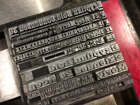
[image description: 4 photos of proof cards of various sizes and fonts in the Garamond family, printed from handset type for letterpress printing, and the formes of type used to print them. Each proof card shows all the letters, figures, and symbols available in the case of lead type, and what sizes of the font are available to typeset. Each type forme is assembled from individual letters and figures, which are redistributed back into the case after printing so they can be set again in a completely different forme. End description.]
14.5 cabinets down 9 to go
Garamond was a bit tough to clean—it’s in use quite a bit which helped some things but tended to leave the spacing extra messy. I did it in a bunch of little bursts, which feels pretty unsatisfying. AND this is the point where I have to admit, I simply cannot barrel through the type cabinets exclusively and ignore the galleys until that’s done. There isn’t enough cabinet space to lay out all the good book stuff accessibly; some larger Garamond & single sizes of titling and such have to go in galleys so that the still-wrapped Century Schoolbook italics can come out of the stone; etc. I feel more disorganized by doing little bits of different cleaning jobs all over, but it’ll all come together into a better typesetting space & catalog eventually. I think.
[video description: a compilation of recordings for letterpress-printed thank you cards. 1 - pinning a relief magnesium plate to a base that raises it to the standard height for the press. 2 - testing with a gauge that the ink rollers on a clamshell-action press are level and the correct height to just touch the relief plate, distributing ink across it cleanly. 3 - feeding the press, where every time the press opens on a hinge a printed card is removed and a blank one is placed in the registration pins. 4 - locking up a forme of handset type for printing, where all the individual pieces of type are wedged inside a cast iron frame, so it can be carried and held vertically in the press without any pieces falling out. 5 - mixing a bright blue color of ink on a glass plate. 6 - feeding the press for the blue pass in a similar clamshell press. 7 - feeding the cards into a press to score the fold into them; scores are punched into the front of the card to pre-stretch the paper fibers and keep them from breaking around the fold line. 8 - the finished cards have a delicate line drawing of sunflowers printed in light brown across the fold line, and the text THANK YOU printed in cyan. with cyan envelope. end description.]
i am cheating, i am a hack and Hermann Zapf is carrying me (Optima)
[video description: recording of taking fresh lead type for letterpress printing out of its packaging and distributing all the individual letters in a type case. The type case is divided into separate compartments for each letter, symbol, and figure. When taken out of the package, several individual pieces might be stuck together, and to safely separate them without damaging the printing face of the type, you tap the feet of the type against the wood of the type case. End description.]
Fresh type goes tip tIP TIP
(Stymie titling)


[image description: 3 photos of a small combination letterpress & hand-inked print, and a photo of the relief letterpress materials used to print it. The 3x4 inch print is an illustration of a person stretching their arms over their head, topless and wearing a three-tiered skirt patterned with pink, blue, and grey flowers. The floral print is selectively letterpress printed, and in three passes, so that the three tiers of skirt are successively fainter towards the hem. The print isn’t framed with glass, just mounted and matted, and the inner edge of the matboard opening is bordered with a soft grey piece of handmade paper. The letterpress printing formes are assembled from many individual relief flowers cast in lead, one forme for the pink flowers and one for the blue. there are flowers in each forme that perfectly overlap, making the grey flowers by repeatedly printing in both pink and blue. end description.]
okay the Pilot is veryfun. easy cleanup. relatively fast for very small scale things. BUT i did clearly learn something about that scale aspect this time around f;lskdjf
the printing surface is so small, and then i made it smaller every time i tore packing away from the lower tiers of the skirt to get the feathering. so the differential between the ~5 pt. mylar mask and the 10 pt. tympan paper packing wasn’t enough in the upper tiers, and the impression came all the way through the mylar sometimes. still! there’s something really satisfying about these minis, and they also give me the freedom to use more varieties of decorative stuff since i don’t have to have so much of it to cover the area. i’ll keep thinking about small ones and work on controlling the pressure better.
anyway sometimes i draw a shirtless woman because im gay and sometimes i draw a shirtless woman because i thought of a Cute Skirt but not a Cute Shirt that goes with it. actually hold up. i don’t wear skirts much but i would wear the fuck out of a sheer shirt in a fabric like this. fuck. i want it for me. uGH—
Post link


ok this is—disproportionately exciting to me and no one else i think, aha, it is: a 5 x 7 digital print for lineart and some colors; then a handset pattern for her dress and the border; then masked off around her dress and the pattern printed in two colors! almost, almost exactly as according to plan.
like, i’m going to do a whole bunch of things differently next time,* but all in all this went really well and it is proof that what i want to do in the future can be done & done at my quality goals!! which is!! very cool for me personally, and anyway when is it not a good day to give Satya time & attention & a new outfit
*if you’re curious, some of the Issues i had included: i’ll need a different material for the frisket, the bleedthrough was almost immediate; i think i can push the digital printer to take a more letterpress-friendly, softer paper; hopefully i can eliminate some registration struggles. basically i had a pretty unacceptable loss rate on my 10 test sheets, but i’m taking it as encouragement that i got a handful of good ones on the first try.
Post link


