This week we present more prints by the legendary American wood engraver John DePol (1913-2004), this time as illustrations for a collection of poems by the English translator and poet Walter Shewring,Later Verses and Earlier, printed letterpress in 1988 in an edition of 150 copies at Neil Shaver’s Yellow Barn Press in Council Bluffs, Iowa. Shaver handset the 14 pt. Joanna type with Perpetua Titling, and printed the edition on dampened Frankfurt Cream paper. Of DePol, Shaver writes:
John DePol ranks today as one of America’s top wood engravers… . Since the 1930′s John DePol has been capturing little corners of our world with the engraver’s burin. Small churches in France, the back alleys of Ireland, the aging buildings of New York, all have been frozen in time with serene, sometimes dramatic, skill. He is sensitive to atmosphere and the romantic age of things, the mood of changing seasons and the images of history. His is the perfect talent for the Shewring verse.
Our copy of Later Verses and Earlier is a gift from our friend Jerry Buff.
Today we present a few pages from a new acquisition, Titel und Initialen für die Bremer Presse, a specimen book of the titling and initials produced by the German calligrapher and type designer Anna Simons (1871–1951) for Willy Wiegand’sBremer Presse, printed letterpress in Munich at the Bremer Presse in an edition of 220 copies in 1926. A student of the renowned British calligrapher and type designer Edward Johnston, Simons taught Johnstonian design concepts at the Kunstgewerbeschule in Dusseldorf and later at Munich under the direction of German architect and type designer Peter Behrens. She began doing design work for the Bremer Presse beginning in 1918, and along with her assistant Franziska Kobell, Simons designed some 1400 titles and initials for the Presse. Simons continued to teach and work in Germany through the Nazi regime and died at 80 in Prien, Germany.
This week we present a fine-press pamphlet by a poet and an artist noted for their spare compositions. British artist and filmmaker John Christie uses minimalist silk-screened squares to illustrate Scottish poet and physician Gael Turnbull‘s equally sparse poem Nine Intersections, printed in 1982 by Christie at Ron King’s Circle Press in Guildford, England in an edition of 70 copies signed by the poet and artist. This is one of 14 publications Christie printed for Circle Press. Despite its minimalism, or perhaps because of it, the pacing, movement, and rhythm of this little book is wonderfully satisfying.
This week we highlight four delightful wood engravings by Washington artist, sculptor, and printmaker Gretchen Daiber that serve as illustrations for Welsh poet Leslie Norris’s 1984 chapbook of poems A Tree Sequence letterpress printed by Suzanne Ferris on handmade papers by Neal Bonham at their Sea Pen Press and Papermill in Seattle, Washington, in a limited edition of 20 copies signed by the poet and artist..
Daiber lives and works in Leavenworth, Washington, a Bavarian-styled village in the Cascade Mountains of central Washington State. She writes that “My work reflects the landscape and environment which I love– the mountains where I live… . my passion is to record and interpret my surroundings with sculpture, pastels, original prints, journal sketches and watercolors.“
We also include two watermark illustrations by Neal Bonham. At first, we couldn’t understand why there are two blank handmade sheets of paper in the middle of the book made of different fibers than the paper in the rest of the book. Then we tuned a page and the light caught the watermarked illustrations of trees and their shadows. Both Ferris and Bonham graduated from the book arts program at the University of Wisconsin-Madison where they were students of the great letterpress printer, book artist, and papermaker Walter Hamady.
Our copy of A Tree Sequence is another donation from our friend Jerry Buff.
This week we present the next ten of the twenty numbered plates in Titel und Initialen für die Bremer Presse, a specimen book of the titling and initials by the German calligrapher and type designer Anna Simons (1871–1951) for Willy Wiegand’sBremer Presse, printed letterpress in Munich at the Bremer Presse in an edition of 220 copies in 1926. We highlighted the first ten plates a couple of weeks ago.
For 15 years, Simons’s Arts & Crafts-inspired designs were important elements in the aesthetics of the Bremer Presse, and Weigand celebrated her contributions in this portfolio set of specimens during the middle of their collaboration. The press closed in 1934 and its assets were liquidated the following year. The studio building was destroyed in bombings during WWII. Simons, however, continued to teach and work in Germany through the war before her death in 1951.
An award-wining short story writer, Leatherbarrow also trained as an artist at Hornsey College of ArtandWalthamstow School of Art, and in the late 1970s started Little Bird Press for her own writing and that of her friends, illustrated with original prints in wood engraving, linocuts, and silk screen. “I began,” she writes, “with an Adana hand press on a table in a corner of my bedroom then progressed to my own workshop above a car showroom on Tottenham High Street,” and would well her books “at Covent Garden Market, craft fairs and bookshops throughout the UK.” She continued illustrating and handprinting until the mid-1980s, when she began writing short stories to great success.
Leatherbarrow has also worked as a librarian, a literary festival organizer, and a university lecturer. In 2010, she retired from lecturing, but continues to write from her home in southwest Scotland.
Got commissioned to do a small edition of wood block prints a few weeks ago and!! It was VERY nice to work on something this purely printmaking, I do not get paid to do that very often.
Digital sketch, carbon paper transfer, yellow highlight hand-inked with an ink ball
OK we’re learning!! Tried again to do digital for lineart and some colors, supplemented with letterpress printing for border & text & the pattern on his shirt.
better in the sense of, uh, I mean giving Satya a very good dress is always time well spent but I thought about it and really what I’m trying to learn is to—not necessarily illustrate events but to amplify the meaning of text with illustration, efficiently. so I went through Hanzo’s voice lines and said well which of these bytes is an efficient encapsulation of his character to me, and how can I present it as a complete idea without sequential parts, and I sure hope I achieved some of that too because—
I also fixed a bunch of technical issues! I handset the pattern on his shirt and printed that in two colors through a frisket on a C&P, and I made the frisket a lot cleaner this time, more reliable, so I didn’t lose any sheets for dumb reasons. So far there’s really no way to do this with the motor of the press turned on unfortunately, so it’s still a really small run—I’ve got ~38 I think.
Also handset the gold border with rule & decorative pieces; DeVinne Condensed for the text. just LOOK at that G!! what a good font.
tbh I…don’t know what the intended market for this is supposed to be, it’s sort of a niche intersection of interests but. I do have ~38 of these, they’re 6 x 8.75 printed on very nice warm white Neenah cotton paper, I think it was 90 lb. Message me if you want a sad guy with shiny gold accents!
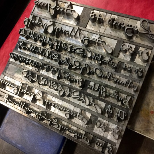
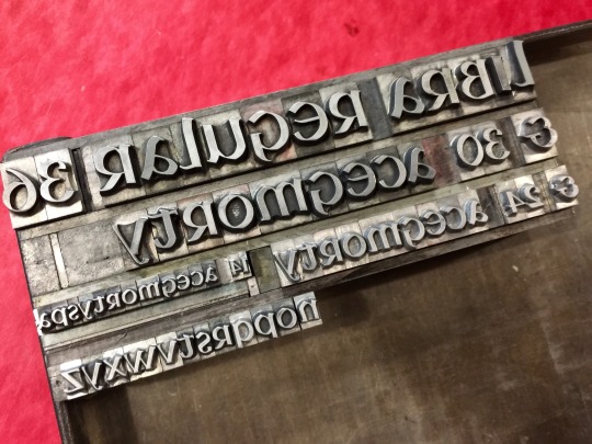
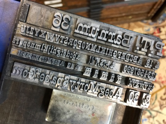
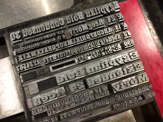
[image description: photos of proofs of handset type for letterpress printing, displaying all the letters in a given font, and the range of sizes available, and also photos of the formes set to print the proofs. Fonts displayed: Legend (a script) Libra (an uncial), Fortune Light, P. T. Barnum, Playbill, and Egyptian Bold (all slab serifs). End description.]
A bit of a weird mix at the back half of this cabinet but we do not have all that many slab serif cases and so they all live under the scripts together. Libra is also—I don’t know why the Libra is here. Last time I moved all the cabinets, I was very careful to keep things in logical groups unless that meant putting a heavy case very low to the ground. I like my spine the way it is.
Larger runs of book faces next—impramatur!! Caslon!! Garamooooond—which are mostly cleaner because they’re frequently used & checked. But still nobody’s just combed through the whole of them yet.
[video description: recording of feeding letterpress-printed cards into a clamshell-action press. The press opens and closes on a hinge, and every time it opens one card is removed by hand from the registration pins, and another is positioned in its place. when a sheet has been misfed in any way, rather than pulling the sheet back out of the press, there’s a lever to throw off impression. When the lever is thrown the press still closes but the relief image no longer touches the sheet. End description.]
somebody asked a while ago about what happens when i fuck up a feed and it happens all the time, usually because slipsheets are being annoying, i just don’t usually post them. for ego reasons. it’s silly, an accidental double-ink isn’t even a blown sheet or anything. anyway! that’s the impression lever up at the top, just inside the flywheel. it does a really really cool but simple thing down in the depths that shifts the whole bed—the right hand half of the hinge motion—back just a bit, away from impressing the sheet.
secondarily: usually i just do double hits in one run, but it’s really a bit better to do a pass, let it dry some to seal the sheet, and feed it again. if i can fit it into the schedule and keep the ink alive it’s slightly more opaque.
[image description: photos of proofs of handset type for letterpress printing, displaying all the letters in the font Civilite, and the range of sizes available. Also photos of two cases of the font, which are divided into compartments for each letter and figure. Civilite is a script font based on semi-formal French cursive of the 1500s, and has several alternate characters, especially lowercase letters with curling starts or extra long tails for beginning and ending words. In the cases, some compartments have extra cardboard dividers inside to separate variants on the same letter. End description.]
I should’ve jumped the Civilite cases up the cleaning queue a while ago. They weren’t very messy except for the part where they’d never been divided for alternate characters. I love setting with it, but it wasn’t very friendly to anybody else’s use.
All done now, and the extra 14 & 30 from a different casting checked for baselines & married in! perfectly usable cases. hmmmmm Legend next i think, but im pretty sure those ones are already basically good to go.
[image description: 7 photos of a combination letterpress and hand-drawn print of Zagreus from the game Hades, and the formes of lead type used to print it. it’s a 5.375x10 inch piece, black pen drawing illustrating Zagreus sitting in a seat full of laurel leaves, one foot resting on a decorative skull and the other dipping in the blood pool. The frame above his head has his name between floral wreaths, and wraps around a water jar pouring blood into the pool as the left-hand frame of the illustration. The letterpress elements are his name, the red of the pool, and a red & gold of his armbands and outer garment, rendered in geometric and floral patterns. individual photo IDs under the cut.]
i tell you what i looked at the environmental details around the blood pool exactly once and said okay, this is the floral pattern we’re using, and that’s the water jug frame we’re putting around his name, and everything else just has to fit somewhere in between those two things. and then at some point i also said sure, that seems like a fine amount of laurel to commit to drawing. GOD laurel is a boring plant to draw a bunch of times. but ok ok ok the texture was Worth It.
really maxed out the coverage i have of these flowers!! it does not help that i have an uneven amount of left- and right-facing pieces, so keeping the pattern sufficiently random when i had to use every piece and couldn’t be picky about how many right-facing pieces there are was, fussy. still! i love putting together a mix n match bunch of 6 pt. florals to augment this set, and i wanted to hold up Zag’s relatively small cloth object with something extra, another color.
1: a photo of the complete print, where Zagreus lounges in a seat full of laurel leaves. he’s sitting above the blood pool where he revives after each run, with one foot resting on a skull and the other dipping into the pool. His foot, always on fire, heats the blood until it steams around his ankle. above his head there’s a frame around his name, bordered in a wave pattern. At one end the wave border transitions into the decoration around a water jug, tipped over and spilling more blood down the left side into the pool. The ripples of the pool and the steam are printed letterpress with radomized decorative borders, mostly lines, some wavy, some extra thick, a few helix-patterned. Zagreus’ red armbands and outer garment are printed in a pattern of red, twisting flowers, with a scattering of more small flowers picked out in gold.
2-4: closeups of the finished print, focusing on things like the jug & border arrangement, the shape of the steam around his ankle, and the red & gold pattern of his clothing.
5-7: photos of the handset formes used to print all the color elements of the print. There are separate formes each for his name, the red pass of flowers, and the scattered gold flowers. these formes need to be lifted up, carried, and held vertically in the bed of the clamshell press, so all negative space around the individual letters and decorative pieces are filled with shorter pieces, too low to ink or print. then pressure is applied by wedges to two sides of the forme, inside a rectangular cast iron frame, so that the whole frame and all the assembled pieces inside it can be lifted up. for the red and gold floral formes, the positions of each flower had to match exactly, so that the red flowers left room for the gold, and the gold dropped into place in the gaps between red flowers.
[image description: 6 photos of a combination letterpress and hand-drawn print of Megaera from the game Hades, and the formes of lead type used to print it. it’s a 5.375x10 inch piece, black pen drawing illustrating Megaera wielding her whip inside a loose & lightweight frame of sharp black rods, climbing roses, and a podium-like base featuring small elements from her chamber in Tartarus. The letterpress elements are her name, bordered with a Greek key pattern, and the blue color of her chiton, pants, and wrapped forearms, rendered in a relief-printed repeating geometric pattern. individual photo IDs under the cut.]
I can’t quite put my finger yet on when i feel it’s beneficial for the printed pattern to be very regular and flat, vs. this kind, which is a bit more randomized and almost pretends to be morphed by 3D folds. The printing on it was pretty straightforward, but i did do this one in multiple passes as well, tilting different parts of her outfit at different angles so her pants and tunic patterns didn’t align across the barrier of her skirt trim. I also needed to be pretty careful to get printed color coverage in a whole bunch of corners, otherwise the tunic especially is missing some important information to parse it.
picking elements from her boss fight chamber to put in the frame was super fun :) there’s so much Good Geometry in Hades’ environment design!! sadly i don’t have nearly enough of the Greek keys to cover the clothing area, so i put it in her titling block and made her a whole podium about it. Name set in Invitation.
1: a photo of the complete print, where Megaera stands with her whip looping around her, wing out and preparing to grasp the hilt tighter. the bottom of the frame implies a pedestal, decorated with hooded heads and and geometric shapes like the statues and floor tiles of Megaera’s boss fight chamber. The iron rods implying the sides of the border end in twisting helixes, also like the tiles on her floor, and are covered in thorny rose vines. Hanging from the roses are her Skull Earring keepsake and Companion Battie.
2: a closeup of the finished print, showing details like the line texture of her hair and whip, and large areas where the pattern was relief-printed in blue.
3: a photo of the handset forme used to print the blue pattern on her clothes. It’s a slightly random arrangement of geometric pieces intended to be a decorative border, looping over and under itself sort of like a blocky Celtic knot pattern. The pieces are in this case set to turn corners and double back on themselves to cover more of the area.
4: a photo of a proof of the printed pattern, and the mylar mask positioned on top of it that will allow the pattern to print only in the desired, irregular area of the shape of Meg’s chiton. the decorative pieces cover a larger, rectangular area, and the print is protected from printing in the negative space by a hand-cut mask made from mylar. The print will be put underneath the mylar mask, and printed only through the hole in the mylar.
5: a closeup of the finished print, focusing on the lower half, her wide stance, the pedestal, and the impression where Megaera’s name is printed with the Greek key border.
6: a photo of the handset formes used to print Meg’s name. these formes need to be lifted up, carried, and held vertically in the bed of the clamshell press, so all negative space around the individual letters and decorative pieces are filled with shorter pieces, too low to ink or print. then pressure is applied by wedges to two sides of the forme, inside a rectangular cast iron frame, so that the whole frame and all the assembled pieces inside it can be lifted up.
[image description: 9 photos of a combination letterpress and hand-drawn print of Thanatos from the game Hades, process photos, and the formes of lead type used to print it. it’s a 5.375x10 inch piece, black pen drawing illustrating Thanatos inside a loose & lightweight frame of broken stone railings, burning candles, and bleeding heart flowers. The letterpress elements are his name, and the color of his cloak, rendered in a relief-printed repeating geometric pattern in greyish purple. The pattern doesn’t contour to folds of the fabric, but it is half the depth of color where, in context of the illustration, it shows the back side of the fabric, like the inside of his hood. individual photo IDs under the cut.]
HELLO,Desert Bus 2021 starts streaming tomorrow (Nov. 12th), playing the worst game of all time to raise money for Child’s Play! They do a lot of other fun stuff on stream as well since, you know, the worst game of all time, including auctions and giveaways, and i donated a set of three Hades prints that are scheduled for giveaway in the noon-6 pm slot Thursday the 18th!
honestly i debated mmmm quite a bit, which 3 characters to do, there’s some tempting element to every single design in the game—but my boy. my guy Thanatos. this enormous, swoopy swathe of fabric, the cavernous hood!! had to do it.
of course then i sketched it and one solid print of the pattern was going to be too much, too hard to read as a 3d object. i had to distinguish parts of the cloak from each other somehow, didn’t want to change the angle of the pattern for a couple reasons, didn’t think i could get the registration i needed between two different masks, SO. treated it like pressure printing! made one single big mask. cut my ink in half with transparent. printed the whole area of fabric once (3 passes, i don’t have all that much of the decoratives i wanted to use :[ ) in pale purple. cut away the tympan backer in all the areas that needed to stay pale, as the back side of the fabric. went back and hit the whole print a second time, with the formes and mylar in the same positions, but there’s not enough pressure anymore to imprint those lighter areas. tadaaaaaa
gosh bleeding hearts are fun to draw. they’re such weird little alien creatures. Name set in Torino.
1: a photo of the complete print, where Thanatos hovers above his name, framed by crumbling stone railings. the bottom left and top right corners are covered in clusters of bleeding heart flowers, and in nestled in the flower clusters are his Pierced Butterfly keepsake and Companion Mort. the right side of the frame is implied by tall candles and their smoke wisps.
2-5: closeups of the finished print, showing details like the smoke wisps, the impression of the relief printing on his name, and places where the letterpress-printed pattern changes from deep purple to pale purple, where fabric in the illustration folds over to show its reverse side.
6 & 7: process photos of the masking process used to print the letterpress material in the irregular area of illustrated fabric. the decorative pieces cover a larger, rectangular area, and the print is protected from printing in the negative space by a hand-cut mask from mylar. to bring the positive space up to printing pressure, a matching set of tympan paper packing is cut to match the mylar mask, and pasted into the press so that the print is sandwiched between paper packing and mylar mask, and printed through the hole in the mylar. the second photo shows the mask in place, and the backer behind reduced to only the pieces that were double-hit for extra color depth.
8 & 9: photos of the handset formes used to print the pattern and Thanatos’ name. these formes need to be lifted up, carried, and held vertically in the bed of the clamshell press, so all negative space around the individual letters and decorative pieces are filled with shorter pieces, too low to ink or print. then pressure is applied by wedges to two sides of the forme, inside a rectangular cast iron frame, so that the whole frame and all the assembled pieces inside it can be lifted up.
[video description: recording of feeding letterpress-printed cards into a clamshell-action press. The press opens and closes on a hinge, and every time it opens one card is removed by hand from the registration pins, and another is positioned in its place. The dark blue card is printed in white with scattered stars on one side, and on the other side a relief version of a drawing of the moon by Galileo. End description.]
Doing a little bit of night sky tonight
I love that you can hear the counter clicking over so clearly from this camera angle akdbxhdh
[video description: recording of feeding letterpress-printed cards into a clamshell-action press. The press opens and closes on a hinge, and every other opening one card removed by hand from the registration pins, and another is positioned in its place. The sheet is left in the pins for another rotation to impress each sheet twice, and put down a thicker layer of ink. End description.]
[image description: 3 photos of a combination letterpress & hand-drawn print, and the handset type forme used to print it. It’s a 4x8 inch illustration of an athletic woman in a floppy hat, bra, and boyshorts, with a lace top printed from a pattern of decorative lettepress pieces. The close-up photo of the print focuses on the pattern where it’s relief printed black-on-black over the underwear, showing in impression and slight reflection of the printing inks. The type forme is alternating rows of looping borders and detailed corner pieces. End description.]
tbh almost No Thoughts about this one, im just vibin, i knew i wanted to try lace and i got a sketch i liked for it and it was pretty easy breezy after that! It’s true I did this one on blue Stonehenge in the hopes I could get white lace to work and the contrast just wasn’t there, but that isn’t bothering me much. I have some saffron yellow scraps that would’ve been great for the printing pass, too, but I didn’t even try it because that paper is way too opaque to transfer the inks through the light table in the first place. There are other solutions for those problems, which I’ll wrestle with another day, but my backup plan was the simple black solution and i like it for this one just fine :)
[image description: 5 photos of a small letterpress printed piece, and the handset forme of lead type used to print it. It’s a 3x15 inch print that folds into thirds, with linoleum illustrations of spiders crawling out of holes in the wall, and across the bottom of the sheet. In the middle panel is text that reads: “I am learning that many names for spiders are extremely local. These ones, that live in the walls and hunt on the ground at night, they might be family Gnaphosidae. My mother taught me to call every small brown spider that startled me in the sink, ‘George.’” end description.]
Happy Spook Day! Have some small terrors.
I tell you what Exposure Therapy Study No. 3 is maybe the closest I’ve come to any kind of affection for spiders as a concept but it has not done anything to engender affection for the physical reality of them. They crawl around on the floor!! Where my feet also are!!! Extremely rude.
Century Schoolbook, linoleum, I’m reasonably certain this is BFK Rives but it’s leftover scraps so I don’t remember. They’re up on Etsy now, and there are only 17 of them!
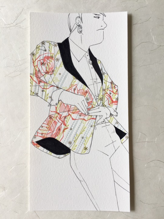
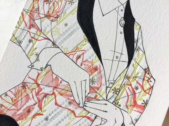
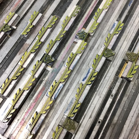
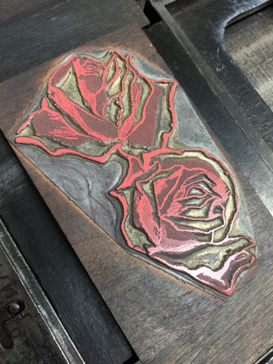
[Image description: 4 photos of a combination letterpress & hand-drawn print, and some of the handset type formes and relief cuts used to print it. It’s a 4x8 inch illustration of a person in a loud, 4-color suit jacket. Their jacket is selectively letterpress printed with green leaves, decorative blue dots, gold stars, and large pink roses. a close-up photo of the print focuses on the pattern, where the large roses print on top of more transparent greens and blues, and where the suit shape is trapped to intersecting ink lines of hands. The green pass was printed from a handset forme of rows of decorative leaf border material, and the roses from a half-tone relief illustration. End description.]
When I do the sketches for these I now have one part of my brain saying to me, hey, you should go beyond the technical challenge of the pattern-printing, you should think about what specifically this contributes to an illustration, what is its Purpose, when is it beneficial and when is it merely a Fun Trick—
And then there’s another part that’s banging its fists on the table and saying FLORAL SUITS FLORAL SUITS FLORAL SU—
I’ll be honest. The Floral Suit Voice is pretty beefy. It works out. I feed it a lot of protein. At some point maybe I should have another long think on what this is all for exactly, but this week I just made a loud textile pattern that I love extremely very much.
[video description: recording of letterpress printing decorative material in an irregular shape, in a clamshell-action press. The illustration of roses in pink bleeds beyond the edges of the area, but the sheet is protected from ink and impression outside the shape by a Mylar mask. The area is also printed with repeating patterns in green and blue, and a scattering of gold stars. End description.]
4 colors was a GREAT idea this is exactly the chaos I was craving
[image ID: screenshot of a spreadsheet used to schedule time on various pieces of equipment. For the current day, the big Chandler & Price press was claimed from 10 am to 5 pm, to print a sequence of 4 colors. end id.]
;ALKSDJF HUBRIS HUBRIS HUBRIS
anyway. i got two colors done today and it took uuuuh 3 extra hours about.
[image ID: a photo of in-process combination hand-inked and letterpress printed illustrations. the illustration of a person will be done in pen, and the colorful pattern of the suit they’re wearing is being printed letterpress from decorative pieces, like border design materials. a digital mockup of the drawing is used to establish position in the press so that the printing can be done first, and then inks will be applied after on a light table, tracing from the mockup. in this stage of the process, the blue and green elements of the fabric pattern have been printed.]