#icon tutorial

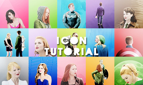
Below the cut is a tutoral for an icon with a transparent background and a small blurry shadow.
Examples:

Materials:
- GIMP
- Icons
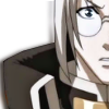
OKAY, first off we’re going to start with a basic icon. If you need help making an icon, I have a tutorial for that here.
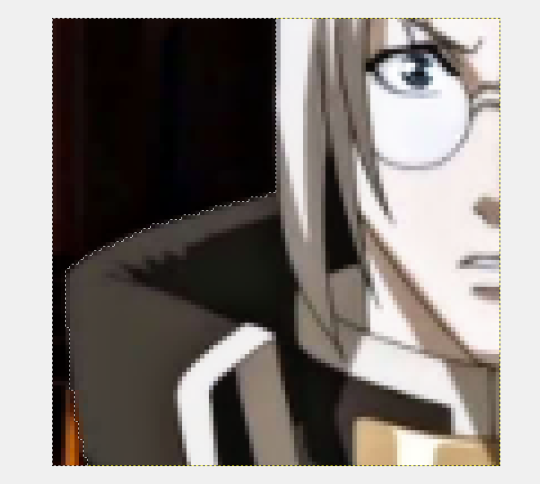
You’re going to need to ZOOM in. I usually zoom to 800%.
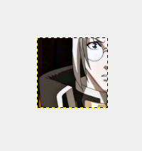
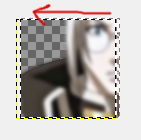
Using the FREE SELECT TOOL, outline the background area.
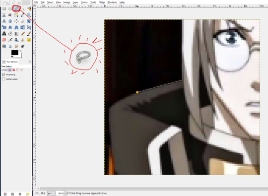
When you’re done it should look something like this.
Next, go to EDIT > CUT to remove the selected area– in this case, the background.
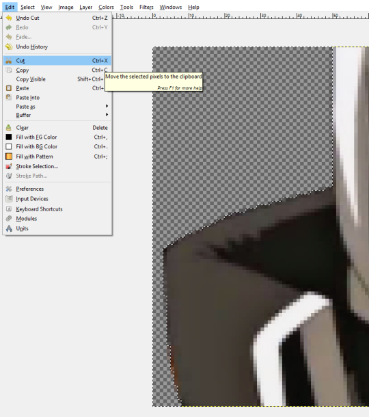
Your icon now has a transparent background! If you DON’T want the little blur-shadow, you can stop now and save your icon as a .PNG file. If not….
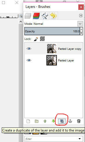
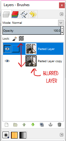
Create a duplicate layer.
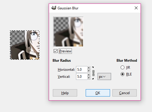
Go to FILTERS > BLUR > GAUSSIAN BLUR and click OK.
Move the blurred layer a little to the side…
Finally, move the Copied/Blurred later BELOW the original layer.
Your icon should now look something like this-

BE SURE to save it as a PNG file!
this will be a really short and easy tutorial because i follow the same steps pretty much all the time and i use psds instead of creating new colorings every time and you’re proably nor interested in that at all but anyways here we go
here are some examples:


what you have to do first is find a screencap you want to use and i recommend using this blog which is a part of this site (i might or might not be selfishly promoting a site that i run with my friend no big deal or anything please use my caps i will love you forever)
i’m going to use this one just because erica looks gorgeous and really, who needs a reason when it comes to erica? nobody that’s who
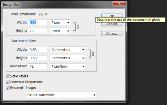
now open your photoshop and the picture you want to use and crop the picture so that it’s 100x100 px. all you have to do is set these cropping options

and crop your picture, it doesn’t really matter how you choose to crop it as long as you like how it looks. after cropping your image, apply any sharpening action you like (you can use one of mine if you want)
here’s what my icon looks like so far:

all you have to do now is apply a psd. i used this one but you can use any of my other ones or your own or any other psd that you like

and it looks pretty good already so you can save it and use it but i just like to color the background because i think it make the icon prettier and i just like that effect a lot? anyways, i explained how to make the backround effect here. and it’s actually really easy to do so it will take you less than a minute but will make your icon look really cute and it will also trick people into thinking you put effort in making your icon when you literally spent like 2 minutes
aaaand here’s the result:

if you have ANY questions, just let me know. seriously, don’t ever be too shy to message me because it makes me really happy that people actually read my crappy tutorials so if i can be any help, i’ll be more than glad to answer any of your questions!!
 + englishplease if this tutorial was useful to you reblog/lik")
- tutorialbysistaround.
- portuguese (br) + english
- please if this tutorial was useful to you reblog/like.
- i really hope that this tutorial will be useful to you.
- sorry, english is not my first language.
Primeiro tutorial: Icon transparente simples
First tutorial: Simple transparent icon

1) Abra a imagem que vai usar e corte da forma que desejar, respeitando a proporção quadrada
Open the picture that you’re going to use and cut as you wish, but always respecting the square proportion
2) Daí, usando a ferramenta Quick Selection, selecione somente a parte que ficara em seu icon
Then, using the Quick Selection Tool, select just the part of the picture that you want in your icon

3) Copie e cole (ctrl+c ctrl+v) a seleção feita
Copy and paste (ctrl+c ctrl+v) the selection that you did
4) Apague a camada de fundo e aplique um .psd de sua escolha (aqui temos vários)
Delete the background layer and add a .psd of your choice (here we have a lot for you choose)
5)Agora é só mesclar as camadas (ctrl+shift+e) e redimensione para o tamanho de icon (100x100)
Now is just merge your layers (ctrl+shift+e) and resize to a icon size (100x100)
6) Agora é só aplicar a nitidez
Now is just aply the sharpen

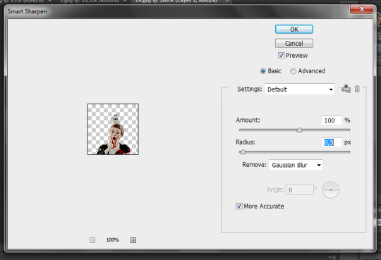
Essas são as configurações de nitidez que uso para esse tipo de icons:
Those are the sharpen settings that i use those kind of icons:
7) Salve seu icon em formato .png para garantir que o fundo fique transparente, e pronto, é só usar no perfil ♥
Save your icon in .png format to ensure that the background is transparent, and that’s it, just use it in the profile ♥
Segundo tutorial: Icon redondo
Second tutorial: Circle icon

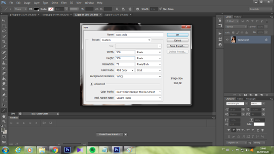
1) Crie um novo documento em branco (eu uso o tamanho 300x300 para ter espaço para visualizar melhor)
Create a new blank document (I use the size 300x300 to have space for a better view)
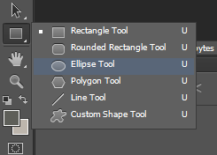
2) Usando a ferramenta Ellipse eu crio dois círculos:
Using the Ellipse Tool i create two circles:
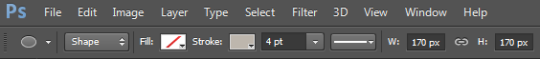
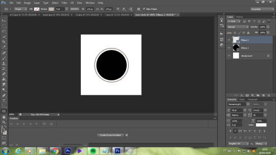
O primeiro círculo em 150x150 preenchido com cor (a escolha da cor não influencia no resultado final):
The first circle in the size 150x150 filled with color (the choice of color does not influence the final result):


O segundo círculo em 170x170 sem nenhum preenchimento, somente como contorno (cor de sua preferência):
The second circle in the size 170x170 without any padding, only as an outline (color of your preference):
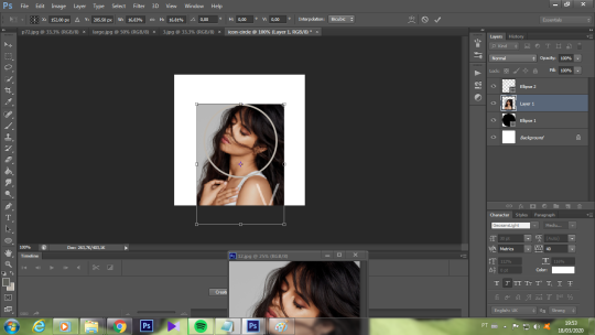
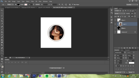
3) Arraste a imagem que você quer para o icon em cima da camada do primeiro circulo (o preenchido) e ajuste (ctrl + t) do tamanho desejado:
Drag the picture that you want for your icon on top of the layer of our first circle (the filled one) and adjust (ctrl + t) the size as you wish:
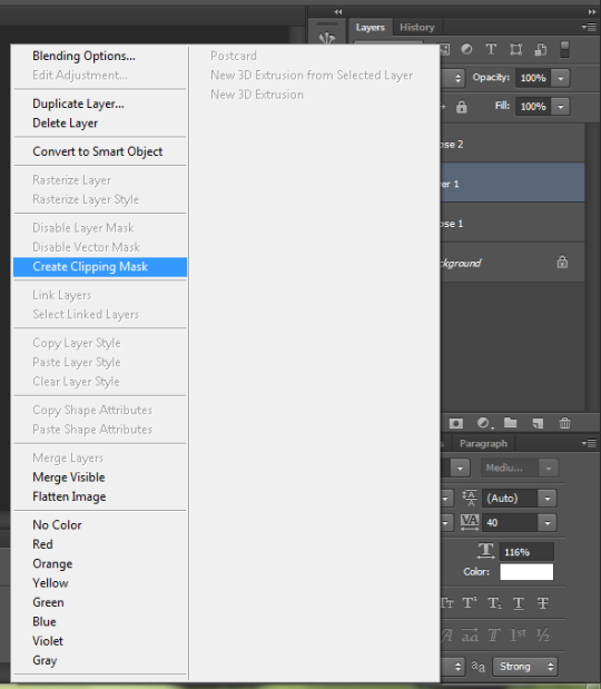
4)Feito isso, clique com o botão direito em cima da camada da imagem e selecione a função de máscara de corte:
After that, right-click on the image layer and select create clipping maskfunction:
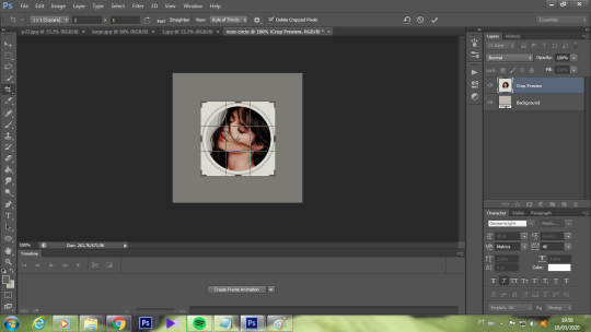
5) Corte a imagem mais próximo ao círculo maior, sempre respeitando a proporção quadrada
Cut the picure right next no the big circle, always respecting the square proportion
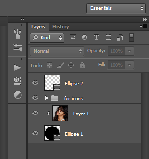
6) Apague a camada de fundo e aplique um .psd de sua escolha (aqui temos vários)
Delete the background layer and add a .psd of your choice (here we have a lot for you choose)

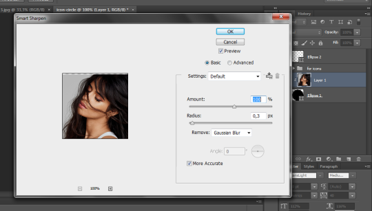
7) Redimencione para 100x100 e aplique nitidez somente na camada da imagem:
Resize to 100x100 e aply sharpen only in the picture layer:
8) Agora é só mesclar as camadas (ctrl+shift+e) e salvar seu icon em formato .png para garantir que o fundo fique transparente, e pronto, é só usar no perfil ♥
Now is just merge your layers (ctrl+shift+e) and save your icon in .png format to ensure that the background is transparent, and that’s it, just use it in the profile ♥
Post link