#matt talbot

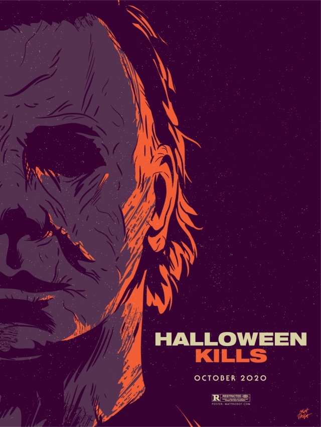
Halloween Kills poster by Matt Talbot


Revisiting old friends today


Game of Thrones portraitsbyMatt Talbot
I drew these portraits over the last week to celebrate Game of Thrones coming back for its final season.
Post link

Got a chance to see Us over the weekend and loved it! Here’s a quick tribute poster I made.
 by Matt TalbotI saw the new Halloween and loved it! Jamie Lee ruled, there were som")
Halloween (2018) by Matt Talbot
I saw the new Halloween and loved it! Jamie Lee ruled, there were some fun callbacks and a bunch of good scares (everyone’s entitled to at least one). So I made a poster this morning. Sure, I’ve drawn a lot of Michael Myers lately, but I don’t mind.
Post link

Here’s my poster for @bettercallsaul 410, Winner! I’m sad that the season is over and there’s no new episode tonight, but what an amazing season it was. I considered a few different concepts for this poster, but the urge to draw the karaoke scene was a strong one. And, in a season full of heavy moments, I wanted to end with something a little lighthearted (even though we now know what it leads to). I want to thank everyone who has commented and liked these episode posters. You all make this project really fun and I hope you will join me again next season. Special thanks to everyone from the show who has taken time to say nice things… can’t tell you how much I appreciate it! And SUPER special shoutout to @heisenbergchronicles for all the support over the last four (!) years!
Post link

Here’s my contribution to the Gallery 1988 Product Placement show! This show features screen printed tributes to fictitious items from pop culture and I chose to focus on Ash Williams’ chainsaw hand, as seen in Evil Dead 2, Army of Darkness, and of course Ash Vs. Evil Dead! This ad is also an homage to the old Charles Atlas “Hey Skinny” ads wherein a mail-order kit could transform a 98-pound weakling into a hulking brute. This 2-color, 18x24 poster was lovingly screen printed by the amazing VGKids and is a limited edition of just 40 copies. On sale at https://nineteeneightyeight.com/ starting sometime on October 13.
Post link

Dracula A.D. 1972 poster by Matt Talbot
My October work schedule continues to be very busy, but I’m still trying to fit in some spooky posters as I can. So here’s one for one of my favorite Hammer Films, Dracula A.D. 1972! Is it, objectively speaking, the best Hammer Dracula film? Maybe not. But, it’s tremendously fun and I just love it. Christopher Lee just can’t be beat. Neither can Peter Cushing.
Post link

Here’s my poster for Better Call Saul season 4 episode 9, Wiedersehen! How could I pass up the opportunity to feature such an iconic moment?
Post link
 by Matt TalbotAll month long, I will be drawing 2-color posters for my favorite spoo")
Suspiria (1977) by Matt Talbot
All month long, I will be drawing 2-color posters for my favorite spooky movies.
Post link
 by Matt TalbotAs many of you know, I’ve spent three of the last four Octobers")
HALLOWEEN (1978) by Matt Talbot
As many of you know, I’ve spent three of the last four Octobers drawing a horror poster each day. For this reason, October is my favorite month, and I enjoy the challenge immensely. That being said, it’s an enormous amount of work and last year it took me months to recover. It has also led to me getting “real” movie poster work and this year, that work is sadly going to prevent me from drawing 31 posters. But! I’m going to look on the bright side and fit in as many as I can. It won’t be daily, but hopefully it will still be fun. My plan is to revisit some of my favorite horror films and give them the ol’ two-color treatment. I’m starting things off with one of my favorite movies (not just favorite horror movies, but favorite movies, period): the oft-imitated but never matched HALLOWEEN by John Carpenter!
Post link


APPRECIATION & INTERVIEW
Better Call Saul episode posters by Matt Talbot
After 4 nearly years, I thought it was time to catch up with Matt Talbot about his Better Call Saul poster project. The last time we talked during Season 1, Matt was deep in the hustle of making his name as an illustrator: juggling a full-time job, freelance projects, as well as band. Finding time for personal projects like this one can be a significant challenge. (Not to mention surviving the death of your tools: During Season 1 his Mac laptop died, and this season, his Wacom tablet bit the bullet). But despite these challenges, the 43-year-old New Hampshire native has persevered to create a clever and thoughtful series of episode posters that has garnered considerable attention, and brought with it new high-profile clientsandart exhibitions.First, congratulations on all of your success andrecognition with this series of posters. It’s well-deserved. What’s been the most gratifying feedback you’ve received?
Thank you! Every interaction I’ve had with anyone from the show has delighted me. I’ve been surprised by all of the cast and crew members who have said nice things – every note I’ve gotten has meant a lot to me. That being said, Michael McKean randomly tweeting at me that he has my poster for Chicanery hanging in his home blew my mind. I was eating dinner when my phone showed the notification and I literally jumped up from the table. I’ve been a fan of Michael’s since I saw Spinal Tap in the ‘80s and never in a million years would I have guessed I’d make something he valued enough to hang in his home.Tell me about your contributionstoGallery1988 exhibitions. How does that process work?
It’s a pretty simple process. They invite me to be part of a show, and I make something to send them. I’m very excited for the opportunity to show there, and I feel like it’s a milestone in my art-making career.Across the 4 seasons, which BCS posters are your favorites? Which one are you most proud of? I’m particularly fond of Rebecca,Rico,Marco,Switch,Sunk CostsandSomething Beautiful.
Oh man, it’s hard for me to evaluate my own stuff. I tend to like the posters where I find a way to get a different take on something they did in the episode. I would say that “Sunk Costs” is also one of my favorites because I did something differently than how they shot it, and because Mike is so recognizable even from the back. I was also pleased with “Off Brand” because it was when I finally figured out how to draw Bob Odenkirk.How has your process for creating these posters evolved over 4 seasons?
When I started this project I had a vague idea that I would focus on scenes rather than portraits or likenesses, but that didn’t even last half a season! The characters were too good not to include. In that way, the posters have evolved in my willingness to draw characters, and also, hopefully, my ability to draw them.My process is now something like: Watch the show on Monday; think about it on Tuesday, figure out what stood out to me and do a thumbnail sketch or two; draw it on Wednesday night; post it Thursday afternoon. I’m a bit faster at drawing these now compared to when I started. And I’m a bit more decisive on choosing which subject matter to depict.
There have been quite a few changes on the visual side of Better Call Saul over the last 2 seasons. New directors (Minkie Spiro, Daniel Sackheim, and Andrew Stanton), a new cinematographer Marshall Adams, even new cameras. What are your thoughts on how the show’s visual grammar has evolved? Has any of this impacted your posters from Seasons 3 & 4?
I try not to just redraw literal scenes from the show, and I don’t need to tell you that they shoot the show in an incredibly beautiful way. I mean, they always, always, pick the best angle, the best shot to capture something. For that reason, it’s sometimes hard to to come up with another take on a moment from the show.That being said, the visual style hasn’t really impacted my posters as much as the evolving subject matter has. The show, I think, is substantially darker than it was in the early going. It was easier to depict Jimmy’s hi-jinx in the first couple seasons. But with Chuck’s deteriorating mental state, the cartel stuff, Mike going deeper into Fring’s world and of course, Jimmy’s loosening sense of morals, the funny moments are harder to spot. That’s lead me to some more somber layouts and color choices.
We didn’t discuss this in our first interview. Which typeface are you using in your posters, or is this custom typography?
The main logo and episode titles are set in Sign Painter, from the excellent House Industries.The Heisenverse is known for it’s color theory and use of color. How has that impacted your color choices in these posters?
I’ve kind of adhered to their blue=good/red=bad symbolism, but I also try to balance out colors between episodes and not repeat myself in sequential posters.Many of your posters (especially ones this season) use a monochromatic, or simple palette of 1-2 colors. Tell me more about why you chose that approach. Is this a signature of your style? I’ve seen this approach in a lot of your work.
You know, in the early seasons, I was trying to use simpler color palettes, but I wasn’t very disciplined and I got away from that. I’m trying to stick to a more consistent style in season 4. It is a conscious decision. I also feel like with the week-to-week nature of this project, it helps quickly set apart each poster. And, I really do love limited color palettes. Giving myself color constraints helps me figure out different ways to solve layout problems.I’ve heard other illustrators say that Bob Odenkirk’s facial features are tricky to capture. Do you share that sentiment? Which characters are more challenging to illustrate?
I do agree with that. I had a really hard time with him at first. I kind of think I have a better handle on it now, but I’m always trying to get better. I feel like if you can get his mouth right, it goes a long way.I found Hector hard to capture both times I drew him. Mike, on the other hand, is just pure fun to draw. Jonathan Banks is so distinctive and iconic.
What’s been the most difficult poster thus far? Why was it challenging?
Maybe it’s because a lot of time has gone by, but I can’t think of one that stands out as having been really difficult.Francesco Francavilla did alternate posters for some of his Breaking Bad posters. Inevitably, when artists look back at their work, they consider revising or redoing it because of a variety of reasons – their point of view has changed, their skill/style has evolved, or maybe they were never truly content with the final product. Looking back at 4 seasons worth of posters, are there any that make you want to scratch the revision itch?
Yeah, more than I would care to admit. I would really like another crack at Amarillo. I know I could do a better job and that drawing is just super flat. In season two, I decided to to experiment with style and I kind of wish I hadn’t. I like Cobbler, but I wish I had drawn it in my normal style. I would redraw Nailed for sure. Oh man, if I start going down this road it’s not going to end well, so I’ll just stop.You mentioned earlier this season you were excited to draw Track Suit Jimmy. Who or what haven’t you drawn, that you are eager to illustrate?
Howard! It bums me out to no end that I haven’t drawn him, but it just hasn’t worked out. And I need to include Kim more. It’s kind of criminal that her face only appeared for the first time in a poster this season.What’s your opinion of Season 4? Tell me about your favorites – episode, scene, character.
I think season 4 is brilliant so far. The Kim/Jimmy relationship has deepened so much this season, and feels so real, but full of inevitable heartache. Oh, the flash-forward to Breaking Bad’s timeline was amazing. Mike doing his audit in the Madrigal warehouse. Really, anything Michael Mando does on screen. It’s hard to pick. I so enjoy the deliberate pace of this show.Where’s your favorite place to discuss the show?
I honestly don’t talk about it too much online, though I lurk in a few places and read a lot. I actually discuss it mostly with my wife!I know you get this question a lot, so let’s cover it here so folks understand: Do you have plans to sell any of this work online?
I really appreciate that people like it enough to want to buy it or hang it, but I don’t plan to sell the Better Call Saul posters online. I’m doing this for fun, not to make a buck off the show, and I don’t own the rights to sell it anyway.What’s next for Matt? Do you have any other poster or illustration projects in the works? Is you band performing soon?
I have several more pieces for Gallery1988 shows coming up. I’m pulling together an art show at a local brewery for whom I design all of their labels and stuff. I’m patiently waiting for a t-shirt I designed for one of my all-time favorite movies to be announced. And for the past several Octobers, I spent the month drawing a horrorposterper day. I’m not sure if logistically I can do that again this year, but I’ll probably fit at least a few in. We’ll see how it goes. Sadly, with all of my illustration work, I haven’t had any time for music making, but someday I hope to get back to that!Follow Matt:Web site/Tumblr/Twitter/Dribbble /Instagram/ PosterSpy
– Interview by Shayne Bowman, Heisenberg Chronicles
Thank so much for the interview, Shayne! I appreciate your support so much; it means a lot to me.
Post link


Here’s my poster for Better Call Saul 407, Something Stupid. I wanted to tackle the AMAZING montage in this episode as it cast a large shadow over the whole episode (and what an episode it was!). But I didn’t want to reference the split screen too overtly, so here’s my attempt to depict the fading nature of Jimmy and Kim’s relationship. Better Call Saul, why u break my heart?
Post link
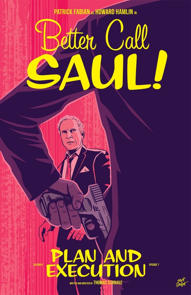
My poster for Better Call Saul 607, Plan and Execution.


Prints and original artwork from Gallery 1988’s “The 90s” exhibit - celebrating 1990s pop culture - is available online. I’ve highlighted some of my favorite pieces:
- The X-Files/Scream by Matt Talbot
- Twin Peaks/The Matrix by Rohitash Rao
- Twin Peaks by Krystal Beisick
- Scooby-Doo! and the Witch’s Ghost by Kristy Edgar
- Jurassic Park by Jen Taylor
- Jurassic Park by Kevin Tiernan
- Tremors by Chet Phillips
- Tremors by Edgar Ascensão
- The Craft by Heather Perry
Post link