#prototyping


Last year I thought it was high time I re-made my Surgy stop motion puppet with the resin printing technology I now possess.
.
That project got delayed until about last month, when I started doing some 3D modeling for it. And just yesterday I decided to finish up that work I started. Here’s some behind the scenes the first test print.
.
More modeling/sizing/testing is needed, but it’s fun to prototype parts.
.
My ultimate plan was to create a YouTube series where Surgy shares tips and tutorials about various art projects, ranging from casting to painting to animation. It’s a possibility.
.
.
#surgy #surgyrobot #creativemechanics #eanimation #prototyping #prototype #resinprinting #elegoosaturn #maya #3dmodeling #robot #stopmotionpuppet #stopmotion
https://www.instagram.com/p/CbDI0b7ram_/?utm_medium=tumblr
Post link

3D printed modular #eurorack - well first test at least needs some refinement
.
.
#3dprinting #3dprinted #modularsynth #synthporn #prototyping #poc
https://www.instagram.com/p/BrTqvnjHNX1/?utm_source=ig_tumblr_share&igshid=iqcwju8p0d9d
Post link
Finished the first round of prototyping of my ballot lookup tool. Here’s a summary of the design and user testing results.

Step 1: Collecting Information
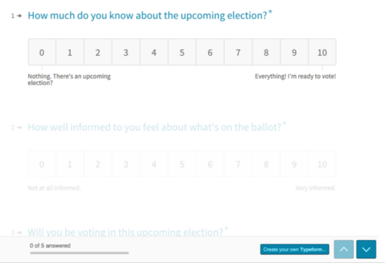
So first, I started with a survey:
Almost all of my respondents were millennials, which was good because millennials are the least likely to vote.
Here are some of the results:
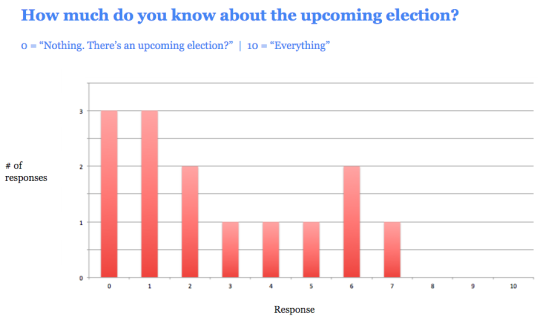

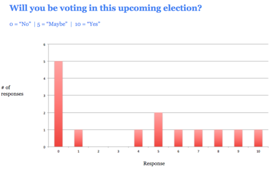

The majority of respondents said the problem was that they “lacked information.”
Step 2: Prototype #1 (Quick and Dirty)
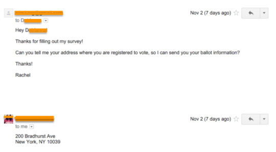
So, with my first prototype, I offered to send them information – and I did this just before the most recent general election on November 3, 2015.
This first prototype was pretty much just an email. I asked people for their registered voting addresses, and then emailed them back with their voting location, when they could vote, what positions and candidates were on the ballot, and links to read more about the candidates.
Here’s an example of an email I sent:

I then interviewed all the people that I sent ballot information to.
Result: Receiving ballot information was not enough to get people to vote.
People liked that ballot information was made so readily available. Some people said that it made the election feel “more tangible.” But people also said they wanted more information to help them decide who to vote for.
…But that they also didn’t want to read too much.
One user said:
First off, the fact that I even have names is helpful. It makes this election feel like something I should participate in. It’s like, with presidential elections, I always know the candidates by name, even if I don’t fully know their agendas.
I haven’t had a chance to read about all of the candidates, mainly because I’m too lazy to open all the links. At first glance having some key points in bullets would be helpful, just so I know if the person is worth learning about.
I definitely think I’d be more likely to vote if I had this info before upcoming elections.
Overall, this really made the election seem like some thing that was within my reach…as in, not too heavy of a lift. I already know where to go and who I could vote for, that’s like 70% of the battle.
Me: What is the other 30%?
It’d be me having background info about each candidate and feeling like I knew enough to pick one to vote for. Also, me taking the time to read through the stuff…time v. the payoff is always a big factor.
I want to say I’d open all the links you provided(which I’ve done, but haven’t read them yet) and read them, but I don’t want to be too idealistic. The thing about presidential elections is that the media covers them so much, that you don’t have to search hard for the info you want about particular issues. Plus, tons of people do think pieces on particular candidates or issues and so the info seems to come to me via Internet and tv, rather than me having to seek that out like in a local election.
Other questions that I heard from users were:
What do the positions mean? I don’t know enough about how our political system works to understand what this candidate would be doing in this position.
And…
In general this information is helpful… But I doubt I’ll go through and read all the links.
So at this point I knew that I needed to create an easy way for people to quickly understand what a particular position was even about, as well as whether or not they would vote for a candidate.
This is, obviously, no small task, since it’s hard to summarize many candidates up in just a few sentences. Still, it was helpful to know that this is what users wanted.
Step 3: Prototype #2 (Let’s Make an App!)
In my second round of prototyping, I was looking to hear from another group of users – except this time, instead of just a text-heavy email, I presented them with a minimal app.
The goal of this prototype was to gauge potential user interest in a mobile app. It had to be accessible via mobile because:
- Almost all millennials have a smartphone
- Mobile is the primary way that millennials get information
- It’s the easiest way to disseminate a large amount of information in a way that isn’t overwhelming. Neither emails nor text messages would allow for me to let users show/hide information as necessary, which I decided was a crucial element of the design.
My first prototype was a long email with a LOT of text. So with this second prototype I wanted to be able to give people access to all of that information, without presenting it in an overwhelming manner.
The other thing I needed my second prototype to do was to help people who weren’t sure about various things – such as their registered voting address, whether they were even registered at all, and what a political position meant.
So I added a few features to the second prototype:
- The ability to check if you are a registered voter
- The ability to verify your registered voting address
Additionally, I added a way for people to find out which candidates best matched their own personal beliefs. This was based on the design of www.isidewith.com/, which I think is a pretty brilliant site.
I wasn’t able to flesh out every single screen in this clickable prototype, but I included enough screens to allow me to get feedback about each of these features during my user testing.
Here’s a shot of the main screen:

You can click here to play with the clickable prototype.
This prototype got generally positive reviews.
Here’s some of the general feedback:
“I think it’s great that I can just tap on the question marks to find out more information.”
“I would definitely vote if it was this easy.”
Yes!! Exactly what I was hoping to hear. :)
And here’s what people expected to see when they tapped on a candidates name:
“I would want to see a voting history for each of the candidates.”
“I’m not sure what I would expect to see.. Maybe more information about their background?”
“I would want to see information specific to the position they are running for. For example, how would they act in this position?”
Here’s what people thought about the “My Stances” feature (which is the feature that allows you to enter your own political beliefs, so that the app can tell you how you match with candidates):
“I like that I can enter my political stances, and that the app will probably match me with candidates.”
“I don’t like that the app wants me to enter my political stances. Why would you ever enter personal beliefs online? Maybe this is a generational thing.”
Interestingly, out of 7 people that I tested this with, 6 of them liked the “My Stances” feature, and only 1 person did not.
Conclusion
I learned a lot through this process.
I learned that people (particularly millennials) want voting information to be as easy and clear as possible. Like with everything else that us millennials do on our phone (order food, chat with friends, check our emails, etc), voting information needs to be presented in a way that allows them/us to move through it quickly.
No one wants to read pages and pages of text, and they won’t, if that’s what they’re presented with.
The interesting conundrum that I am now faced with is: Is there even a simple and clear way to present candidate information to people? Is there a way to make this information scannable??
(For more information about scannability, see here.)
Furthermore, is there a way to make this information scannable, and yet still credible and trustworthy?
I think this is the crux of the issue I’m faced with. So, I’ll be working on this in the days/weeks to come. Stay tuned! :)
(P.S. You can view a Google Slides version of this presentation that I gave here.)