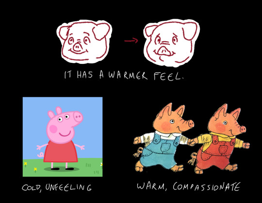
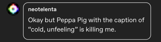
As you might be aware I have big feelings about all besnouted creatures, but recently something has been grating on me. Sometimes, when people draw a snout animal, they draw the snout as a nose with the mouth as a separate entity underneath. This is a stylistic choice I greatly dislike because a snout or trunk is, by definition
A COMBINATION OF THE NOSE AND UPPER-LIP.
You can see here that the snout is not a separate entity from the mouth in these mammals, but is a fleshy protuberance emanating from the upper jaw.
You can see in this illustration how a more anatomically accurate snout position gives an anthropomorphic pig a degree of charm that an inaccurate snout position does not.
Snout positioning can make or break a character design for me.
A very rough map of some of my inspirations for my GoT redesigns.
Each “region” has only one image to represent their general inspiration/vibe. I thought about doing a more intensive/more references version of this sort of thing like I have for my other redesigns… but quickly whimp-ed out. Way too many reference eras/images and at this point with how fantasy/combination-y these fantasy fashions are… maybe I’ll come back to it later. Probably not. After nearly 80 GoT redesigns I am lost in the sauce. But hopefully this sneak peak is able to help a little bit to illustrate what I mean by things like “Burgundian” or “Houppelande”.
I did not make the map of Westeros it is an official GoT one as far as I can tell.
Don’t repost without permission & credit! Thank you! Come visit me over on: Instagram,Patreon