#williammorris


#Februllage Day 7: Bug
#collage #collageart #mixedmedia #cutout #williammorris #unsplash
https://www.instagram.com/p/CK-b9Foh7eg/?igshid=1akl4zl10lrsz
Post link

I can’t face reinvention.
#happiness #everafter #lyrics #taylorswift #collage #collageart #mixedmedia #williammorris
https://www.instagram.com/p/CK-CXDBh1xP/?igshid=128fls85nd230
Post link

Three William Morris poppy tiles: Red on cream, Salmon pink on white, Kelmscott House blue and white. Other colors here:
http://williammorristile.com/early_tiles/william_morris_poppy_tiles.html
Post link


Woodland Weeds, Morris & Co.
Woodland Weeds is based on a Morris and Co. wallpaper design. This design has the medieval millefleur look that William Morris was so fond of but with a late Victorian repeating scroll form.
The design for wallpaper that is attributed to John Henry Dearle for Morris & Co. It was first printed in 1905, nearly a decade after Morris’s death in 1896. It is interesting, though, because, although it has the tidy millefleurs look that Dearle does very well, it has several characteristics that are uniquely Morris. Morris incorporated natural “imperfections” in his designs; he would design elements based on what he actually saw. A leaf might curl under, or he would present the backside of one flower, giving his designs a depth that was not commonly seen. Dearle has also done that in this design.
Source:http://williammorristile.com/textiles/woodland_weeds.html
Post link


The first Morris daisies were inspired by a medieval painting, The Dance of the Woodhouses. They were designed by William Morris and embroidered by Jane Morris. The back wall in the Wodehouse painting shows the pattern that inspired William Morris.
What’s a Wodehouse, you ask? A Wodehouse is a mythic wild man, something of a cross between a berserker (Noridic crazy man, from which the term “berserk” comes) and a Green Man. The wodehouse was a savage, naked or ivy-covered, a satyr or faun. Morris was enchanted with mythic and natural symbols, such as Yggdrasil (The Viking Tree of Life).
(viaRed House Daisies : William Morris Tile)
Post link

William Morris Tile: Blue and White Tiles. Top row: Brother Rabbit, Willow, Lodden, Medway, Fairytale Swans ‘Hill’ version. Middle Row: DeMorgan Ships, Early Lodden, Philip Webb stork, DeMorgan dragon ship. Bottom row: Brother Rabbit bird detail, Philip Webb Red House duck, William DeMorgan galleon, Kelmscott swans, Philip Webb goose tile
Post link


Here are some pictures of the books! (My artbook Forgotten Gods is still available on my webshop: https://fr.yoannlossel.com/shop)
And some secrets revealed:
For almost a year and a half I designed this book in its entirety. It was conceived as an art object, in the vein of 19th century art books and illustration books. It is an obvious tribute to the golden age of illustration, to Arts&Crafts and to the artists of this period that I love so much, especially William Morris.
I drew and inked each motif, each frame, each decorated initials, each cul-de-lampe. Several plants and flowers were chosen, our favourites with Psyche, for the initials and vignette frames: bluebell, jasmine, honeysuckle, wisteria, bramble, thistle. Depending on the theme of the text, the flowers that decorate the initials change.
Forgotten Gods speaks of the “Marriage of Heaven and Hell” to use William Blake’s title. More simply, it is about the marriage between nature, matter, and aspirations, concepts, ideas. This is the theme that interests me in art. I created the frames around the texts to illustrate this thread that drives the book. The first frames of the book are composed of vegetal elements. The last frames are composed of more celestial symbols: moons, suns, stars.
Thus, I designed the endpapers, the title page illustration and the colophon to reflect the symbolism of the book. The interlacing of vegetation and celestial elements that mark the progression of the book are found there. Thistles, clouds, stars and suns for the title page. A ribbon that links brambles to the stars and the moon on the title page. Vegetal interlacing around a moon and a sun for the colophon.
Forgotten Gods presents my work of the last decade: a selection of my works, my technique, my Arts&Crafts collaborations, the story of our meeting and artistic collaborations with Psyche. I talk about my themes, my way of conceiving a work and my artistic philosophy. Several authors have joined me to talk about one of my works from their own perspective. The preface and afterword complement each other beautifully, written by Alan Lee and Florence Alibert.

In December 2020, @psycheophiuchus and I moved into a new house, which was an opportunity to build my new studio. This was done in collaboration with a local cabinetmaker I love, a timeless craftsman straight out of the 18th century. Together we made the wainscoting, inspired by 18th and 19th century French mouldings, and with Psyche we decorated the new studio with one of my favourite William Morris tapestries. Finally, I was able to put back the raw yew shelves I made 10 years ago. I love their twisted movement, they bring the forest around me.
Building the workshop was one of the steps I wanted to complete last year. I unveiled the first pictures in Forgotten Gods, my artbook.
#artiststudio #williammorris
https://www.instagram.com/p/CbLAnCjI3cv/?utm_medium=tumblr
Post link
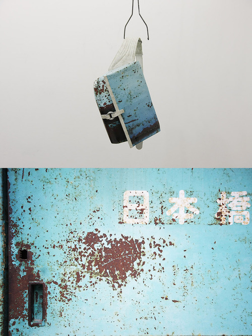
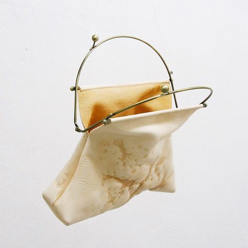
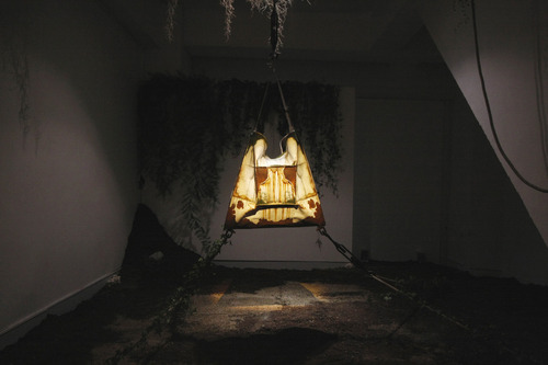
Yusuke Kagari
el neo-constructivismo ornamental
Dentro de los fenómenos estéticos de la modernidad, el constructivismo siempre ha ocupado un lugar muy especial, quizás por caracterizarse por el linde de lo ornamental.
Hacer un recorrido por la historicidad constructivista, si bien austera será necesaria para comprender este fenómeno que desde hace un tiempo parece haber redoblado la apuesta en la contemporaneidad.
Podríamos rastrear la tradición constructivista hacia los primeros postulados desarrollados por William Morris, fundador del movimiento arts and crafts[1]en Inglaterra a mediados del siglo XIX. Luego tomados por la escuela de la BauHaus en Alemania durante la primera mitad del siglo XX.
La escuela de la BauHaus profundizaría la idea de Morris de revalorizar el trabajo artesano, pretendiendo reivindicar al ser inventor por sobre las nuevas tecnologías en desarrollo post revolución industrial, haciendo énfasis en la creatividad artística en la producción en serie.
Influenciada por los movimientos de vanguardia, y por la incorporación de Theo Van Doesburg y El Lizzitsky al cuerpo docente, pronto la escuela de la BauHaus abandona su lenguaje expresionista y adquiere una identidad propia: una suerte de fusión entre el expresionismo y los movimientos artísticos concreto-constructivistas con sus filosofías binómicas:
“Las grandes energías polares de la vida «naturaleza e inteligencia,
o los principios masculino y femenino, lo negativo y lo positivo,
lo estático y lo dinámico, lo horizontal y lo vertical»´´[2]
Pero las ideas contemporáneas no terminarían por encontrarse conformes con las ideas de la escuela alemana de romper con el predominio del individuo.
Hacia comienzos de la década de 1930, la Bauhaus ya se había convertido en una escuela con gran énfasis en arquitectura y años más tarde cerraría, habiendo dejado abierta una gran puerta para el desarrollo del diseño proyectual mundial.
Quizás los movimientos más interesantes en arquitectura datan de mediados del siglo XX en adelante. Con distintos focos mundiales, los que más podrían interesarnos son la arquitectura brutalista, y el desarrollo del movimiento metabolista en Japón, luego extendido a occidente.
Si bien el carácter del metabolismo se desligó de muchos conceptos de principios de siglo, y podría considerárselo como un movimiento con independencia y opacidad suficiente en cuanto al diseño contemporáneo, cabe destacar los esfuerzos de Kisho Kurokawa al relacionar modelos biológicos y arquitectónicos, y por el legado de documentos visuales que nos ha dejado.
En las últimas décadas se han desarrollado muchas marcas con gran auge a nivel mundial en tradición constructivista, tales como Rick Owens, Comme des Garçons y Maison Martin Margiela, entre otros. Fuertemente influenciados por la transculturalidad oriente-occidente, el mundo de la moda ha aceptado de manera muy positiva sus propuestas y al día de hoy, luego de años de que occidente central haya hegemonizado el estilo, el constructivismo toma revancha.
Pero es la evolución de este movimiento lo que me interesa desarrollar: Alrededor de un siglo después, el constructivismo, que, como ya hemos dicho, se caracterizó durante largo tiempo por su austeridad, o quizás por así decirlo por su ausencia de ornamentación aparente, parece haberla encontrado.
Este tipo de diseño durante mucho tiempo dejó de lado el atavío visual, para transformarlo en un elemento táctil. La seducción del constructivismo, en moda, se halla en el descubrimiento concepto-perceptual de la prenda, lejos de su simplicidad y decoro, y parece que su especial cosmovisión en cuanto a su relación con la naturaleza, hoy, le ha brindado su ornamentación propia y ha permitido el desarrollo de un nuevo tipo de lenguaje.
Algunos lo llaman neo-constructivismo, pero en realidad no ha sido el desarrollo y profundización del movimiento, sino su devenir hacia un meta-constructivismo, consecuencia de sus propios límites materiales, lo que lo han cargado de lo que muchos prefieren llamar su carácter lugubricista.
Yusuke Kagari, diseñador Japonés contemporáneo, ha sabido captar la esencia de la propia contemporaneidad constructivista en sus trabajos y, casi diez años después de la fundación de su marca, podemos notar que esta posee una identidad inapelable.
Su producto no solo posee un nivel de desarrollo funcional y estructural estupendo, es además original, innovador y permite al mundo un ejemplo claro de esta evolución lúgubre de los caracteres estéticos ya mencionados.
La discursividad desarrollada por Kagari pareciera combinar lo mejor de la cultura occidental y de la herencia constructivo-oriental, brindando así un producto netamente contemporáneo, con todos los matices de transculturización, funcionalidad y conceptualización que esto implica.
No es que uno siempre quiera ver hacia afuera, pero realmente su estetización de lo feo o quizás lo no estético vuelve a sus diseños un producto original. Un producto original dentro de una contemporaneidad que posee una ideología de culto a lo lúgubre y abandónico. Que considera lo destructivo como algo bello, y que posee un gusto que lejos de lo refinado se caracteriza por la esteticidad, embellecimiento, aceptación y fascinación de una suerte de vulgaridad con la cual pareciéramos querer identificarnos.
[1] Del inglés ‘’Arte y artesanías’’. Si bien la posibilidad de traducción permite ``arte y oficios´´ he preferido esta acepción del concepto porque se encuentra más ligada a la ideología de Morris.
[2] Theo Van Doesburg: Der Wille zum Stil. En T.v. Doesburg 1883-1931. Cat. De exp. Abemuseum. Eindhoven 1968, pág. 49


#servomuto for @carlasaibene #williammorris #fabrics ##viasanmaurilio #5vie #fashionweek #milanofashionweek #light #warmlight #decor
Post link