#3d typography
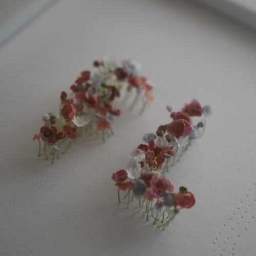
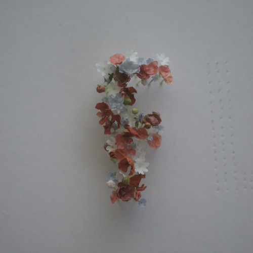
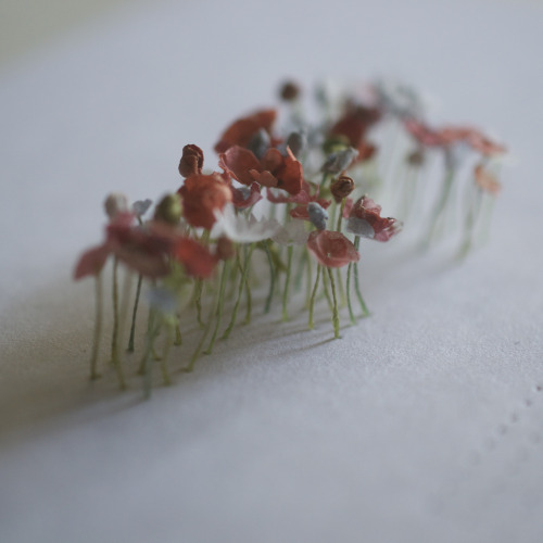
Beginnings of a typography piece… I think I’m going to need a to make a lot more flowers than I had originally planned…
Post link
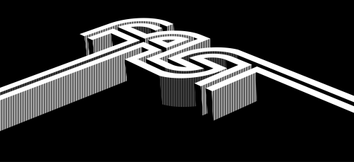
“Faster” — My contribution to Typism 2 | Londondesignz.com
Leading on from the black and white theme of my previous post, I thought I should finally get around to uploading my own contribution to the Typism book two.
Featuring the work of calligraphers, letterers and typographers around the world, the main consideration of Typism’s books is that all artwork featured is printed in black and white. So rather than playing around with gradients and grayscale images, I focussed on using just black, but in such a way as to infer that other shades were in use. Additionally, the colour limitation inspired me to do something beyond a ‘flat’ image, so I tried to give the illusion of three dimensions with as few visual elements as possible.
I think Typism 2 might still be available at the time of writing (November 2015), so go check out the site and pick up a copy while you still can.
Post link


