#album cover
NINE INCH NAILS - THE DOWNWARD SPIRAL
GRAPHIC DESIGN - SINGLE COVER ART
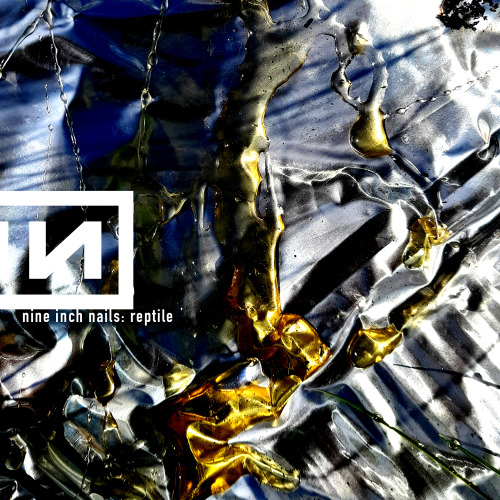
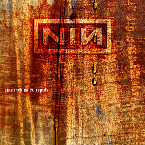
TRACK 12: REPTILE
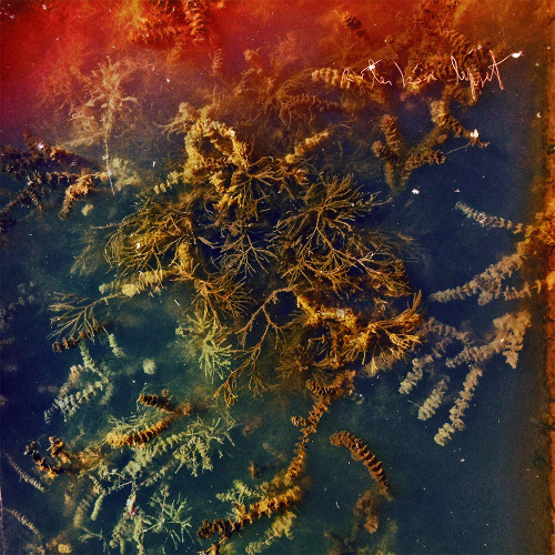
I like the way all of these translated into single covers, but I’m definitely drawn to the one up top with the slug following the worm. It feels like there is a narrative being played out, as if the slug drawn to the worm after being put under some sort of spell. The fact that only the tail end of the worm is exposed after I cropped the image, curling upwards as if it is luring the slug down a dark path is very apt for the song ‘Reptile’
The protagonist returns to his old ways indulging in the worst parts of himself but the only thing he knows to be true. What’s tragic is he will realise that seeking escape in these destructive patterns has made him weary and aware of just how alone he is. The woman to which he has turned is cold and compassionless. She cares as little for him as she did the one before him or will for the one after him.
Devils speak of the way in which she’ll manifest
Angels bleed from the tainted touch of my caress
Need to contaminate to alleviate this loneliness
I now know the depths I reach are limitless
Oh my beautiful liar
Oh my precious whore
My disease my infection
I am so impure oh
Post link
‘THE DOWNWARD SPIRAL’ - NINE INCH NAILS
SINGLE ARTWORK : IDEAS DEVELOPMENT
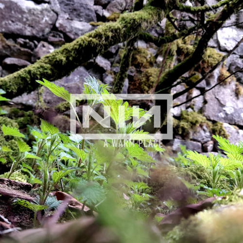
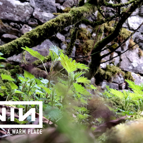
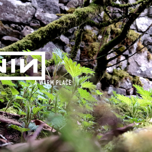
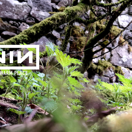
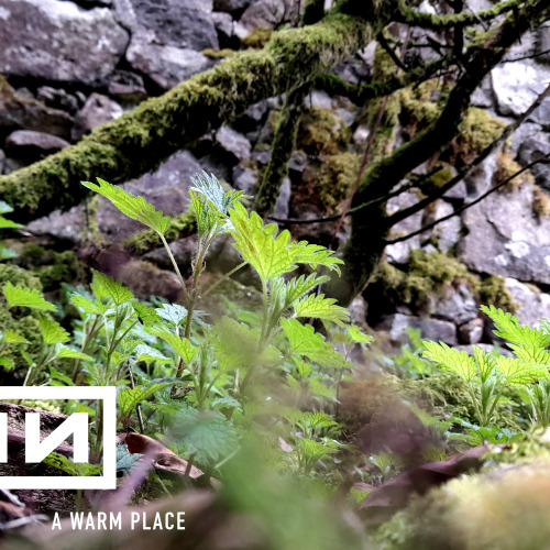
TRACK 10: A WARM PLACE
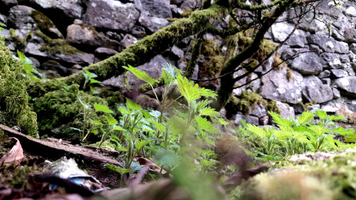
I had a very hard time figuring out what worked best for this cover. I had taken many arguably “better” photos, or at least ones that would make more sense as a cover. But this one had the most significance to me in light of the subject matter.
I had taken this photo lying on the floor within the walls of what remained of the Maamtrasna home of John Joyce and his family. I wanted to lie down on the ground and get a sense of what they must have felt in their final moments. Everything suddenly became very real to me and I was very overwhelmed with emotion.
Even now I feel a sense of loss looking at this image, but visiting just as spring was setting in gave me a sense of hope as I look at all of the life sprouting from the ground. Sometimes it can be easy to forget about hope, but it’s always there.
My issue was not regarding the picture itself. I knew as soon as I took the photo that this would be the one. My fear was obscuring it with the logo and text. I am studying graphic design at the end of the day, and not photography, so I had to find a way around this problem. I knew I wanted to align it on the left hand side if not the middle ( I had already used the right hand side for “I Do Not Want This” and didn’t feel like repeating myself )
After moving the logo and text around for WAY too long, it finally occurred to me to lower the opacity of the logo and text so as to make it slightly transparent. I was then able to find a good middle ground between making the logo and title legible, but also keeping the integrity of the image.
I’m happy with my decision to use this image, and it probably stands as the thing I am most proud of and emotionally connected to throughout this project.
Post link
‘THE DOWNWARD SPIRAL’ - NINE INCH NAILS
SINGLE COVER: DRAFTS
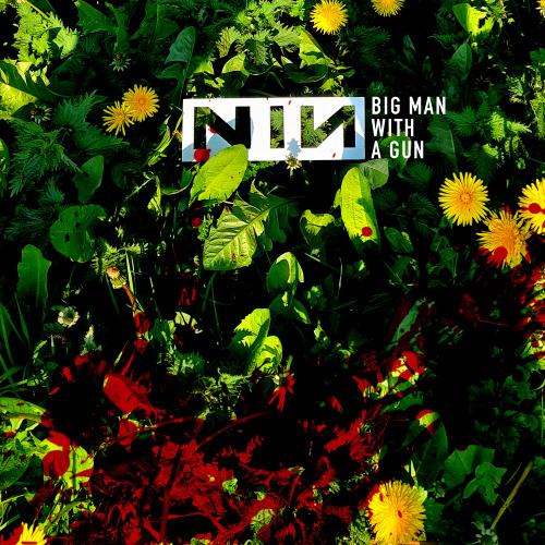
TRACK 9: BIG MAN WITH A GUN
I brought the ‘big man’ image into photoshop when I decided which one I would use. After slightly adjusting the contrast, I felt something was missing, so similar to what I did with the “explicit” version of my ‘The Becoming’ artwork, I added a splash of blood to the bottom of the image. I like the idea of mystery behind who’s blood it might be, the shooter or a victim.
I also love the contrast between the very grim subject matter and the beautiful, sunny day. the dandelions are a nice touch as well. I remember always thinking of them as beautiful flowers when I was a kid, until I was corrected and told that they are in fact weeds. But who is to say really?
It was nice as well to not have to digitally impose the ‘NIN’ logo. The fact that it is so symmetrically perfect really makes it easy to do something like this, as at the very most it might need a slight adjustment in regrgards to perspective in photoshop. The fact that it is bright white also makes it pop when the contrast is adjusted, making it look as though it may have been digitally added or enhanced.
Overall I’m very happy with the way this turned out, and it probably needed the least editing of any of the other covers I have come up with so far.
Post link

