#choropleth map
SCHOOL DAZE: In-person or Virtual?
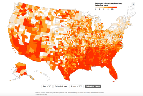
As the beginning of the new academic year fast approaches, U.S. school districts debate the pros and cons of reopening. This map by The New York Times uses estimates from a study by researchers at the University of Texas at Austin, which shows the likelihood of students carrying the virus would to arrive at school in the first week.
The highest-risk areas include Miami and Fort Lauderdale in Florida, Nashville, Tennessee, and Las Vegas, Nevada. A study by Education Week uses data surveying 342 schools across the country found that 50% of surveyed districts are offering online classes only, 32% are offering classes in person, and 18% doing a mix of the two.
This map depicts the estimated number of infected students arriving back to schools of 1,000+ in the first week back. All COVID-19 updates will be displayed in a red box.
Source: American Geographical Society, August 5, 2020
Post link
MAPPING NYC: Coronavirus Deaths by Zip Code
There have been 15,871 confirmed COVID-19 deaths in New York City. Until yesterday, the data was not connected to geographical location. Check out the newest map using the latest from the NYC Department of Health.
Interestingly, this map shows a population virtually the opposite by income and status of a previous map of those New Yorkers who were able to flee the city during the pandemic! But the message remains the same: wealth and privilege provide more spatial mobility and choice of locale in whatever circumstances!
Source:Untapped New York, 19 May 2020
Post link


