#mapping


UPDATE: 11/8
First I’d like to mention that I opened aKo-Fi!
Anyone who would like to do so can find it in this post; and in my page description~
Any amount would be a huge help with keeping me afloat while I develop the game. I’ll have the page available until the crowdfunding campaign after the demo is released.
Onto the game related updates..
Blackwater’s maps and assets are now 90% colored and complete, with Blackwater’s boss area being the final push for the “Saint Path” demo maps~
As for the “Demon Perspective” maps; they’re closer to 45%, with most assets being complete as well and just needing NPC’s to fill up the areas and breathe life to the city.
The lowest area pictured above is Bernadette’s Abode; the first area of the game you occupy in the “Demon Perspective” run of the demo. Being made of wood and covered head to toe with magic cotton, her abode isn’t exactly fireproof…
Post link

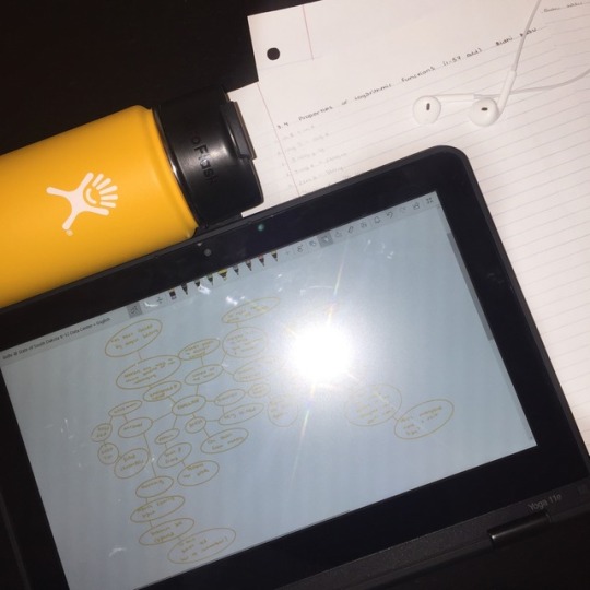
11.26.18
did some math homework and mind mapping today :)


The 80cm diameter Curve - the globe spins 360 degrees in a fluid motion by hand. The base is handcrafted bespoke to order in London Plane, Walnut, Oak, or Aluminium.
Colour here is Glacial Blue and the globe has added hand drawn and hand painted illustrations.
The second photo for comparison is with a 22cm Mini Desk Globe | www.bellerbyandco.com
Post link

36cm diameter desktop globe
www.bellerbyandco.com | Bellerby & Co Globemakers, London
We ship worldwide - each globe is made bespoke to order and can be personalised.
Post link
 diameter globe is cradled in a handcrafted Oak or Walnut base and available is")
 diameter globe is cradled in a handcrafted Oak or Walnut base and available is")
 diameter globe is cradled in a handcrafted Oak or Walnut base and available is")
 diameter globe is cradled in a handcrafted Oak or Walnut base and available is")
 diameter globe is cradled in a handcrafted Oak or Walnut base and available is")
This 127cm (50 inch) diameter globe is cradled in a handcrafted Oak or Walnut base and available is a variety of styles and finishes. It sits within a huge hand-engraved brass meridian and has deep horizon bands around the table.
Click to watch how the globe spins.
The deep hues are created with many watercolour washes painted by hand in our London studio. A truly individual product, exuding quality craftsmanship and skill, the Churchill would not look out of place in a grand home or workspace.
As with all Bellerby globes, each one can be individually tailored to suit taste and requirements.
Only 40 globes will be made in this Churchill series.
We ship worldwide from London | www.bellerbyandco.com
Post link
The USA is the world’s largest weapons exporter. This map shows the flows of arms transfers leaving the US from 1950 to 2017
via@willgeary
UK city drive time analysis, visualized as rainbow coral

The yearly cycle of Earth’s biosphere
Global meteorite landings, complete with data-driven sound effects
via: @craigtaylorgis

An atmospheric river spanning the entire Pacific. This map shows it in action over 11 days.

BRAZIL: COVID and Dengue Cross-Reactivity
A study led by Prof. Miguel Nicolelis from Duke University has suggested that exposure to the mosquito-transmitted illness, dengue, may provide some level of immunity from COVID-19. The report, still in preprint, found a link between the spread of the virus and past outbreaks of dengue fever.
These maps by the Federal University of Paraíba (UFPB) show the comparison between the geographic distribution of COVID-19 cases and dengue fever cases, summarizing all data from 2019 until May 2020. The findings suggest a possible immunological cross-reactivity between the two illnesses as areas with lower COVID-19 infection rates and slower case growth were places that had suffered recent intense dengue outbreaks.
Source: American Geographical Society
Post link

SCHOOL DAZE: In-person or Virtual?
As the beginning of the new academic year fast approaches, U.S. school districts debate the pros and cons of reopening. This map by The New York Times uses estimates from a study by researchers at the University of Texas at Austin, which shows the likelihood of students carrying the virus would to arrive at school in the first week.
The highest-risk areas include Miami and Fort Lauderdale in Florida, Nashville, Tennessee, and Las Vegas, Nevada. A study by Education Week uses data surveying 342 schools across the country found that 50% of surveyed districts are offering online classes only, 32% are offering classes in person, and 18% doing a mix of the two.
This map depicts the estimated number of infected students arriving back to schools of 1,000+ in the first week back. All COVID-19 updates will be displayed in a red box.
Source: American Geographical Society, August 5, 2020
Post link

US Coronavirus Geography: Different Policies, Different Results
A growing number of states are pausing plans to reopen amid rising cases of COVID-19, with some even reimposing restrictions that were previously lifted. The federal government has left it to individual states to implement their own guidelines for reopening the economy, leading to varied stay-at-home policies and health outcomes. Maps produced by Fortune show the changes over the past few months of where cases have spiked, and where they have decreased. Florida and Texas had early reopenings of their economies and are now seeing strong increases in cases of the virus, while New York and New Jersey, which were at one stage the epicenter of the coronavirus pandemic in the United States, have seen their cases decline since April, amid some of the toughest restrictions implemented in the country.
Source: American Geographical Society
Post link

Chinese Investment in Africa
The massive investments from China are now transforming the global South. This map suggests that the main sectors of Chinese interest in Africa are in energy, transportation, and real estate.
Post link

COVID VISITS NEW YORK: While New Yorkers shelter at home, a most obnoxious tourist visits the city! Everyone wants him to leave as soon as possible. This map shows where he has left his coronavirus by Zip Code. (Including new cases as of last week).
Source: Untapped New York, May 6, 2020.
Post link

CLIMATE CHANGE: Extreme Heat by 2070
This map depicts the areas of the world predicted to suffer from extreme heat from global warming by 2070. Humankind has lived and thrived in a moderate climate niche with a yearly average of 52 to 59 degrees Fahrenheit, but with carbon emissions continuing at projected rates, the geographical position of this climate niche will shift in the next 50 years. According to a study just released, some 3 billion people will live in areas of extreme heat by 2070 if trends continue unchecked. These brutally hot conditions currently only occur in 0.8% of the earth’s surface in the hottest parts of the Sahara Desert, but could expand to over 19% of earth’s landmass by 2070. This trend could lead to extreme climatological events and mass migrations.
Source: Chi Xu, Timothy A. Kohler, Timothy M. Lenton, and Marten, “Future of the human climate niche,” PNAS, May 4, 2020 https://doi.org/10.1073/pnas.1910114117
Post link