#editorial design
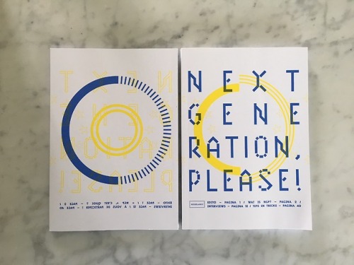
Jef Aeresol Mural Performance Poster 2017 | French Culture Center
Doozie Dozer
https://www.behance.net/anildarinc
Post link
Tereza Bettinardi (São Paulo, Brazil)
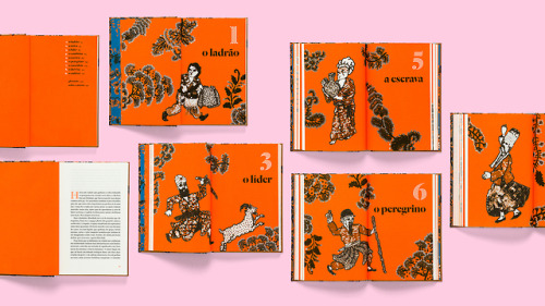
O Alforje (The Saddlebag) by Bahiyyih Nakhjavani, 2018
“The drawings were made in ink on paper by Adriano Rampazzo and then embroidered by fashion designer Izabela Starling. The novel describes events set in the Najd plateau along the pilgrim route between Mecca and Medina during one day in 1844–1845, when a mysterious saddlebag passes from hand to hand, and influences the lives of each person who comes across it. The main idea was to make reference to Persian carpets. The task to choose a typeface that could go along the richly detailed illustrations was not simple — I didn’t want to make any obvious reference to Arab lettering. The title of the book combines layers of Dala Floda and Dala Prisma, which is also used for chapters and drop caps (in Pantone 021) inside the book. The interior is set in Nyte by Portuguese type designer Dino dos Santos.” (source)
Post link
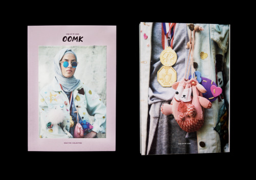
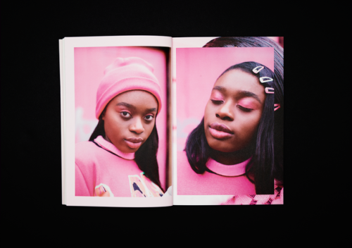
Rose NordinofRabbits Road Press andOOMK (London)
On March 28, 2018, Nordin participated in Hidden Women of Design’s Spring 2018 edition of talks: REACT! The evening found female graphic designers sharing projects that use design to tackle social issues ranging from higher education to empowering vulnerable women. DESIGN FOR GOOD!
Post link
Magda Tsfaty (Holland) · Interview
Selected work, designed with Wim Crouwel as Total Design, 1971-72
Women of Graphic Design is delighted to make available a biography of Magda Tsfaty. In 2016, we posted about a project Tsfaty worked on and asked for more information about her practice. Over the past year, Tsafty herself worked closely with WOGD contributor Robert Rebotti (@garadinervi) to scan work from her archives and produce a career history.
We are thrilled to make this resource available to the public.
Post link
Sonya Dyakova of Atelier Dyakova (London)
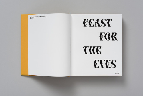
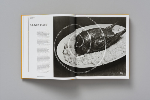
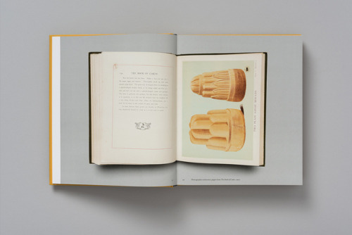
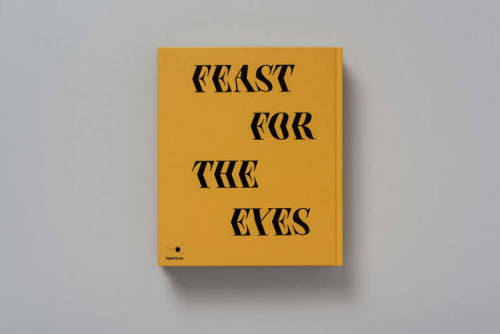
Feast For the Eyes: The Story of Food in Photography by Susan Bright, Aperture, 2017
“[Atelier Dyakova]… used the kitsch and the retro as inspiration, resulting in a tasteful balance of the new and old. “We borrowed a flavor or two, but in the end the book had to exist today and be contemporary,” explains Sonya Dyakova. “The typography for us was an essential tool to express both qualities. In our typographic direction we chose to employ modern revivals of Victorian typefaces, and used them in a stark way, without being overly illustrative.”
Initially Sonya was keen for the cover to be purely typographical, yet after discussions with the publisher aimed to make the book more accessible to a wider audience. “So, we have a beautiful image by Irving Penn on the cover and the title with expressive typography on the back,” she says. Though the cover is subtle, Atelier Dyakova played with the “tactile and physical aspects of the book” during the design process. “We used gloss black foil on a pre-dyed book covering paper. The image is inset into the cover,” says Sonya.” (source)
Post link
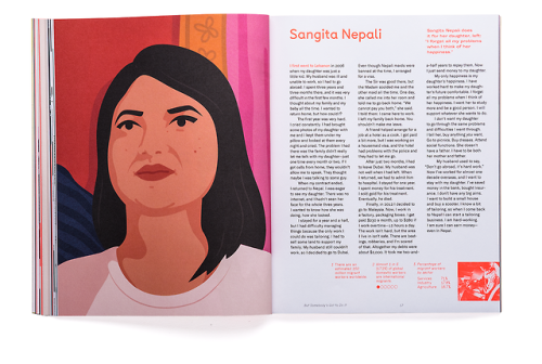
Livia FoldesandAlma Avila (San Francisco Bay Area);
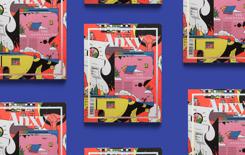
Creative direction by founder Indhira Rojas (San Francisco)
Anxy magazine, “The Workaholism Issue,” Fall / Winter 2017
Post link
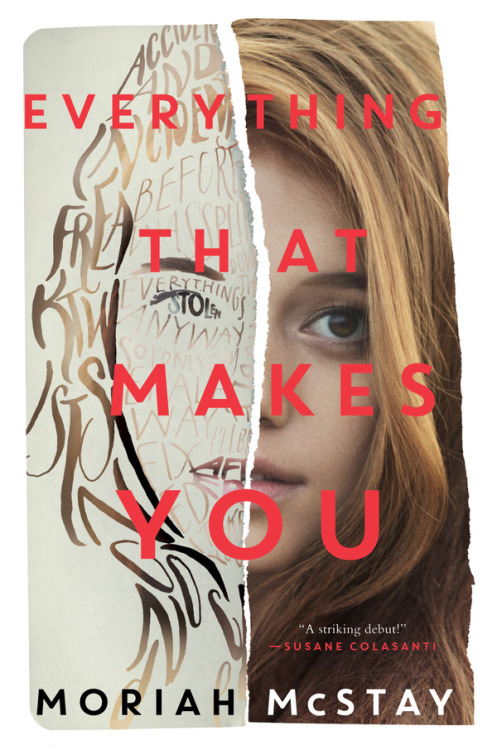
Erin Fitzsimmons (New York) · Interview
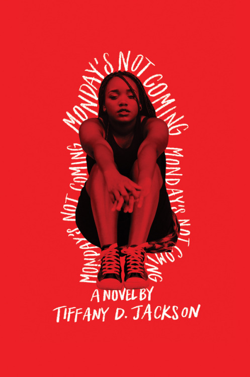
Selected book covers for HarperCollins Publishers, 2017-2018
Post link
Chantal Jahchan (New York)
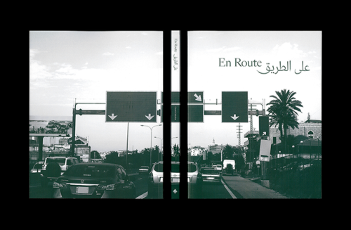
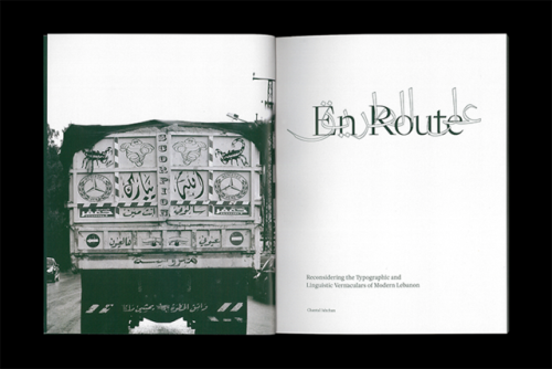
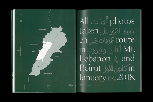
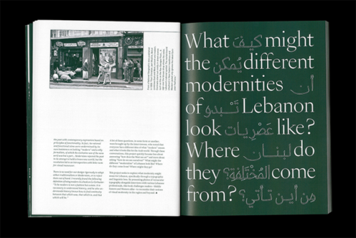
En Route: Reconsidering the Typographic and Linguistic Vernaculars of Modern Lebanon, 2018
“Although she originally set out to challenge the West to see – or not see – Lebanon in a certain way, through her design and research process Chantal realised En Route was about something else: how Lebanon sees itself. Instead of drawing conclusions on this subject, the publication poses questions. “Because digital type technology has only recently caught up with the complexity of the Arabic script, there are many unanswered questions about how we should move forward,” Chantal adds. En Route presents modernity as a subject that means something different to everyone depending on personal experiences, religious beliefs and historical knowledge. In terms of typography, Chantal explains ‘modernity was similarly hard to pin down—for some, it meant being informed about the roots of the Arabic script before moving forward, and for others, it meant pushing the envelope through experimentation and collaboration.’” —Ruby Boddington forIt’s Nice That
Post link

