#logo design


Buttons


It just looks cool


It’s one of my favorite ones - mostly because it took a lot out of me


It’s two pandas
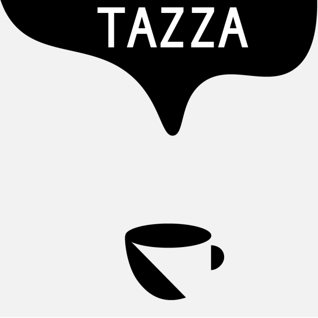
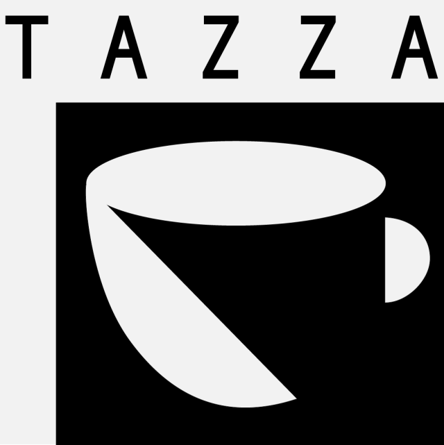
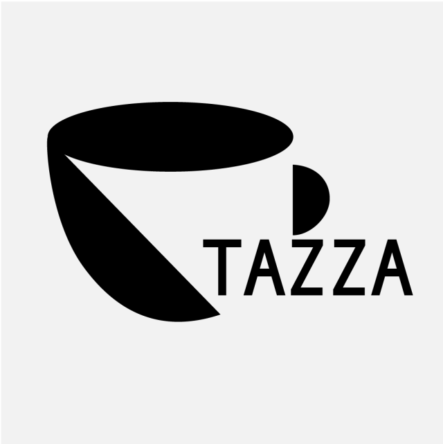
Looks like a new minimalist magazine instead of a cup of coffee


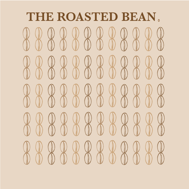
I made coffee beans ☕️☕️☕️


Working on a logo. The thing at the very center is my monogram DMC, all arranged to look like an M.
Post link

My logo(?) design!


Salmson. ca. 1929. Alexis Kow.
42 ¾ x 62 5/8 in./108.6 x 159 cm
Salmson began as a manufacturer of water-cooled airplane engines. Consequently, the poster boasts that the car has the precision of these airplane motors. Their first automobiles appeared in 1921, and graduated from amusing cyclecars to sports cars, and from there to majestic luxury sedans like this one. In 1925, Salmson won 76 races and set 14 speed records for its class. Russian-born Kow created smart and sleek automobile print advertisements and posters. Here, he makes effective use of strong, flat colors, with the Salmon insignia shining above, as the blurry whir of a plane engine spins in the background.
Available at auction June 26. Learn more >>
Post link


Post link


Sergeant is a hand drawn stencil font designed by James Lafuente. It’s perfect for your hand drawn logos and branding. This font comes in .TTF format and includes 10 numbers, Various Glyphs, and 26 letters. Grab it now for the Introductory rate of only $12 at Creative Market.
Post link


Pearl District is a hand drawn, slightly-condensed display face designed by James Lafuente. It’s perfect for your hand drawn logos and branding. This font comes in .TTF format and includes 10 numbers, Various Glyphs, and 26 letters. Grab it now for the Introductory rate of only $12 at Creative Market.
Post link

")


Over the holidays I did a doodle that turned into more than I expected. With ‘chocolate truffles’ as a start word, I tried out my new gold marker & a bit of fancy lettering and got something kinda neat : the illustration in image 1 - minus photoshop extras. It sparked the idea for an imaginary truffle bakery logo design - finally, something I can put in my portfolio. I love the idea of logo & type design!
Practice makes perfect I guess, so onto the next project! …or maybe even more of this one? I could retouch the logo & add a menu, business card, and/or package design. Good idea? Y/N?
Oh, but first - any suggestions on the color?
Thanks for the input ❤ Dani.K
Post link
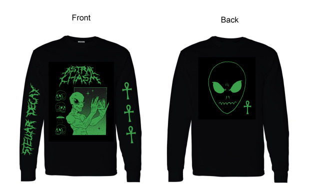
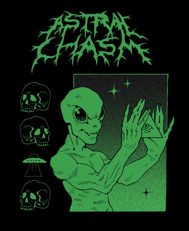
Since people were asking, I’m going to try to do a limited run of t-shirts based off this faux-metal design I came up with. Price-wise it’d be ~$40 + shipping. If you’re interested, send me an email ([email protected]). There’s a min order qty so I want to gauge interest first.
Note: shipping outside of the US can be in the range of $40-70 or more depending on where you live, so keep that in mind