#female designer
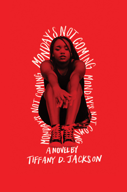
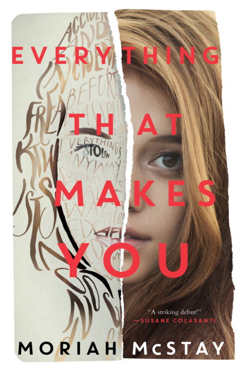
Erin Fitzsimmons (New York) · Interview
Selected book covers for HarperCollins Publishers, 2017-2018
Post link
Soo Jin Lee (Los Angeles)
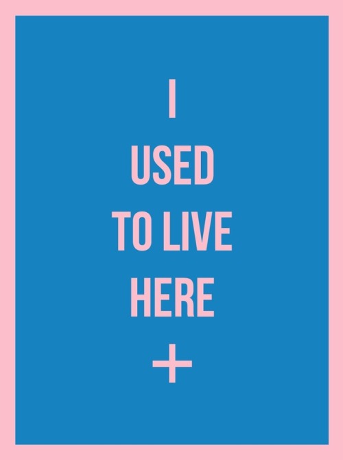
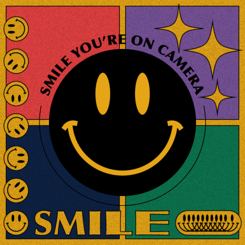
“The graphic series Replica is a reinterpretation of symbols, store stickers, banners and labels from our mundane life in a subversive and humorous way. It approaches everyday advertisements and signs in an anti-capitalist perspective.” (email with WOGD)
Post link
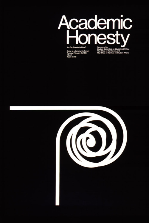
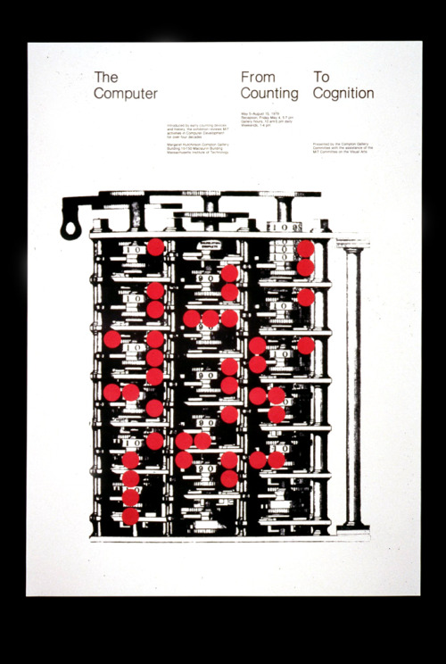
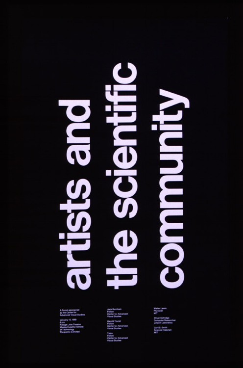
Jacqueline Casey (1927-1992) · Article 1/2
Posters via Graphic Design Online RIT Archive
“Jacqueline Casey trained at Massachusetts College of Art before working as a fashion illustrator and advertising, editorial and interior designer. In 1955 she joined the Office of Publications (Design Services Office) at Massachusetts Institute of Technology (MIT) working with Muriel Cooper who was then Design Director. Casey’s work acknowledges the influence of the Grid established by the post-war graphic design masters in Switzerland. As Director of Design Services many of her posters have been created to publicize exhibitions organized by the MIT Committee on the Visual Arts. She often uses strong elemental imagery, manipulated by letterforms.” (source)
h/t@garadinervi
Post link
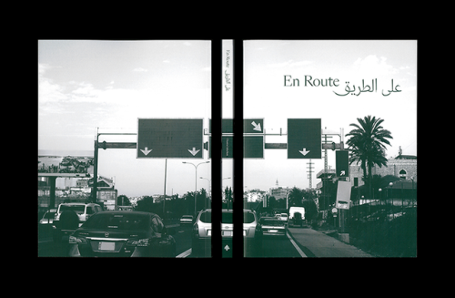
Chantal Jahchan (New York)
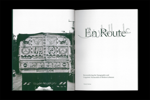
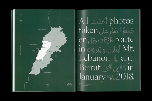
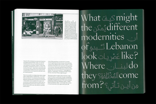
En Route: Reconsidering the Typographic and Linguistic Vernaculars of Modern Lebanon, 2018
“Although she originally set out to challenge the West to see – or not see – Lebanon in a certain way, through her design and research process Chantal realised En Route was about something else: how Lebanon sees itself. Instead of drawing conclusions on this subject, the publication poses questions. “Because digital type technology has only recently caught up with the complexity of the Arabic script, there are many unanswered questions about how we should move forward,” Chantal adds. En Route presents modernity as a subject that means something different to everyone depending on personal experiences, religious beliefs and historical knowledge. In terms of typography, Chantal explains ‘modernity was similarly hard to pin down—for some, it meant being informed about the roots of the Arabic script before moving forward, and for others, it meant pushing the envelope through experimentation and collaboration.’” —Ruby Boddington forIt’s Nice That
Post link


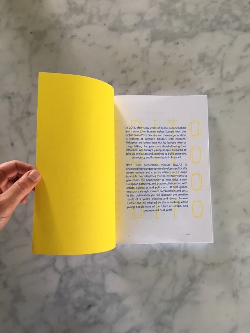











![Doretta Rinaldi (Pesaro, Italy)Het Bourgondishe Leven [The Burgundy Lifestyle], Utrecht Early Music Doretta Rinaldi (Pesaro, Italy)Het Bourgondishe Leven [The Burgundy Lifestyle], Utrecht Early Music](https://64.media.tumblr.com/e608bf41102d1ca78318ddcce26f6be4/tumblr_p8p0ypoNYm1spitb2o2_500.jpg)
