#identity design

LIVE
 The BuzzFeed News Logo Is In The Buzz: Yay or Nay?The old logo wasn’t so much a logo as a brand ext

The BuzzFeed News Logo Is In The Buzz: Yay or Nay?

The old logo wasn’t so much a logo as a brand extension of the main BuzzFeed logo with a sprinkling of Newsweek. The new logo does away with the casualness of the BuzzFeed logo and instead treads on more of a The Guardian aesthetic with a sharp, serious-ish, bold serif.

What do you think of the new logo?


Post link
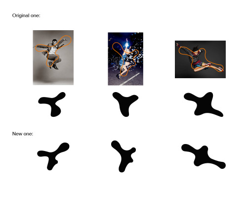
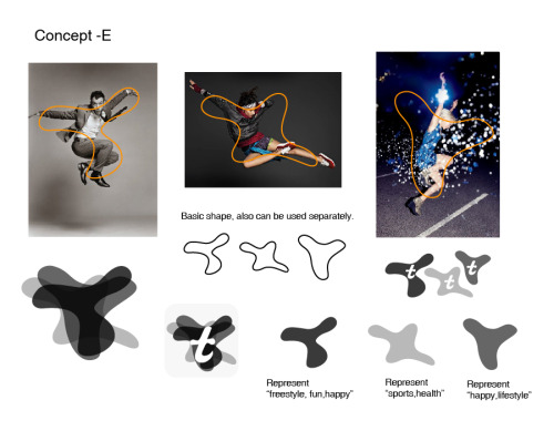
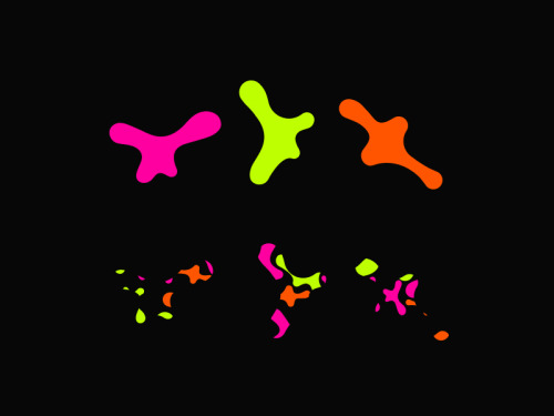
Branding For Tiggrr App. - Brand Image Graphic Pattern Part.-Client: Anya Ka & Jeremy / Tiggrr.DBranding For Tiggrr App. - Brand Image Graphic Pattern Part.-Client: Anya Ka & Jeremy / Tiggrr.DBranding For Tiggrr App. - Brand Image Graphic Pattern Part.-Client: Anya Ka & Jeremy / Tiggrr.DBranding For Tiggrr App. - Brand Image Graphic Pattern Part.-Client: Anya Ka & Jeremy / Tiggrr.DBranding For Tiggrr App. - Brand Image Graphic Pattern Part.-Client: Anya Ka & Jeremy / Tiggrr.D

Branding For Tiggrr App. - Brand Image Graphic Pattern Part.

-

Client: Anya Ka & Jeremy / Tiggrr.

Date: 2015.2-2015.4

————————————————————————————-

Twitter  |  Instagram  |  Shop  |  Oh Good Goods Mag  |  Pinterest  |  Medium  |  P.E.A.C


Post link
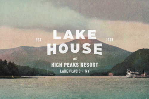
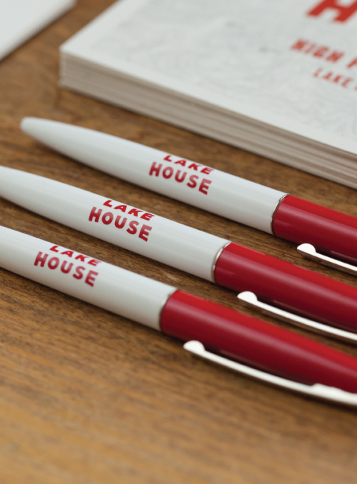
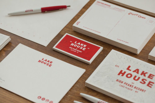
“The identity system for Lake house was inspired by local trail maps—encouraging guest to get “The identity system for Lake house was inspired by local trail maps—encouraging guest to get “The identity system for Lake house was inspired by local trail maps—encouraging guest to get “The identity system for Lake house was inspired by local trail maps—encouraging guest to get “The identity system for Lake house was inspired by local trail maps—encouraging guest to get “The identity system for Lake house was inspired by local trail maps—encouraging guest to get “The identity system for Lake house was inspired by local trail maps—encouraging guest to get “The identity system for Lake house was inspired by local trail maps—encouraging guest to get

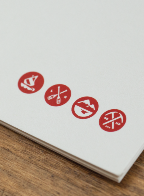
“The identity system for Lake house was inspired by local trail maps—encouraging guest to get out of their room and enjoy the Adirondacks. We used topographic patterns, mountain coordinates and created iconography around the activities available during each season. The color palette is minimal, letting the natural textures and landscape take center stage. A rustic red is used throughout, adding a pop of color that ties back to the rich heritage of the Adirondacks.”

Lake House branding by Tag Collective.


Post link
“In February of 2014 Marie & Claude LaPonte Launched Puree, an organic medicinal vegetable“In February of 2014 Marie & Claude LaPonte Launched Puree, an organic medicinal vegetable“In February of 2014 Marie & Claude LaPonte Launched Puree, an organic medicinal vegetable“In February of 2014 Marie & Claude LaPonte Launched Puree, an organic medicinal vegetable“In February of 2014 Marie & Claude LaPonte Launched Puree, an organic medicinal vegetable

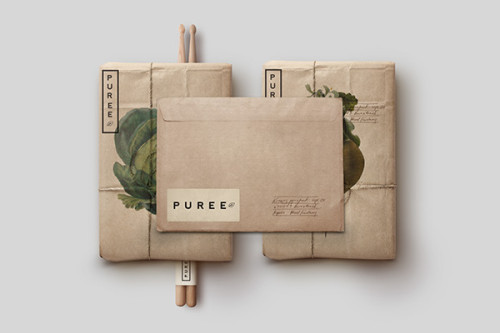
“In February of 2014 Marie & Claude LaPonte Launched Puree, an organic medicinal vegetable garden where consumers can have access to naturally farmed food located in there very neighborhoods. 

Specific produce has been known to help with health problems such as joint and arthritic issues as well as a variety of cronic illnesses. Although Puree is known for its attention to growth and detail in supplying locals with fresh and specialized produce owners Marie & Claude wanted to steer away from looking like a typical health pharamcy and focus more on the product they produce.
 
It was important right from the start to showcase Puree as a specialty produce company that is quite different than your typical organic mom and pop store. In order to accomplish this it was important to create a timeless Identity that held up to Puree’s standards of simplicity and aesthetic value. Inviting people to make the most of the food they eat.”

Post link
Your destination for smart, independent and creative females is not hardcore.

Your destination for smart, independent and creative females is not hardcore.


Post link
loading