#fezzik
Part 3 - The Sicilian Assassins
Part 1 - The Family|2 - Style |4 - Buttercup and Westley |5 - The Prince and the Count |6 - Florin Castle
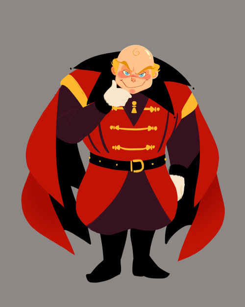
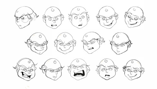
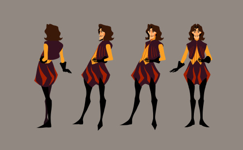
With Vizzini I was trying to combine the feeling of baby angels from old renaissance paintings, sinister-ish expressions, and ringmaster, plus dash of gaudiness. I made Vizzini prominently red so that there would be a transfer of association from Vizzini in the first half to Humperdinck in the latter half. The colour red and the pawns on his design apart from being on theme for his character can also serve as foreshadowing, that he is not the overarching antagonist.
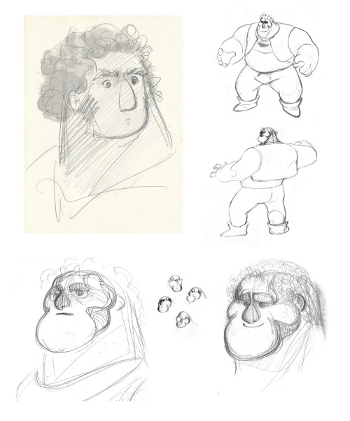
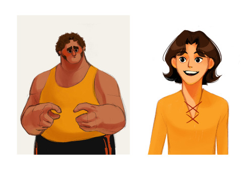
Sometimes due to Fezzik’s backstory of working in Greenland, people mistake him for being Greenlandic but it was clearly stated that Fezzik is a Turkish wrestler. It was important that his design made it very clear that he was not European. In the books, he is described as hairy, large, and gorilla-like in appearance. By dividing his head into three sections (upper head, cheeks, and mouth-chin) keeping the graphic shape of his head across different angles was made easier. To determine the direction of Fezzik’s overall design the emphasis was established (his arms), inspiration was taken from circus strongmen, then combined with a strong but soft and lovable feeling.
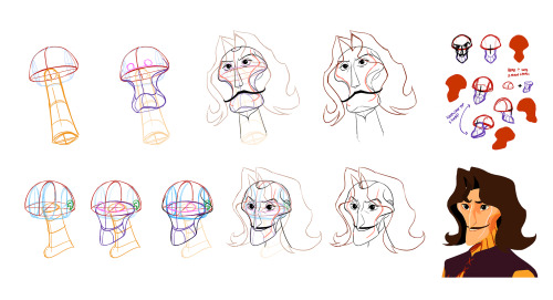
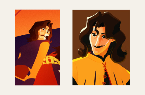
The general direction of Inigo’s features was clear early on, but his head shape did undergo many iterations. His final head shape design has a clear and readable graphic iconography even in different angles. Its iconic integrity is easily maintained but can be difficult to draw, because of that a diagram was made to show how the structure of his head.
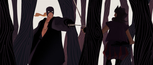
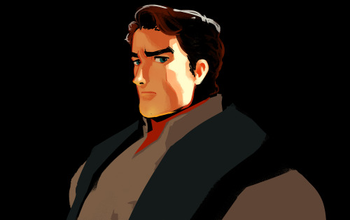
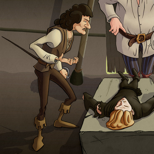
It was important to make sure Inigo and the man in black’s silhouettes were distinguishable from one another. So I tried to pull their designs in opposite directions. Inigo’s leaning towards a more slender swish-flick feel and the man in black’s to a larger, billowy, and intimidating direction.
Post link
Part 2/6 - Adapting a Classic (Style)
Part 1 - The Family|3 - The Sicilian Assassins |4 - Buttercup and Westley |5 - The Prince and the Count|6 - Florin Castle
One of the ideas behind this project was about bridging the gap between the old and the new. I wanted to express the vibrance and colourful quality of a medieval (nearing renaissance) setting while using contemporary techniques, to appeal to a modern audience, with a nostalgic undertone.
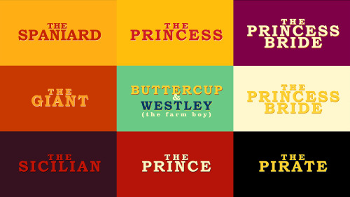
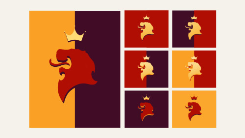
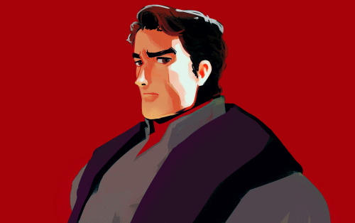
Adding some browns to the palette also helped pushed it towards that slightly nostalgic direction. I shifted the other colours slightly, like using mustard or yellow-orange instead of just yellow, vermillion instead of just orange, and throwing in some violets, all to add that dash of quirky-ness to reflect the fun and witty tone of both the movie and the book.
Another idea is that this version would be a series. This gives us time and opportunity to see and experience the characters’ past, like in the book.
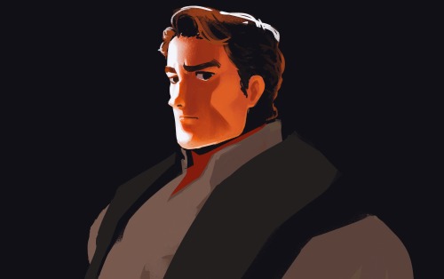
I was figuring out how light would interact with the characters while pushing the role of line. I did studies on how to make a line express form, colour, and light. From afar, the line can be reflected light, but up close the “line” expressing reflected light would spread in a stylized manner. This creates the feeling of an increase of detail when we look at something up close all while strengthening the colourful quality of the project throughout.
Post link

