#letterpress


May, June, July & August from my 2017 Slow Food Calendar. Letterpress printed by Bison Bookbinding & Letterpress, 2016. ©PhoebeWahl2016
Post link


January, February, March & April from my 2017 Slow Food Calendar. Letterpress printed by Bison Bookbinding & Letterpress, 2016. ©PhoebeWahl2016
Post link
")
")
")


#MiniatureMonday
A brief history of borders and type flowers / Robert Freese, Sr.
This one is for all of the type enthusiasts out there!
Freese walks us through a short history of the use of metal decorative borders that can be used with metal type, with many beautiful examples from different time periods!
“(Illustrations) consist of samples of type borders.
Cloth boards, printed paper label pasted on front cover; pink silk endpapers.” –Catalog
–Diane R., Special Collections Graduate Student
. | Londondesignz.comFollowing on from")
. | Londondesignz.comFollowing on from")
. | Londondesignz.comFollowing on from")
. | Londondesignz.comFollowing on from")
. | Londondesignz.comFollowing on from")
. | Londondesignz.comFollowing on from")
. | Londondesignz.comFollowing on from")
Pick Me Up 2016: Alan Kitching — A Life in Letterpress (pt2). | Londondesignz.com
Following on from my earlier post covering Alan’s work throughout the Nineties, this one samples some of his work from the turn of the Millennium.
One of the great aspects of this exhibition is that it shines a light on the working process used in select pieces. This can be seen in the artwork of 2003′s history of the Royal Albert Hall where we get to view the final product in tandem with a rough production layout.
You can find out more about the exhibition and its companion book over at thetypographyworkshop.com.
Post link
. | Londondesignz.comI recently droppe")
. | Londondesignz.comI recently droppe")
. | Londondesignz.comI recently droppe")
. | Londondesignz.comI recently droppe")
. | Londondesignz.comI recently droppe")
. | Londondesignz.comI recently droppe")
. | Londondesignz.comI recently droppe")
. | Londondesignz.comI recently droppe")
. | Londondesignz.comI recently droppe")
Pick Me Up 2016: Alan Kitching — A Life in Letterpress (pt1). | Londondesignz.com
I recently dropped into this year’s Pick Me Up festival at Somerset House and made a point of spending some significant time looking through Alan Kitching’s ‘A life in Letterpress’ exhibition.
There was loads to look through and wittling the number of pieces down to a small set to be featured here posed a challenge. Even then, I’m having to spread my picks over several blog posts.
This one focuses on Kitching’s work throughout the Nineties which from my perspective, was the period I found myself most drawn to in the show. While this era includes 1992’s legendary ‘Broadside 5: Clerkenwell Typographic Map’, I’m find myself more drawn to some of the other work here, possibly because the Clerkenwell map has been very present throughout my design career (great though it is). One such piece is the poster advertising a Gert Dunbar lecture and its reference to Dunbar’s Dutch background — it has great punch.
Watch this space. More of my choice picks to come from this exhibition…
Post link
 www.discoverattic.com")


Cheers to 2015!! We’re so excited to already have a few projects in the works for the new year,
and we can’t wait to share them with you! Here’s to a wonderful 2015!
Post link

Here’s to wishing 2014 a very warm goodbye and welcoming in the new year!
Happy New Year’s Eve everyone!! xoxo Jasmine & Leah ♥
Post link

I had some letterpress type left over from last academic year so I decided to finally use it in a drawing.
~
Jazz music has always been one of my favourite genres of music.

Sir? Excuse me, sir? Sir, PLEASE stop pulling books off the shelf and dropping them on the floor! Who even let you in here??


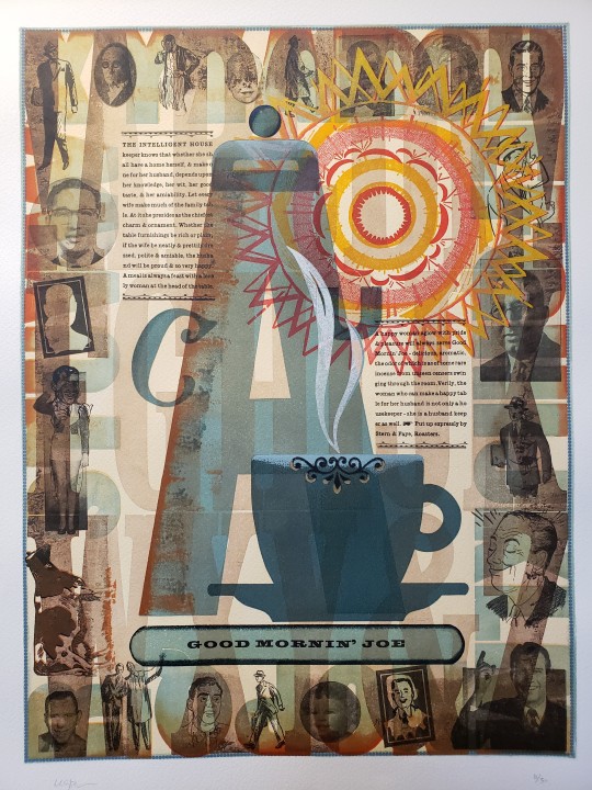
Good Mornin’ Joe! We’re back, open again in person! The special collections is ready to see you all again live and in person! Advance appointment is required so give us a call at 503-988-6287 for details! In the meantime, enjoy this beautiful letterpress print (an edition of 35) by the late and oh, so talented, Chris Stern.

Going out in the mail today to my $5 #Patreon mail art level- this print that I did during my two day typesetting class at @atxbookarts. I carved the palette shaped linoleum block late the night before, so the lines aren’t as smooth as I’d like. The paint blobs were added later as I used up excess color from various projects.
#handprinted #letterpress #typesetting #quote #vincentvangogh #painting #colorful #Patreonrewards #ArtistsonPatreon
Post link

Write more letters. #nss2018 #letterpress #day2 #nyc #stationeryshow #stationery #writemoreletters #handwritten #creative #dreamer #doer #success #careermove #dowhatyoulove #careerpath #entrepreneur #handwritten #blessed #graphicdesigner #artdirection #creativeprocess #makingmemories #midwest #livelovelife #laugh #inspire #inspiration #legionpaper iPhone (at New York, New York)
Post link
![vase w/ 153vase linocut with two stacks of ornament [lanston monotype 153].letterpress on johannot.m](https://64.media.tumblr.com/06fbcfd0d3957d02f772e56f064c7b4c/614d24a629d3f237-62/s1280x1920/3b153b3f46ff54eb13578d07d4743ebc51f092a7.png "vase w/ 153vase linocut with two stacks of ornament [lanston monotype 153].letterpress on johannot.m")
vase w/ 153
vase linocut with two stacks of ornament [lanston monotype 153].
letterpress on johannot.
more vase prints: ‹vase & screen›, ‹vase 2›.
Post link


fat face
apt german phrase, which permeates german literature. translation i like to give: gather together to form a composite. set in ultra bodoni [lanston monotype 675]; w/ tailpiece of ornamental border [lanston monotype 153-4].
letterpress on rives heavy weight, buff.
bodoni never cut anything so black as «ultra bodoni»! nicolette gray tells us that the process of fattening the modern cut for display purposes began with william cottrell in 1766, reaching a norm w/ edmund fry (2nd illustration) in 1816 [XIXth Century Ornamented Types and Title Pages, faber & faber, london, 1937, pp 22‒3]. but, she concludes: «The inventor of the fat face is generally considered to have been Robert Thorne. … It was he who was asked by the Imprimerie Royale in 1819 to cut a fat face for them.» [ibid., p25.]
theodore low de vinne gives an interesting account of the evolution of thorne’s face: «But great changes had been going on in public taste. Light faces were disapproved; bold and black faces were demanded. To meet the demand, Thorne showed in 1803 a full series of ‘improved types’ of the bold face which so seriously vulgarized the book printing of the first half of the century [19th]. Subsequent specimens from his foundry showed still blacker and more unsightly faces of large romans, but they were much admired and freely bought by printers in quest of novelty.» [Plain Printing Types, the century co., nyc, 1902, p100].
2nd illustration from facsimile: Specimen of Modern Printing Types by Edmund Fry 1828, printing historical society, london, 1986.
Post link


we may wish to know who first said it, but apt dictum from alfred forbes johnson. his next line reads: «This may very well be done in the case of Petrarch in the sixteenth century, of whom there were scores of editions.» [Periods of Typography | The Italian Sixteenth Century, ernest benn, london, 1926, p7.]
set in a custom fount of bembo italic—more fount info.
letterpress on johannot.
Post link


fournier’s oblique silhouette flowers
first illustration is page 117 from pierre-simon fournier’s seminal Manuel Typographique [tome ii, imprimé par l`auteur, se vend chez barbou, paris, 1766]: vignettes 322-3, the fleuron pair of interest. john ryder tells us: «… because it is cast obliquely on the typebody, is capable of many variations in arrangement. Its immediate origin may be a crude little design of Luce [louis-renè luce, the third royal punch-cutter of the imprimerie royal] but certainly binders’ stamps of a similar kind existed in the sixteenth century.» [john ryder, A Suite of Fleurons, charles t. branford, boston, 1957, p40]. «Fournier’s flowers earned him the admiration of the world.» [ibid., p39].
two formes showing composition with montype’s recuttings of the pair [english monotype 475-6]:
2nd illustration: letterpress on hahnemühle ingres, silver gray;
3rd illustration: letterpress on kitakata.
Post link


nuremberg arabesque
diapered lozenge formes. the unit is a monotype recutting [lanston monotype 486—english monotype also cut one, their 240], & the exemplar may have been the fleuron cut by johann andrea endter before 1721 for use in his nuremberg printing office—it is shown in the book issued by his heirs in 1733, Die Wol-eingerichtete Buchdruckerey; but the design did not originate with endter. [cf. john ryder, A Suite of Fleurons, charles t. branford, boston, 1957, p35].
1. letterpress on curtis retreeve vellum, rouge.
2. letterpress on mohawk superfine white eggshell.
Post link

for the dictum vide‹& so said claudio acquaviva›. typeset in fournier ornate—for details vide‹dare to know›.
letterpress on rives heavyweight, white.
Post link