#mercator


Hello. We’ve been writing this blog every day for a little over eleven and a half months now. As it was our intention to find out why every single day of the year is BRILLIANT, we’re almost there and it seems appropriate to have some sort of countdown. If we make it, there will be ten more posts after this one. You can also find this blog on Wordpress, along with a short explanation of how it came about, and in which we reveal which of us has actually written all of this on the ‘about’ page. Thank you all for reading, liking and re-posting. Will we reach a hundred followers my March 15th? Probably not…
Why March 5th is BRILLIANT
Off The Map
Today is the birthday of Gerardus Mercator, who was born on this day in 1512 in Flanders. He was an extremely skilled map maker and the first person to use the word 'atlas’ for a collection of maps. He mapped the whole world at least twice and he did it all without setting foot on a ship or ever leaving Europe. He is best known to us because of his Mercator Projection, which is a way of representing the world that is still very familiar to us well over four centuries later. The projection, which he devised in 1569, has proved incredibly useful for anyone navigating the oceans. It also has glaring and insurmountable problems if you want to look at it to find out how big countries are in relation to one another. The difficulty is, that it is not possible to accurately represent a spherical object on a flat piece of paper.
Mercator began to study geography, mathematics and astronomy in 1534 at Louvain under the guidance of Gemma Frisius. (John Dee was a fellow student) Gemma had a sideline in the manufacture of globes and navigational instruments. Along with a man called Gaspard van der Heyden, he had created a terrestrial globe in 1529. But in the early sixteenth century, many new geographical discoveries were being made and by 1535, they were planning another. Along with his other lessons, Gemma taught Mercator how to make mathematical instruments and van der Heyden taught him the art of engraving. When they started work on the new terrestrial globe, he was given the job of engraving all the text, which he did in beautiful italic script.
In 1537 he produced his first map, which was of the Holy Land. It was very well received and a year later he printed a map of the world. We’ve already mentioned that it simply isn’t possible to draw something round on a flat sheet of paper. In 1538, Mercator approached the problem by drawing his map as a double heart shaped projection. It’s a beautiful map, but you couldn’t use it to plot a course over the ocean. It is the first map to use the name America for the northern half of the continent as well as the south.
He went on to publish a map of Flanders and to produce a globe of his own. He also started work on a large map of Europe, but it took him ages. This was partly because he was arrested and held by the Inquisition for a time but also because, with so much new geographical information pouring in constantly, it was hard to know when it was finished. It took him twelve years and was published in 1554. It’s detail and accuracy were unprecedented and was highly praised and sold well.
In 1569, he published a map of the world using what is now known as the Mercator Projection. But he called it: “Nova et Aucta Orbis Terrae Descriptio ad Usum Navigantium Emendate Accommodata” (New and more complete representation of the terrestrial globe properly adapted for use in navigation). This was a map that sailors would be able to use to plot a course using a compass. Because both the lines of longitude and latitude are straight and meet at right angles, it is possible to calculate the direction you need to go in to reach a certain destination, then follow your compass. As long as you stuck to your course, you would end up where you expected to be. It would be a revolution in the world of navigation.
Geographically, it’s not great. Partly because he had a lot of information that was wrong. When he made his map, everyone thought that the tip of South America was joined to a vast unexplored southern continent. His inset map of the North Pole is very peculiar indeed. It has four channels which carry the sea into an abyss at the centre. The only information he had about it came from a fourteenth century monk who had used 'magic arts’ to explore the region. Also there were vast areas that no one knew anything about. Most obviously in North America.
It was a while before people really took up with Mercator’s Projection but for centuries it has been the most recognised method of representing a map of our planet. It’s probably the one you had on your classroom wall, although the details are obviously more accurate. It does, however, have one major flaw. Because Mercator’s map shows the lines of longitude as equidistant from north to south, it means that anything close to the poles looks much bigger that it actually is. Scandinavia looks bigger than India and it really isn’t. India is three times as big. Generally speaking it manages to distort Europe and North America to make them look much bigger than they actually are. But Antarctica looks insanely huge. If you want to see a much more accurate representation of the relative sizes of the continents, you could do worse than take a look at the Gall Peters Projection. It’s still rather distorted, in that it stretches everything out a bit to thin towards the South Pole. But Europe and North America don’t look so big and important as we’ve been led to believe.
Post link

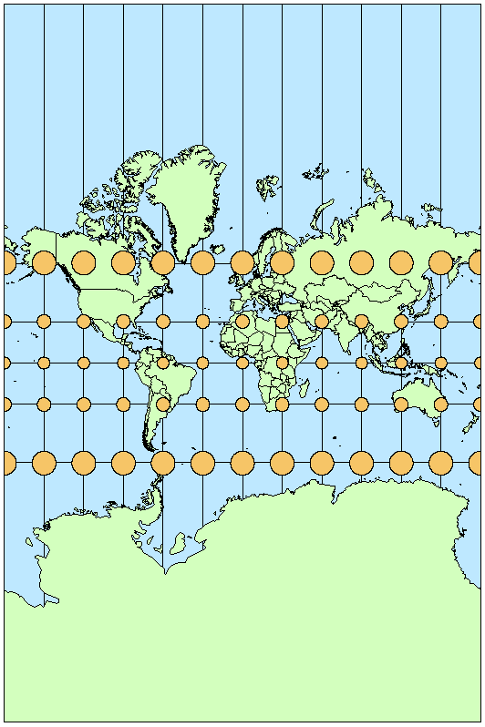
Chances are, most of the maps you look at use a Mercator projection. Or, to be more accurate, a slightly modified version called a Web Mercator projection. That’s because every time you use your phone or computer to get directions, Google, or Bing, or Mapquest (gasp!) shows you this projection. That would be ok, because Mercator is a conformal projection, which means it preserves local angular relationships, making it great for viewing roads in your city. But Web Mercator isn’t even conformal, so really it’s not ideal for anything! Oh well…as long as you get to your destination, I suppose it doesn’t really matter.
The purpose of this graphic is to illustrate that, while Mercator has become the default perception of the world for many, it creates a severely distorted view because it grossly exaggerates areas near the poles, as can be seen using Tissot’s indicatrix. If you aren’t familiar with this tool, read this article. So while Mercator is great for local viewing, it’s painful to look at on a global scale.
When selecting a projection, it’s important to consider how the map is going to be used. Are you going to be measuring distances? Angles? Areas? If so, choose a projection that preserves the quality of interest. For comparing the area of Greenland to Africa, we need to use equal-area projections like sinusoidal or Mollweide. If you use Mercator, you’ll make the mistake of thinking that Africa is slightly smaller than Greenland; the Africa to Greenland area ratio is 0.9 in a Mercator projection, as opposed to its true ratio of 13.9. If you are making a global thematic map that just needs to look pretty, find a projection that suits you. Just make sure it isn’t Mercator.
Data source: http://resources.arcgis.com/en/help/main/10.1/index.html#/List_of_supported_map_projections/003r00000017000000/
Inspiration:
http://www.pratham.name/mercator-projection-africa-vs-greenland.html (Note that many other sites have compared the areas of Greenland to Africa using varying projections – this is just one example.)
Post link