#not what he seems
“I trust you”
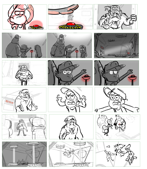
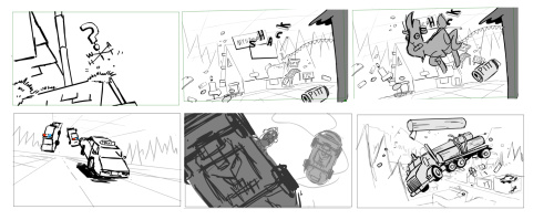
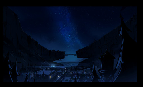
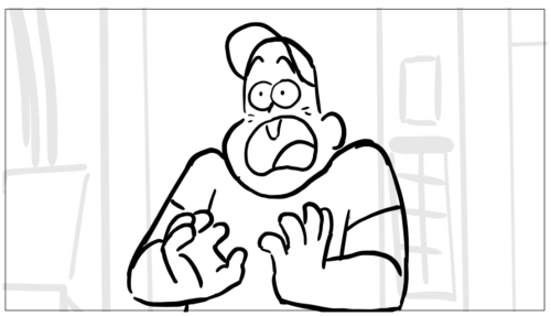
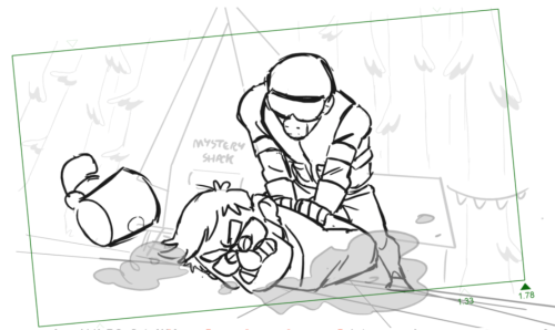
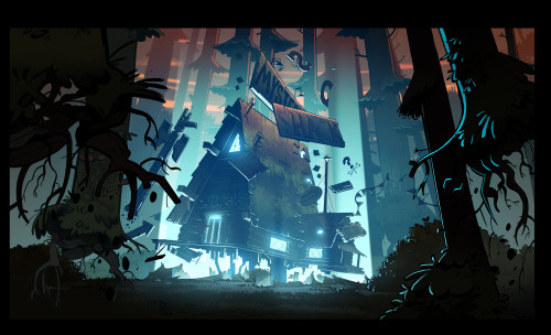
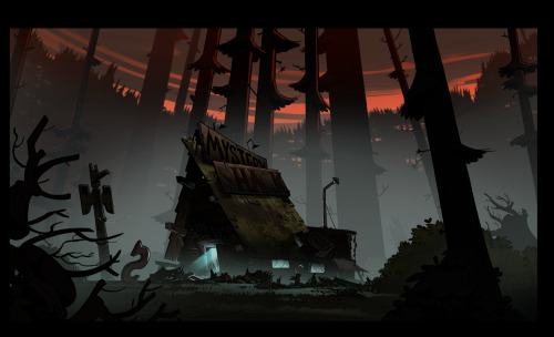
Nobody puts more heart into their storyboards than Alonso Ramirez Ramos does! Selected boards from “Not What He Seems” by Alonso, directed by Stephen Sandoval, shack exterior boards by Dana Terrace.
Post link
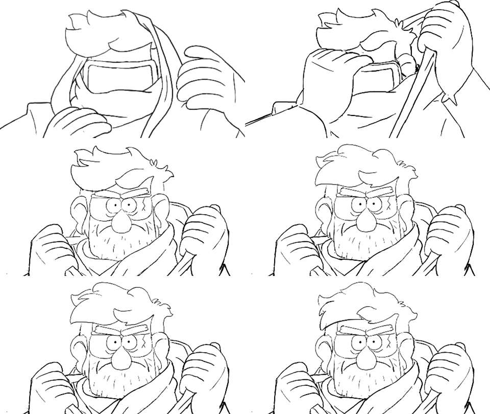
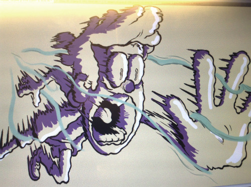
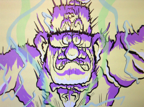
Animation I did from the last scene of Not What He Seems. Keys by Matt Braly. Woo
Every now and then we have a scene so important that we don’t want it to be animated overseas. When that happens, we call Dana
Post link
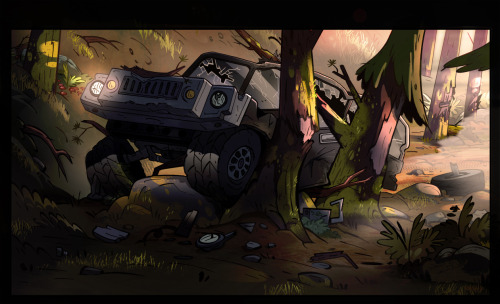
Some more of my final paints for “Not what he seems”. Layouts by Ian Worrel, SunJae_Lee, and Myself.
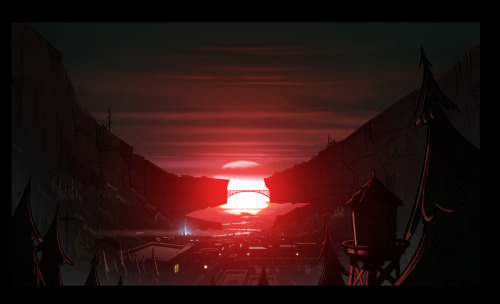
Calm down everyone- its not like its the end of the world! Awesome BGs by the Gravity Falls BG team.
Post link
Drawings from Gravity Falls, there will be more after the next episode.
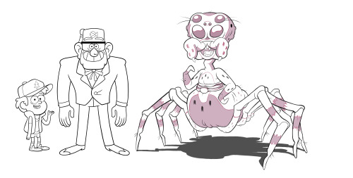
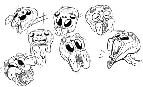
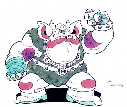
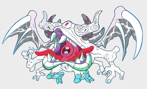
Some miscellaneous monsters and mishaps (all hand drawn!) by Gravity Falls resident Character Designer/Child Traumatizer Robert Ryan Cory!
Post link
Now that the cat’s out of the bag, I really wanted to share this piece of concept art I did waaaay back when during the planning stages of GF season 2. This was done to pump up our brainstorming session and set the tone for the big things and feelings we wanted to accomplish going forward.
The ride only gets better from here!
An earrrrly early brainstorming image done by series director Matt Braly way back when we were planning season 2. A lot has changed since then, but some key themes remain. Love this composition!
Post link
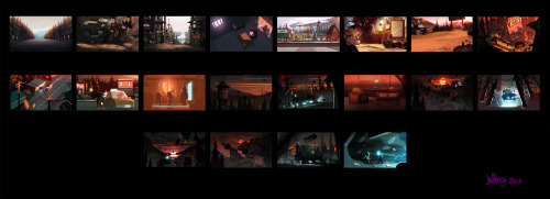
Gravity Falls Season 2 “not what he seems” Color keys.
Look CLOSELY at these awesome color keys by Jeffrey Thompson. This is where he scripted out how the color should change to enhance the emotions over the course of the episode. Masterfully done!
Post link
HEY GUYS you enjoy the episode last night? Here are some of the boards I did (I tried not to show anything too spoilery for those who haven’t seen it yet). Like I’ve said this was my first episode so I’m both proud and intensely embarrassed to show these. I can go on about what I don’t think works and what I would change today but sometimes I draw a cute expression and think it’s worth showing. I owe a lot to the director and my fellow board artists for their invaluable advice and support. And cheers to the designers and painters who made every shot look CRAZY!
A peek at the storyboards from this episode, by Dana Terrace!
Post link
Getting to destroy the Mystery Shack was some of the most fun I’ve had all season. Art direction by the all powerful Ian Worrel. So humbled to be a part of the crew and contribute to this series.
What goes up must come down. Beautiful work by Jeffrey Thompson!
Post link
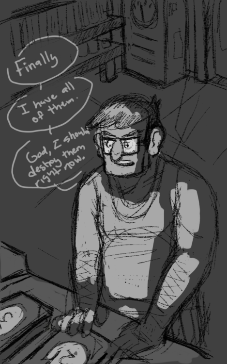
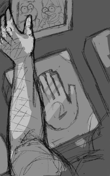
I’m playing around with this real dumb headcanon that Stan is actually Grandpa Pines, cause apparently Not What He Seems didn’t have enough feels for me, I gotta fabricate my own over here.
I also like the idea of Stan having a not sure if want [to potentially destroy universe] moment after getting his hands on all of the journals.
Ugh guys cartoons are ruining my life right now.
Post link
Now that the cat’s out of the bag, I really wanted to share this piece of concept art I did waaaay back when during the planning stages of GF season 2. This was done to pump up our brainstorming session and set the tone for the big things and feelings we wanted to accomplish going forward.
The ride only gets better from here!
Post link
Some more of my final paints for “Not what he seems”. Layouts by Ian Worrel, SunJae_Lee, and Myself.
Post link
Getting to destroy the Mystery Shack was some of the most fun I’ve had all season. Art direction by the all powerful Ian Worrel. So humbled to be a part of the crew and contribute to this series.
Post link
Continuing with Amphibia liveblog.
I watched “Escape to Amphibia.” It may not be fully fair to compare it to “Not What He Seems” in Gravity Falls - especially since I haven’t finished Amphibia, and especially since different shows will have different narrative desires. I’m going to compare them anyway. I hope people forgive me for comparing apples to crab apples.
“Escape to Amphibia” appears to be the major action turning point, the drama, the reveal, the showdown where lots of which has been built up breaks loose. We’ve been waiting long for the return to Amphibia. Here it is. That’s similar to “Not What He Seems,” where everything breaks loose, and we get the season-and-a-half built up reveal of what Stan is hiding and who the Author is. Functionally, it seems these two episodes intend to operate the same way.
However, “Not What He Seems” comes off better from a satisfaction standpoint. This is because it’s the buildup of mysteries that we’ve always had. Literally from Episode 1. We’ve wanted to know who the Author is. We’ve wanted to know what Stan is up to. GF has always promised that this would be in the scope of the show. Fans are at their wit’s end to get the explosion and reveal.
But that isn’t the case with Amphibia. We didn’t get introduced to Mr. X, a major antagonist of S3, until S3. We didn’t expect an urban-centered showdown with a group of friends we’d never met ‘til S3. So it can’t compare to the excitement, investment, relief, and thrill of “Not What He Seems.” It doesn’t feel as natural or as much of a payoff.
Now, both shows introduce FBI agents late in the game. GF works because they aren’t main antagonists. They don’t overdo their presence. Their simplicity is their strength. They’re more “background” and means to an ends (rather than the flamboyant personality and direct, ongoing antagonist Mr. X is).
In GF, the FBI reinforce what the heart the show has always been - character relationship investments (Stan, Dipper, and Mabel’s love and trust). They add tension to the mysteries central to the show. But Mr. X is both too colorful a personality, distracting us from the emotional tensions Amphibia introduced us to (Anne, Sprig, Hop Pop, and Polly’s love for each other, which wasn’t touched in “Escape to Amphibia”), and Mr. X is too “basic” - a straightforward villain type. So the FBI becomes more intrusive to the narrative of Amphibia, rather than reinforcing the emotional centers.
To be clear, Mr. X would be a cool character in other shows. I could see him in many cartoons where people would fall in love with him. I would, too! But he doesn’t match the tone of a show that was initially about the rural, daily lives of talking frogs.
And to be clear, the group coming together to bust the frogs out of the FBI compound was fun. It was cool to see everyone we’d befriended in S3 become relevant. It also highlights the diversity Amphibia S3 has intentionally included (ex: racial diversity, and intentionally placing women in scientific positions). The diversity feels natural and nicely done. For instance, Amphibia has always been a story where women are central and important, and they set it up that way with Anne and her two girl friends. I loved that. The trio of characters isn’t the overdone “two boys and a girl” cliche that drives me batty. It’s about three girls, which feels very real to me. I am always stoked when children’s media have girls’s relationships highlighted and central.
Now. Despite this being a complete tonal shift, I admit I loved the Star Wars vibe when Anne fought the FBI agents with the pseudo-lightsaber. It just looked cool. Black suit. Red saber. Heck yeah. Also, it feels more relevant, not just because Anne and her parents sparred earlier in the episode (so dorky! so pure!), but because we’ve seen Anne fighting with swords before. It’s an established skill she has. It’s a skill she’s grown in Amphibia, though if the show had shown the learning curve more, this moment might have been even MORE satisfying. But it was fun! It hit at guilty pleasures, so I couldn’t complain.
The moment where Anne opened the portal with her blue powers was epic and cool (the blue powers I’ve always liked, btw - well-established magic in this world, plus tying back to the music box we’ve always known about and wanted to learn about). And when the frogs stared out at a changed Amphibia, it was heartbreaking. It shows there’s no going back to the idyllic norm of S1. That makes me sad because S1 is what got me invested in the show, but it’s extremely well-done, and I give kudos to the writers for shoving wrenching emotions in.
If I read this episode right - and I’ve only been writing qualifiers to be careful - it’s a good analogue to “Not What He Seems,” and maybe I can write a more confident, robust analysis later.
P. S. Sprig with his red hair tuft and beanie - his human clothes - were always real cute.
P. P. S. I ship Hop Pop x Avocados.
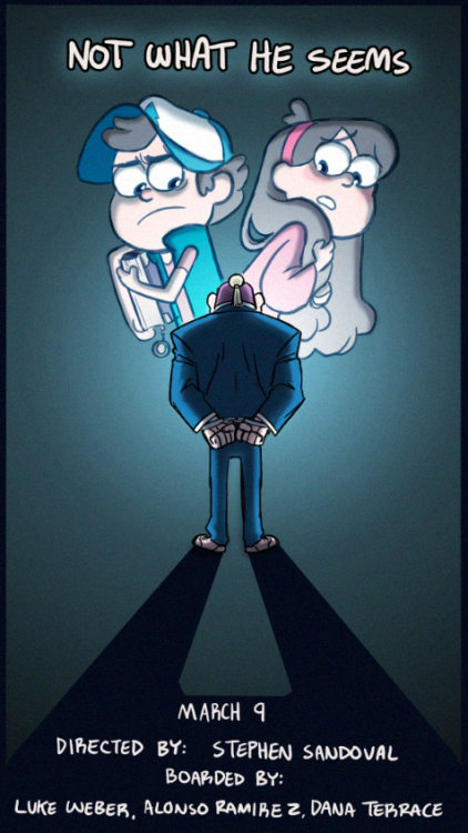
x NOT WHAT HE SEEMS x
Gravity Falls Poster Series 31/40
~
Ahh another favourite episode… it wasn’t just good for a cartoon it was good for television.I remember how nervous I was when I was watching it, knowing that I was now hooked into this fandom forever…
~
I discovered Gravity Falls when I least expected it. I expected to just sit back, relax and watch a fun cartoon. But it ended up being so much more than that. It spoke to me on such a personal level, from making me nostalgic for the summers of my childhood to identifying with the power of sibling love. (Can I also mention how stunning the animation is?) Here’s my own little love letter to it. c:
~
LIKECOMMENTREBLOGFOLLOW ~ If you like my work, please help me out in this way! It will only take a few seconds of your time and my dreams are dependent on it!
~
You can find links to my website, shop, Instagram, social media policy, commission info (all proceeds go to charity!) and resources for justice *HERE*.
Post link

