#pret a porter
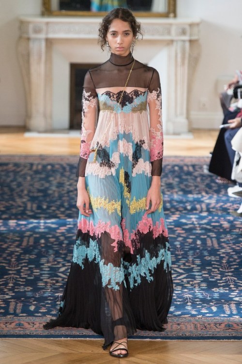
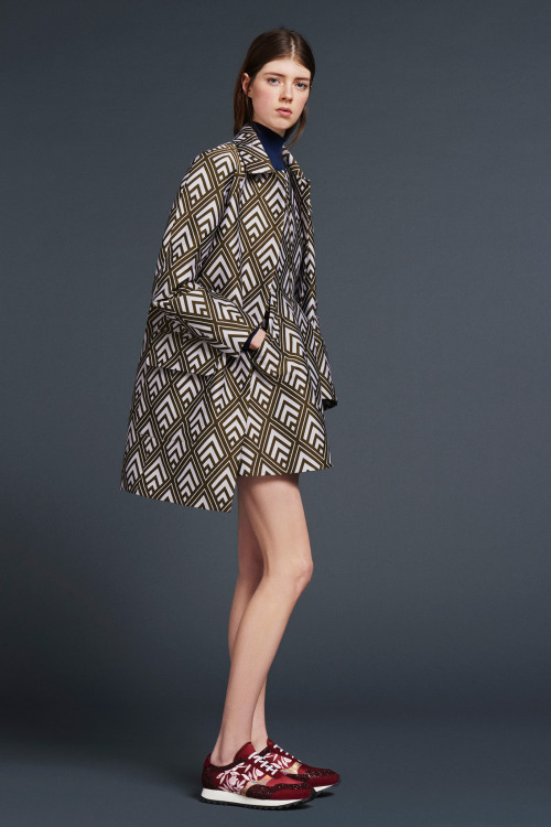
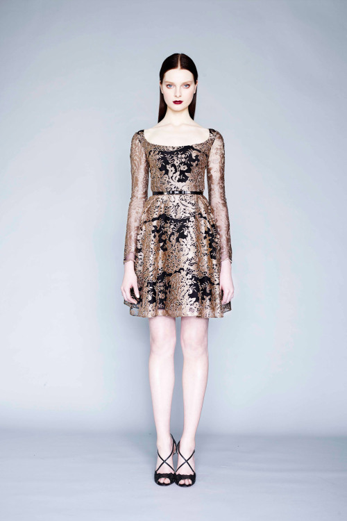
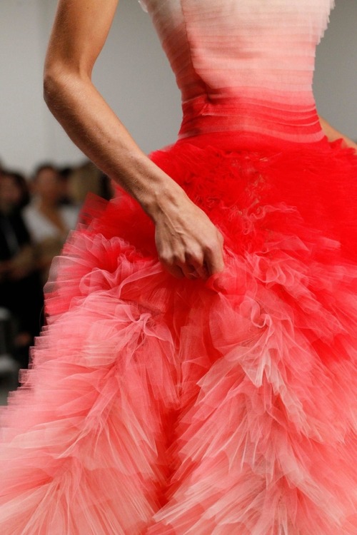
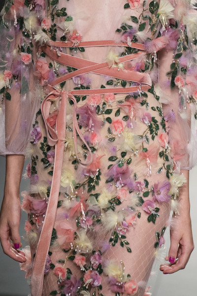
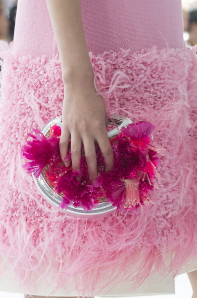
Valentino Ready to Wear Spring - Summer 2017.
Model: Yasmin Wijnaldum.
i know this is lace, but if i ever spill oil paint on a dress, remind me to turn it into a piece of art like this dress by Valentino <3
Post link
Paris Fashion Week - Days 5 & 6
Day 5
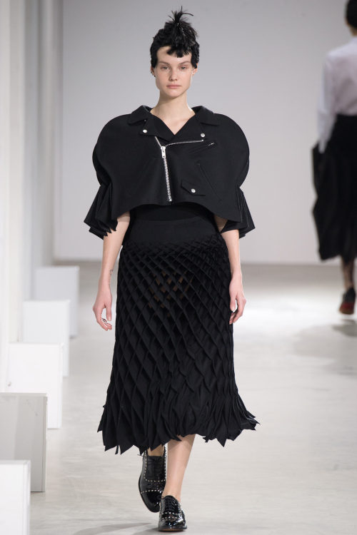
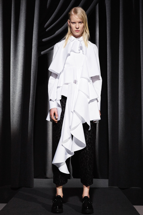
The simplest you can get was definitely at Junya Watanabe’s (photo 1) - white shirts - with the most - aesthetically - complicated you can get - origami: together they made a wonderful match. Black and white was the essential palette, the pieces were manipulated beautifully: leather maxi-skirts looking like fish scales, amazingly constructed three-dimensional shapes for jackets, trousers, decorative elements, capes reminding of Chinese paper lamps. It was wonderland - and wonderful.
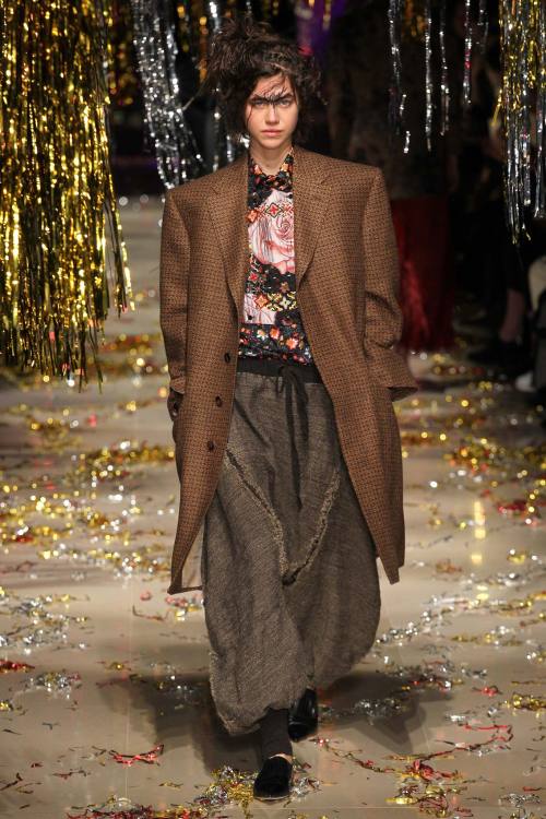
Superwoman is instead the first word you could think of in front of Tsumori Chisato’s collection (photo 2), where comics were the centerpiece. Amazing illustrations over cute A-line dresses or baseball jackets gave an atmosphere in between 60s and 70s. Loved the pieces where the comic inspiration was more subtle but still there, through shapes borrowed from graphic novels - like cloudy curved lines or spiked figures. At Vivienne Westwood’s (photo 3) Andreas Kronthaler’s t-shirt at the end of the show didn’t leave space for doubt - if ever there was any: this show was about the concept of unisex. Stilettos and fitted jackets or bustier for men, formal suits for women: roles were switched, but they were also mixed and reinvented. In the usual extravaganza of prints, the most interesting pieces were definitely the extremely oversize suits, changing from being formal pieces of clothing to a comfy streetwear choice.
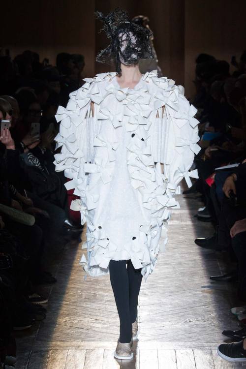
With experimentation at its purest, Comme des Garçons (photo 4) never upsets. This time with all the lace, bows, white and brocade, I had the impression Rei Kawakubo wanted to talk about what happens behind the bedroom doors. I read some reviews talking about mourning, but I guess this mourning theme took over a little bit too much, both on the runways and in the reviewer’s minds. No, if there was mourning in this collection it was linked - as many times it’s done - to a very different yet close topic: sex. But it was sex in Kawakubo’s style: there was lace, but it was not used in a common way, it covered the body, nearly eating it, prevailing over it; bows did the same, covering every inch of the body. And then gold brocade, nothing more representative for the idea of luxury.
Basic silhouettes and the pairing of thick structured materials like plaid and leather with ethereal chiffon were the choice of Acne Studios. Beautiful the decorating maxi-stitches. It was then the last ready-to-wear collection for Viktor & Rolf (photo 5) before they completely dedicate their work to the couture - and you could actually see some couture in this collection. Brocade and metallic colours were rich but not actually the real couture moment of the collection; it was more about the structure and the perfect tailoring of shirts, with meters of ruffles and crenellated edges giving the impression of unfinished - yet, it’s perfectly finished and awesomely beautiful.
Day 6
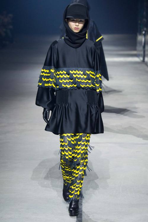
Rei Kawakubo’s secondary line Comme des Garçons Comme des Garçons opened the day and it was impossible not to imagine Asian schoolgirls wearing every single piece of this collection: from the Korean collars to the black Chinese-inspired dresses and the ensemble reminding of sailor uniforms - Sailor Moon was a Japanese manga and anime after all - Rei Kawakubo seemed to explore the world of Asian youth. Wonderful the insertion of activewear jackets among formal suits and little dresses. Couture activewear is possible, at least judging from Kenzo show (photo 6), where raincoats with bright-coloured stripes were paired with pieces with artsy details - materials manipulated to look like feathers, for example - and hi-tech fabric. Loved the flowery prints treated as camouflage.
Geometrical panels in different colours adorning extra-minimal pieces were the fil rouge for Céline collection (photo 7): slip dresses with extremely thin straps, trench coats where the focus was on the very tiny waist, duvet capes, delicately printed blouses and oversize ensembles in pure simple Céline style.
Maison Rabih Kayrouz used tiny little cuts to give some more personality to the full-coloured surface of these extremely minimal dresses, with beautiful knitwear in neutral colours, juxtaposition of layers of materials in different cuts and new innovative geometrical necklines. Long silhouettes could be found at Chloé, with a tiny tad of ruffles - which are always welcome in a 70s inspired collection. Beautiful the patchwork coats and the sexy deep cleavages showing the right amount of skin.
Akris chose horizontal lines reproposed in different ways: quilted, knitted, with a degrading effect given by the quality of a particular type of fur. Colours were never extreme: they went probably towards grey and white or cream, and even when there was black, it had a sort of powdery feel to it. Jean Paul Lespagnard (photo 8) wrapped his models in beautiful tartan or abstract-inspired coats, with exaggerated proportions and revisited construction - look at the coat in the photo and notice the beautiful idea of moving the line of the shoulder very low down the sleeve. Cropped trousers were then paired to multicoloured socks, in a collection where the attention for details was essential.
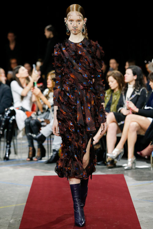
Amazingly young and successful was Kolor’s collection (photo 9). I particularly loved the oversize shapes, the duvet coats, asymmetrical skirts and then the amount of sweaters with interesting details, paired with pleated conservative skirts or the plain white blouses with giant maxi-skirts at the bottom. Grand finale with Givenchy (photo 10) where a sort of dark past was readable in the looks conceived by Riccardo Tisci. Starting with black velvet and going through high necklines, conservative silhouettes, lace, dévorée fabrics, everything seemed to take you far away to the Victorian Age. There was a great deal of modernity though, especially in the subtle sexiness highlighted by naked shoulders and see-through textiles.
xxx
Post link
Paris Fashion Week - Days 3 & 4
Day 3
What was exciting in Roland Mouret’s nice wearable collection was the little details, the juxtaposition of prints and especially the necklines, taking geometrical shapes and giving a new fresh direction to the little dresses. In the wonderland of Manish Arora, then, ‘Winter is coming’, as it was written in different ways on many of the looks and as it understandable from the little hints spread here and there, like the prints depicting a deer or other 'winter’ scenes - despite of the flowers adorning some other looks. There was gold, there were big sweaters with phantasmagoric patterns, there were studs decorating the hems and the accessories.
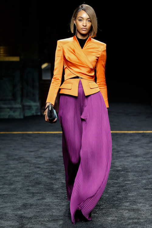
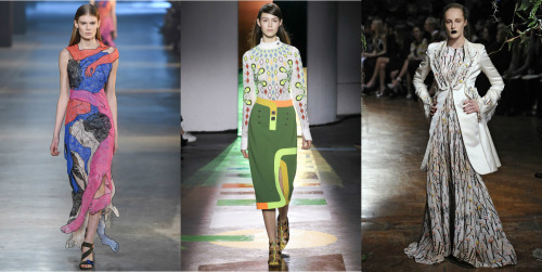
Architecture was the focus of Paco Rabanne (photo 1) collection, not only because of the buildings and structures depicted on some hoodies and sweaters, but also because it was visible in the quality of the looks: waists were moved higher, tightened and balanced by wide bottom parts and very long and oversize sleeves; when the material used wasn’t as thick as neoprene and wool, lines transversally crossing the body gave the idea of structure, with chiffon acting as a window sexily showing the body. Classic glam was instead Balmain’s main style choice (photo 2). If you’re looking for something in particular, you could probably find it in this collection. It was classic but in a badass way, which made me think of the power collections of the 90s rocked by top models on the runway. There were fringes and lurex, gold and bright colours. What I liked the most were the contrasts: colour blocking, as well as contrasts of materials - pleated chiffon and glossy silk - with some fun twists - coloured lace as an example.
Dark, frightening, regal at the same time was the collection presented by A. F. Vandevorst (photo 3). There was a sort of algid quality to the black, grey and sometimes white dresses, with ruffled fringes, layers of fabric, exaggerated proportions. Loved the trousers inspired by boots with strings and the wrinkled fabric.
Rick Owens proposed a pattern and explored it in countless ways: neutral colours, with some hint of gold, cape, tight waist broadening at the bottom, straight lines. A master of construction and of experimentation, beautiful the fabrics gently wrapping the body. Christian Wijnants sent down the runway beautiful African-inspired prints for long wrapping dresses, leaving place then to woolen coats in egg shapes and ensembles with ethereal transparent fabrics.
Africa was also presente in Lanvin (photo 4), precisely Morocco, Alber Elbaz’s motherland. It was definitely the inspiration this time, even if he didn’t give up on the elegance which distinguishes Lanvin as a brand: beautiful long black gowns were revisited with the use of fringes - it seems fringes are the new black, they’re everywhere! - thin ropes hanging from the body, stripes, a little chiffon, brilliant colours paired with gold. Everything contributed to give movement. Gosia Baczynska (photo 5) developed her collection around a common aesthetic theme: brocade. The pattern was repurposed in several versions, with normal brocade, or quilted, or even through cut-outs, embroidered, alternated to total black silk looks. Amazing the last pieces with an iridescent fabric beautifully reflecting the light. Electric.
Day 4
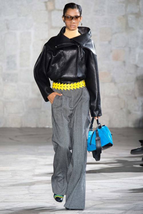
Another strong, bold collection for Loewe (photo 6) was designed by J.W. Anderson. Trousers were the real protagonists of this collection, in tweed, a masculine fabric which can become the king of the female wardrobe - as Chanel taught us well. But there were also long dresses and pleated skirts, sweet and cool at the same time. My favourite pieces were the coats, reinvented to look less stiff, slightly oversize to give a little draping movement to the ensemble.
In Chalayan’s show men and women were walking together down the runway, both wardrobe looking as one: maxi-zippers over windbreakers, a lot of black, skinny fit trousers. In the most feminine looks different types of fabric were put together with the use of little chains or in a 'patchworky’ style. Texture was instead the main theme of Issey Miyake collection (photo 7), where three-dimensionality was explored in different ways. Fabrics with difference of texture underlined by different colours, graphic patterns all over the body giving the impression of depth, stripes with maxi-pleats. Everything was new, everything was flawless.
Multicoloured threads decorating the body with sinuous lines were the focus of Julien David’s collection, threads forming graphic and optical patterns with a strong impression of movement. The collection at Christian Dior this time, instead, was more aggressive than feminine, and this is not usually the case with the maison - even if the brand definitely has an edgy side too. Latex for boots was enhanced by dark total looks, cocktail dresses with lines reminding of classic Dior but in a toned-down femininity, or bright maxi-prints - leopard in acid tones - metallic textiles and showing of skin - but never too much.
When everyone is saying flares are coming back in fashion again, Isabel Marant seems to reply NO. All her trousers were leggings-like super skinny pieces flattering the body and showing the curves, paired with knitted turtlenecks with a sporty vibe or feminine ruffled chiffon tops, evoking the last ethereal pieces. There was no doubt, instead, that eternal beauty was the theme under Undercover collection (photo 8). From the plastic masks over the models’ faces mimicking plastic surgery to the paintings of children over some of the dresses, everything seemed to go to that direction. The clothes, never too bright, seemed to conceal the body more than showing anything: oversize shapes, layering of fabrics draped and tied around the body, just few instances of thin waists and slim fit.
I expected more from John Galliano at Martin Margiela. Everything was a little bit too confused, but I loved the camel-toned coats manipulated in various ways. Nothing like that Balenciaga (photo 9), after which I could breathe easy as Alexander Wang proved again to be one of the most interesting designers around - remember I didn’t like his collection for his eponymous brand? This time, it was classic reloaded: egg-shaped coats, pencil skirts, cute fitted jackets, very classic old-fashioned pieces with extremely modern details. The different items looked stapled more than sewn together, the dresses and jackets are completely studded, giving them an edgy look, at the same time elevated by sophisticated details like the brooches with the initials of the great master, Cristóbal Balenciaga.
The idea of Japan is a fixed obsession for Yohji Yamamoto (photo 10). You could see it in the yards of fabric wrapping the body in shapes which only remotely reminded kimonos, yet they were an obvious reference, using colours like black and blood red. Tailored looks immaculately constructed showed Yamamoto can also go very Western-like, with a touch of masculine style.
Off-White awesomely reinvented 70s vibe, with leather and sheepskin jackets paired to classic cut beige trousers freshened by the insertion of a little print. Beautiful the last printed ensemble paired with Timberland-like boots.
xxx
Post link
Paris Fashion Week - Days 1 & 2
The last fashion week, Paris, started three days ago to say bye to fashion lovers with its amount of innovation, craziness and fantasy put into clothes. Let’s see these first exciting two days.
Day 1
Léa Peckre (photo 1) chose to explore deconstruction and reconstruction. And what better way to do it if not tailoring? Beautiful jackets with separate panels forming a structured piece or patchwork skirts with raw hems underlining the different parts were the strong pieces of this collection.
The most ironic - if there’s one - versione of death and mourning was at stake in Dévastée collection, full of humour and lightness. Total black was lit up by white chiffon over simple short dresses and long tops, with prints depicting graveyards, gravestones and ghosts with smiling faces. It was the idea of youth as a period so far away from death that can even dare laugh at it. Brilliant. Anrealage (photo 2) started its show with a first part in total black where the powdery white of the centre of the looks seemed to be as an escamotage to make everything look even more black with its difference of tone. Genial the use of the two contrasting colours (b&w) to explore the theme of light: it was translated into simple military-like woolen coats, or knitwear, even as a mosaic degrading from pure white to grey and the blackest black. The second part was surprisingly…colour. It made it more complete, the prints hit by limelights enhanced the power of the light showing the strong contrast with the part of the looks still drenched in darkness.
AtJacquemus show (photo 3) you probably felt like it was an exhibit of contemporary art where the focus was on form. It was like an analysis on the power of cut, intended literally as the thing you do with a pair of scissors. That explains a lot: it explains the half-naked models sent down the runway, it explained the cut-out pieces of fabric covering some of the models’ faces as well as the ‘second face’ drawn next to the real face of some other models. And it also explains the aesthetic of the looks: different materials cut into geometrical or more irregular shapes covering the body through the use of strings, bows, knots, creating a new never-seen-before wardrobe.
Coperni Femme delivered a total collection: an ideal wardrobe where basic pieces were mixed with more conceptual and unique others, where the real innovation came from details - sometimes even not so subtly: a coat with petal-like shapes juxtaposed giving the idea of movement, very long sleeves, or menswear pinstripe fabric for a very feminine little dress.
Day 2
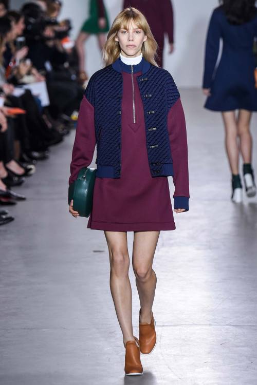
At Lemaire focus was on the shoulders: big, strong, underlined by necklines which let them naked and sexily showing. Coats and strapless dresses were the key-pieces of such a collection. Cédric Charlier (photo 4) married a vague American sportswear 'cheerleadish’ vibe in the silhouettes and in the pleated skirts, in the lengths taken a little more than above the knee, to an elegant appeal, made of contrasting shades never too bright or in-your-face: there was navy blue with bordeaux, green and black. It was simple, yet successful: loved the choice of materials, giving structure to the little cocktail dresses and short jackets.
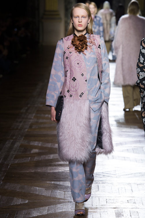
Grounded Glamour was the name of Dries Van Noten’s collection (photo 5), and it immediately spoke to you from the very first look: there was brocade with beautiful golden embroideries, paired with military-like ensemble in oversize shapes and neutral colours, a little lived-in looking. It was the description of a brand wanting to dress with opulence the people of today, with their needs coming from living in an urban jungle. Always glam.
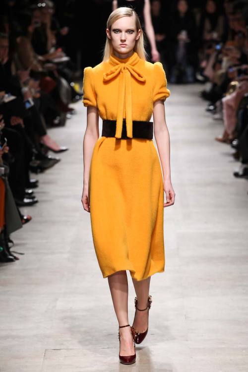
Rochas (photo 6) was a roller coaster between conservative shapes and details and sexiness to its extreme sophistication. Conservative were the colours, with a chain of looks in brown, reminding old coats worn by poor people in the years of the war maybe - that’s what it made me think, actually - conservative were the shapes, with long straight-lined dresses with short puff sleeves, conservative were the details, very high necklines closed by bows. The collection was cheered up now and then by a flame of brightness, like the yellow of the dress in the photo. Sexy was instead the black chiffon, covering and showing the body at the same time, beautifully decorated by delicate prints of birds and leaves.
An architectural collection came from Aganovich (photo 7). The fabric and its cure were the real protagonists. Pinstripes, white, black and white tweed-like fabric designed new innovative lines crossing the body and manipulating the body’s silhouette. Sometimes they were sharp like knives, sometimes rounded, following the body lines. The result was always a harmonic movement of shapes structuring the body like a sculpture.
An interesting theme was explored in Alexis Mabille’s collection, all about the idea of knotting and the crossing of lines, brought through every look of the collection in different ways: sometimes it was the detail of two fabrics tied together, sometimes it was about strings crossing the dress, sometimes it was translated into print.
xxx
Post link
Milan Fashion Week - Day 5 & 6
Very few collections were in my opinion worth talking about in these last two days, and I’ll be honest: I was disappointed by this Milan Fashion Week this year. Pity, as usually it’s my favourite moment of the fashion year, but as a reviewer my judgments should be completely unbiased. Now let’s see who got it right.
Day 5
Marni delivered straight lines, kimono shapes made vibrant by abstract and flowery prints, even the lace became simple and a subtle decoration for this collection where the luxury part was in the insertion of fur pockets and in the neckline. Laura Biagiotti took inspiration again from her favourite theme: the Roman empire. You could see it in the ‘twisting’ patterns, especially in the first awesome part in which it was played around the different tones of grey, in the column stylised on some of the dresses, as well as in the strong shoulders, underlined by the use of fur, and the embroidered fronts of the tops, where studs gave an impression of armour. But you could also see it in the beautiful, floor-length evening gowns: modern goddesses, that’s what these models looked like.
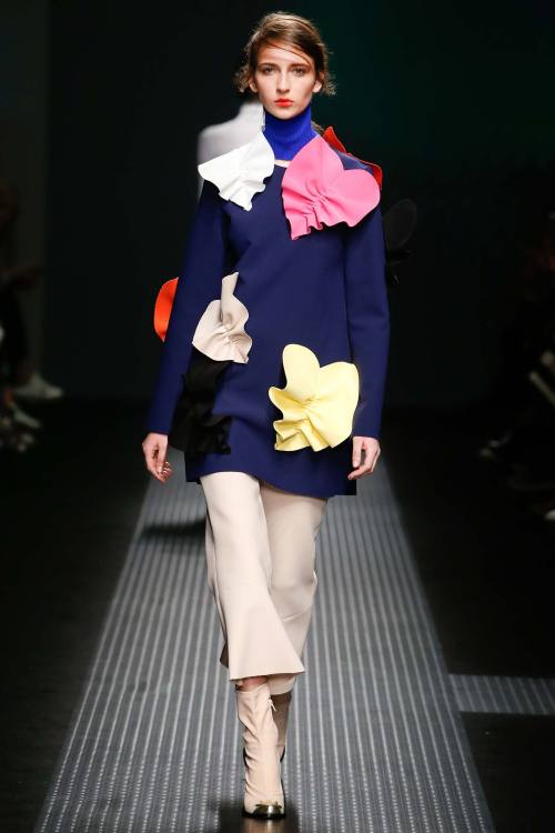
MSGM (photo 1) took the concept of three-dimensional to the next level in such a simple way it’s impossible to understand why not everyone does the same. First with big knots just below the neckline, then with decorative patterns over tops and trousers, it continued with full bright contrasting colours: lemon yellow with electric blue, a particularly flamboyant shade of orange. Not sure if I liked the three-quarter length of the trousers, but in general it came up very strongly.
All the stripes and lines in Salvatore Ferragamo collection really reminded me of Missoni. I loved the fact that the theme was not researched in an expected way: stripes are not only those of colourful patterns, but also those given by a particular type of knitwear, or those - I guess it was a trompe-l'oeil effect - of the pleating of skirts. Silhouettes were back to those of the 40s, simple, functional, toned down, but colours exploded in the last graphic part with optical prints. I loved that most of the pieces in Trussardi collection were leather, even the ones you would never expect: slip dresses, jumpsuits - my favourite ones - cocktail dresses. The colour palette was really classic, based especially on brown, which is after all the most natural colour for leather.
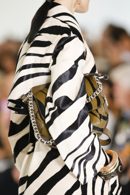
You know I don’t like animal prints - especially zebra, but who does? - blingy/tacky clothes, in general I don’t like when there’s too much going on. In this case there was DEFINITELY too much going on, but it was like they found the way to make it work and show a certain polished quality to the looks which made everything like an ironic game. It was definitely a collection which could make you laugh, impossible to list all the colours, the prints, the materials used. It was infused with a sort of 70s attitude which was not pushed too far. It’s the last word you would think to associate to such a collection, but it felt like it was balanced.
Impossible not to laugh at the ode to mothers of Dolce & Gabbana (photo 2). They translated their signature elements - black lace, black chiffon, bright-coloured embroideries, silhouettes taking inspiration from traditional everyday clothes from the South of Italy - for a figure which is definitely one of the most important in a person’s life: mum. It’s like an inspiration coming from THE inspiration, the first and foremost in your life. I would have done without the writings on skirts and dresses, but the children drawings in embroideries or prints gave the entire collection an aura of innocence which no one could resist. Once again Dolce & Gabbana proved they can be inspired by something as simple as not so much thought-about: who would ever think of going so literal on such a theme? Beautiful.
Day 6
Western inspiration for two designers coming from the West - Dsquared2 (photo 3) designers are Canadian. It was like a Western film actually: there were the Indians, with ethnic prints, big ponchos and fur coats, as well as the beautiful girls seducing men in the saloons, with ruffled dresses, exaggerated proportions down the waistline - translated here into more modern trousers and jeans - and a cocky attitude which definitely suits Dean and Dan Caten’s type of woman.
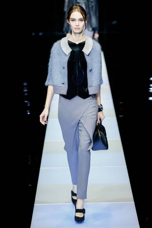
The brush of colour crossing one of the first pastel-coloured looks at Giorgio Armani (photo 4) set you already for some pops of colours here and there. They were not very bright though, and this was the focus of this collection: understatement, which, if you know a minimum about fashion, is not a new thing for Armani. This time the colour palette was really subtle: it went towards light blue, grey, some nudes. Folding, juxtaposition of materials, see-through with ethereal chiffon: it was mysterious, it was fascinating.
xxx
Post link
London Fashion Week - Days 3 & 4
Day 3
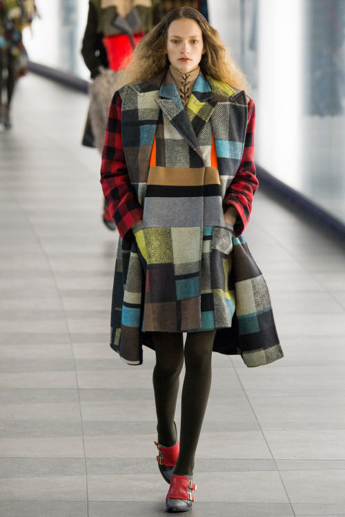
Patchwork is a nice technique which is becoming more and more fashionable, and Preen by Thornton Bregazzi (photo 1) put it at the centre of its collection, stitching different fabrics together, mostly tartan and checks, in a hurricane of colours and ruffles. The black part was more focused on the cut and on the subtle decorations of the pieces, and another take on the patchwork theme was proposed in a lace version.
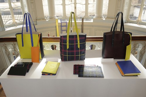
I would title Mulberry collection as ‘oversize elegance’. Loved the shearling checked coats and the giant jackets in cream and brown. But at London Fashion Week space is also given to great accessory makers. The collaboration Aspinal of London x être cécile (photo 2) had one of the best collections in this field, with shoppers, clutches, suitcases, basically every type of bag you can think of, in amazing prints and mix of contrasting colours. I need one! If you’re more about shoes then, don’t miss the shoe extraordinaire Sophia Webster (photo 3), especially if you’re not an ordinary person and you want shoes that fit your personality. A pop art collection made of everything you can think ok: animal prints, butterflies, feathers, Coca-Cola logos, messages on bags and shoes… Amazingly colourful, amazingly extravagant!
There’s still someone doing flowers, and I’m actually happy about it after all. Matthew Williamson proposed in this sense a 70s inspired collection which struck for its ability to pair the opposites: amazing chiffon gowns with loose silk pajamas, different flowery prints mixed together in a schizophrenia of patterns. The evolution of floral print continued with Temperley London (photo 4) - or is it better to talk about 'hybrid’ in this case? Hybrid between flowers and ethnic patterns, which was really visible in the collection with warmer tones and darker shades linked through the constant presence of the black. Boho silhouettes with a sexy twist.
Toga proposed its deconstructed kimonos, while Belstaff delivered its rigorously structured coats paired with more contemporary pieces of clothes. Beautiful the furry-fringed sweater.
Vivienne Westwood Red Label was fearless. I mean, don’t you feel it’s brave to choose very short shorts for a winter collection? It’s possible with Vivienne, especially if paired with a pair of red rain boots. And of course, the mixing of prints with the iconic tartan. Mary Katrantzou (photo 5) draw inspiration from wallpaper, which seems to be the newest trend on the runways. This time Katrantzou decided to give it a minimal restyling, and while she kept silhouettes very simple, she put all her fantasy into the prints and fabric manipulation. The classic wallpaper was then declined in several bright shades of yellow, orange, green - loved the fringed textile looking like grass - and appliqué of plastic and PVC ruffles went to adorn skirts, jackets and tops. Also loved how the collection was balanced on the runway: the darker shades were suddenly followed by pops of colour, so you could see a maroon and purple little dress and then, BANG! a neon yellow three-quarter sleeved top with a black mermaid skirt.
Jonathan Saunders’s collection (photo 6) definitely had a graphic quality - the three-dimensional prints of the beginning were just psychedelic - again like in Katrantzou, I appreciated keeping shapes simple to give space to experimentation on the field of prints. A wide palette of colours, which found its maximum in the degrading stripes of tones in some of the skirts and shirts.
Day 4
Antonio Berardi (photo 7) chose an unusual summery palette of lemon yellow and tangerine for a very elaborate structure of ruffles and layers of fabrics. In the simplest looks the sophistication came from jewel-like embroideries. London designers have understood that they don’t have to be afraid of colours during winter, and Roksanda (photo 8) proved that colourful furs and dresses can brighten up even the cloudiest day. Her clothes, then, do it in the coolest way possible. Loved the colour blocking as well as the variety of materials. Balance between flamboyant shades and more subtle ones.
I’ve learnt that in Erdem’s collections (photo 9) two things are sure: lace and chiffon. This time even leather was treated as lace, with intarsia-like shapes covering and embracing the body - sometimes in unusual shades like deep purple - and chiffon was there, ethereal as usual, in a wide variety of tones for little flowery dresses. But there was more to it: there was brocade blackened like coal, or even wool for coats in which the raw hems underlined the structure of the beautiful tailoring. Burberry Prorsum (photo 10), with long embroidered shawls, fringed leather skirts and capes, multicoloured maxi gowns in chiffon, definitely stated itself as a collection strongly inspired by boho culture.
Osman started very ethereal in the different tones of white, with feminine shapes and materials and ending darker, total black, with leather and feathers. But the real poet of this day was Christopher Kane (photo 11). The body is a primary problem for a fashion designer, and we know Christopher Kane is one of those artists who approach problems from the closest point of view possible - remember the biologically precise version of flowery print he proposed some seasons ago? So why not putting the body directly into his clothes? I was already amazed by the first black velvet pieces with women profiles in different colours on them; the middle part of the collection was all about the juxtaposition of layers of contrasting colours, without letting any of them prevale over the others though, a concept which took sense only in the last, amazingly emotional part, with the juxtaposition of human figures on the dress and on the models’ bodies themselves. I was completely speechless and this is definitely one of the best collections I’ve ever seen.
Peter Pilotto (photo 12) was inspired by board games and the paths in which you have to go forward through your moves. The collection itself was a sort of game and the cheerful colourful looks were the perfect match for such inspiration. Giles (photo 13) went instead for period costumes with an algid appeal. Loved the decorations of the silk dresses - are those mushrooms?
xxx
Post link
London Fashion Week - Days 1 & 2
Fashion experts have arrived to Europe to attend the fashion weeks opening with London, and I’m excited to see some old friends among the designers as well as some new talents. Let’s start the show.
Day 1
J.Js.Lee(photo 1) was a good start for London with a little bit of minimal directly from Asia. I loved all the shades of grey in this collection - cannot talk about it without referencing ‘50 shades of grey’, it’s becoming a joke - and the concept of the thread crossing the fabric and linking all the looks together was a nice, subtle feel rough putting together the whole collection.
LFW is always a great container of new talents, and Manuel Facchini (photo 2) debut on the catwalks was really one of the most promising I’ve seen recently. Facchini does very feminine silhouettes using bold and even aggressive patterns in a palette which is basically black and white, but the pops of colour weren’t missing: it’s only little touches, like the fine line bordering a jacket in red, or the yellow interior of a black and white dress skirt. Graphic and vibrant, I can’t wait to see more from this designer.
Paul Costelloe chose very bon ton shapes, with round skirt dresses inspired by the 50s. Chanel-like tweed jackets were mixed to brocade opulent fabrics and maxi shoulders to ironise. Very sleek and young silhouettes came from Fyodor Golan (photo 3), even if I still don’t understand what 'My Little Pony’ is doing there, but it added a touch of irony and thoughtlessness which is very in the mood with London Fashion Week. Towards the end the exaggerated proportions and the even more flamboyant colours made everything crazier but definitely more fun.
If there’s a place you’re sure you’ll find some great new artists, that’s Central Saint Martins. In this MA runway show fashion was art at its highest. It’s incredible to think that these designers were only fashion students until now. Among others, my favourites were Hayley Grundmann and Krystyna Kozhom, with their sculptures stating that basically every kind of material can be knitted, and also Beth Postle, with a very visible nod to the art of Keith Haring.
Day 2
Every time an African designer sends his creations down the runway I think that they all know how to deal with prints. Duro Olowu (photo 4) wasn’t different, and he definitely knows how to translate their traditions and aesthetic into beautiful feminine clothes which women from all over the world will definitely find as desirable items.
Mother of Pearl had a collection where innocence exuded from every single garment, inspired by a sort of children-like fashion - vichy checks, knee-high coats and jackets, styling to the minimum, everything looked really natural. Bon ton is the thing at London Fashion Week, and Orla Kiely went all the way about it. Little cute dresses for extremely feminine women in pastel tones, sometimes paired with a silk foulard tied around the model’s neck. Someway there was space for slightly more alternative options, like furry long-sleeved dresses in warmer tones.
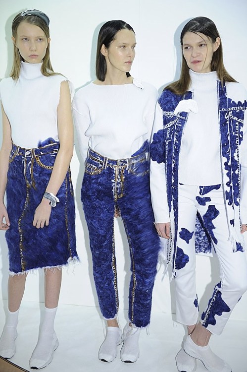
Faustine Steinmetz (photo 5) is a designer I put my eyes on last year for her debut at LFW, and now she’s one of those I wait for their collections to be shown, because I know there will be something amazing going on. Denim is her signature piece, and she manipulates it in ways still unknown to the fashion world. This time paired with hyper-white tops, the blue of the denim looked unusually bright and sparkly. It was minimal, yet had the impact of an avant-garde collection.
You can’t think of anything more minimal than Ports 1961. The clothes were cut to perfection, most of the collection was realised in black, white and nudes, but the touch of colour that every collection needs came toward the end, especially with a lovely very simple multi-coloured lace little dress which I adored. Softness everywhere was the first think I thought watching Emilia Wickstead’s collection (photo 6). Comfortable wool wrapping the body in soft coats and amazingly cozy sweaters in pale shades of pink, sky blue, nudes, were just lovely. Some concession to brighter shades in the last looks. Effortless atmosphere.
Sibling delivered a visionary collection, even if maybe more toned down than usual. Three-dimensionally graphic, loved the late embroidered with wool. Markus Lupfer (photo 7) was geometrical under every aspect: from the optical prints to the shape of the pieces, with perfectly tailored raglan sleeves, sharp edges and straight lines. Loved the variety of fabrics.
Contrasting feelings were featured in Danielle Romeril’s collection: every piece could be associated to the idea of strength as well of decay. Deconstruction, with clothes looking like they were falling apart, but never looking weak, everything looked stable somehow. The contrast was also given by the structured quality of quilted leather mixed to the fragility of lace.
The detail I liked the most from Lucas Nascimento’s collection was the extra thin straps in some of the dresses and tops, which made me think of 90s but in a cooler way, in contrasting colours, a little bit of bling and long silhouettes.
There was a lot going on in J.W.Anderson’s runway show, so you had to figure out what you were looking at. After all, Anderson has established himself as one of the greatest - and surest - promises of fashion. The thing I liked the most about this collection was that proportions were asymmetrical - sometimes the focal point was underlined with a belt, or with a simpler knot - and materials were really diverse, from leather to fringes.
I don’t usually like only gown collections, but Marchesa (photo 8) always knows how to sell it in the best way possible. This special line is really a jewel in Marchesa maison, with gowns made of the finest materials and sewn by the most expert hands. Loved the ethereal chiffon and organza which looked like made of nothing, as well as the golden lace. It exuded perfection.
Black velvet was one of the most luxurious materials you could get during the Italian Renaissance. If Simone Rocha wanted to start her runway show making people think about opulence and luxury, well, that was the right thing to do. To translate the message into modern language then, taking brocade was a great choice, a fabric which managed to go beyond time differences and kept its appeal nowadays. The last looks were the extreme consequences of such a passage, looking much more modern than the previous ones, but still nodding to the past from where they came from.
I didn’t expect such an exciting runway show from Henry Holland for his House of Holland (photo 9) - don’t know why, in my mind his designs were much less bright than these ones. I loved the puzzling effect of prints creating new patterns and I loved the happiness coming out of them. And Henry Holland, running down the runway with a big smile on his face after the show, was definitely happy as well.
Total black, as many designers chose to do for this season, was the perfect choice for Gareth Pugh (photo 10). This time he really let his fantasy run wild and free, and the result was amazing. His creations are definitely sculptural: you see it in the duvets covering the body in shapes that made me think about Japanese warriors; but also in the structural shapes of the leather or the fringes made of only god knows what material was that. Experimental.
xxx
Post link
New York Fashion Week - Day 6, 7 & 8
And we’re finally here, to the closing of one fashion week and saying hello to London - which actually kicked off with its fashion week two days ago. Let’s see the best looks, day by day.
Day 6
Tory Burch gave a great start to this day of runway shows with Moroccan-inspired prints reminding of the beautiful rugs woven in North Africa. The style was in between relaxed, chilled and cool, feminine. I would have liked more pieces in the ethnic prints of the beginning. Very polished instead was Jil Sander Navy (photo 1), extremely well-structured, with beautiful bright young colours. Loved the quilted total looks.
Would you ever say such a designer as Vera Wang, who creates the most beautiful wedding gowns, could be able of such amazing dark fashion? Nearly everything was black in her ready-to-wear collection, silhouettes were kept really plain, very far away from the ruffles and white organza of the bridal gowns. A sort of indie vibe kept together the whole collection.
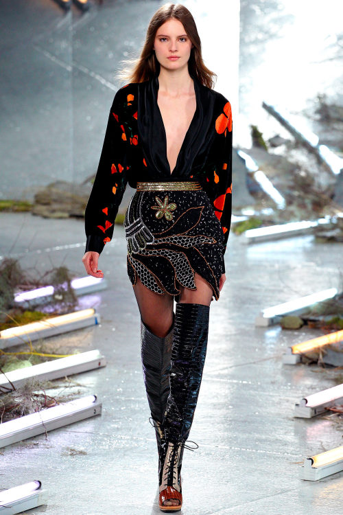
One of the most commercial brands of NYFashion Week, J.Crew (photo 2) opted for simple wearable clothes where the exciting element was the pairing of subtle tones with bright shades of yellow, blue, red. Classic pieces from a woman’s closet reinvented - from the cream-coloured jumpsuit with a formal cut to the oversize grey tailored trousers. A little bit chaotic Rodarte collection (photo 3) was, but I liked it because it made me think of very inspiring references: the circus, with the blingy dresses worn by its performers; the street, with black leather and fur nodding to a dark urban style; at the same time, though, it was vulnerable, feminine, sweet, with chiffon and flowers made of sheer lace adorning the front of the mini-skirts paired with velvet deep cleavage tops.
There was nothing new in Jenny Packham’s collection, yet everything was pleasing to the view and extremely cool looking. The champagne gold, the pearl tones, the bows, the lace gowns, everything talked about opulence, but it was not an ostentatious kind of wealthiness, it was more of a contemporary chic lifestyle. Rachel Zoe knows how the market works, and she knows what people want. Her collection, then, can never do wrong: nothing is too much, nothing is superfluous, everything is essential.
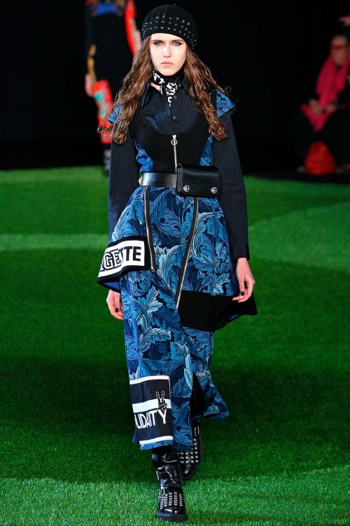
All the lines coming out of the Jacobs maison - even this Marc by Marc Jacobs (photo 4), which is not designed by Marc Jacobs himself - seem linked by a common goal: dressing women for war. It’s an everyday battle, the one that all women have to face when waking up in the morning and preparing for a new day. So why not fighting while wearing cool stuff? Shoulders are always very strong and one of the focus of the garment, but they are never too exaggerated. Wallpaper-like prints are mixed to written panels and activewear insertions in a colourful but wearable extravaganza.
Lela Rose presented a collection where everything was extremely measured, even in the peacocky prints and fringed fabrics, which didn’t look too heave or showy. Impossible, then, not to talk about the debut of Peter Copping at Oscar de la Renta, after the death of the much beloved designer some months ago. However, I thought this collection lacked of self-confidence. Of course we have to recognise that substituting such an artist of fashion as De la Renta is a stressful and difficult task, but it seemed to me Peter Copping didn’t want to overshadow his master, and in this way he ended up with a mediocre collection. Nothing like the last one Oscar designed last season. He will be greatly missed, again.
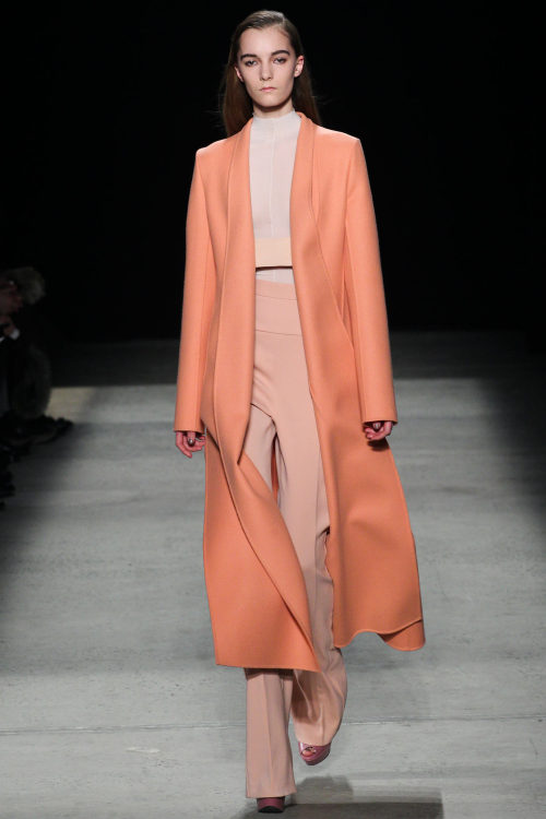
Narciso Rodriguez (photo 5) understood the secret to make every woman look thinner and taller, and applied it to every look he sent down the runway for next season. So the rules are: never use colours that are too bright or flamboyant, but always go for nudes, black, white - especially cream; tighten the waist but go looser towards the top part and the feet - resulting in amazing slightly flared trousers; whatever you can elongate, just make it longer - what about the ankle-length waistcoats? Divine.
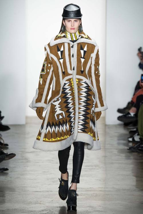
After the first two looks KTZ collection (photo 6) stated itself with the strength of a loud scream: IT WAS AMAZING! Definitely one of the best runway shows so far, maybe not as wearable as you would expect from New York Fashion Week - after all KTZ is based in London - I just thought as genius to take ethnic prints and decline them in flamboyant shades - my eyes were actually hurting with brightness @_@ - and put them everywhere, even translating them into fur. GLAMAZING!
Day 7
You can’t expect pure innovation from a designer all about business like Michael Kors, but in some way he always manages to transform the wearable things he create in something effective just as if he was dealing with art. He always chooses the best prints, the best colours, the best silhouettes for this prints and colours, the bust fur, the best length of dresses, trousers, skirts. And when it comes to accessories, well, his market success in this field is enough to tell everything about it.
Starting a runway show with a pop of colour is always a great way to grab everyone’s attention from the beginning, and I loved the fiery red Jason Wu for Boss decided to send down the runway for the first looks, especially because it was paired with grey coming from classic suit tailoring. Everything was immaculately constructed, as usual, but I would have preferred seeing more of that sparkle of colour of the beginning.
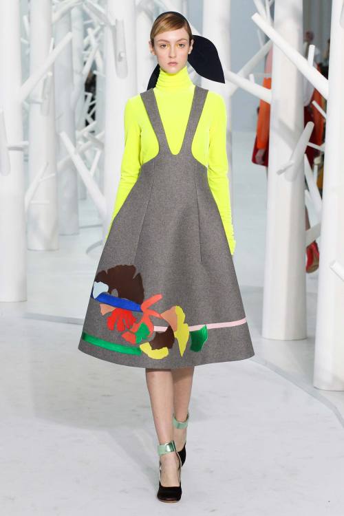
Psychedelic is the right word to describe the most hippy-like collection I’ve seen so far, despite having watched so many inspired by 70s. And Anna Sui’s ambition was probably to conceive a total collection, in the sense that this one really included everything you can think of about hippy style, just like a brain storming: strange headpieces, print mixing, chiffon, maxi dresses, fringes, leather. But it was Delpozo (photo 7) the collection that really made me crazy about it. I was waiting for it because I knew it was going to be epic, and yet I was shocked. The neon yellow was enough to make me swear I will love Delpozo for the rest of my life, but in general this was one of those collections which you can NEVER forget. Amazing knitted pink dresses, cut-out decorations of flowers and birds in thousands of beautiful colours. It was bold, it was elegant, young, fresh and with a touch of irony. Just the best.
Marchesa (photo 8) toned down the volumes for this runway show inspired by 30s and 40s, with feathers, pearls and fringes giving movement to the little dresses or to the long, sleek gowns where the focus was on the waist. Kinda reminded me of the dress Dmitry designed for the red carpet challenge at Project Runway All Stars - is Georgina Chapman copying?
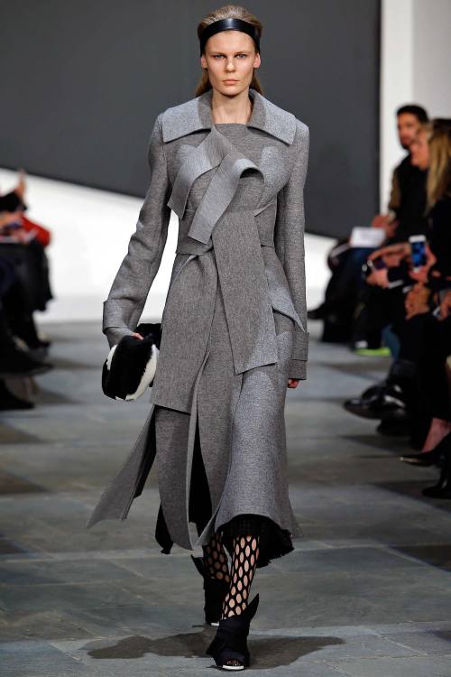
Wayne featured a collection where prints were banned, except for a tartan brown and grey coat. The aesthetic is really clean, I loved the fact they chose very feminine elements to complement the dull colours - black, grey - like bows and ruffles. Destructuring is instead the key-word for Proenza Schouler (photo 9), this time accompanied by sexy cuts of the dresses to show a little bit of skin, but always in an experimental way. Graphic juxtaposition of lines and layers gave a graphic quality to it.
Day 8
Tokyo Runway Meets New York is an event for Japanese fashion talents, and this time Han Ahn Soon (photo 10) really stood out among others with a futuristic look where cool hip clothing - fur coat, baggy trousers, street style accessories - met future - loved the insertion of metallic leather.
From Romania Dorin Negrau couldn’t help being heavily inspired by his land’s traditions, with long knitted pieces paired with chiffon gowns embroidered with colourful lace. It lacked of sophistication though. Sophisticated and simple, as usual, was instead Calvin Klein Collection, this time with a decorating twist set to the minimum. Dresses and jackets were made of rectangular pieces of fabric put together like a puzzle, or also the bouclé pieces of the end really fit the aesthetic of the brand; colours veered mostly to a dark palette.
Marc Jacobs with his eponymous line closed London Fashion Week, depicting a woman that you can define as a mistress: algid, dark, a lot intimidating. For this purpose, silhouettes were really long, colours were mostly dark - black, navy blue, bordeaux, maroon - and there was a strong sexiness going through the whole collection - the completely sheer gowns seemed like an invitation to touch and at the same time were frightening in their ostentatious transparency and sex appeal.
Stay tuned for London Fashion Week!
xxx
Post link
New York Fashion Week - Days 3,4 & 5
A little because I’m lazy, a little because I was really tired these days after my mother came to Milan to visit me - sightseeing with someone who doesn’t know the city where you live in can be a very stressful experience - I delayed my review for New York Fashion Week, and now I’m here to get you through day 3,4 & 5 - and hopefully tomorrow there will be the remaining three days and the first day of London Fashion Week!
Day 3
What better way to start a new day in New York, the most commercial of the four main fashion weeks, with a very commercially appealing brand? Lacoste (photo 1) sent some models down the runway wearing sweaters with ‘René did it first’ written on them. And it’s true, René Lacoste was the first one, in the 30s, to give sportswear a sporty look without losing the elegance of formalwear. I found it incredible how successfully for this collection they managed to merge tracksuits and trench coats together, or pinstripe suits and polo shirts. Flawless under every aspect.
A brand which I always like for its sophisticated vibe is Noon by Noor (photo 2). This time, though, it was not polished as usual, or extremely feminine as I’m used to, but I was glad for this collection because it was experimental - at least for such a brand. I was happy to see that there are brands which still know it’s important to question their aesthetic and to take a breath of fresh air. The last part of the collection reminded me of the good old signature style of the brand, made of jewel appliqués and flowing silk.
Dion Lee treated his clothes like puzzles given by stripes of fabric in which the constant peek-a-boo of naked skin was the super sexy element giving brightness to the general atmosphere. Max Azria with his line Hervé Leger opted again for a structured aesthetic translated into dozens of different - sexy - ways. I didn’t like the fact there was not any variety of length - all the dresses were higher than the knee, and this made it a little bit repetitive.
Alexander Wang went for total black, and no one knows how much I would have liked to see a nice total black collection, but I was highly disappointed. There was nothing of the activewear wave he surfed for the past collections. Of course it’s fine to evolve as a designer, but I would prefer some time to transition from one design aesthetic to the other, instead of making such rapid changes. That was a no no.
For Altuzarra collection there were all the predictable elements of sexiness: sheer lace, leather, form-fitting dresses. Yet, it wasn’t predictable, it was instead sophisticated and seductive. Every woman wants to be like the woman depicted by Altuzarra, that’s sure.
Another total black collection was shown on the third day, this time by Alexandre Plokhov. Very strong but still feminine, my favourite elements were the strapless dresses and the draping on many of the silhouettes. If you want an example of wearability and effortlessness at the same time, take a look at CG collection (photo 3). Menswear suits were a little bit shrunk down to give them a more feminine appeal, mini-skirts were decorated by ruffles, all the colours were very earth-toned, with brown, beige, a little bit of pale ochre - and yet, they looked so bright.
Isa Arfen was one of the few doing minimal who managed to catch my attention. Loved the wide range of fabrics - wool, lurex, faux fur - and I was amazed by the peek-a-boo pieces paired with simple plain shirts. So nothing and so everything.
I didn’t expect I would like Rosetta Getty’s collection (photo 4) so much. There was only a little number of pieces, all of them with a strong 70s vibe, in earth-toned colours and laid-back attitude. Yet I was struck with curiosity for the innovation I could see in shapes and cuts as well as in the modified proportions of many looks.
Day 4
Ranfan went for coat as the hottest choice for winter: furs, maxi silhouettes, trench. I wished I could see more of that juxtaposition of beautiful colours I so much loved in some of these looks: sky blue, white and tangerine, all together, all extremely bright and beautiful in their difference.
Donna Karan for her young collection DKNY used very graphic colours, with layers of clothes in contrasting tones building a harmony of style. But a real showstopper - surprisingly- was Custo Barcelona collection (photo 5). This time the brand totally nailed it. Even if the collection had a really big number of pieces walking down the runway, and so the risk of losing the main theme was really strong, the fil rouge that tied together all the looks was clear throughout the show. Structured pieces following and accentuating the lines of the body and at the same time manipulating the woman body’s shape, that was the strong point of the entire collection. I particularly likd the raglan sleeves giving the shoulders a sort of 80s attitude which I see as more and more fashionable. Amazing the flamboyant prints, signature of the brand.
Victoria Beckham sported her usual minimal style, but this time I found it too dark maybe, while Public School showed its urban style canceling all the differences between menswear and womenswear.
70s style will be strong for the next season as well, we understood that, and Derek Lam (photo 6) nailed the trend with an ultra-sophisticated attitude. All the pieces were perfectly structured, the trench coats were immaculate in their construction, the bell bottoms were never too large, colours were measured.
Simple is a word you would never associate with a brand such as Hood by Air (photo 7), but that’s it: it was much simpler than usual, cleaner, more polished. The brand is growing up, it’s becoming adult, so it’s changing, but it’s still strongly recognisable. Colours were reduced to minimum, white, nudes, black. Outfits were not too busy, and there was even space for smarter pieces of clothing.
Yigal Azrouël played with the juxtaposition of lines, both in the materials, with checks and criss-crossing tweed, and in the construction lines, in the shape of the pieces themselves. Porsche Design (photo 8) was strong as usual. The collection was developed in basically two colours: total black and total nudes, with the exception of some grey piece in the middle. Loved the silhouettes, accentuating the waist, and the knitted leather.
Thakoon unveiled a collection where the interesting elements were so many that I didn’t know where to start reviewing it. In general the attitude was easygoing, the pieces were simple, made interesting by knots, criss-crossing, juxtaposition of different types of materials.
A brand that is becoming bigger and bigger among fashion experts is definitely Opening Ceremony (photo 9). This time the two designers decided for a strong 70s attitude with a younger and fresher take on it. Flares were high-waisted, to the ankle, giving the impression of extremely long legs, an impression enhances by the use of oversize tops. The accessories were simply amazing, especially the shoes. To finish the day, Tracy Reese (photo 10) was part of that group of designers who went very graphic, offering an extremely wide range of pieces among which to choose - they know how to satisfy every taste.
Day 5
Tommy Hilfiger, after so many years, still has an appeal for cheerleaders - or better, he still is inspired by them. But this time they were definitely luxurious cheerleaders whose uniforms are made of fine leather and soft velvet, girls who follow fashion and know how to be cool in the streets wearing oversize baseball tracksuits and bombers. Another very American designer follows, and of course we are talking about Donna Karan, with her main line. It shone with New York lights: there was the black of the city at night, the gold of the blinding lights, the boldness of the New York typical career woman wearing clothes that fit her strong personality.
Vivienne Tam had a collection were many little elements were the really interesting part - I wished I could see more of that lace decorating many of the garments, or, especially, that beautiful fabric looking like a piece of silk Chinese tapestry adorning many of the first gowns. I appreciated, though, the fact the silhouettes were kept simple when using such heavy decorations.
Oudifu is a brand from China, and yet in this collection there were elements coming from everywhere but China: front panels and lace looking like inspired by Indian sacred icons; monogram digitally stylised symbols; optical multicoloured patterns; urban cool style, totally Western. Talking about prints, it’s obligatory to mention Alice+Olivia (photo 11) which completely won me over with the best prints of the season so far.
The Row by the Olsen twins was in some way more serious than usual, even if you can obviously see the signature aesthetic made of oversize shapes and soft comfy materials. This time the palette was less 'indie’ and more 'professional’ - not sure an oversize buttonless coat worn with slippers can be defined as professional - an attitude confirmed by the venue: the Seagram Building, designed by the architect Mies Van Der Rohe. The Olsen twins continue to create magic and are definitely among the celebrities who successfully brought something smart and unique into the fashion world.
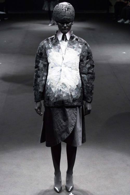
I swear I have tears in my eyes while writing this, it feels stupid but this is what happens when fashion really touches you like art does. If you happen to read my blog from time to time, you know that Thom Browne (photo 12) is my favourite designer, so I can’t really be unbiased when looking at one of his collections. The fact is that his creativity goes so much beyond whatever you can imagine, that it’s impossible not to fall in love with what he does and not getting excited when looking at his new creations. I didn’t like this collection as much as I liked his past ones, yet I recognise the masterful quality of the details and the amazing concept behind it. It was mourning, again, which inspired Thom for this new season, and for this reason he went for a total black collection. Yet, the white figures standing up in the background gave the impression of watching a black and white movie. But apart from this, the clothes were anything but old: they mimicked old, maybe, but this was the most contemporary and accessible collection created by Thom Browne yet. There was a sort of Chanel vibe to many pieces - look at the raw edge of some of the jackets, or at the tweed used in some other pieces - and black was not used in a plain fashion: it was kind of three dimensional, with shades - 50 shades of black? - giving detail to every single element of the clothes - the buttons, the zippers, the seaming and the ruffles. Masterpiece, as usual.
Adeam showed how to go very dark and still keeping a feminine attitude, while Zoë Jordan borrowed clothes from the male wardrobe and reinvented them in an androgynous style. Loved the white biker jacket and the dégradé long blazer.
A very strong pop of colour in 70s style came from Karen Walker, who offered very different options keeping it cohesive. Rag & Bone displayed a strong collection where different style were put bravely together. Silk night gowns were paired with trousers and quilted windbreakers, black was mixed to acid colours and lurex and leather met in more than one look.
xxx
Post link
New York Fashion Week - Day 1
Here it begins, the tour de force of the fashion weeks. And now that New York has inaugurated the season with the first day, I can’t wait to tell you everything about my favourite collections.
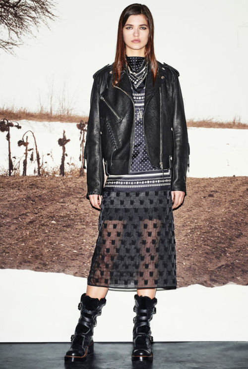
It was a nice start with Coach (photo 1) which presented a style which I would define as indie: leather coats with furry edges, long plain silhouettes with different layers of - black, of course - garments, including long skirts and some oversize knitwear. Cool in the streets.
The urban style of Nicholas K was presented this time in a very feminine translation, with chiffon, pinstripe manly fabric used in delicate draping and shapes which enhanced the woman body. About Jonathan Simkhai’s collection there were some things I really liked and some which I really DIDN’T. For sure I loved the injection of modernity given by the straight lines over the first lacy outfits; I completely loved the juxtaposition of lines in some of the other looks, like for example in the sky blue, black and white sweater, as well as the crisscrossing of thin lines in the last gowns. I hated the champagne gold fabric though, I thought it completely destroyed the collection looking extremely cheap.
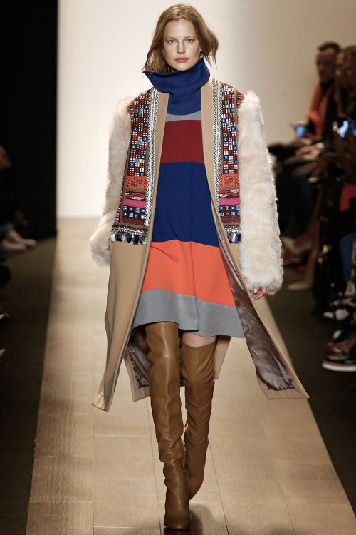
It was an unusual inspiration for BCBCMAXAZRIA (photo 2) but this tribal native American atmosphere really nailed it: fringes, ethnic prints, everything declined in the usual vocabulary used by Max Azria, where femininity is the first word to know. Loved the juxtaposition of colours which is not very usual with the designer, and it was a good step outside his comfort zone.
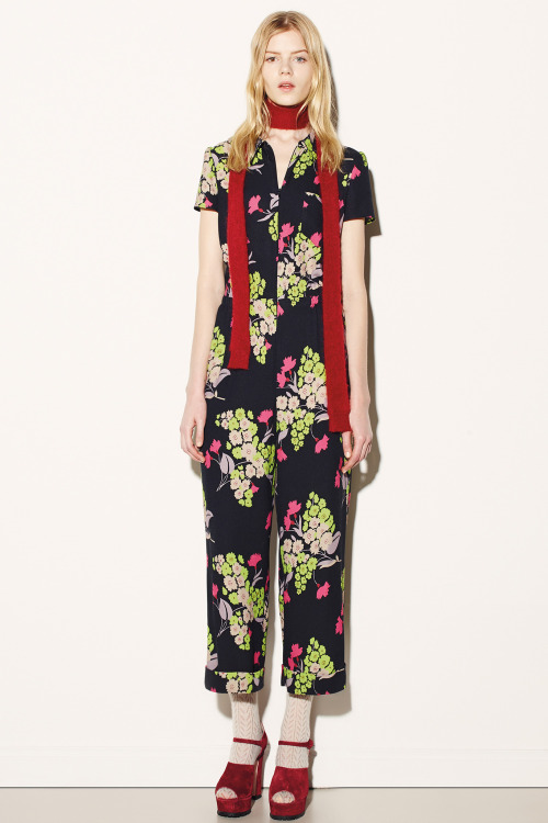
Red Valentino (photo 3) the young line of the Italian maison always gives great satisfaction with the minimum effort. Yes, effortless is maybe the best adjective to descrive this collection made of pastel colours - powdery pink and baby blue as first - simple silhouettes, mini dresses and checked shirts. Loved the bold prints and the jumpsuit which are definitely the coolest outfit for a woman-to-be.
I kinda loved the first half of Creatures of the Wind collection (photo 4), and it was a pity as it could be a great one if it wasn’t for the second part where a very toned-down atmosphere toned down my enthusiasm as well. Loved the jackets with the raw stitching in bold colours, loved the nude coats and I also appreciated the metallic print which made me think 60s in a sort of 80s revisitation.
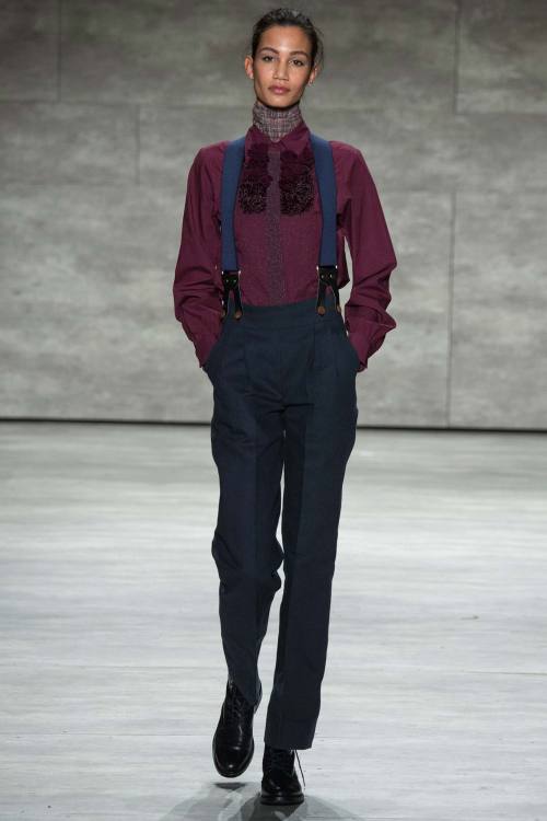
Costello Tagliapietra (photo 5) probably had the best collection of the day. It was menswear for women and it has never looked so sexy! There were braces, high-waist trousers, dungarees, overalls. It was kinda schoolboy too but there was always space for some extremely sweet and elegant dresses, and overall, despite the differences, everything worked well together. It was a great, polished, pleasing collection.
Sea proposed a collection of basic pieces with an edge and some prints here and there which are never a bad idea. But Honor (photo 6) was another one having a great collection. I always love Honor collections because they all take you to a world of fairytale. This time, though, the protagonist was not the princess, but the mistress, the evil witch. Yet, it was a pretty fashionable witch. I loved the fact the brand is always recognisable, especially in its prints looking like shades projected by a night lamp, with a sort of children-like irony attached to it - we are talking about fairytales after all - which definitely makes you smile - aren’t those little whales extremely cute? And I also loved how mature it can go without losing its freshness - look at the red chiffon gown, it looks like it’s made of flames. Exquisite collection, even if I preferred the first part and didn’t like the purple shade they used in some of the looks; it read old in my mind.
From Norma Kamali I particularly appreciated the first grey denim patchwork looks and I loved the sporty vibe of the overall collection; however, it went a little 80s disco-dance at the end. Creatures of Comfort (photo 7) instead opted for flowing dresses and skirts everywhere, but nothing was too ethereal - just look at the boldly coloured check fabrics. It was energetic, even the bows adorning dresses, trousers and tops were large and in-your-face, but still feminine and gentle. Great balance throughout the whole collection, even between pretty basic looks and more eccentric ones.
Marissa Webb was all about classic shapes, different layers in different materials - wool and chiffon for example - I loved the coordinates in grey, they had a very professional attitude and made me think of a strong career woman. The real miracle of the first day happened with Desigual: I don’t know what changed from the last time I told myself ‘Give another chance to the brand, take a look around’ when entering the store while I was on holiday in Vienna. After that time I promised myself I would have never put my nose inside another Desigual store EVER. But after this collection I might change my mind: I actually liked most of the pieces. Loved the aztec prints, I loved the fact they stopped using thousands of different -ugly - prints in the same outfit - and I usually love mixing prints, but that was just too much! - and I loved as well that they quitted writing awful messages on their t-shirts and dresses. That’s a good new start.
Tome (photo 8) chose the coat as the centrepiece of the whole collection, translated into different ideas: first the camel woolen trench coat in different lengths and proportions, then the leather jacket - in bright lemon yellow - over an elegant dress.
I would like to close my review and the first day of NY collections with a designer which I’ve never really thought about, Rachel Antonoff (photo 9). I didn’t remember her - but after all, Valentino was not successful at the very beginning of his career, so this doesn’t mean anything - but I loved her schoolgirl aesthetic. There were some very subtle references to school in these first collections, but Antonoff was the only one to take it to the extreme and make this reference clear - her model was definitely dressed in a school uniform - and it was cool. What I particularly appreciated was the subtle reference to biology - is the girl behind this collection a biology student? First, from the little dresses with the front printed with the stylisation of the reproductive system in one case and with some lungs in another instance; then the print for the last looks, depicting fruit and flowers with biological precision. School can be fashionable then. Interesting.
xxx
Post link
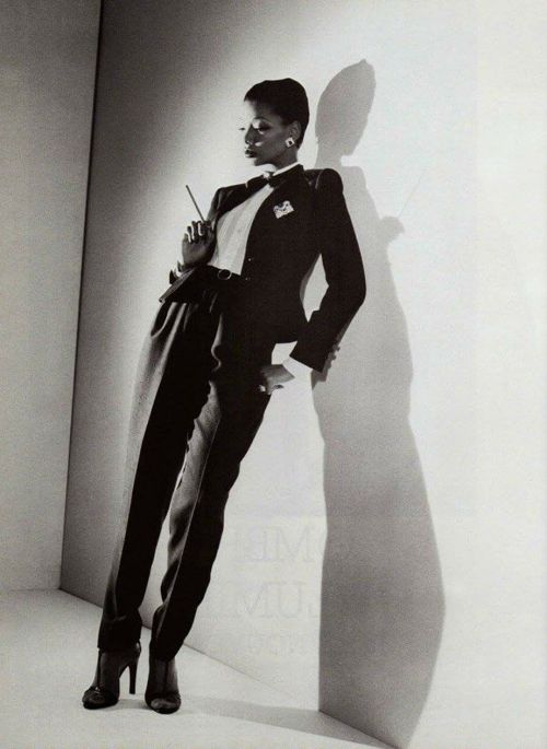
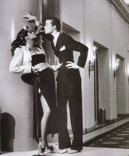
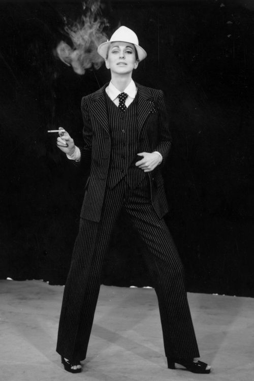
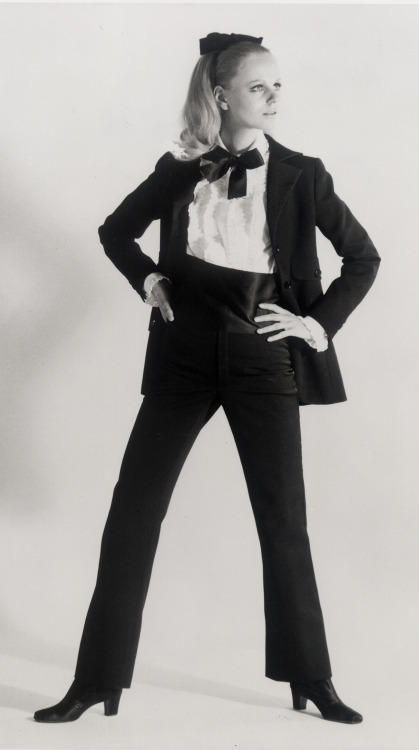
Algerian-born Yves Saint Laurent launched ‘Le Smoking’ Look in 1966, his couture collection featured a style that divided fashion critics: a black tailored tuxedo with a classic satin side stripe (similar to adidas 3 stripe today), worn with a white ruffled shirt.
Responses were tepid – it was the first time that any couturier had presented trousers as an option for eveningwear, and women wearing it were refused entry by some restaurants the following season.. My How Times have changed, this is prety tame..
Historical POV
Post link
I’m finding it very hard to find fault with Valentino lately. This collection is beautiful and I want it in my wardrobe right now! Amazing beadwork and embroidery!! Watch out Dior, Valentino is on the road to take over as my favourite designer.
Post link

Yasmeen Ghauri
Christian Dior Ready To Wear SS 1998
‘In a Boudoir Mood’ collection
By John Galliano


John Galliano RTW F/W 1998 99
“Cabaret” collection
Girls Cast:
Ling Tan
Erin O'Connor
Linda Evangelista
Elsa Benitez
Carmen Kass
Susie Bick


Irina Pantaeva
Maison Dior Ready To Wear Spring Summer 1998
“In a Boudoir Mood” collection
By John Galliano


John Galliano
“Cabaret” collection
Fall/Winter 1998 99
Models:
Nadja Auermann
Kirsty Hume
Inés Rivero
Laurence Desbisschopp
Phoebe O'Brien


Carolyn Murphy
Dior RTW SS 1998
By John Galliano


Linda Evangelista & Suzanne Von Aichinger
Chandra North & Kristina Semenovskaya
Carla Bruni & Esther de Jong
“In a Boudoir Mood” collection
Maison Dior RTW SS 1998
By John Galliano


