#settimana della moda
Milan Fashion Week - Day 5 & 6
Very few collections were in my opinion worth talking about in these last two days, and I’ll be honest: I was disappointed by this Milan Fashion Week this year. Pity, as usually it’s my favourite moment of the fashion year, but as a reviewer my judgments should be completely unbiased. Now let’s see who got it right.
Day 5
Marni delivered straight lines, kimono shapes made vibrant by abstract and flowery prints, even the lace became simple and a subtle decoration for this collection where the luxury part was in the insertion of fur pockets and in the neckline. Laura Biagiotti took inspiration again from her favourite theme: the Roman empire. You could see it in the ‘twisting’ patterns, especially in the first awesome part in which it was played around the different tones of grey, in the column stylised on some of the dresses, as well as in the strong shoulders, underlined by the use of fur, and the embroidered fronts of the tops, where studs gave an impression of armour. But you could also see it in the beautiful, floor-length evening gowns: modern goddesses, that’s what these models looked like.
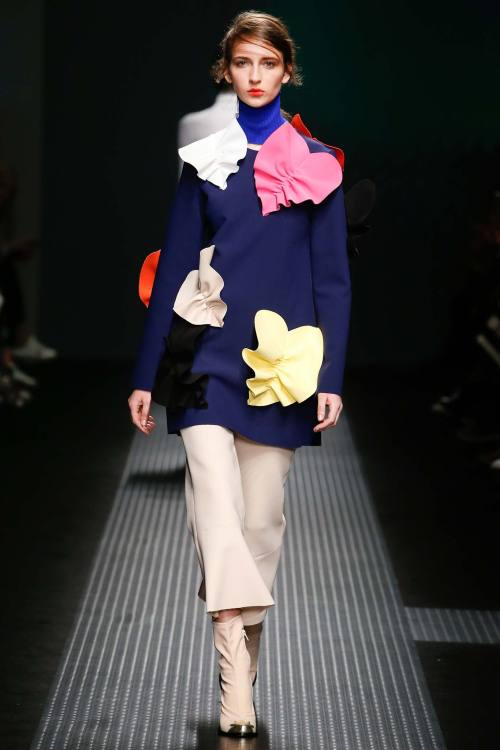
MSGM (photo 1) took the concept of three-dimensional to the next level in such a simple way it’s impossible to understand why not everyone does the same. First with big knots just below the neckline, then with decorative patterns over tops and trousers, it continued with full bright contrasting colours: lemon yellow with electric blue, a particularly flamboyant shade of orange. Not sure if I liked the three-quarter length of the trousers, but in general it came up very strongly.
All the stripes and lines in Salvatore Ferragamo collection really reminded me of Missoni. I loved the fact that the theme was not researched in an expected way: stripes are not only those of colourful patterns, but also those given by a particular type of knitwear, or those - I guess it was a trompe-l'oeil effect - of the pleating of skirts. Silhouettes were back to those of the 40s, simple, functional, toned down, but colours exploded in the last graphic part with optical prints. I loved that most of the pieces in Trussardi collection were leather, even the ones you would never expect: slip dresses, jumpsuits - my favourite ones - cocktail dresses. The colour palette was really classic, based especially on brown, which is after all the most natural colour for leather.
You know I don’t like animal prints - especially zebra, but who does? - blingy/tacky clothes, in general I don’t like when there’s too much going on. In this case there was DEFINITELY too much going on, but it was like they found the way to make it work and show a certain polished quality to the looks which made everything like an ironic game. It was definitely a collection which could make you laugh, impossible to list all the colours, the prints, the materials used. It was infused with a sort of 70s attitude which was not pushed too far. It’s the last word you would think to associate to such a collection, but it felt like it was balanced.
Impossible not to laugh at the ode to mothers of Dolce & Gabbana (photo 2). They translated their signature elements - black lace, black chiffon, bright-coloured embroideries, silhouettes taking inspiration from traditional everyday clothes from the South of Italy - for a figure which is definitely one of the most important in a person’s life: mum. It’s like an inspiration coming from THE inspiration, the first and foremost in your life. I would have done without the writings on skirts and dresses, but the children drawings in embroideries or prints gave the entire collection an aura of innocence which no one could resist. Once again Dolce & Gabbana proved they can be inspired by something as simple as not so much thought-about: who would ever think of going so literal on such a theme? Beautiful.
Day 6
Western inspiration for two designers coming from the West - Dsquared2 (photo 3) designers are Canadian. It was like a Western film actually: there were the Indians, with ethnic prints, big ponchos and fur coats, as well as the beautiful girls seducing men in the saloons, with ruffled dresses, exaggerated proportions down the waistline - translated here into more modern trousers and jeans - and a cocky attitude which definitely suits Dean and Dan Caten’s type of woman.
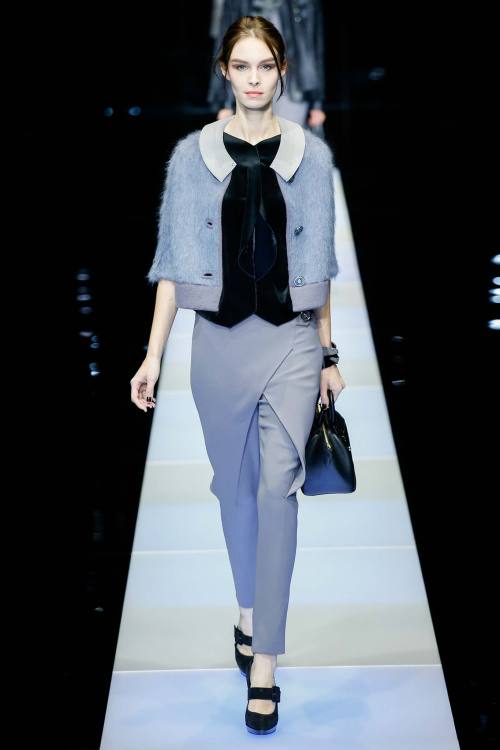
The brush of colour crossing one of the first pastel-coloured looks at Giorgio Armani (photo 4) set you already for some pops of colours here and there. They were not very bright though, and this was the focus of this collection: understatement, which, if you know a minimum about fashion, is not a new thing for Armani. This time the colour palette was really subtle: it went towards light blue, grey, some nudes. Folding, juxtaposition of materials, see-through with ethereal chiffon: it was mysterious, it was fascinating.
xxx
Post link
Milan Fashion Week - Days 3 & 4
Day 3
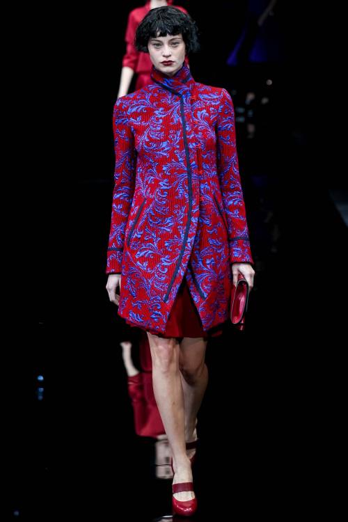
I start my review with Emporio Armani (photo 1), with a slight inspiration coming from Asia, with lines similar to the kimono translated into Armani language. Maxi-buttons were placed on the side, shiny silk brocades gave a little light to the looks, ruffles everywhere and just one very bright colour, red, together with grey and black. Sportmax (photo 2) always finds a good compromise between wearability and fashionability. It was great because the details that made the clothes simple made them also remarkable: the raw cuts of the little dresses, wool in neutral shades used for the beautiful coats closed by just one string, straight lines and basically no decorations at all.
This time I didn’t like the prints in Etro collection - guess in some cases it reminded me of Desigual, which I hate - but I recognise this is a matter of taste. It wasn’t a bad collection, but overall that’s the problem: it was just nice. Too many dresses looked as the same, the only successful ones in my opinion being the ensemble top + trousers and the ones in the shiny tones of gold. Iceberg (photo 3) was instead a grower for me. It started looking like another ‘normal’ collection but it wasn’t: when you start noticing the three-dimensional quality of the few prints, or the focus on the extremely tight waist, with high-waisted sort of trousers which are maybe more leggings than pants, in neutral tones, or the wool multi-coloured skirts paired with immaculately made white blouses, well, it wins you over.
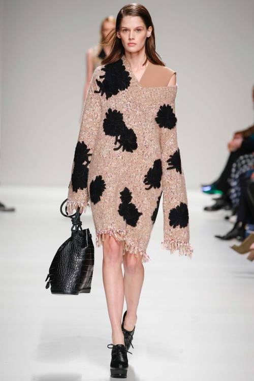
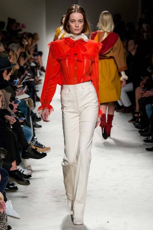
How I like experimentation with fabrics! The great strength of Marco De Vincenzo’s collection (photo 4) was, first of all, the extremely wide variety of materials: there was leather, sheepskin, denim, wool, velvet. And then the interesting manipulation of these materials: criss-crossing in contrasting shades, fringes, fur patchwork. It was a total collection. Philosophy di Lorenzo Serafini (photo 5) had period elements with 70s vibe: the ruffles, the bows, the white lace meets high-waisted slightly flared trousers, chiffon maxi-dresses, bright colours like blood orange, with some much more modern twists - shorts with printed sweaters and tiny jackets in flowery patterns.
There were definitely too many idea in Versace collection. The glam look is becoming old, and the only looks I really appreciated were the black ones with slits revealing slashes of amazingly bright colours: lemon yellow, fiery red. I also save the little dresses with the puzzle of greek prints - signature of the brand - declined in different colours. For the rest, it’s a no no. Bally chose instead classic shapes revisited with a touch of irony: colour blocking, oversize croco trousers, bright accessories.
Day 4
Ermanno Scervino (photo 6) presented a collection which was already successful after the first few white quilted dresses in which the quilt creatively formed a pattern. It then went on with a chain of sophisticated blue looks, with dreamy and romantic shapes. Beautiful the gowns closing the show, inspired by the 40s and still linking the brand to its signature elegant style.
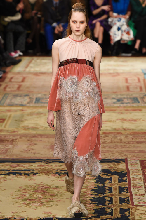
Creativity takes over again at Antonio Marras (photo 7) and the result is always fabulous. Colours veered towards pastel shades, but shapes are much more rigorous and structured: square-shaped oversize coats with prints inspired by abstract and deco art, referencing the beautiful lace used throughout the collection, mixed with velvet or juxtaposed on the other colours to create beautiful graphic effects.
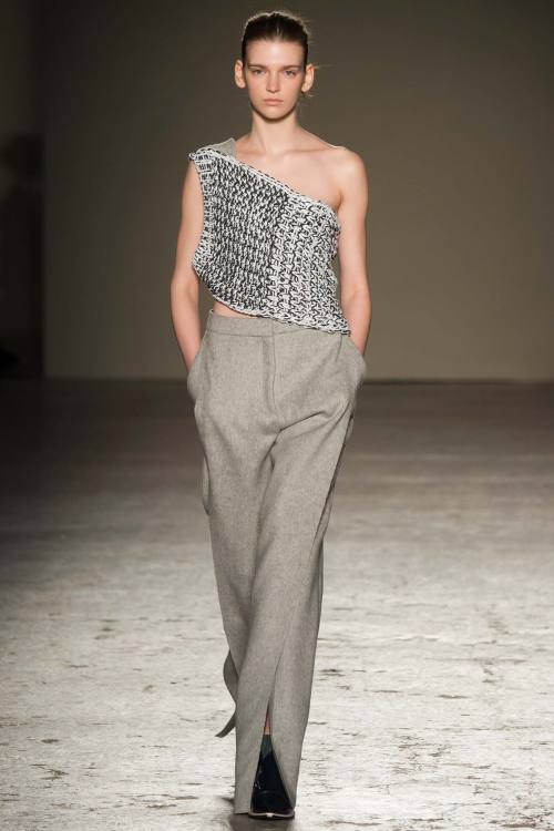
I chose that outfit in the photo for Gabriele Colangelo (photo 8) because it represents, in my opinion, the very core of this amazing collection: a pair of wool blend grey trousers and a simple woven panel as a top. The woven panel was the real fil rouge connecting the whole collection and was present over dresses, coats, trousers, skirts. Wonderful idea that of the insertion of colours in the final part, fuchsia being the main tone. Fur added that little bit of opulence giving character to an already perfect collection.
xxx
Post link
Milan Fashion Week - Days 1 & 2
Milan is currently hosting Fashion Week, and as I’m living there I can tell you: the city breathes and lives fashion! Let’s see together these first two days of fashion week.
Day 1
Genny went sexy this time, with total see-through crossed by lines forming geometrical shapes. Beautiful the white and gold pieces.
Himalaya is definitely Stella Jean’s latest inspiration (photo 1), as we’ve seen in her menswear collection - and she actually translated some of the prints she used for menswear here for this new exciting collection. Useless to talk about print when it’s Stella Jean: that’s her signatur, we know that, we love that. Last season I wished she would change something in her design which was becoming repetitive; now I can say I’m happy with this collection. I loved the puff skirts in plaid, the warm pullovers and the beading made of pearls, little jewels, fringes… I even saw a more sophisticated attitude in her tartan trench coats.
Luisa Beccaria’s collection was about modern Cinderellas, and you could actually feel that romantic atmosphere in these clothes inspired by lady-like shapes and the most classic of gowns and feminine desires: a pale golden long evening gown with no decoration but just its simplicity; cute little caps; chiffon blouses, blingy cocktail dresses.
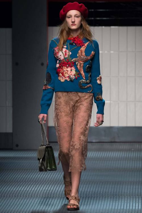
Gucci (photo 2) is still recognisable as Gucci, so we can breathe easy. I admit, after the beautiful menswear collection I saw in January I expected more from the new appointed creative director Alessandro Michele, but there were still many very valid elements. For example, it was slightly more daring than usual: some models were basically walking down the runway with completely sheer ensemble - without wearing bras, of course. It continued on the gender-crossing mission, and some looks could be definitely worn by either men or women. Yet, there was something missing, that je-ne-sais-quoi which still doesn’t convince me completely. But Gucci is on the right track.
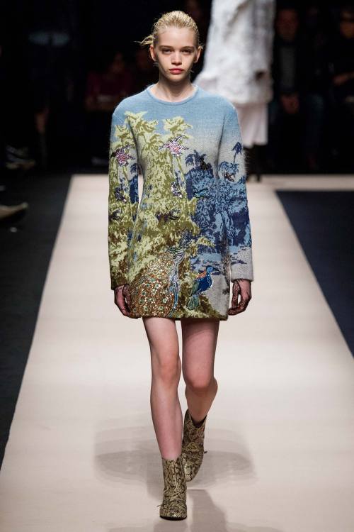
Every designer draws inspiration from the remote past from time to time - Alberta Ferretti (photo 3) did it now. Renaissance was visible in these total white lace looks, or in the brocade-like coats and trousers lightened by golden threads against the black background. I particularly appreciated the white blouses, being the pieces in which the detailing is at the same time the most subtle and the most intricate and sophisticated. I also liked No. 21 collection (photo 4), and the only negative thing I can say about it is that I still need to find that fil rouge connecting the different styles in it. Overall, though, I was completely blown away by the pixeled landscape print and the dozens of ruffles architecturally placed around the body covered by the white coats and jackets looking like white paper.
Fausto Puglisi’s style doesn’t suit me personally, but I recognise the strength in it, a sort of kitsch attitude combining very distant things together, gold and zebra print, elegant shapes and urban style. Francesco Scognamiglio’s show (photo 5) started with extremely simple black silk dresses, and I was already in love. It takes guts to give start to a runway show with extreme simplicity. It kept that way throughout the collection, with some highs of sexiness and sweetness some times, romantic shapes and ethereal fabrics gently and swiftly following the body lines.
The principle ‘sport, sport, sport’ is taking Brunello Cucinelli as well, so much that he decided to match activewear shapes with hyper soft furs for this new collection. And I’m sure this can make a trend.
Day 2
Max Mara proposed effortless looks with effortless shades in effortless shapes: coats lost all the decorations, even buttons were invisible; shades veered towards sand, beige, cream; beautiful the quilted sweater coordinated with the quilted silk coat. Even more basic was the direction taken by Les Copains, yet there was a sober atmosphere which gave space to the very small details: jewel brooches, the soft quality of materials, colours declined in different very similar shades building a tonal architecture which gave depth and structure to the clothes.
Fendi (photo 6) went slightly alternative. Younger and fresher than usual, it started with loud white ensembles in candid leather which lit up the runway completely. It went on with very innovative elements: the duvet of the coats used to create total duvet dresses, maxi-coats with strong shoulders, oversize furs wrapping the body.
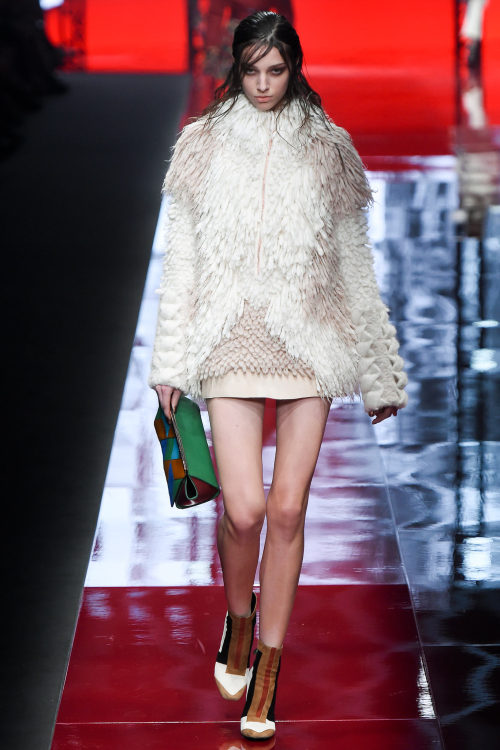
It’s official: I like Roberto Cavalli’s secondary line, Just Cavalli (photo 7). It’s becoming much more polished, elegant and animal prints are disappearing or are translated into something more graphic and less predictable. It was Cavalli anyway: the fur, the feathers, the edgy attitude of his woman, everything was there as proof that you can keep your style without necessarily going tacky. The one thing I loved about this collection was the extreme variety of the offer: there were little dresses in total black, maxi furs, studded jackets, mini skirts…
Miuccia abandoned the black she embraced during last season and for menswear, and she went back to her first love for this Prada (photo 8) collection: colour. And crazy prints as well. Everything looked like being made of neoprene, but then I read Tim Blanks’s review and saw that he missed the 'joke’ as well: it wasn’t neoprene, but double-faced jersey. Magician Miuccia pulled another rabbit from her magic hat. And so she went on, with irony, mimicking tartan and tweed prints, mixing colours, showing that something new in fashion can still be created.
Cristiano Burani presented a cool collection with an edgy and activewear twist: bomber jackets in fur, coloured stripes everywhere, black leather and glossy plastic for mini-skirts. Daniela Gregis knows how to be a conceptual designer without giving up on wearability. Research on cut and colour was central: peek-a-boo elements opening a window on brushes of colours looking like painted on a canvas. Black serving as the contrast against which opposing the whole rainbow.
Byblos Milan opened its show with shocking pink and colour blocking, which could trick you into thinking you were going to assist to an explosion of tones. That was not the case: colours were used to lit up the main shade, which was definitely black. Black made electric by blue, black made bright by the match with the most classic white, black being sexy as pattern on sheer fabric against the naked skin. And then Moschino came. The first looks really made me hope that Jeremy Scott was over the references to pop culture - which I like, but you know, you have to change if you want to stay hot in fashion. Then it started with another of his obsessions: cartoons. This time it was Looney Tunes, but the formula was the same: blingy accessories, shapes and types borrowed from football, basketball, sport in general. But it wasn’t even cartoons: it suddenly went to what we can easily call the new 'mascotte’ of Moschino, the teddy bear. And then graffiti. It was definitely too much - but is it a praise or a critique for a designer whose motto can easily be summed up by 'more is more’? Anyway, my favourite part was definitely this last one: I didn’t even think Scott could be able to conceive such elegant traditional shapes. Reinvented through the colourful graffiti though. Yes, I would have definitely loved to see some more of that, it would have made Moschino collection one of the best so far.
I was in love with Ports 1961 (photo 9) as soon as I saw the first photo of this new collection. After that, I couldn’t get over it anymore. Beautiful the grey ensemble with the maxi-knot in front, being the detail which turned around a whole look. And then it went on with ethereal fabrics, looking like made of nothing, the beautiful draping of some gowns - bravely paired with slippers - decoration to the minimum: even the simplest thing can look great.
Marcelo Burlon County of Milan closes my first review for MFW, and I can say alternative futuristic fashion lovers have found their guide in Milan. Everything was over-the-top without being bad taste: graphic prints, silver fabric looking like space suits, exaggerated proportions.
xxx
Post link

